Compare your deck to Talkdesk

Compare Your Deck

Talkdesk Pitch Deck (2012)

SaaS
Stage: Seed
Raised: $3.15M
Year: 2012
Slides: 27
Outcome: Valued at $10B after Series D (2021)

Pitch Deck

1 / 27
Talkdesk pitch deck - The Opening: Clear promise and positioning
Click to expand

Deck Analysis

This 2012 seed pitch deck from Talkdesk presents a concise case for a browser-native, cloud-hosted call center product that plugs directly into CRM workflows. It is notable for its strong visual storytelling (icons and simple diagrams) that quickly communicates the problem (complex legacy telephony), the solution (browser-based calling integrated with CRM and support tickets), and a clear go-to-market/monetization plan. The deck’s later real-world traction and eventual large exit valuation ( ~$10B after a Series D in 2021) make it a useful study in how early clarity, focused product positioning, and rapid customer momentum can attract investors.

The Opening: Clear promise and positioning

The Opening: Clear promise and positioning

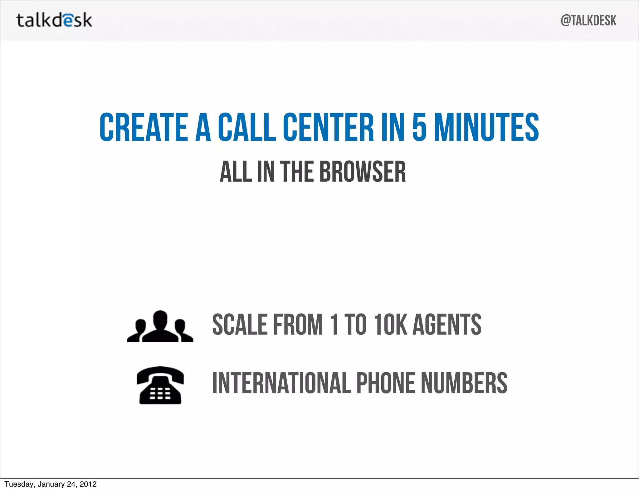
Slide 1 opens with a bold, single-line value proposition — “Create a call center in 5 minutes — all in the browser.” That headline immediately sets expectations about speed, simplicity, and where the product lives (the browser). The visual is uncluttered: large logo, the tagline, and a date stamp, which delivers confidence and makes the pitch feel immediate and executable.

This economy of words and clean layout is effective because it answers the core investor question: what is the product and why does it matter — within seconds. Founders can learn from this slide that a crisp top-line promise that highlights the differentiator (ease and browser delivery) is more persuasive than a long, feature-laden opening.

Key Takeaway: Lead with a single, measurable value proposition that communicates your biggest differentiator (what you enable and how fast) and keep the opening visually simple.
The Problem: human impact and customer pain

The Problem: human impact and customer pain

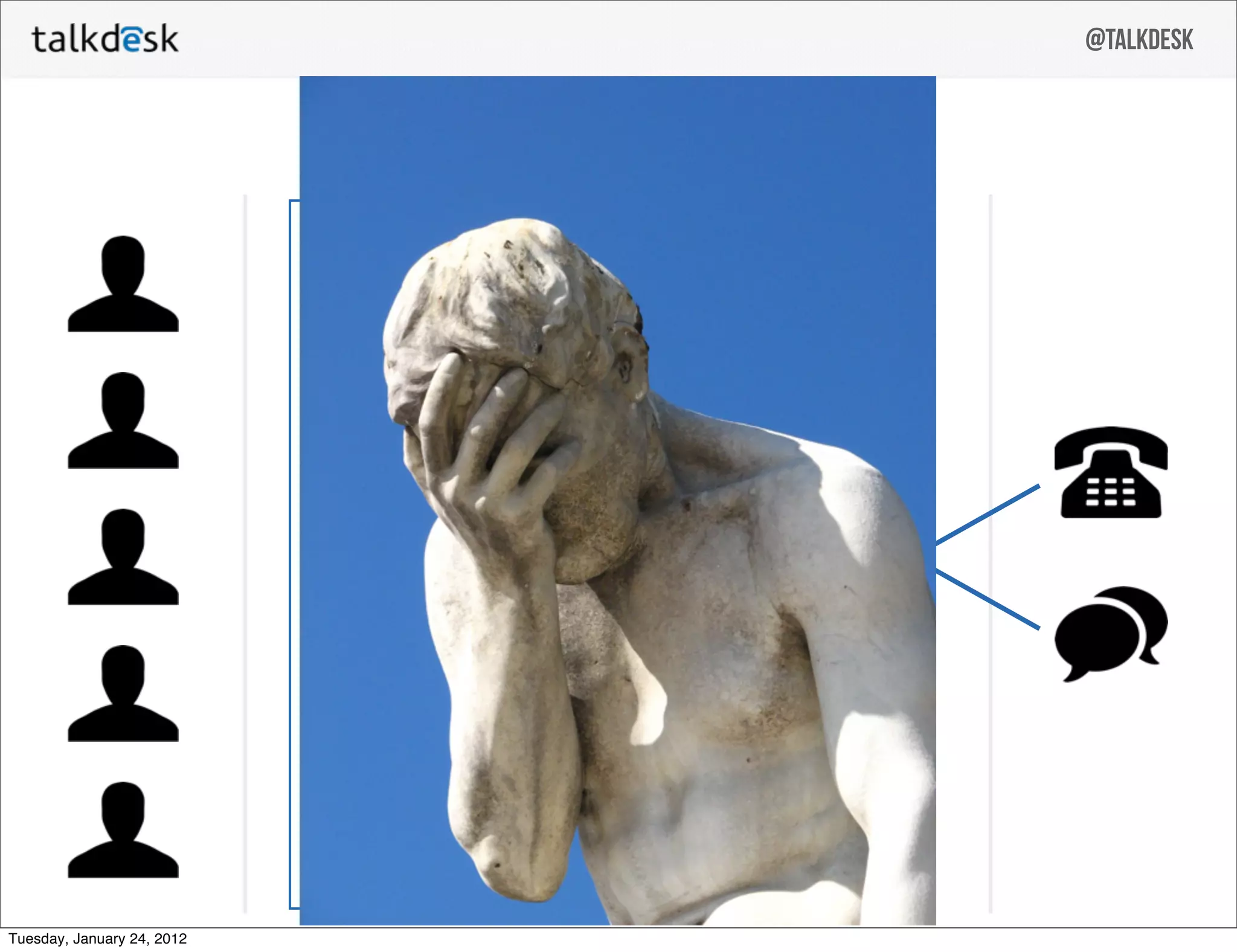
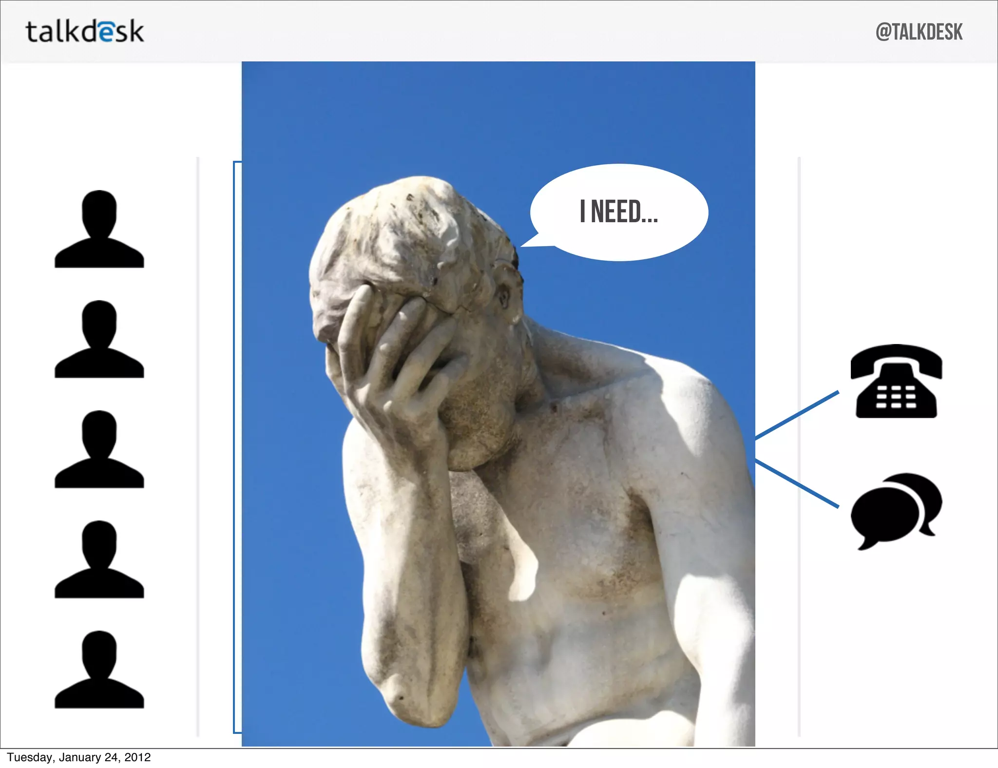
Slide 11 uses a striking image (the facepalm statue) and a small speech bubble (“I need…”) to dramatize customer frustration. Rather than listing technical shortcomings, the deck humanizes the problem — customers need support and current systems create pain and friction. This approach primes the audience emotionally, making the solution feel like an obvious relief.

The choice of a large, relatable image (facepalm) paired with minimal text teaches founders that illustrating the pain succinctly and emotionally can be more effective than a long bulleted list. This slide demonstrates how to create empathy quickly and make the market need tangible for investors.

Key Takeaway: Show the customer pain with one strong image or anecdote — make the problem visceral and immediate before diving into tech details.
The Architecture: simple diagram to explain technical advantage

The Architecture: simple diagram to explain technical advantage

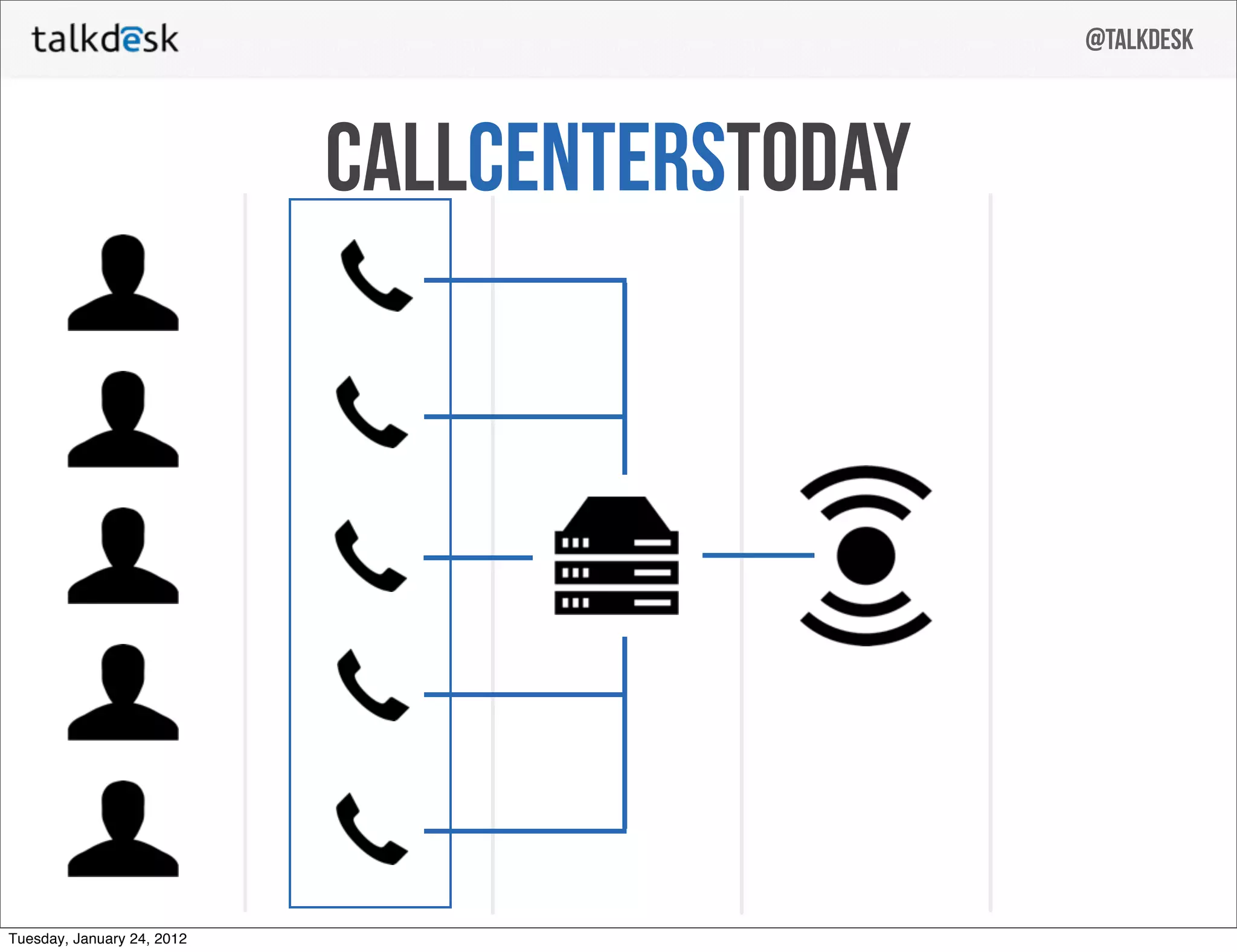
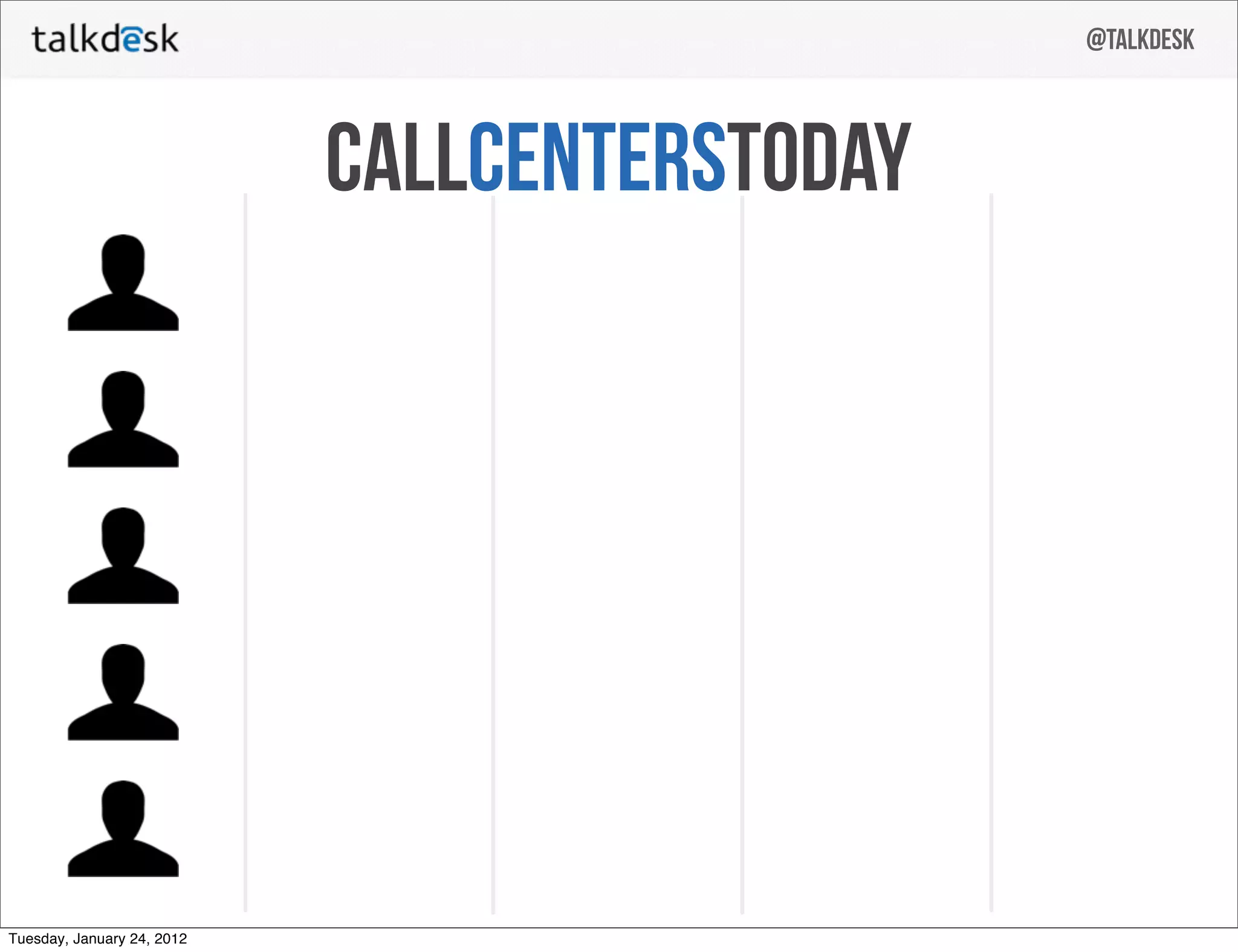
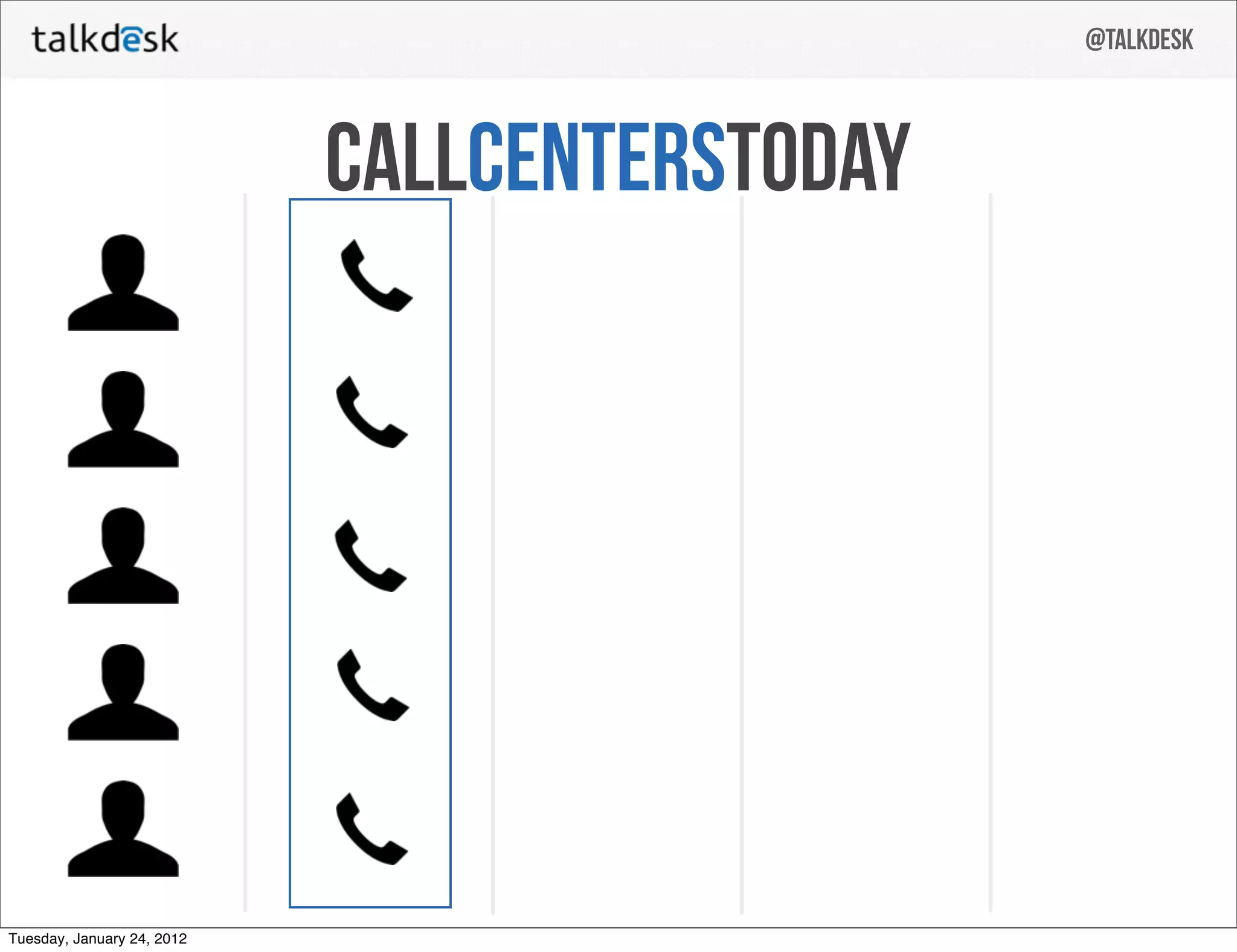
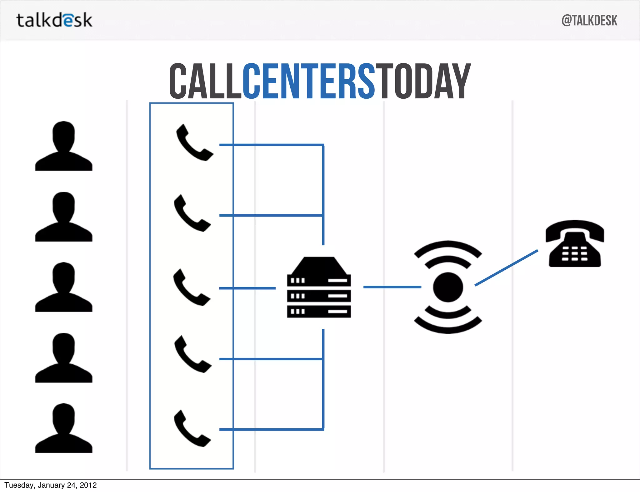
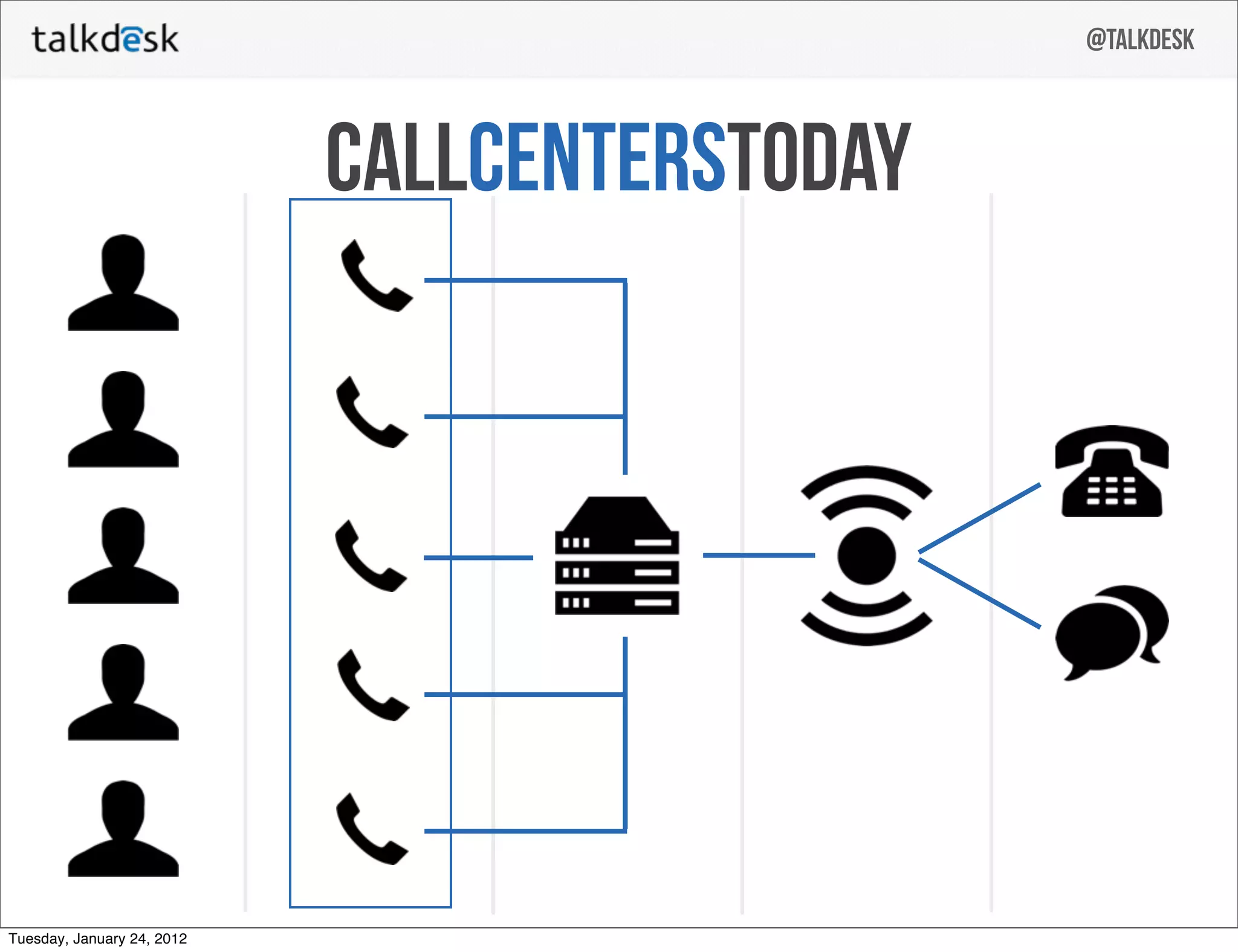
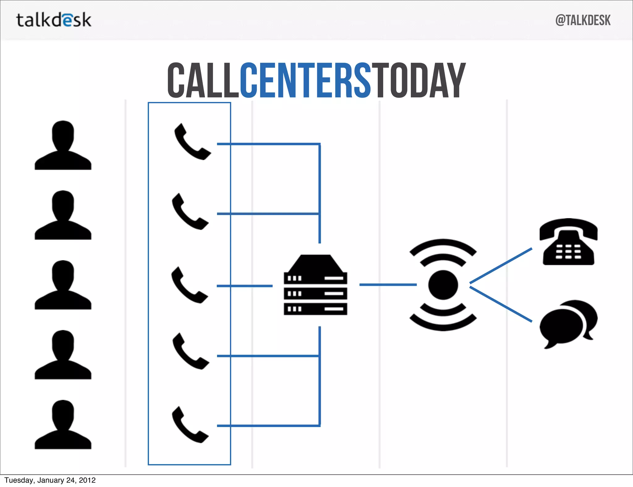
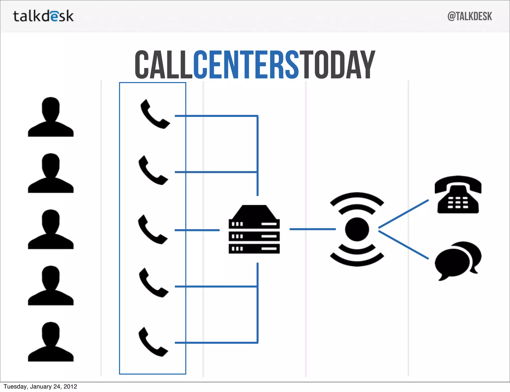
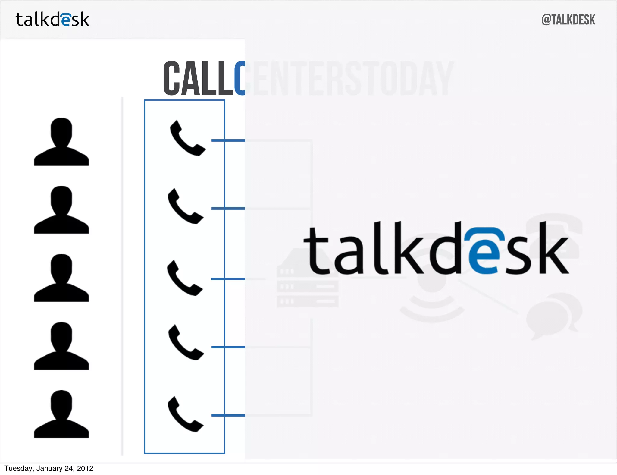
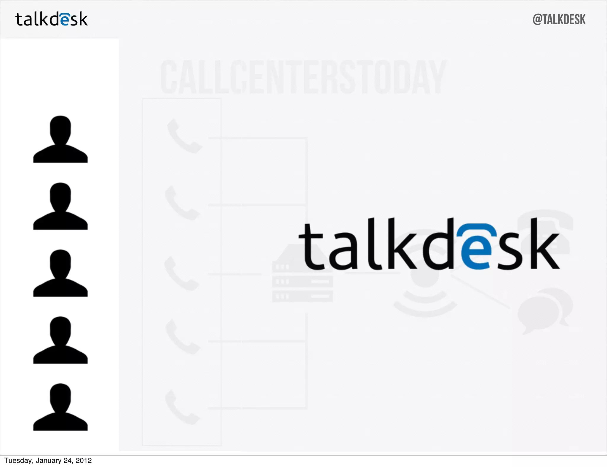
Slide 6 (and surrounding sequence) uses a progressive icon-based diagram to illustrate how agents, call routing, servers and cloud endpoints interact. The stepwise build-up (agents → telephony server → cloud endpoint → multiple outputs) clarifies that Talkdesk’s innovation is not just another PBX but a cloud-native routing layer that bridges calls to modern endpoints and systems.

This visual approach reduces technical complexity into a few shapes and arrows, making the architecture approachable for non-technical investors while still signalling a defensible engineering design. Founders should copy this technique: break complex systems into a small number of visual steps and show the unique layer you control that creates value.

Key Takeaway: Use a simple, progressive diagram to show where your technology sits in the stack and what unique capability it provides.
Product Demo: show, don’t just tell — in-browser integration

Product Demo: show, don’t just tell — in-browser integration

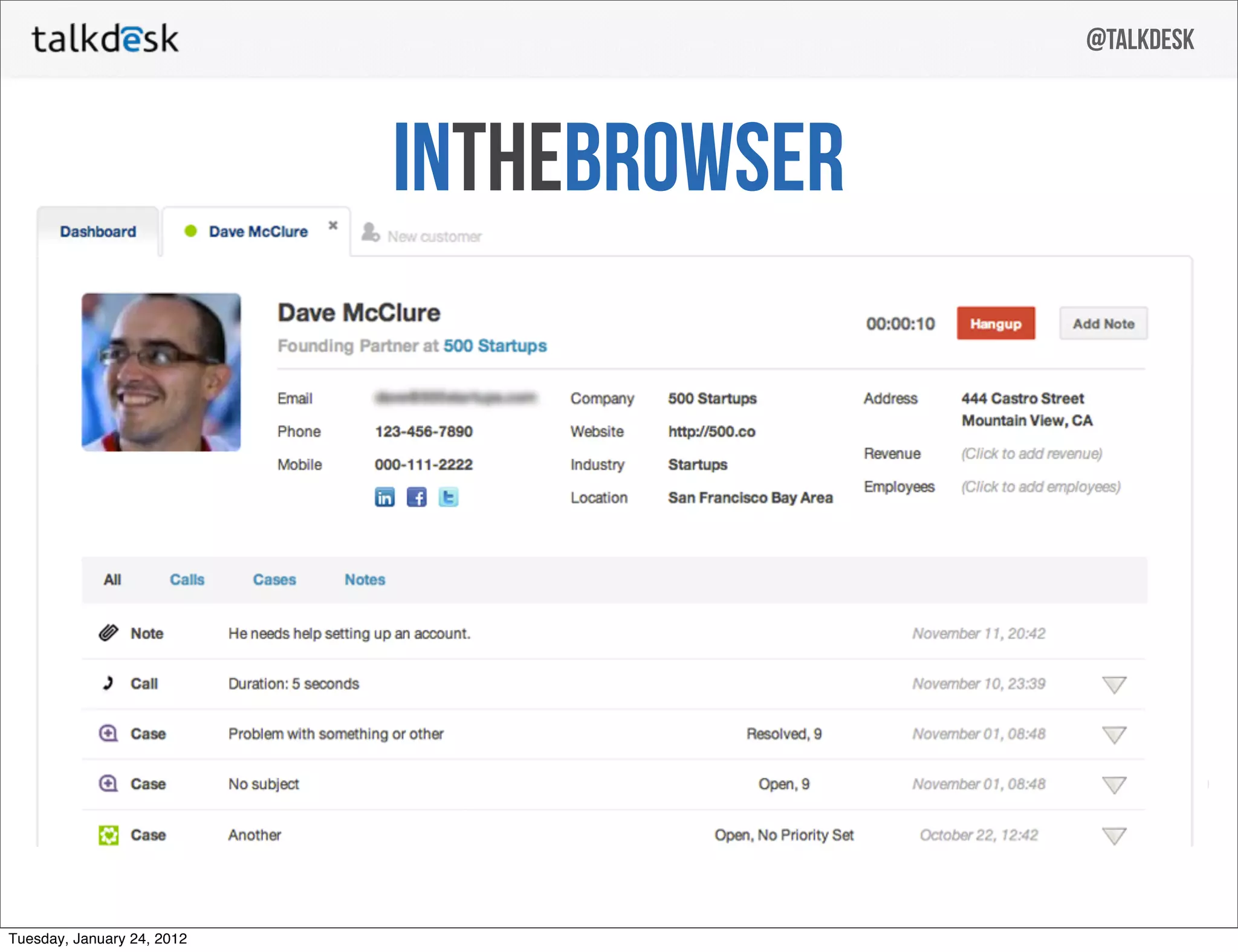
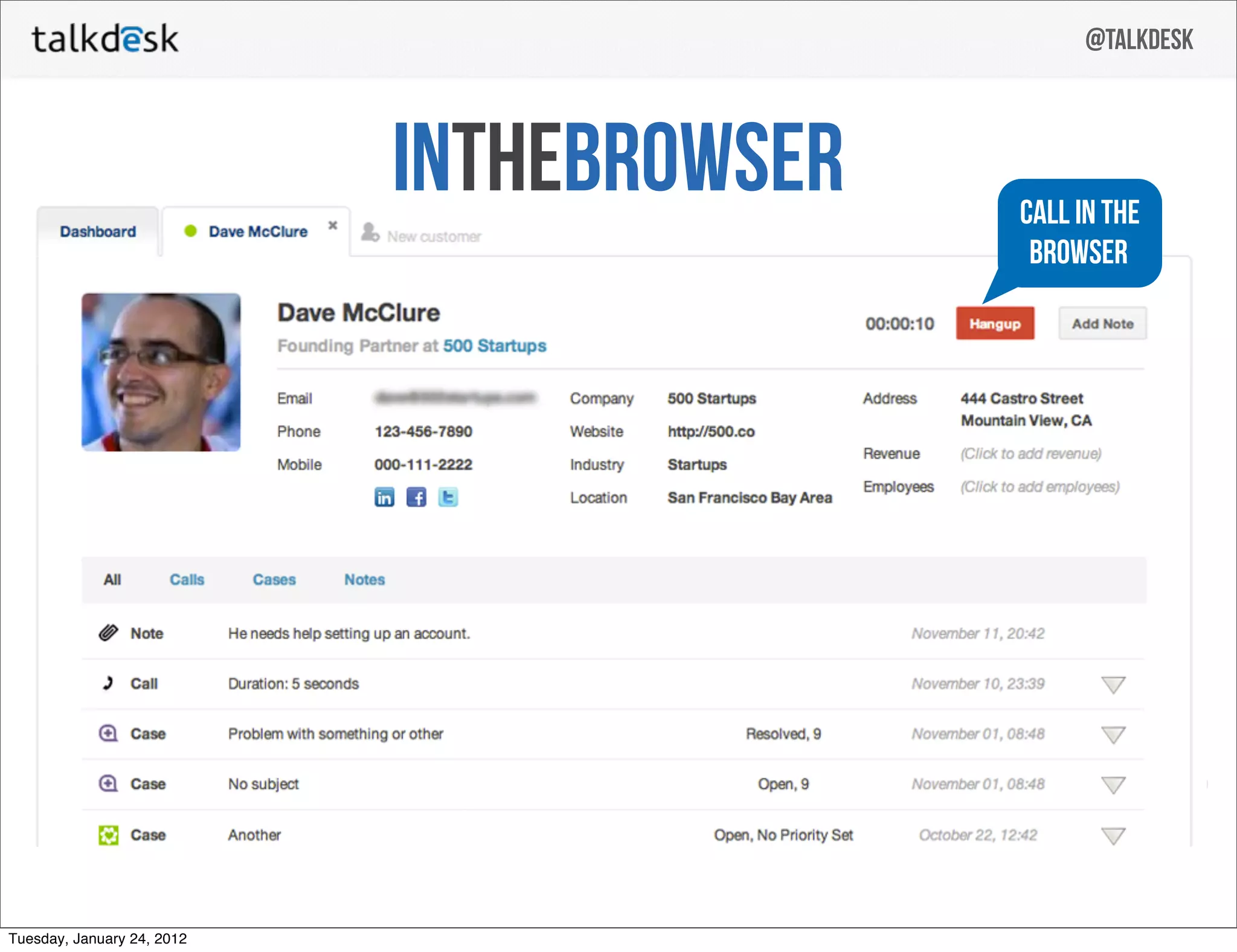
Slide 16 moves from architecture to product: a screenshot labeled 'IN THE BROWSER' demonstrates the actual user interface embedded inside a CRM profile. This concrete example shows an agent view with a call timer and CRM fields, proving the earlier promise of browser-native calling. It bridges the abstract architecture to real UX and workflows agents use every day.

By surfacing a real screenshot, the deck builds credibility: the product exists, it’s usable, and it integrates with CRM data. Founders should similarly include at least one real product screenshot or short flow to demonstrate maturity and help investors visualize adoption and user experience.

Key Takeaway: Include a real product screenshot that shows how your solution integrates into customers’ existing workflows to turn abstract claims into tangible evidence.
Value props: integration with CRM and operational benefits

Value props: integration with CRM and operational benefits

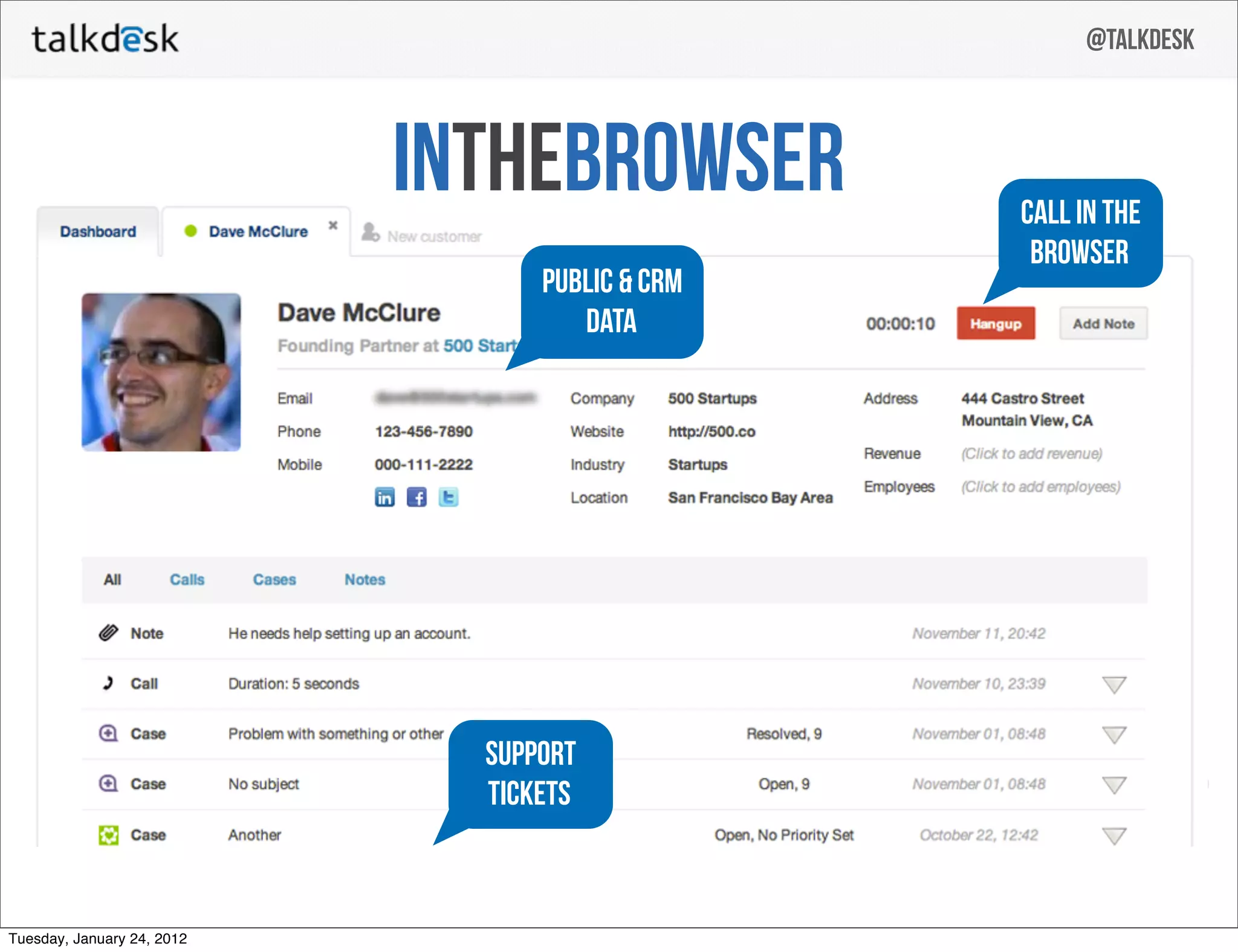
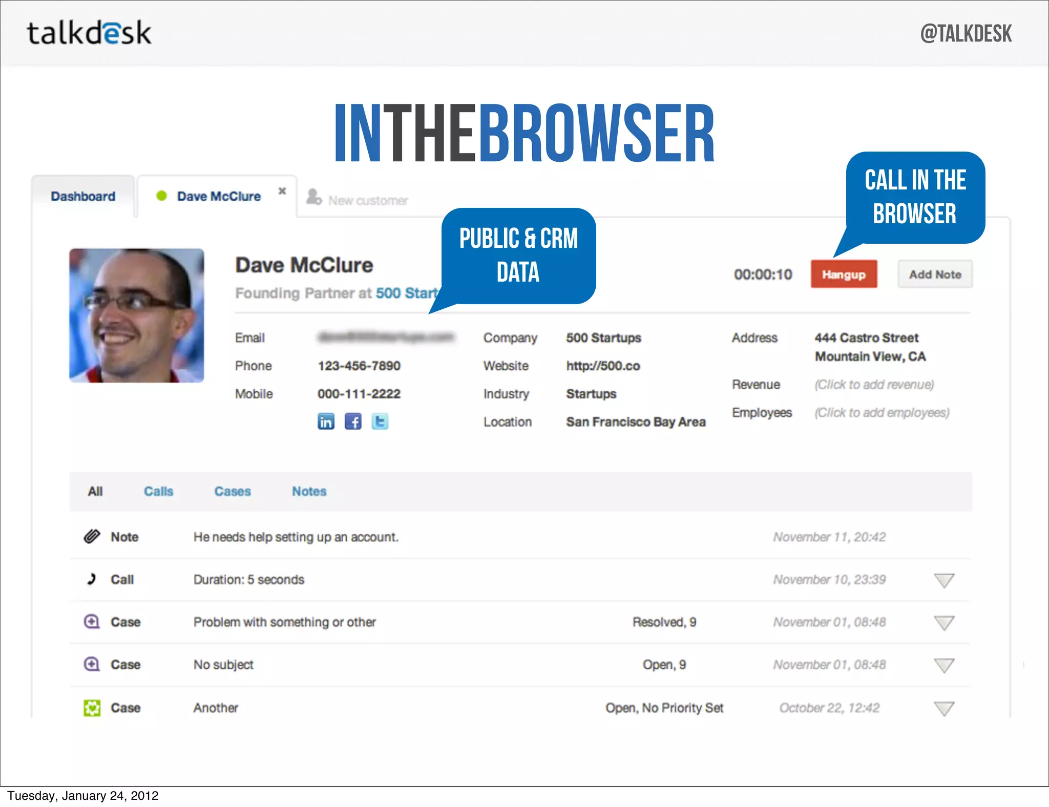
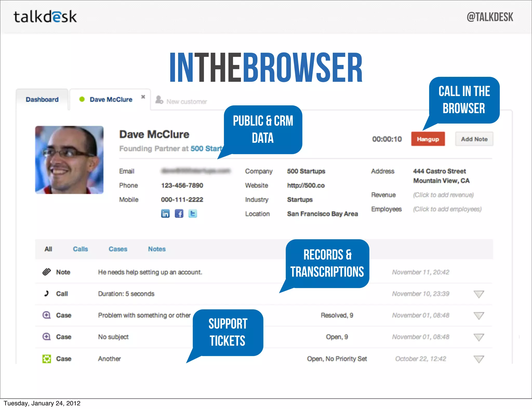
Slide 19 highlights complementary value propositions — in-browser calling, public & CRM data, and support tickets — using callouts positioned over the screenshot. This communicates a trifecta: agents can call from the browser, surface relevant customer data automatically, and log support actions (tickets) without context switching. That combination directly addresses agent efficiency and company workflows.

Framing product benefits as integrated wins (data + telephony + ticketing) rather than isolated features strengthens the product narrative: Talkdesk isn't just a dialer, it’s a workflow engine for customer conversations. Founders should define their product by the workflow (what jobs it completes) rather than by a list of features.

Key Takeaway: Position your product as an integrated workflow solution — show how features combine to reduce friction and increase agent productivity.
Business model and unit economics: simple, actionable pricing

Business model and unit economics: simple, actionable pricing

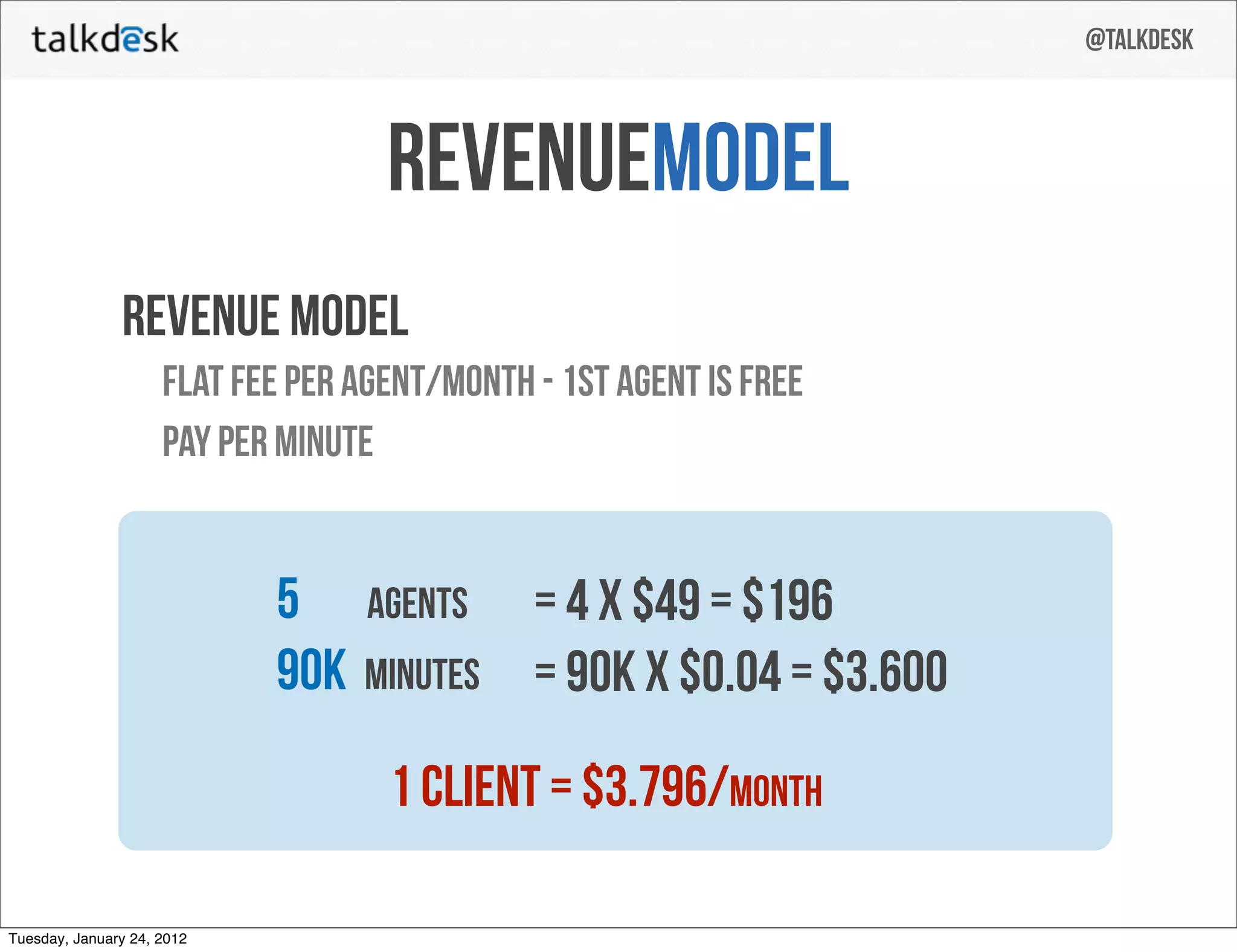
Slide 21 presents a straightforward revenue model: per-agent monthly fees plus pay-per-minute voice usage, with a worked example showing how one client could generate monthly revenue. The slide’s clarity about pricing components and a numeric example (agents × price and minutes × price) makes the business model tangible and easy to stress-test.

Investors want to understand how usage scales and where the margins live; this slide gives them both a subscription and usage story. Founders should emulate this by presenting a clean pricing model and at least one realistic customer revenue example to demonstrate how unit economics drive ARR.

Key Takeaway: Present a clear pricing model plus a simple worked example so investors can quickly understand revenue drivers and scalability.
Traction & Team: early metrics and capable founders

Traction & Team: early metrics and capable founders

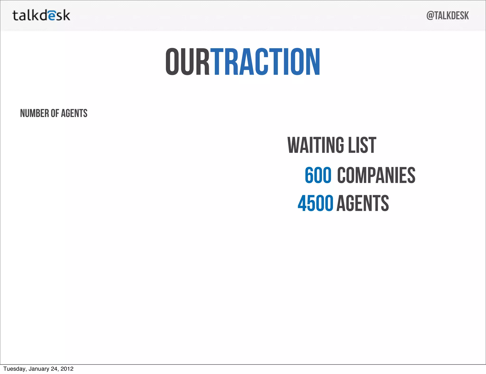
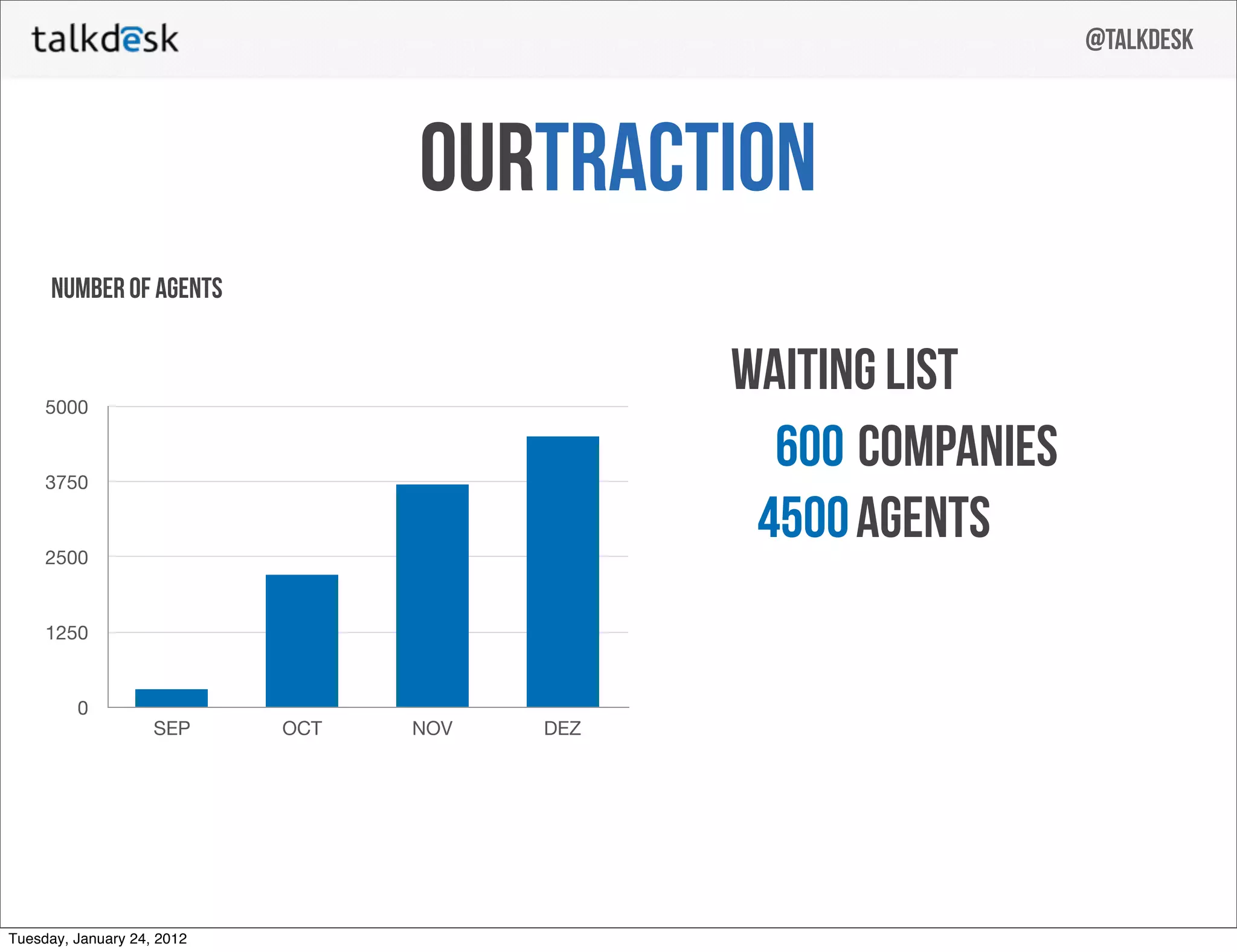
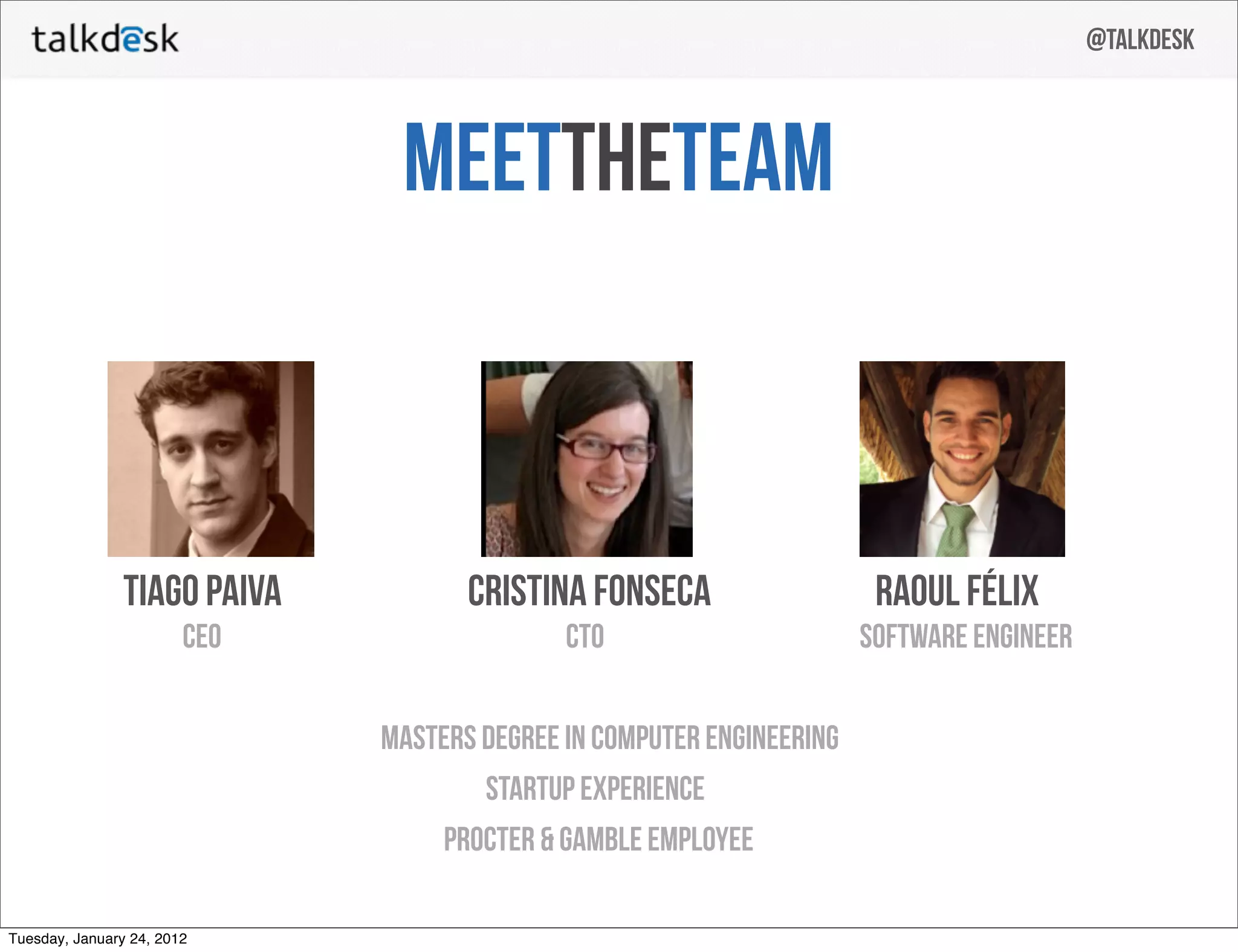
Slide 24 shows rapid agent growth across months (visual bar chart) alongside a waiting list metric (600 companies / 4,500 agents), communicating demand and early commercial traction. Slide 26 (team) follows with founder backgrounds (engineering degrees, startup experience), matching product-led traction to a capable technical team. Together these slides demonstrate that demand exists and there are operators who can deliver.

For investors, traction plus a credible team reduces execution risk. Founders should prioritize a short slide showing real customer interest and growth metrics and pair that with a succinct team slide that highlights domain expertise and prior outcomes.

Key Takeaway: Combine concrete early traction metrics (sales, waiting lists, growth by month) with a compact team slide that signals the ability to execute.

Conclusion: Key Lessons

Talkdesk’s seed deck succeeds through clarity, focus, and evidence: a single compelling headline, a vivid depiction of customer pain, a simple technical diagram showing the unique layer they control, a real product screenshot demonstrating integration, a clear pricing example, and early traction paired with a capable team. The deck balances emotion (customer pain) and rational proof (architecture, product screenshot, unit economics), which together build a persuasive narrative for investors.

Actionable advice for founders: open with one crisp promise; humanize the problem quickly; use progressive visuals to explain the tech; demonstrate the product in-context with a real screenshot; make pricing and unit economics concrete with worked examples; and show early traction plus a focused team. Keep slides visually simple and ensure every slide answers an investor question — what is the problem, how do you solve it uniquely, how will you make money, and who will execute it.

Full Deck Analysis

11 sections

Overview

Company: Talkdesk
Round: Seed (deck from 2012; company later raised seed/angel rounds; user context: Seed $3.15M total)
Year: 2012
Outcome: Valued at $10B after Series D (2021)


Executive Summary

This 27‑slide seed deck tells a simple story: legacy call centers are complex and brittle, so build a cloud, browser‑based call center that plugs into CRM and public data. The deck is notable for its clear visual narrative of the problem (slides 3–12), a straightforward business model (slide 21), and early traction (waiting list and agent growth shown on slides 22–24) — all presented with clean, high‑contrast design and a short team slide.


Problem Statement

How the deck articulates the problem:

  • Slides 3–9 use a visual storyboard to show customers → phones → on‑prem servers → telephony providers and fragmented channels, emphasizing complexity and failure points.
  • Slides 10–12 use a large “facepalm” image + “I need…” balloon to convey customer frustration with current solutions and slow, fragmented workflows.
  • Key message: current call center setups are hard to deploy, hard to integrate with CRM/data, and cause poor agent/customer experience.

(Primary reference: slides 3–12.)


Solution

How the deck positions the solution:

  • “Create a call center in 5 minutes — all in the browser” (slide 1 & reiterated on slide 15).
  • In‑browser calling integrated with public & CRM data, support tickets, recordings/transcriptions (slides 16–20).
  • Core technical/value props: no heavy on‑prem PBX, simple web UI for agents, international phone numbers, scalable from 1 → 10K agents (slide 15).
  • Product demo / UI shown on slides 16–19 emphasizing “call in the browser,” CRM record view, and integrated workflow.

(Primary reference: slides 1, 15–20.)


Market Opportunity

  • The deck does not present explicit TAM/SAM/SOM numbers. No slide provides a quantified market size.
  • Implied market: call centers / customer support SaaS and telecom replacement for enterprises and SMBs (they state ability to scale to 10k agents, international numbers — slide 15).
  • Investor takeaway: market opportunity is large (telephony + contact center), but the deck omits explicit TAM figures.

(Primary note: missing explicit market size slides.)


Business Model

  • Revenue model: subscription + usage.
    • Flat fee per agent/month (example uses $49/agent/month; first agent free) — slide 21.
    • Pay‑per‑minute billing for telephony usage at $0.04/minute in example — slide 21.
  • Example unit economics presented: for 5 agents and 90K minutes, they calculate:
    • Agents: 4 × $49 = $196 (first agent free)
    • Minutes: 90,000 × $0.04 = $3,600
    • Total: 1 client ≈ $3,796 / month (slide 21).
  • No CAC, LTV, gross margin, ARPU breakout, or churn presented.

(Primary reference: slide 21.)


Traction & Metrics

  • Waiting list: 600 companies, 4,500 agents (slide 22 / 23).
  • Growth chart (slide 24) shows agent growth across four months (labels: Sep → Dec). Visual values approximate:
    • Sep: ~500 agents
    • Oct: ~2,400 agents
    • Nov: ~3,750 agents
    • Dec: ~4,400 agents
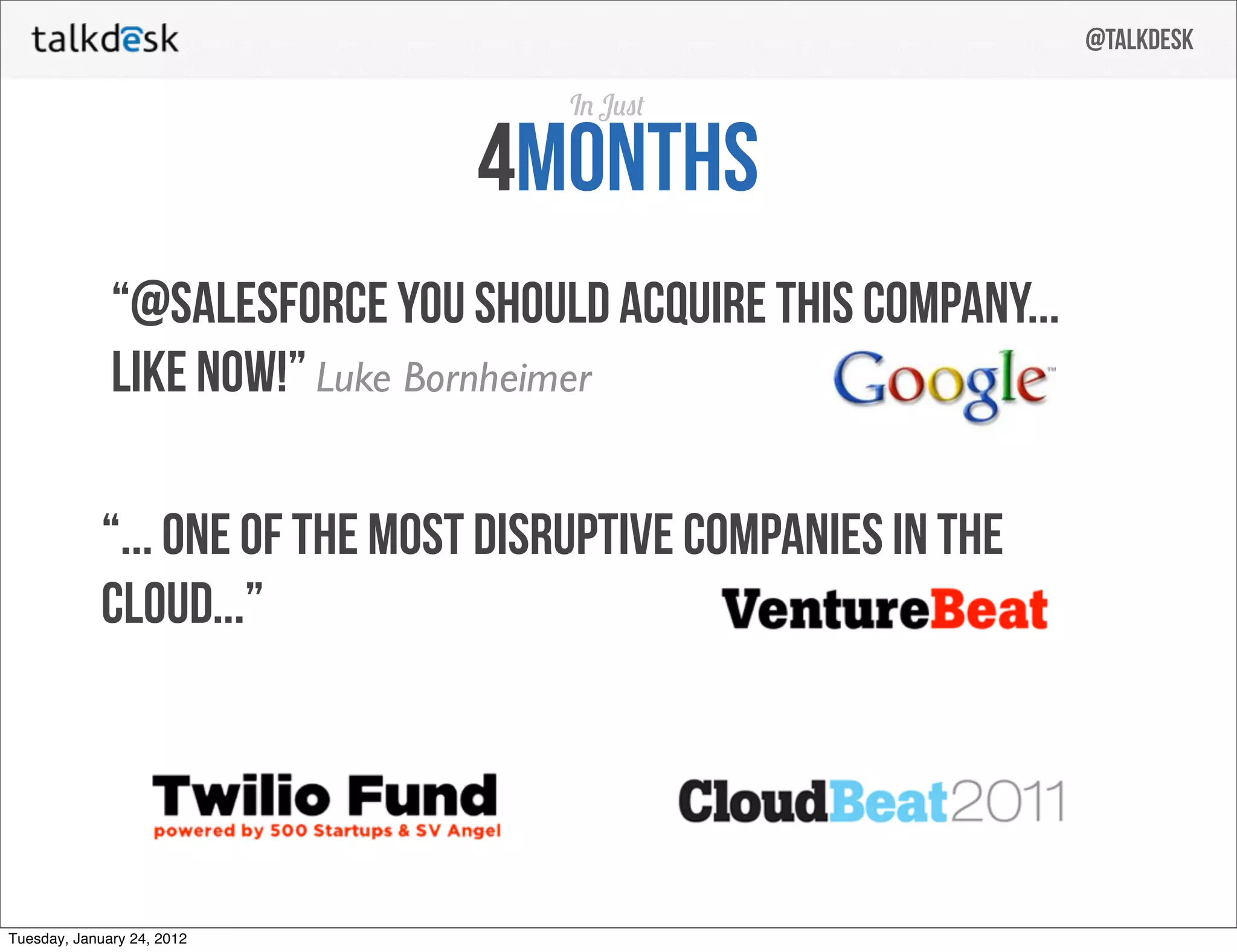
  • Press/validation: positive mentions and endorsements (slide 25) — a tweet urging Salesforce to acquire them, VentureBeat quote, Twilio Fund & CloudBeat 2011 logos.
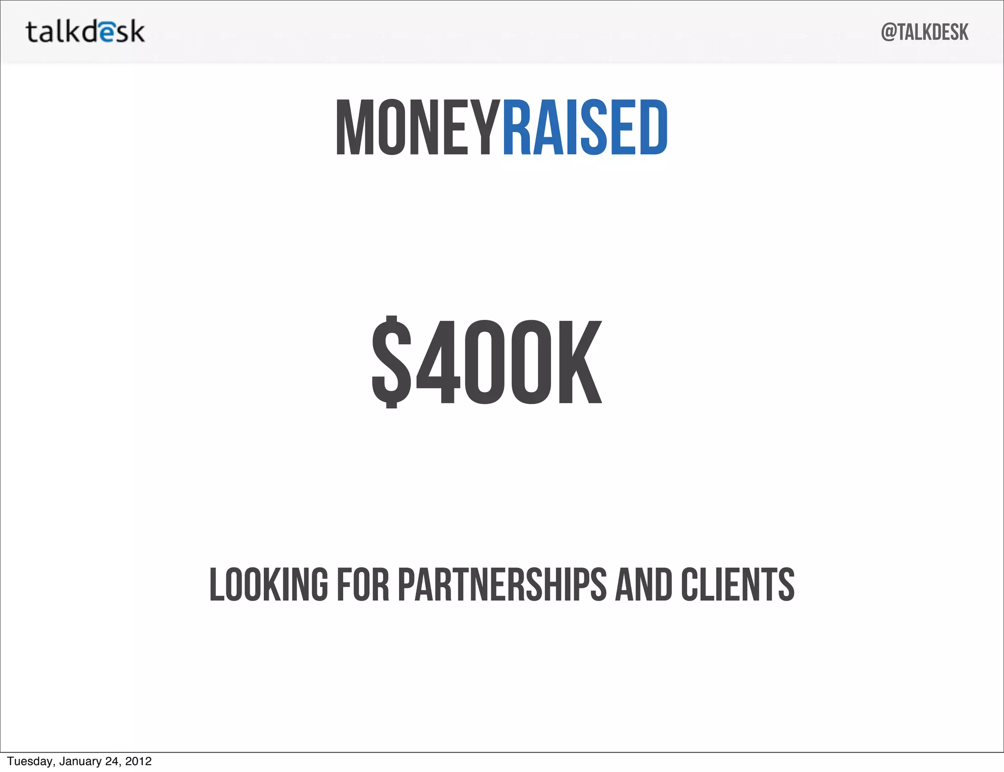
  • Fundraising to date (deck): slide 26 shows “$400K” raised (note: user context indicates broader seed $3.15M).
  • No explicit MRR/ARR, churn, conversion rates, or revenue numbers shown.

(Primary references: slides 22–26.)


Competitive Positioning

  • Differentiation emphasized:
    • Pure browser‑based calling (no desktop app) — slides 15–19.
    • Tight CRM integration and enrichment from public data (slides 16–19).
    • Recording & transcription and support ticket integration (slides 18–20).
    • Simple set‑up (claim: create call center in 5 minutes) and scalability (1 → 10k agents) — slide 15.
  • The deck lacks an explicit competitor matrix or direct comparison to incumbents (Avaya, Genesys, hosted PBX providers, or newer SaaS entrants).

(Primary references: slides 15–20; note missing competitor slide.)


Team

  • Slide 26 “Meet the Team” lists three founders:
    • Tiago Paiva — CEO
    • Cristina Fonseca — CTO
    • Raoul Félix — Software Engineer
  • Team cues: Masters degrees in Computer Engineering, startup experience, and prior employment (Procter & Gamble noted generically). Pictures and titles provided; bios are short/more implied than detailed.
    (Primary reference: slide 26.)

Go-to-Market Strategy

  • Shown / implied elements:
    • Organic inbound / waiting list (600 companies, 4,500 agents) — slides 22–24.
    • Partnerships / channel plays suggested by “looking for partnerships and clients” (slide 26) and Twilio Fund mention (slide 25).
    • Focus on ease of deployment and CRM integrations to land in SaaS/SMB customers via product hooks.
  • Missing: explicit CAC, sales motion (self‑serve vs. SDR/enterprise sales), channel partner specifics, or marketing spend plan.

(Primary references: slides 22–25, slide 26.)


The Ask

  • The deck itself does not present a clear dollar ask or full use‑of‑funds slide.
  • What the deck shows:
    • “Money raised” slide indicates $400K raised to date (slide 26).
    • Slide 26 footer text: “Looking for partnerships and clients.” Contact info and email on final slide (slide 27).
  • External context (user): overall seed close $3.15M, but that amount is not called out in the pitch deck slides.

(Primary references: slides 26–27; note absence of explicit fundraising ask.)


Investor Deep Dive

Executive summary, strengths & red flags

Executive Summary

This 27‑slide seed deck tells a simple story: legacy call centers are complex and brittle, so build a cloud, browser‑based call center that plugs into CRM and public data. The deck is notable for its clear visual narrative of the problem (slides 3–12), a straightforward business model (slide 21), and early traction (waiting list and agent growth shown on slides 22–24) — all presented with clean, high‑contrast design and a short team slide.

Key Strengths

3 identified

1

Clear visual storytelling of the problem and product flow

2

Straightforward, demonstrable product differentiation

3

Early traction and social validation

Red Flags & Weaknesses

3 identified

1

No quantified market size (TAM/SAM/SOM)

2

Limited unit economics and financial detail

3

Weak ask and use‑of‑funds clarity

More Pitch Decks To Study

Compare structure, fundraising context, and investor-facing story across similar startup decks.