Compare your deck to Slidebean

Compare Your Deck

Slidebean Pitch Deck (2014)

SaaS
Stage: Seed
Raised: $100K
Year: 2014
Slides: 28
Outcome: Profitable SaaS; helped clients raise $500M+

Pitch Deck

1 / 28
Slidebean pitch deck - The Opening: Brand + Promise
Click to expand

Deck Analysis

This deck from Slidebean (Seed, 2014) is a polished SaaS pitch that demonstrates the company’s core promise: automatically generated, design-forward presentations. It stands out because the product is showcased through the product — the slides themselves are the example. The narrative progresses from pain (bad presentations and clunky tools) to a clear visual solution, team credibility, traction and pricing, using strong visual hierarchy, bold imagery, and minimal text to sell both the product and the idea of design-as-a-service.

The Opening: Brand + Promise

The Opening: Brand + Promise

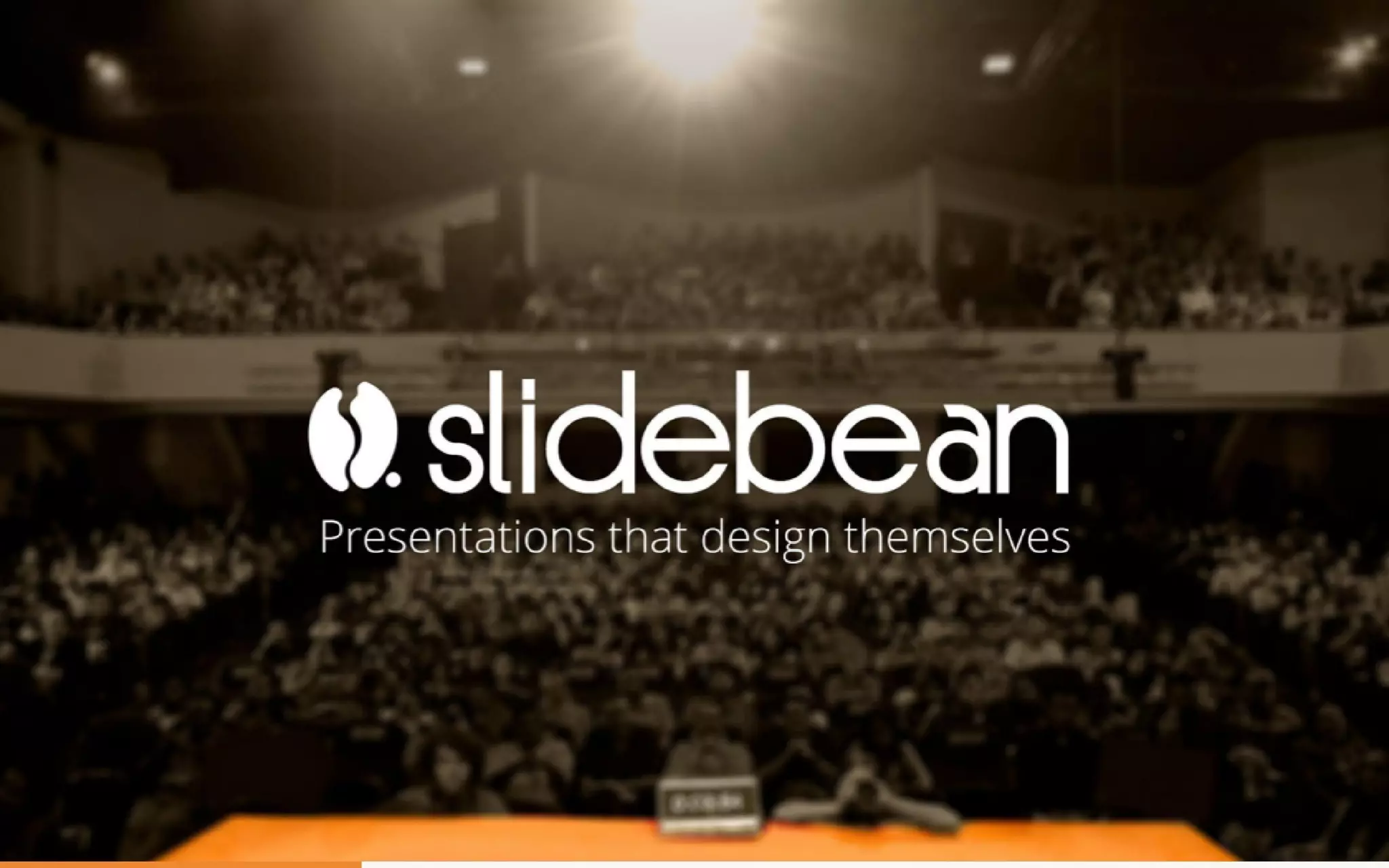
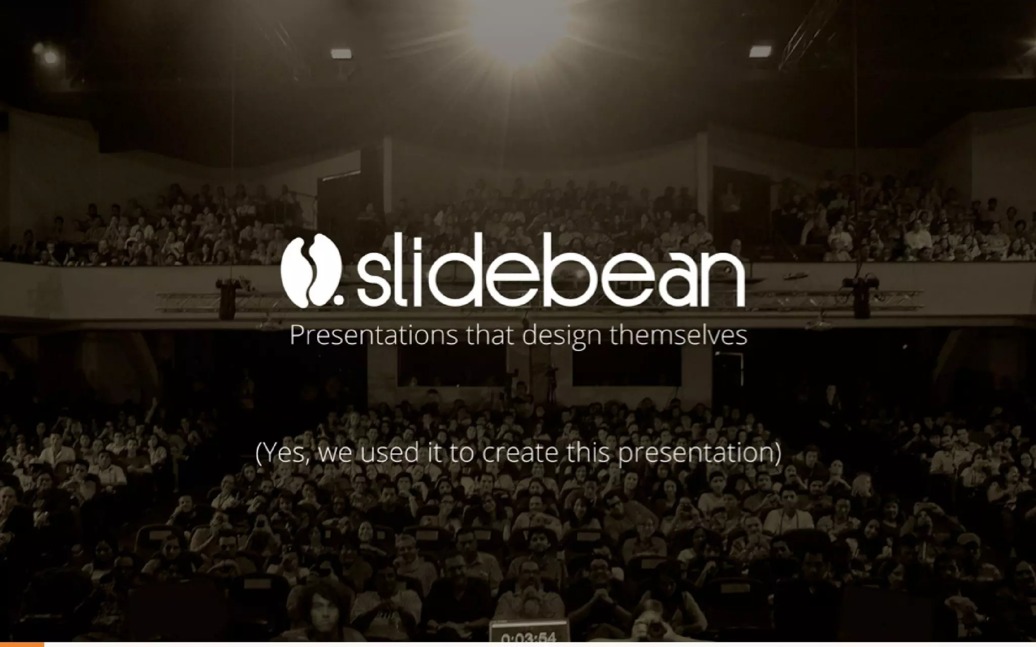
Slidebean opens with a large, cinematic cover (logo and tagline) that immediately conveys professionalism and purpose. The image of an audience behind the bold, clean logo frames the company as presentation experts — they’re not just selling software, they’re selling better talks and pitches. The tagline “Presentations that design themselves” is specific, benefit-oriented, and memorable, which primes investors to evaluate the deck through that lens.

What founders can learn: start with a clear one-line value proposition and back it with a visual that matches your market. The opening should both brand and promise; Slidebean’s cover does both simultaneously and creates a contract with the audience that the rest of the deck will demonstrate that promise in practice.
Key Takeaway: Lead with a single, benefit-focused tagline backed by a strong visual that positions your company as the solution to a clear problem.
The Problem: Bad Presentations and Poor Tools

The Problem: Bad Presentations and Poor Tools

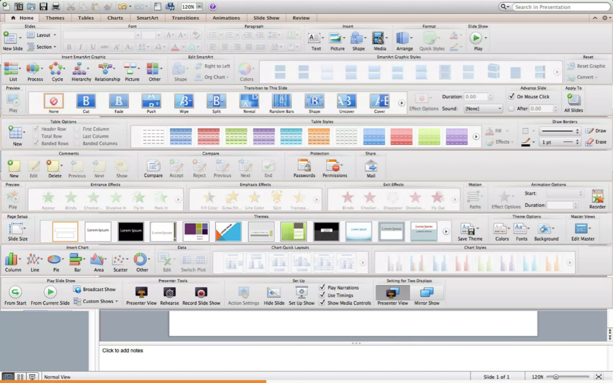
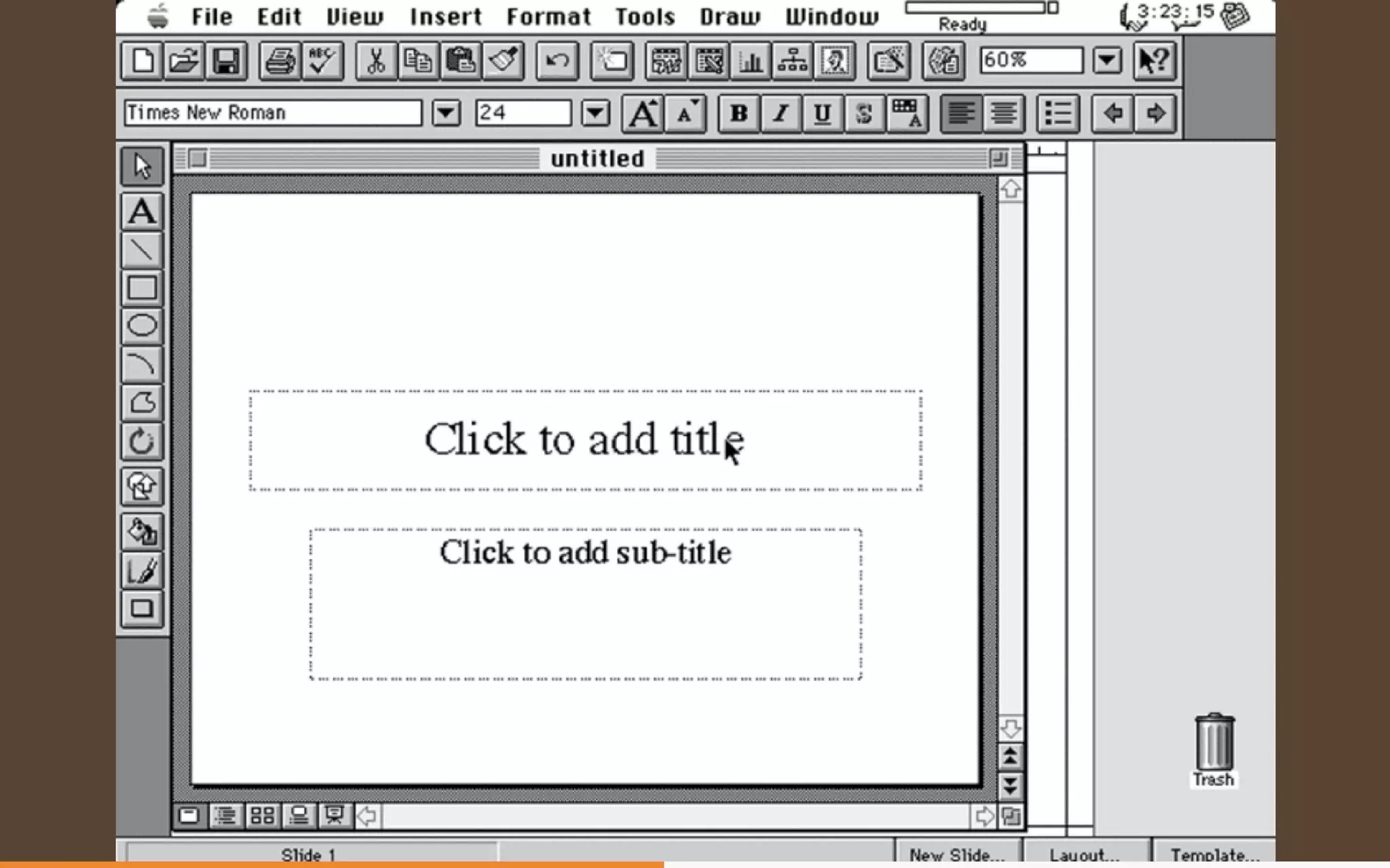
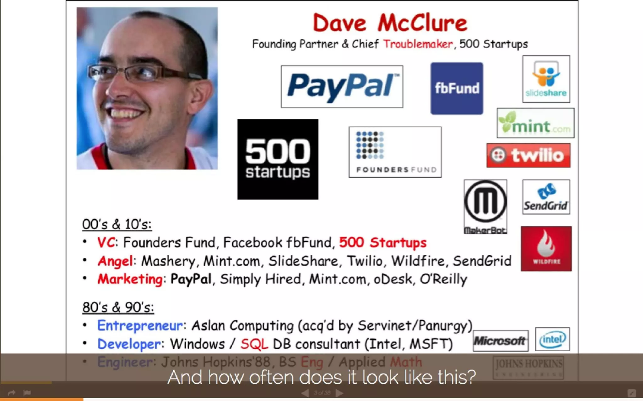
The deck quickly establishes the problem using concrete examples of the status quo: overloaded, messy slides and bloated editing interfaces. Slides that show a crammed speaker bio and a cluttered PowerPoint UI create empathy — everyone recognizes these pains. The juxtaposition of ‘how often does it look like this?’ with the messy examples makes the problem tangible and relatable to investors and users alike.

This approach works because it uses visual proof rather than text-heavy complaint. Founders should show — not tell — the pain. Using real, recognizable screenshots or visuals that your audience will instantly understand accelerates comprehension and emotional connection.

Key Takeaway: Visually demonstrate the problem with familiar, relatable examples instead of long textual explanations.
Product Demonstration: Show the Outcome, Not the Process

Product Demonstration: Show the Outcome, Not the Process

Rather than explaining UI screens or listing features, Slidebean shows finished, attractive slides as the product output (examples of redesigned slides and streamlined bios). The deck flips the narrative from ‘how to use the tool’ to ‘what you get’ — high-quality slides that save time and look professional. Large photography, clean typography, and negative space reinforce the value proposition: design quality and simplicity.

Founders should emulate this by prioritizing outcome-led demos in their decks. If your product produces visible improvements, put before/after visuals front and center and keep text to a minimum. Investors need to understand the user benefit instantly — design outputs do that faster than feature lists.

Key Takeaway: Demonstrate the product’s end-result with clear before/after visuals so investors see user value immediately.
Traction & Metrics: Visualize Growth Metrics Cleanly

Traction & Metrics: Visualize Growth Metrics Cleanly

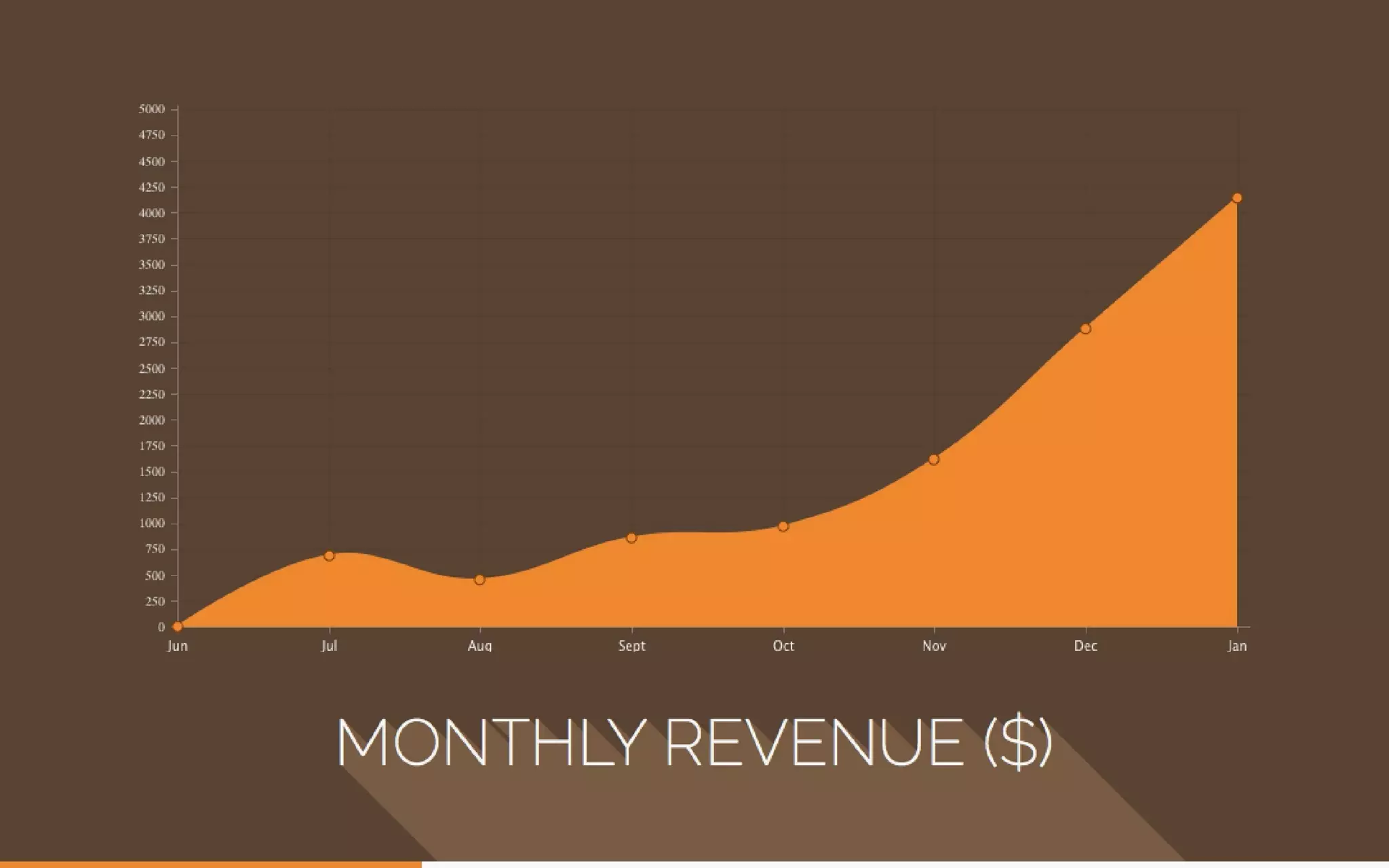
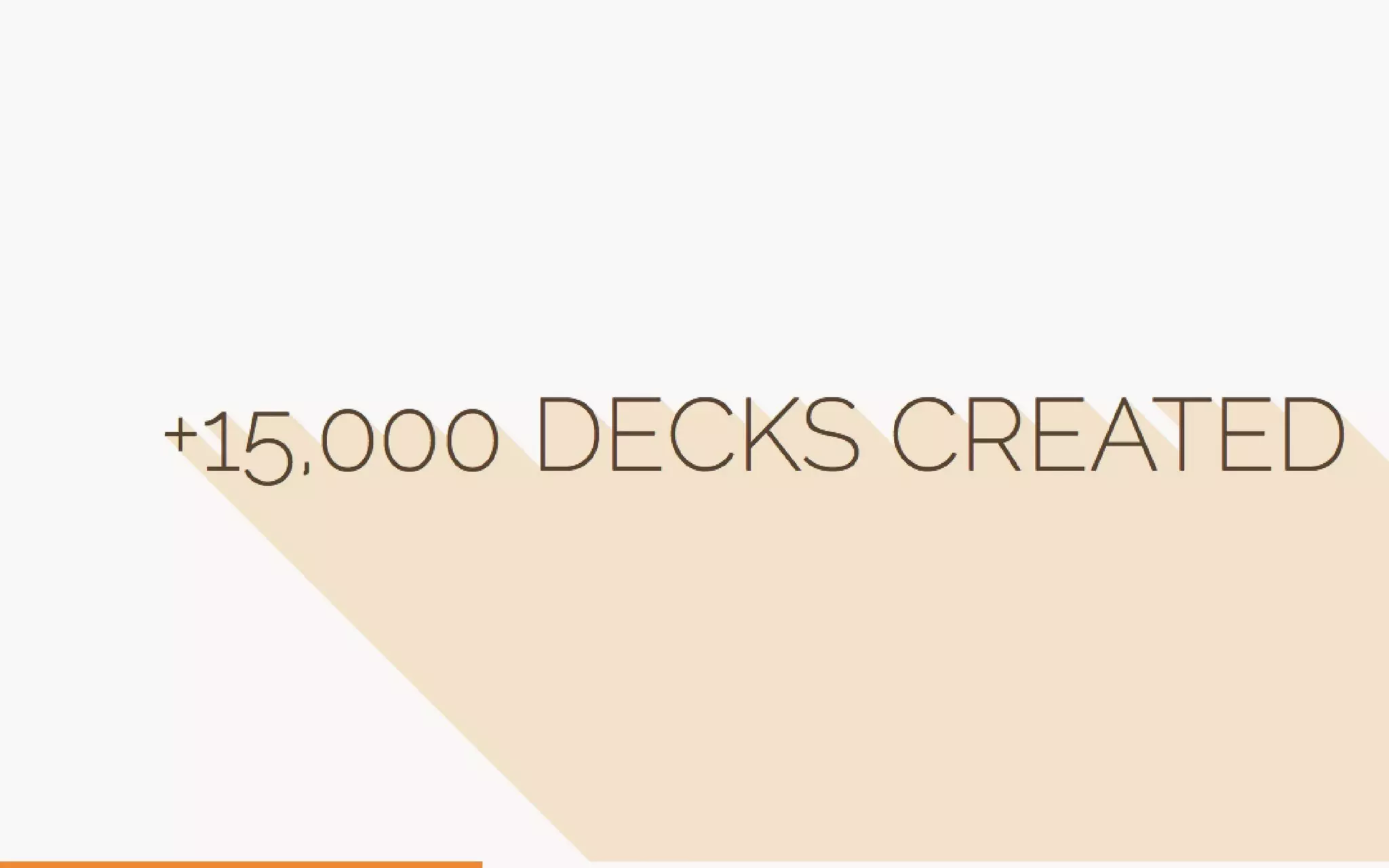
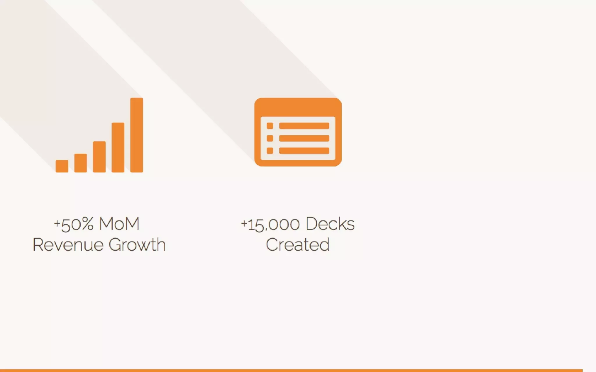
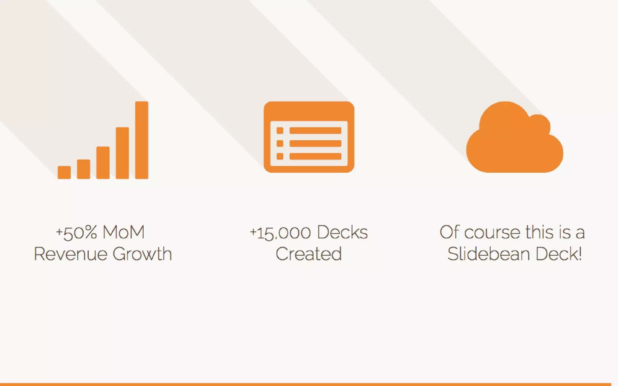
Slidebean uses a clear, upbeat revenue chart and concise numeric milestones (+15,000 decks, growth stats) to convey traction. The chart is visually integrated with the deck’s design language (colors, shadows) which keeps messaging consistent and reinforces brand identity while communicating performance. Short, bold claims (e.g., decks created, presentations delivered per day) pair with the graph to create a narrative of momentum.

For founders, the lesson is to present traction visually and succinctly. Use one clean chart and a couple of headline metrics rather than a table of numbers. That lets investors immediately grasp growth rate and scale without getting bogged down in raw spreadsheets during the pitch.

Key Takeaway: Use one strong visual (chart) plus two or three headline metrics to communicate traction quickly and convincingly.
Business Model & Pricing: Simple, Tiered Offers

Business Model & Pricing: Simple, Tiered Offers

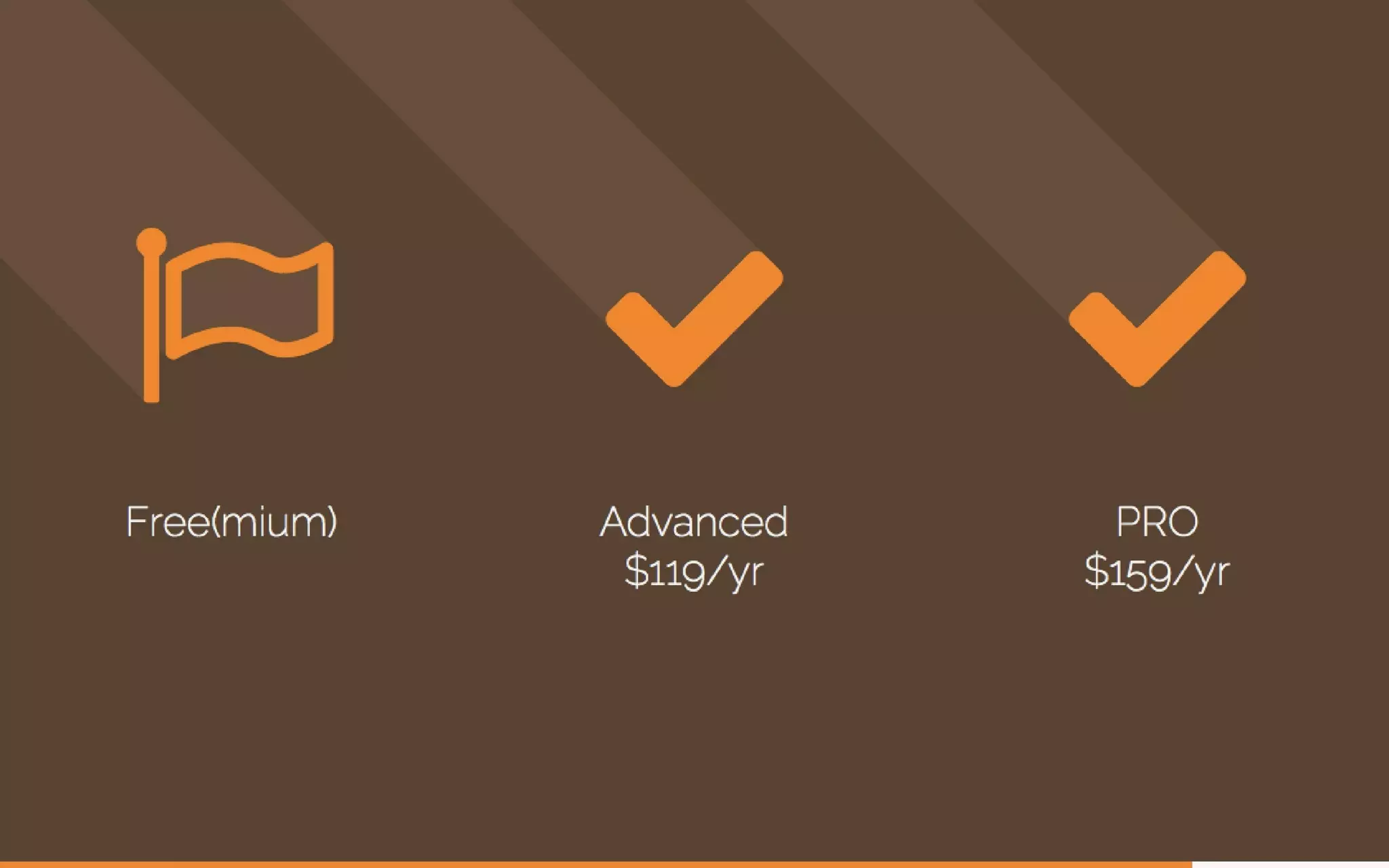
The deck explains monetization with simple iconography and a straightforward freemium + paid tiers presentation. Pricing slides show progression (Free, Advanced $119/yr, Pro $159/yr) and use icons and symmetry to communicate simplicity and clarity. By making pricing legible and unobtrusive, Slidebean avoids distracting from product-market fit and traction while still signaling a monetization path to investors.

Founders should make pricing transparent but not dominant. Present a clear pricing tier structure, tie it to value (what each tier enables), and show how it maps to user segments. Avoid cluttered tables; icons and short captions work better in a pitch context.

Key Takeaway: Present pricing as a simple tiered structure with clear values for each tier — clarity breeds investor confidence.
Team: Credibility Through People and Roles

Team: Credibility Through People and Roles

Slidebean dedicates slides to the founding team with portraits, titles and concise credentials (TEDx speaker, Mozilla awards, business school). The design keeps focus on faces and short credential lines so the audience can quickly connect who will execute the plan. Team slides balance modesty and credibility — they highlight relevant wins without long bios.

Best practice for founders: show the people and their relevant track record — not every job. Use headshots, role titles, and one-line accomplishments to establish execution capability and domain expertise. Investors want to know the right mix of product, design, and go-to-market experience exists on the team.

Key Takeaway: Show founder faces, roles, and one-line credibility proofs to quickly establish the team’s ability to execute.
Close / Call to Action: Reiterate Promise and Brand

Close / Call to Action: Reiterate Promise and Brand

The deck closes by circling back to the opening promise — a quote-style, visual-heavy end slide that reiterates Slidebean’s tagline and website. Ending on brand reinforces recall and gives a simple CTA (visit site or try product). The closing is consistent with the deck’s aesthetic, which leaves a cohesive impression rather than a fragmented one.

Founders should use the final slide to remind investors of the core value and how to act next: contact, demo, or trial. A memorable visual anchor plus a single CTA outperforms multi-option clutter at the end of a pitch.

Key Takeaway: End by restating your single-sentence value proposition and give one clear next step for investors.

Conclusion: Key Lessons

Slidebean’s deck is a model for product-led storytelling: it demonstrates the product with the medium itself, uses strong visual hierarchy to communicate quickly, and keeps copy to a minimum while emphasizing outcomes, traction and team. Strengths include a compelling opening promise, visually demonstrated problem/solution, clean presentation of metrics, transparent pricing, and focused team credibility. Actionable advice: 1) Lead with a single value proposition and support it visually; 2) Use before/after or product-output visuals instead of feature lists; 3) Show one clean traction chart and 2–3 headline metrics; 4) Keep pricing simple and tied to value; 5) Present the team with photos and concise credentials. Follow these rules to create a deck that communicates quickly, looks professional, and helps investors and customers alike understand the value at a glance.

Full Deck Analysis

11 sections

Overview

Company: Slidebean
Round: Seed ($100K)
Year: 2014
Outcome: Profitable SaaS; helped clients raise $500M+

Executive Summary

Slidebean’s 2014 seed deck is a concise, design-forward pitch that sells a simple product promise — presentations that “design themselves” — via strong visual storytelling, a handful of traction metrics and a clear freemium pricing model. The deck’s strength is in demonstrating a polished product outcome (examples + templates) and early growth signals; it is light on detailed market sizing, unit economics and use-of-funds.


Problem Statement

How the deck articulates the problem:

  • People waste time creating unattractive, cluttered slides and templates (slide 2 poses the opening question; slides 3 and 4 show an overloaded, “bad” slide as an example).
  • Existing tools either produce poor design by default (PowerPoint screenshots, slide 11–12), or rely on complex interactions/flash (reference to Prezi and “No Flash, No Plugins” on slide 16).
  • The implicit pain: non-designers can’t easily produce high-quality corporate / investor-ready decks quickly.

Referenced slides: 2, 3, 4, 11, 12, 13, 16.


Solution

How the deck positions the solution:

  • Product promise: “Presentations that design themselves” — automated layout + polished templates (slide 1, slide 7, slide 15).
  • Visual proof: multiple example slides/pages that demonstrate the aesthetic quality customers get (slides 5–6, 14–15).
  • No-technical-hassles claim: web-based, no Flash/plugins required (slide 16).
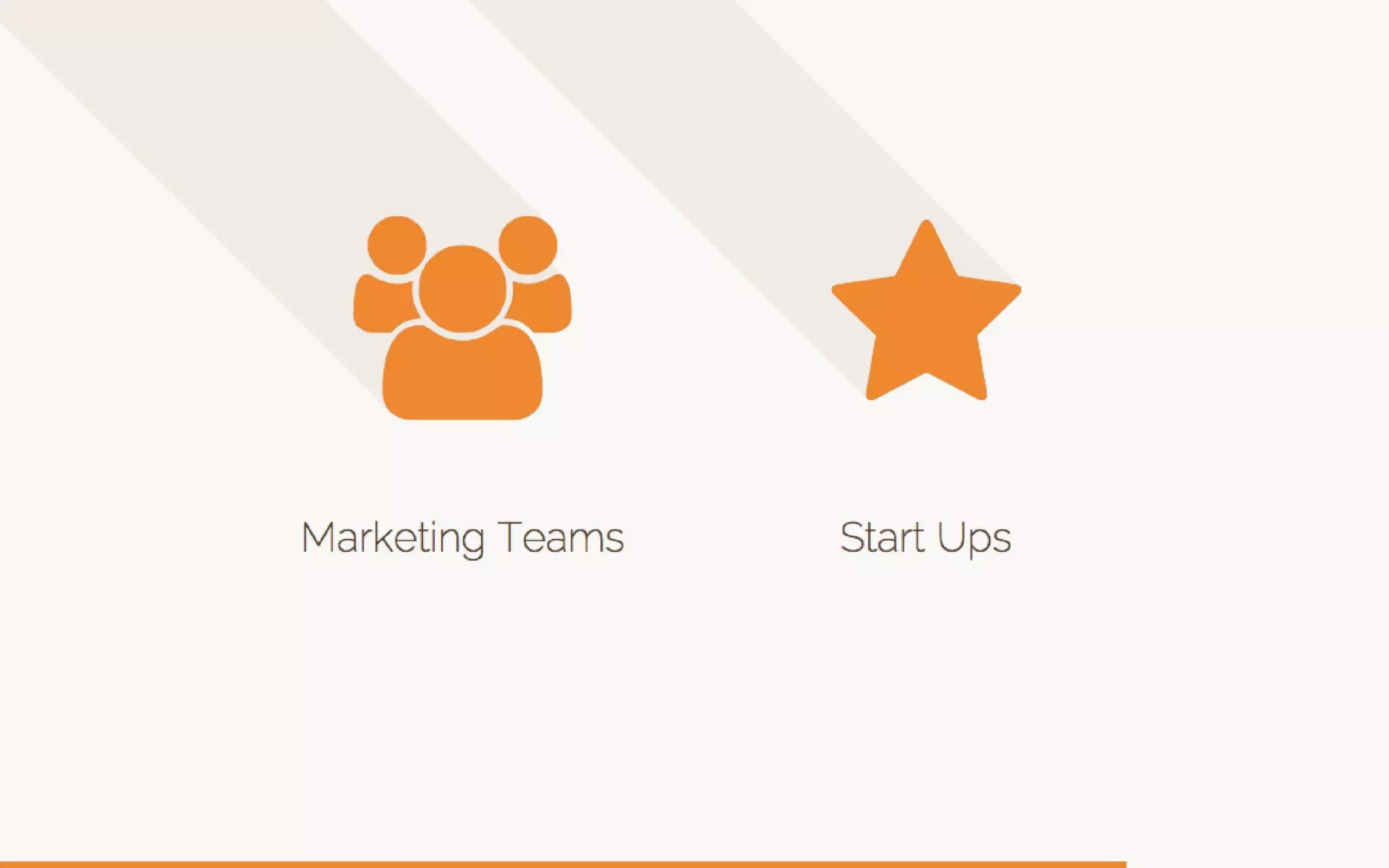
  • Targeted product positioning: built for Marketing Teams and Startups (slides 17–19).

Key messages: automation of design, web-delivered, simple UX for non-designers.

Referenced slides: 1, 5–7, 14–16, 17–19.


Market Opportunity

TAM/SAM/SOM analysis — what the deck shows (and what it omits):

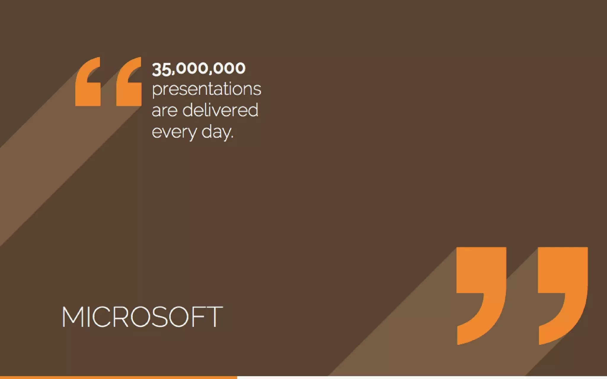
  • Market context: cites a Microsoft stat that “35,000,000 presentations are delivered every day” (slide 10) to imply a very large market of presentation authors/consumers.
  • No explicit TAM/SAM/SOM dollar estimates are provided in the deck.
  • Implied addressable audiences: Marketing teams and startups (slides 17–19), and broadly anyone who creates decks (Microsoft stat).

Takeaway: the deck gestures at a very large user base but does not quantify revenue-based TAM/SAM/SOM.

Referenced slides: 10, 17–19.


Business Model

Revenue model and unit economics:

  • Freemium model (slide 20): basic free tier for user acquisition.
  • Paid subscriptions: Advanced tier at $119/yr and Pro at $159/yr (slides 21–22).
  • Team / enterprise packaging is implied by targeting “Marketing Teams” but not explicitly priced in the deck.
  • No explicit CAC, LTV, gross margin, ARPU or churn numbers are shown.

Referenced slides: 20–22.


Traction & Metrics

Growth metrics and proof points (specific numbers shown):

  • +50% Month-over-Month revenue growth highlighted (slide 27).
  • +15,000 decks created (slide 8 and reiterated on slide 28).
  • Monthly revenue chart (slide 7) visually shows growth from near zero in June to ~4,000 (y-axis ticks) by January — the chart demonstrates month-by-month revenue acceleration (visual only; no raw currency totals labeled as ARR).
  • Quote/market stat from Microsoft: 35,000,000 presentations delivered daily (slide 10) — used as market signal rather than company metric.
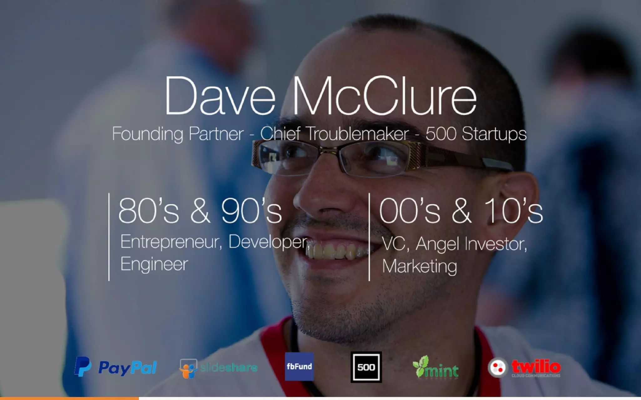
  • Endorsement / credibility: slide 6 highlights Dave McClure (500 Startups / PayPal origin story imagery) and logos of companies associated with team/advisors, serving as validation (slide 6).

Referenced slides: 7–10, 27–28, 6.


Competitive Positioning

How they differentiate:

  • Differentiator: automated, design-first approach (product promise: “design themselves”) with high visual quality vs. manual PowerPoint or flashy Prezi experiences (slides 5, 11–16).
  • Technical differentiator: web native, no Flash or plugins required (slide 16).
  • Positioning vs. competitors: the deck calls out traditional slide tools (PowerPoint), zooming canvases (Prezi) and shows the modern flat-design language as a visual differentiator (slides 11–15).

Referenced slides: 11–16.


Team

Team credentials presented:

  • Caya — CEO (TEDx Speaker; Intel @ 17) (slide 23).
  • Jose E. Bolaños — CTO (2x Mozilla Expand the Web winner) (slide 24).
  • Vinicio Chanto — VP Design (INCAE business school) (slide 25).
  • Early-stage endorsement / advisor presence (slide 6 shows Dave McClure / 500 Startups and several recognizable startup logos).
  • Team presentation is short but emphasizes design + engineering credentials.

Referenced slides: 6, 23–25.


Go-to-Market Strategy

Distribution approach shown:

  • Freemium conversion model for user acquisition (slide 20).
  • Target segments explicitly stated: Marketing Teams and Startups (slides 17–19).
  • Implied viral/organic acquisition via product use: easy-to-share web decks (slide 28 cloud icon + “Of course this is a Slidebean Deck!”).
  • No explicit paid acquisition channels, partnership strategy, sales motion, or enterprise outreach plan presented.

Referenced slides: 17–20, 28.


The Ask

What they were raising and use of funds:

  • Raise: Seed — $100K (document context). The deck itself does not explicitly detail use of funds or a line-item allocation.
  • Use of funds: not specified in the slides — missing.

Referenced slides: (no explicit slide showing use of funds).


Investor Deep Dive

Executive summary, strengths & red flags

Executive Summary

Slidebean’s 2014 seed deck is a concise, design-forward pitch that sells a simple product promise — presentations that “design themselves” — via strong visual storytelling, a handful of traction metrics and a clear freemium pricing model. The deck’s strength is in demonstrating a polished product outcome (examples + templates) and early growth signals; it is light on detailed market sizing, unit economics and use-of-funds.

Key Strengths

3 identified

1

Strong visual storytelling and product demonstration — the deck practices what it preaches: minimal copy, polished examples, consistent flat design and long shadows (slides 1, 5–7, 14–16). This greatly helps a design/product startup sell its value.

2

Clear, simple monetization and GTM focus — freemium plus two paid annual tiers ($119/yr, $159/yr) with defined target audiences (slides 20–22, 17–19). Easy for investors to map to conversion math (even if the math isn’t supplied).

3

Early, credible traction signals — +50% MoM revenue growth, +15k decks created, and a month-by-month revenue chart that visibly trends up (slides 7, 27–28) give tangible signs of product-market fit and growth momentum.

Red Flags & Weaknesses

3 identified

1

No detailed market sizing or revenue TAM/SAM/SOM — the deck uses a Microsoft presentation stat but provides no dollar TAM or serviceable market breakdown that investors typically require (slide 10). This makes it harder to model upside.

2

Sparse unit economics and financials — the deck omits CAC, LTV, churn, gross margins, runway and explicit revenue figures (beyond a visual chart and % growth). Investors cannot validate unit-economics-driven scalability.

3

Use of funds and exit/raise plan not explained — the deck states Seed $100K but lacks a slide on how funds will be used, milestones to reach or follow-on fundraising strategy (no slide contains a clear “ask & allocation” breakdown).

More Pitch Decks To Study

Compare structure, fundraising context, and investor-facing story across similar startup decks.