Compare your deck to Oscar Health

Compare Your Deck

Oscar Health Pitch Deck (2014)

Health
Stage: Series A
Raised: $30M
Year: 2014
Slides: 33
Outcome: IPO at $7.9B valuation (2021)

Pitch Deck

1 / 33
Oscar Health pitch deck - Brand & Positioning: Simple, Friendly, Smart
Click to expand

Deck Analysis

This deck from Oscar Health (Series A, 2014) lays out a simple, design-led argument for rethinking health insurance through better branding, focused product design, and data-driven UX. It combines a clear problem statement with visual storytelling and product mockups that show how search, navigation, and integrated telemedicine can reduce friction for members. Notable because Oscar pairs consumer-grade design with healthcare complexity, the deck demonstrates how focus on a few high-value use cases (finding care, telemedicine, billing transparency) can create a differentiated insurance product.

Brand & Positioning: Simple, Friendly, Smart

Brand & Positioning: Simple, Friendly, Smart

Slide 1 introduces Oscar with a minimal, well-crafted identity and three words: simple, friendly, smart. The economy of the slide — lots of negative space, a bold logo and a short trio of attributes — sets expectations for the rest of the presentation. That visual promise (simplicity and warmth) is important in a category historically defined by complexity and coldness.

For founders: this is a reminder that the first slide should not be a pitch summary or numbers table, but a statement of identity and intent. By defining tone early, Oscar primes the audience to evaluate every subsequent slide against those attributes (is this simple? friendly? smart?). The coherence between brand words and product examples later in the deck strengthens credibility.
Key Takeaway: Open with a crisp brand promise that sets the experiential bar for the entire deck — use design and a short, memorable tagline rather than dense text.
The Problem: Health Insurance Is Broken

The Problem: Health Insurance Is Broken

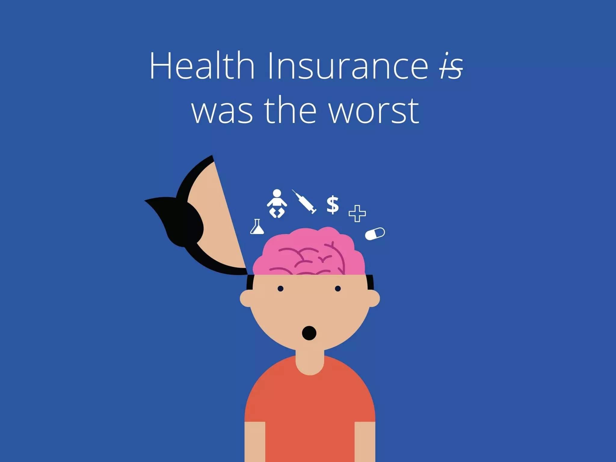
Slide 2 (and its illustration) clearly communicates the emotional problem: health insurance ‘was the worst’. The crossed-out verb and the exposed cartoon brain with medical icons visually convey confusion, fear, and cognitive overload. The messaging is simple, emotional, and immediately relatable to anyone who has struggled with coverage decisions or billing surprise.

This slide is effective because it avoids industry jargon and instead focuses on the user feeling. Founders should note the power of an empathetic problem statement: it creates alignment with the audience and makes the solution feel necessary rather than aspirational. Use imagery and a short sentence to make the pain immediate and visceral.

Key Takeaway: Lead with the user's emotional pain in plain language and supporting visuals to make the problem tangible and urgent.
Market Context: Rapid Change and Opportunity

Market Context: Rapid Change and Opportunity

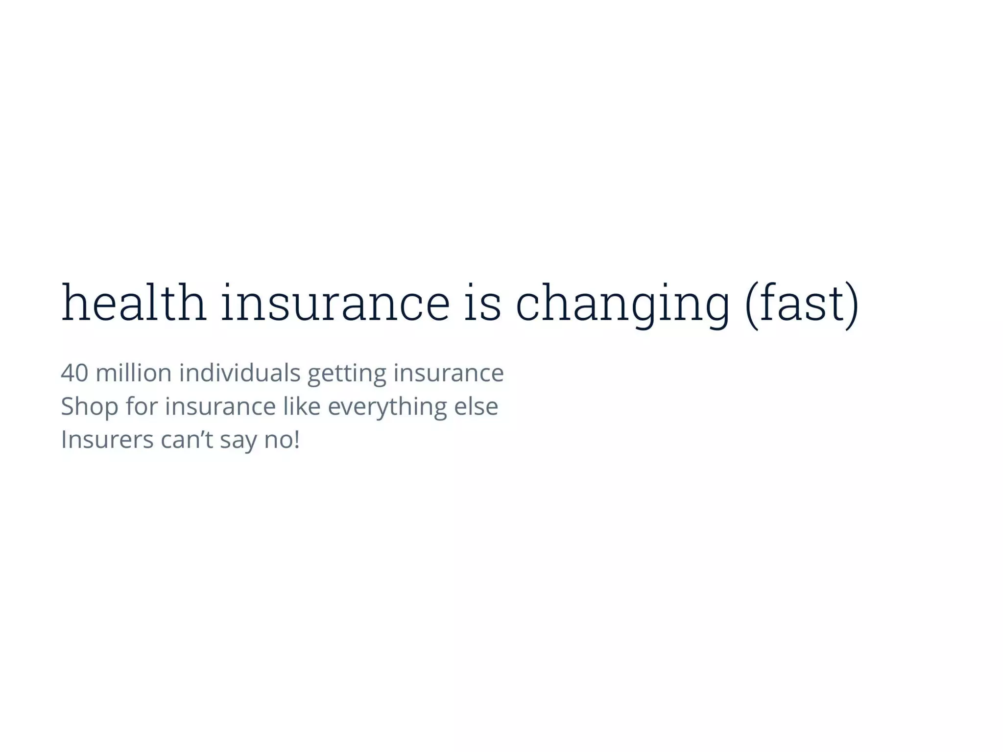
Slide 3 frames the market opportunity: millions getting insurance, shopping behavior shifting, and regulatory changes that open room for new entrants. The slide keeps copy minimal but communicates scale (40 million) and forces changing dynamics (consumers shop like consumers). It positions Oscar not as a marginal product tweak but as an entrant primed by macro tailwinds.

Founders should emulate how Oscar couples emotional problem framing with high-level market forces to show why now is the right time. Keep the market slide concise but include one or two data points that justify urgency and the addressable opportunity.
Key Takeaway: Pair a human problem with a succinct market thesis — one or two numbers that explain why the timing is right.
Homepage & Messaging: Positioning the Product

Homepage & Messaging: Positioning the Product

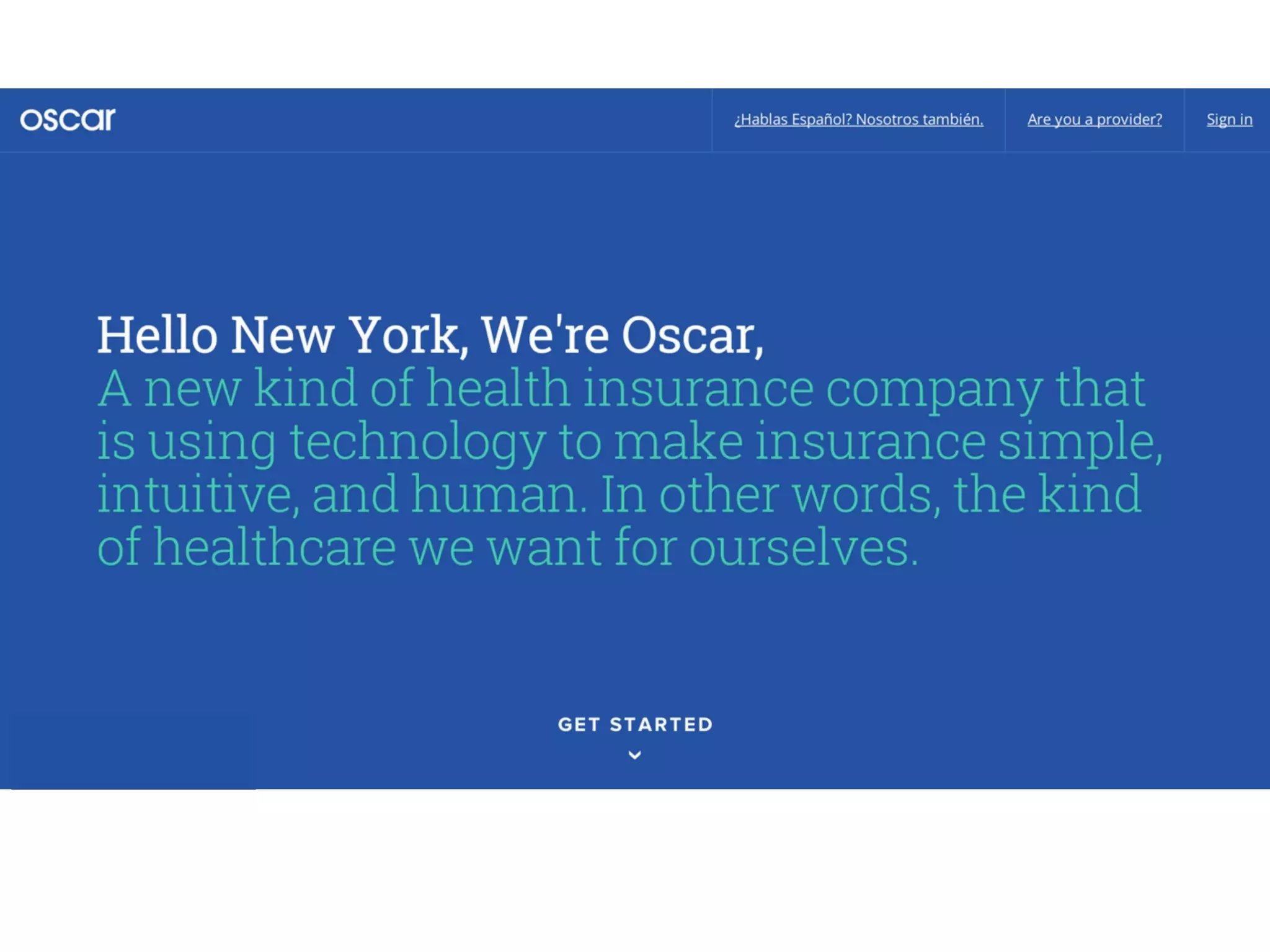
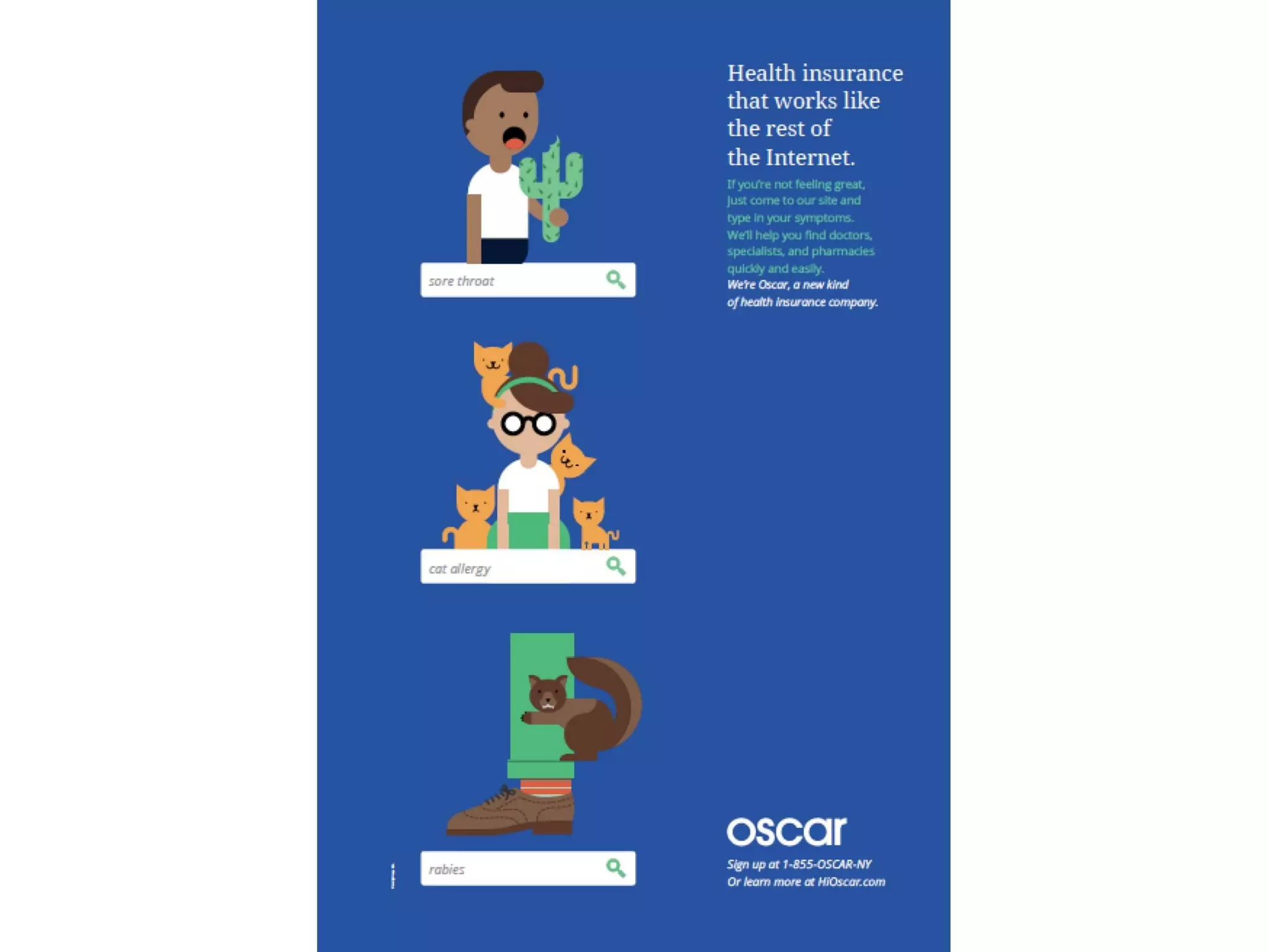
Slide 7 shows a homepage-style hero that introduces Oscar as ‘a new kind of health insurance company’ using technology to make insurance simple and human. The visual design (large type, friendly colors, strong CTA) mirrors the brand promise from slide one and shows how messaging translates into product-facing language. It presents a consumer-ready face for a traditionally B2B/administrative industry.

The lesson for founders is to demonstrate how brand promises map directly into customer touchpoints (website, onboarding). This slide acts as both a commercial landing page mock and a promise of user experience; it’s an effective proof point that the company is focused on consumer adoption and not just backend insurance mechanics.

Key Takeaway: Show how your brand translates to the customer-facing product — include a homepage or onboarding mock to prove you can execute the promise.
Search & Data-First UX: Making Complexity Simple

Search & Data-First UX: Making Complexity Simple

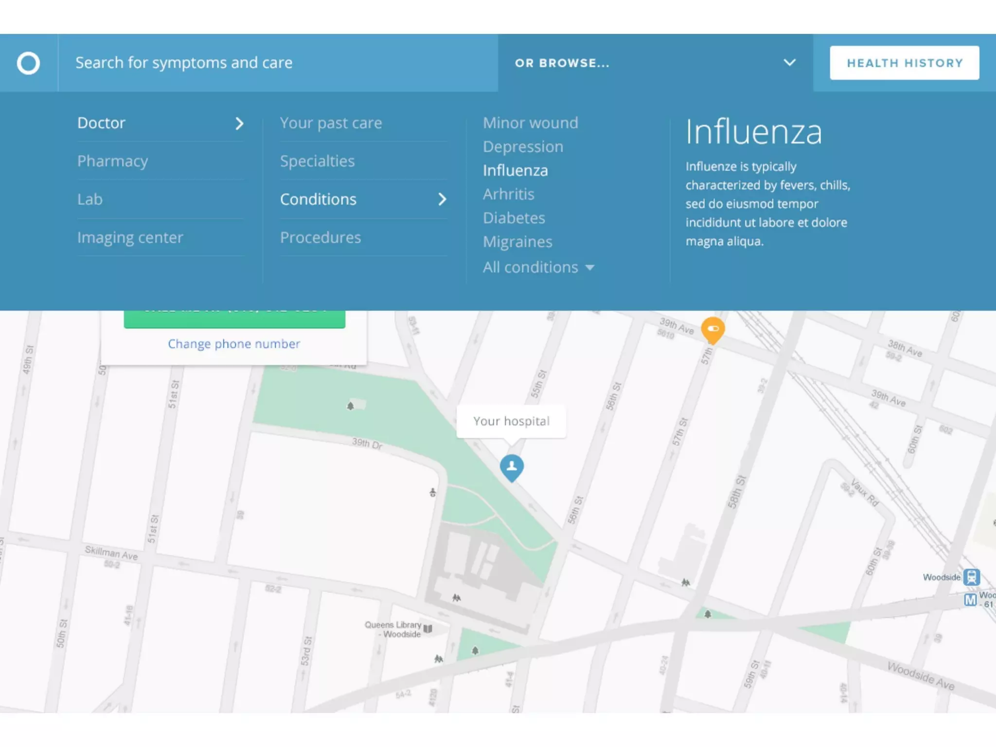
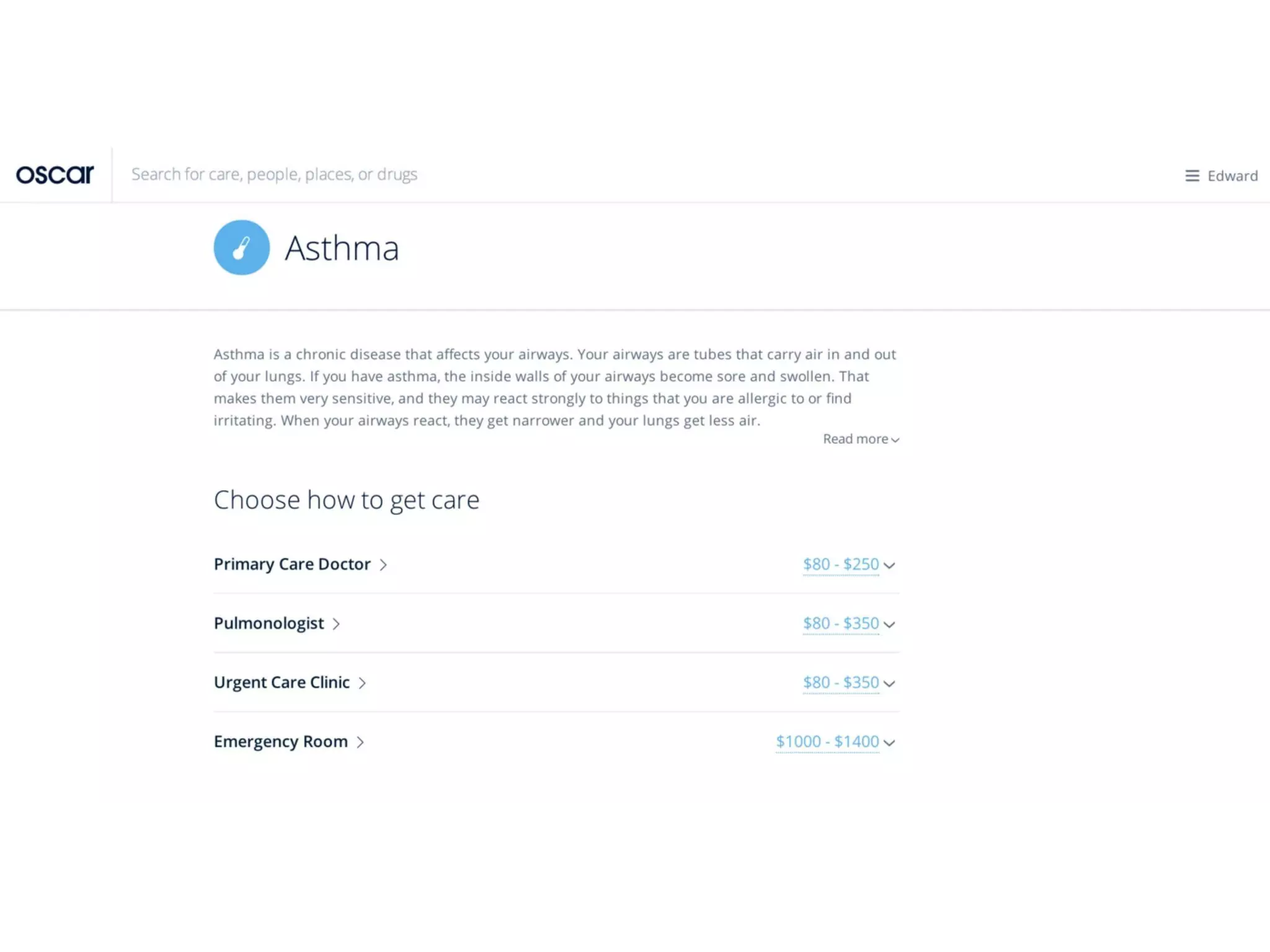
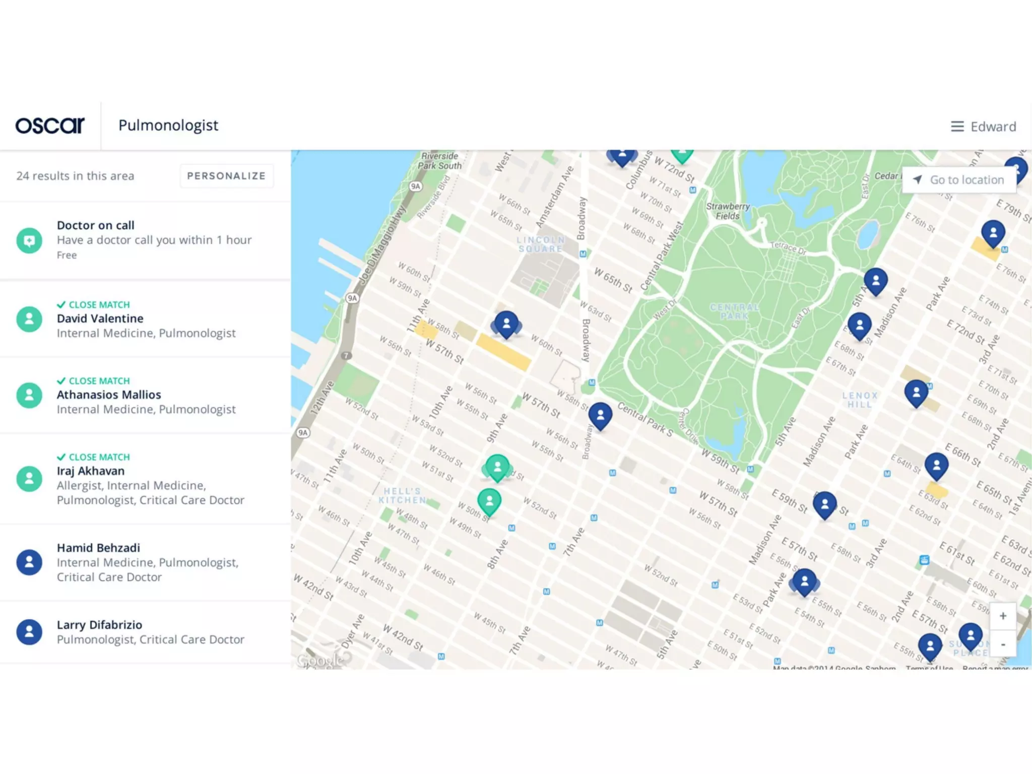
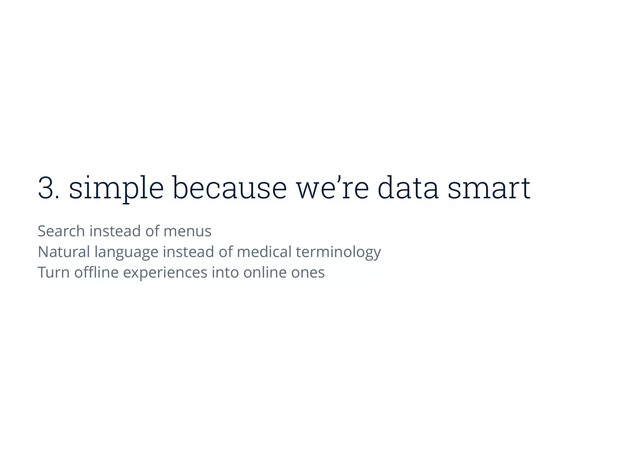
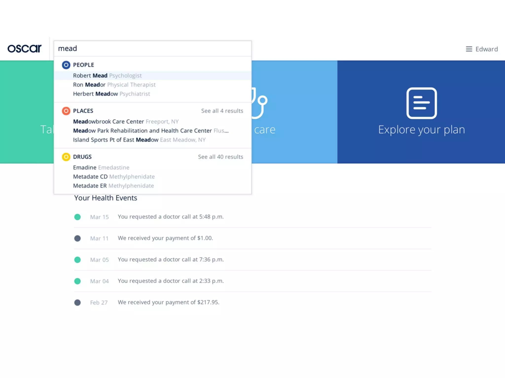
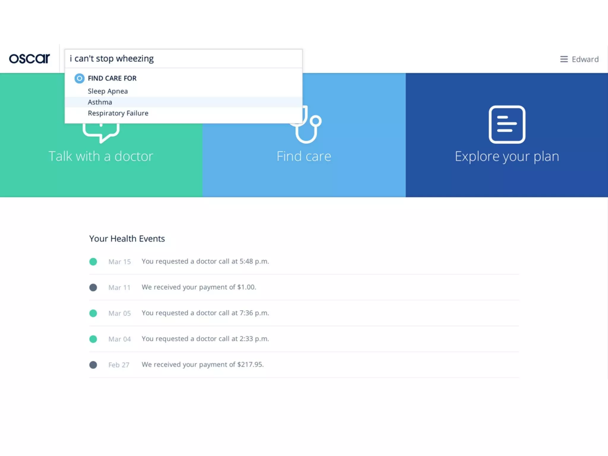
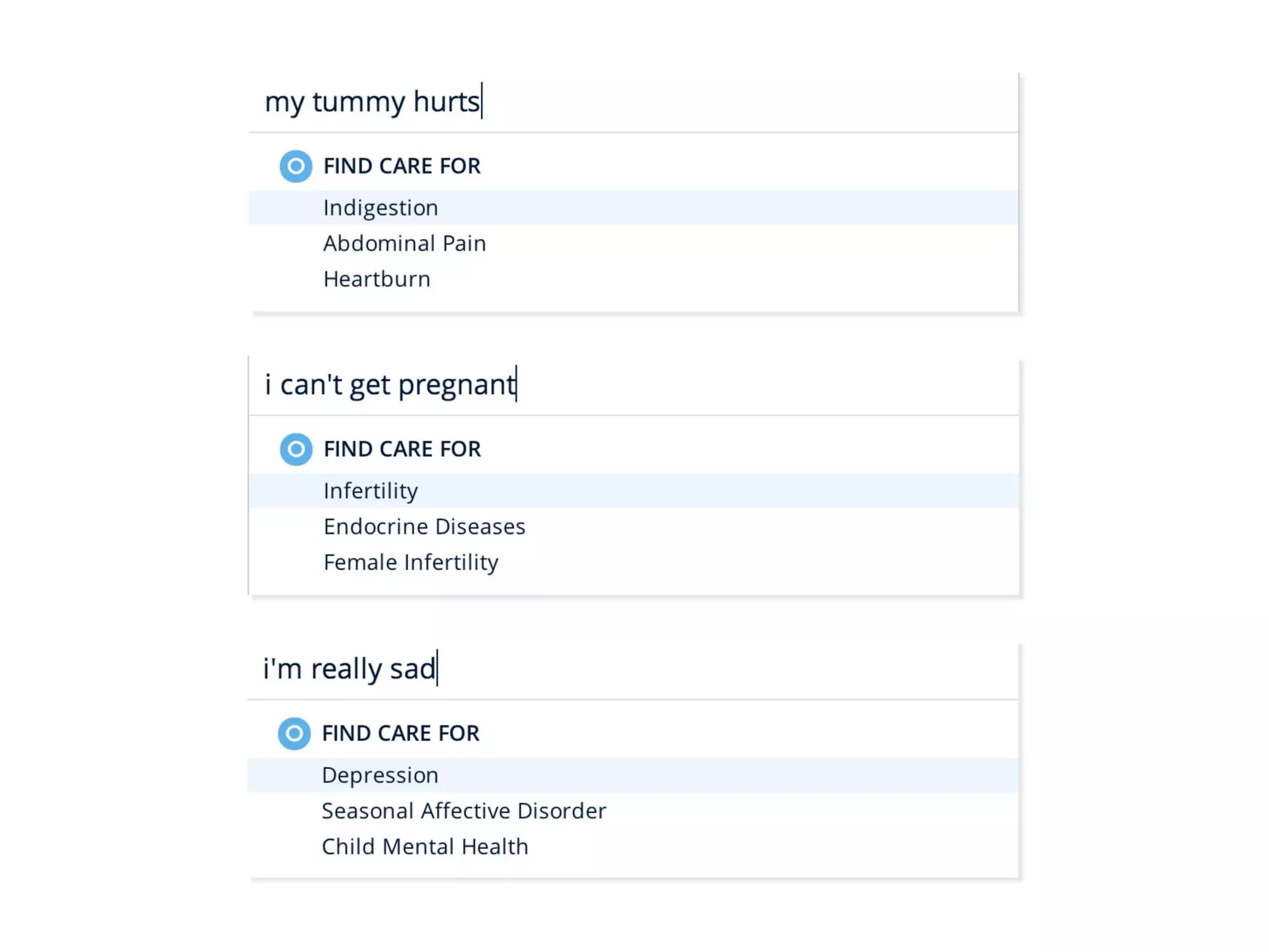
Slide 20 (and nearby UI shots) demonstrates Oscar’s approach to search-first navigation and natural language inputs — letting users type symptoms or questions instead of navigating dense medical menus. This emphasizes ‘data smart’ UX: remove menus, interpret plain language, and use data to guide users to the right level of care. The screenshot of a broad dropdown and condition summaries shows how knowledge and design meet to reduce friction.

For founders building complex products, this is a model of how to hide complexity behind well-designed defaults and search capabilities. Prioritize the few user intents that matter most and use data to map those intents to concrete actions (telemedicine call, specialist booking, pricing). Presenting actual UI mockups helps investors see practicality, not just vision.

Key Takeaway: When your domain is complex, lead with a search-first, natural-language UX that turns user intent into clear actions using data.
Seamless Care Flow: From Symptom to Doctor Call

Seamless Care Flow: From Symptom to Doctor Call

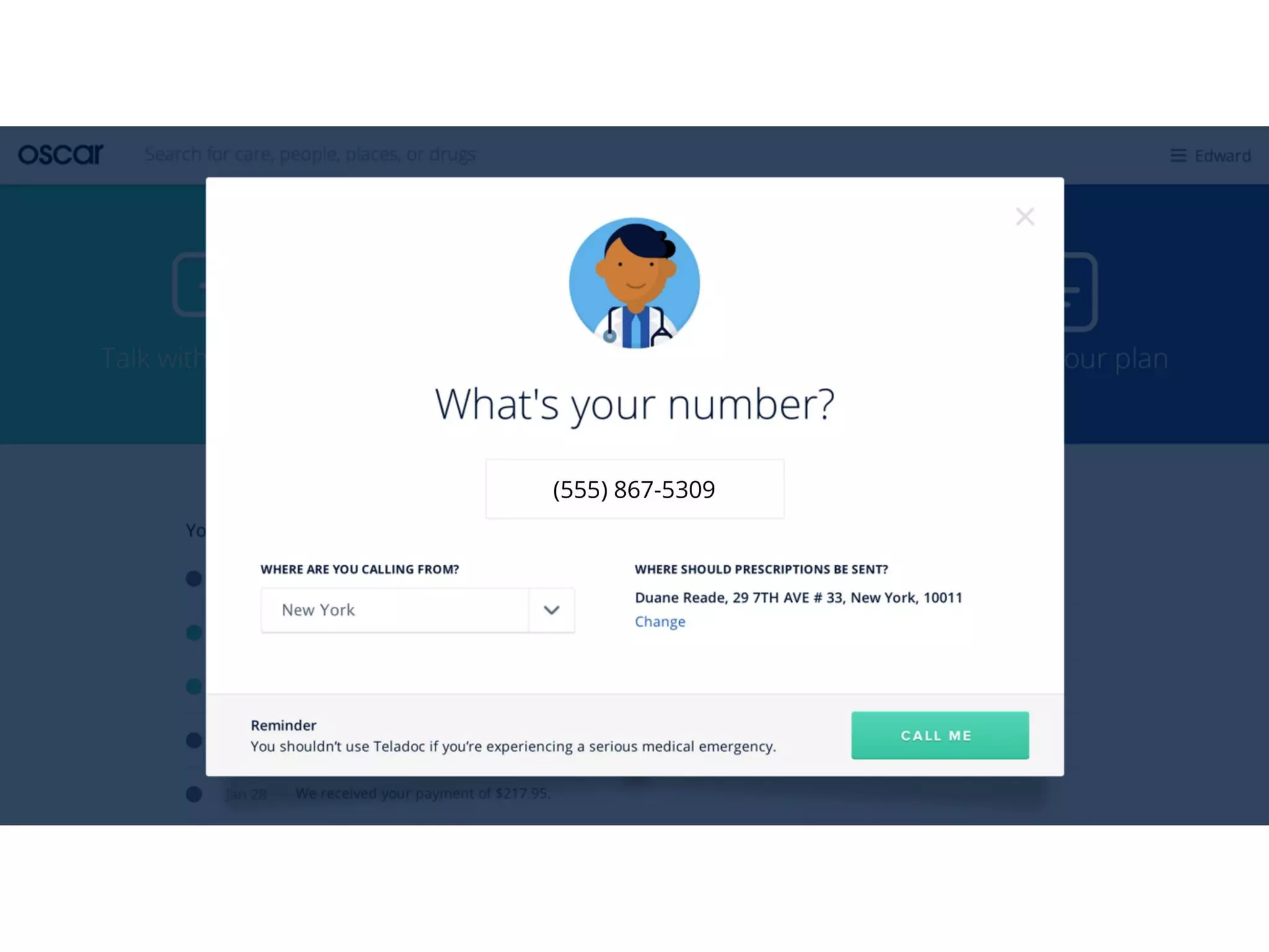
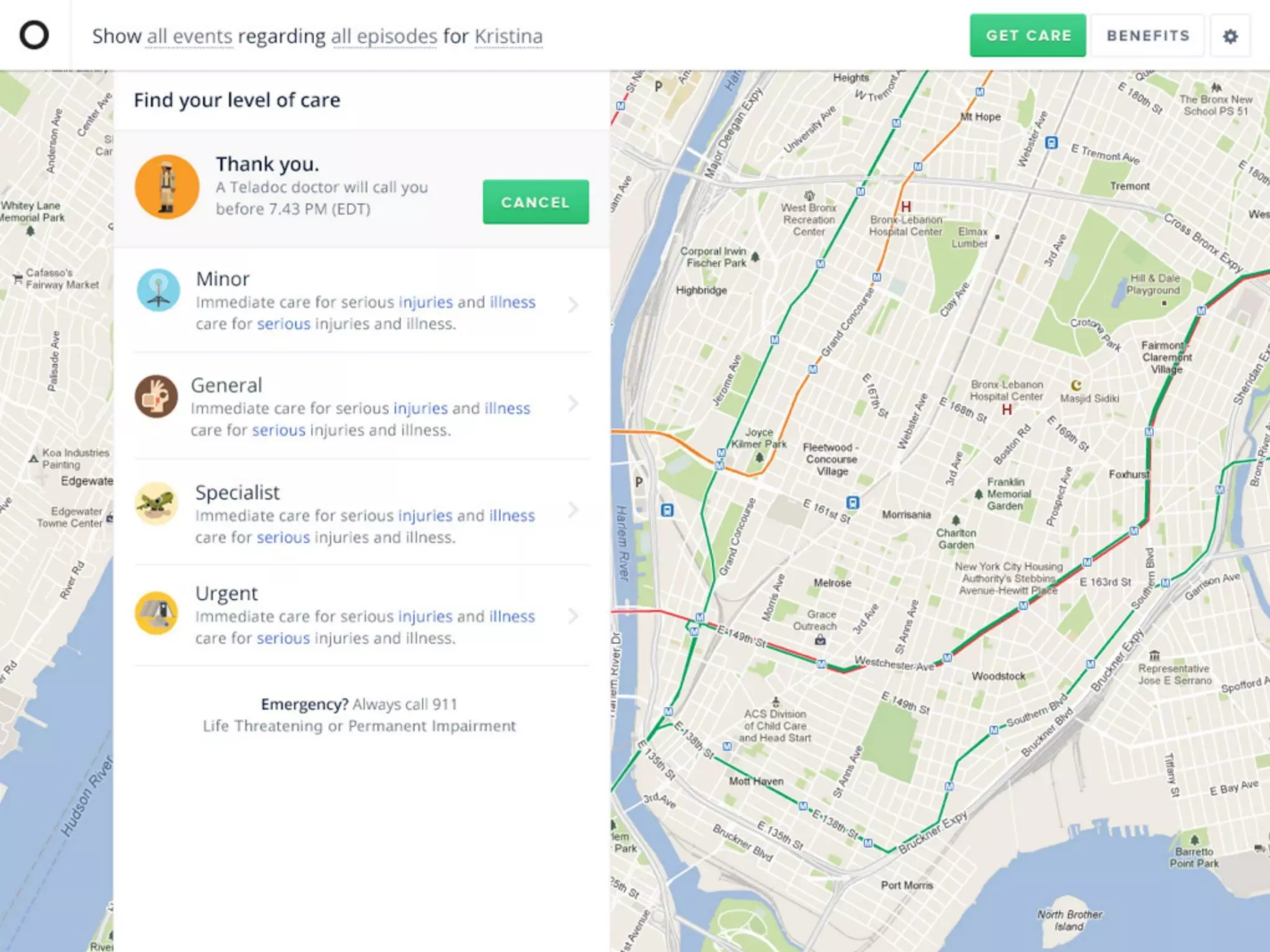
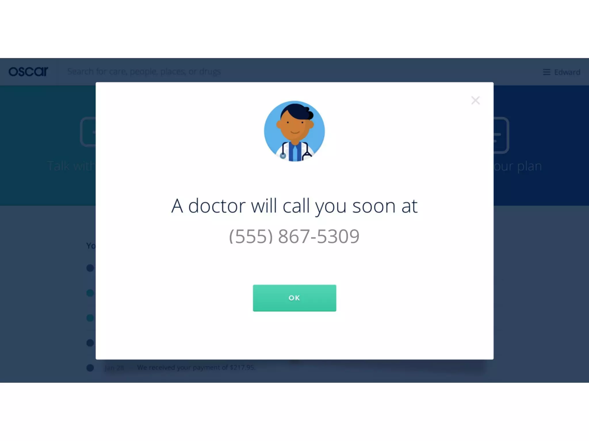
Slides 24–26 (represented here by slide 24) walk through a real interaction: a member types a symptom, requests a doctor call, enters a phone number, and receives a confirmation that a doctor will call. The flow is short, visual, and reassures the user at each step (where prescriptions will go, where the call will come from). It makes the value proposition concrete: quick, accessible care that bypasses traditional friction.

This is a strong example of demonstrating product mechanics, not just features. Investors need to see how users actually accomplish high-value tasks. For founders, show a real end-to-end microflow for your highest-value use case — it's more persuasive than feature lists because it demonstrates operational thinking and user empathy.

Key Takeaway: Show an end-to-end microflow for your highest-value user action to prove your product actually delivers the promised outcome.
Membership Engagement & Transparency: Timeline and Billing

Membership Engagement & Transparency: Timeline and Billing

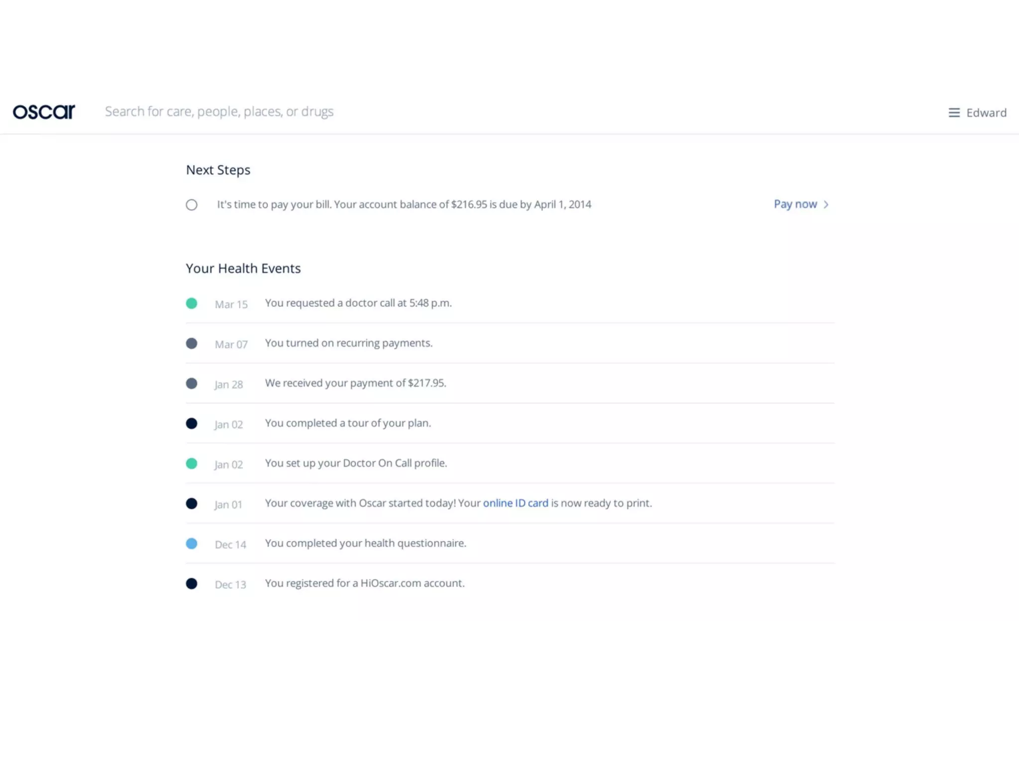
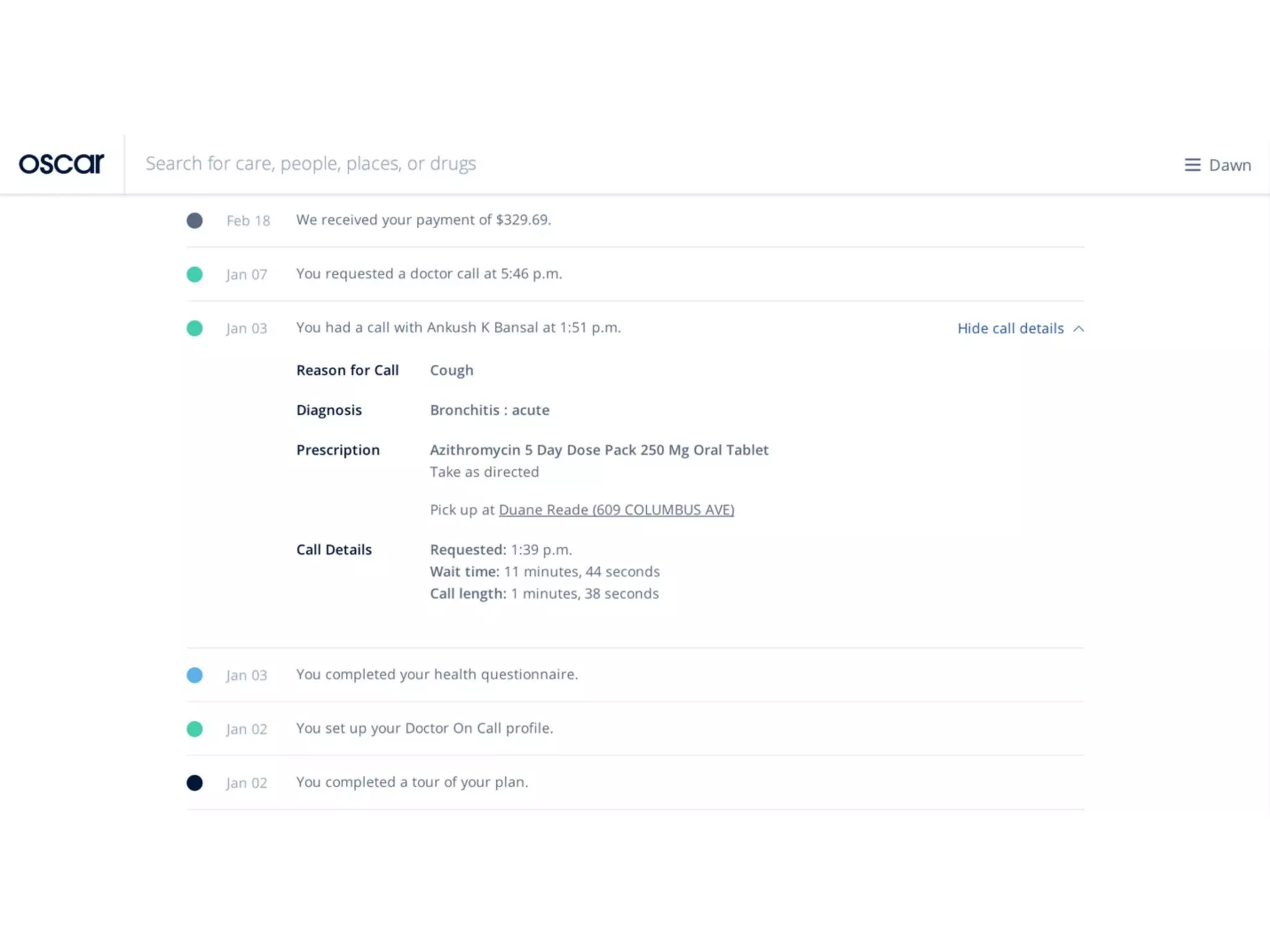
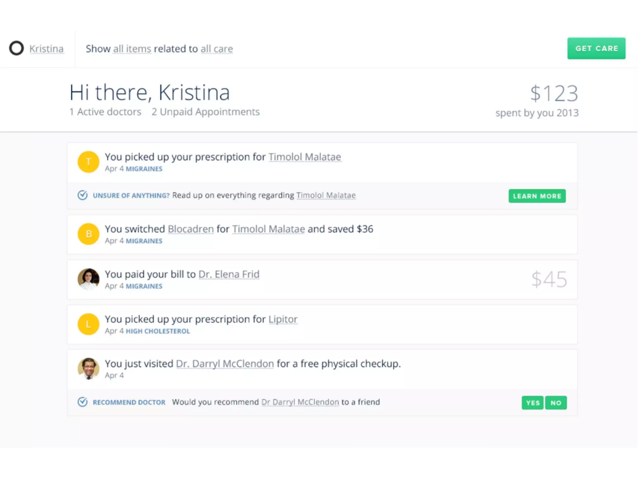
Slide 29 (and adjacent shots) presents the member timeline and transaction transparency — payments, doctor calls, prescription pickups, and next steps. This brings two crucial benefits into view: engagement (a feed that nudges users to relevant actions) and financial clarity (billing statements that reduce surprise). Both are major pain points in healthcare and are directly tied to retention and satisfaction.

Founders should note how operational details (billing, call logs, prescriptions) are presented as product features that drive stickiness. Including screenshots of member histories and billing examples tells investors you’ve solved backend integration and that your service creates ongoing, measurable touch points with members.

Key Takeaway: Turn necessary operational work (billing, call logs) into product features that increase transparency and keep customers engaged.

Conclusion: Key Lessons

Oscar’s Series A deck succeeds by aligning brand, problem, market timing, and concrete product flows. Strengths to emulate: a clear emotional problem statement, a concise market rationale, strong brand-led visuals, and concrete UI walkthroughs of primary use cases (search, telemedicine, billing). The deck emphasizes execution — not just big ideas — by showing how design and data work together to simplify complex systems.

Actionable advice for founders: 1) Start with a succinct brand promise and stick to it across slides. 2) Lead with the user pain in plain language and follow with one or two market numbers to justify timing. 3) Show real product microflows for your core use cases rather than long feature lists. 4) Demonstrate how backend work (billing, operations) becomes a user-facing advantage. Finally, use design to communicate trust and simplicity — in categories where complexity frightens users, clarity is a strategic moat.

Full Deck Analysis

11 sections

Overview

Company: Oscar Health
Round: Series A ($30M)
Year: 2014
Outcome: IPO at $7.9B valuation (2021)


Executive Summary

Oscar’s Series A deck is a product- and design-first pitch that frames a large consumer problem (health insurance is confusing and painful) and shows a cohesive digital product, user flows and brand that aim to make insurance “simple, friendly, smart.” The deck leans heavily on UX screenshots, search-driven experiences and telemedicine integration as evidence that a modern, data-driven insurer can win consumers where incumbents fail.


Problem Statement

How the deck articulates the problem

  • High-level problem statement shown visually and textually (Slide 2): “Health insurance is / was the worst” with a striking visual to evoke confusion and pain.
  • Market context (Slide 3): “health insurance is changing (fast)” and a callout that “40 million individuals [are] getting insurance” — framing a large consumer market coming online via policy changes and exchanges.
  • Behavioral change: consumers now “shop for insurance like everything else” (Slide 3). Incumbent insurers are not set up for this consumer-first behavior (Slides 3–4).

Solution

How the deck positions the solution

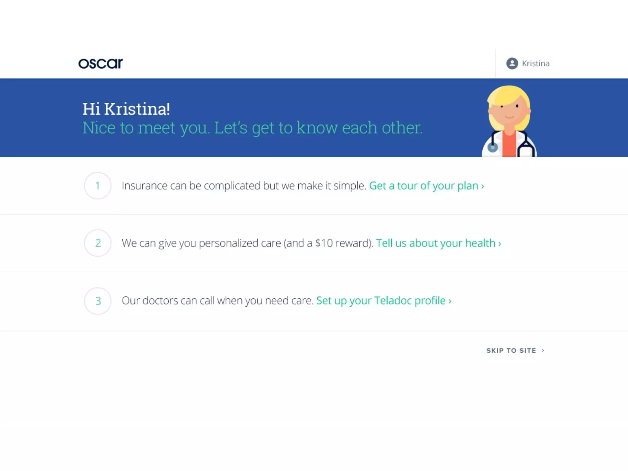
  • A consumer-centered insurance brand and product: strong visual identity, simple language and onboarding flows to make insurance approachable (Slides 1, 6–7).
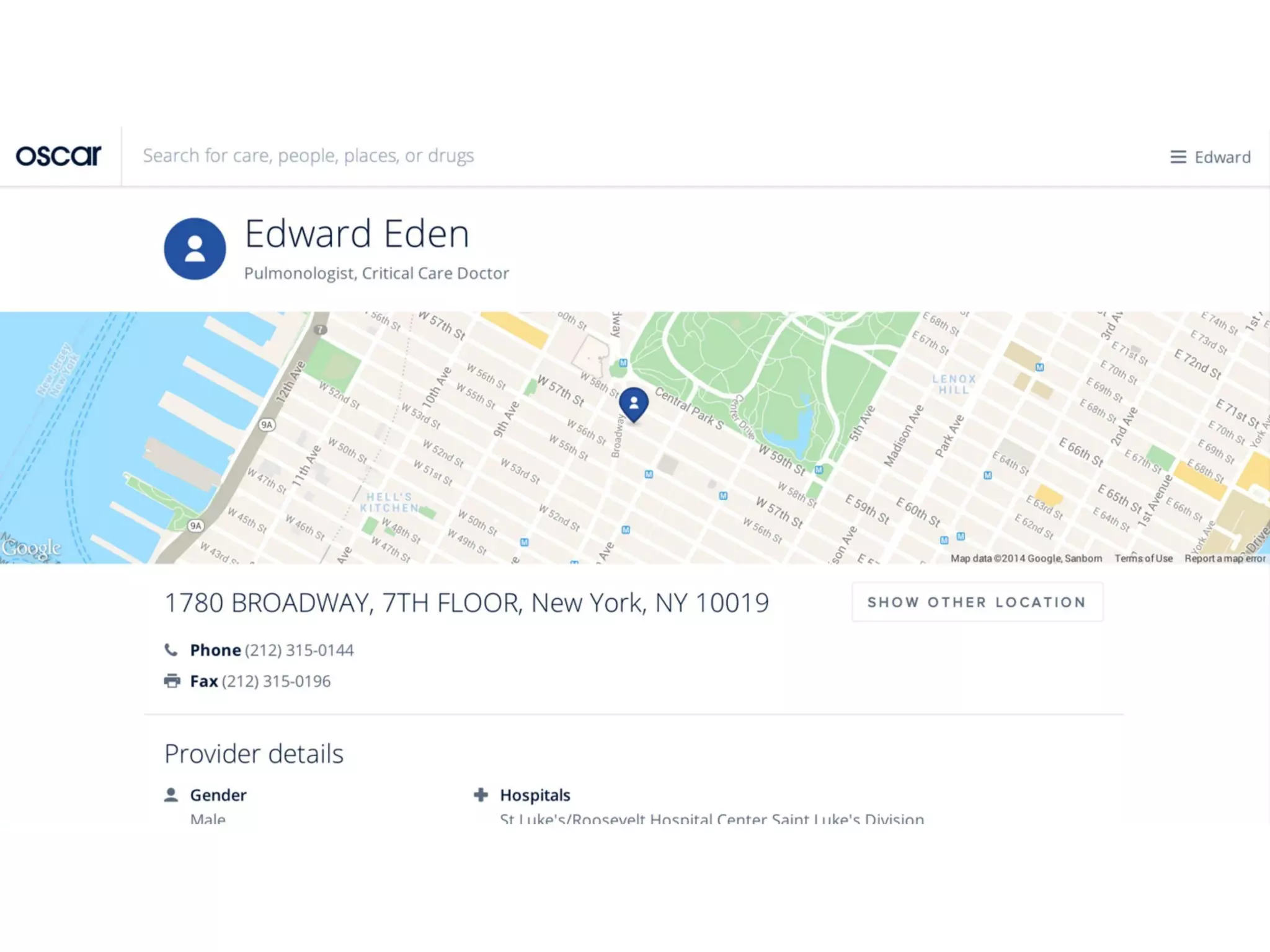
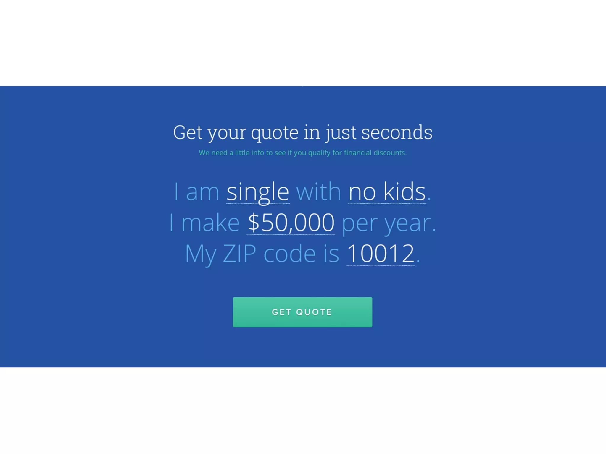
  • Product-first UX: natural-language search for symptoms/conditions, maps to provider choices, and a guided “get quote” flow that asks a few simple questions (Slides 8, 12–17, 21–26).
  • Embedded services: telemedicine/Doctor-on-call integration (Teladoc) to provide immediate care access (Slides 11, 24–26).
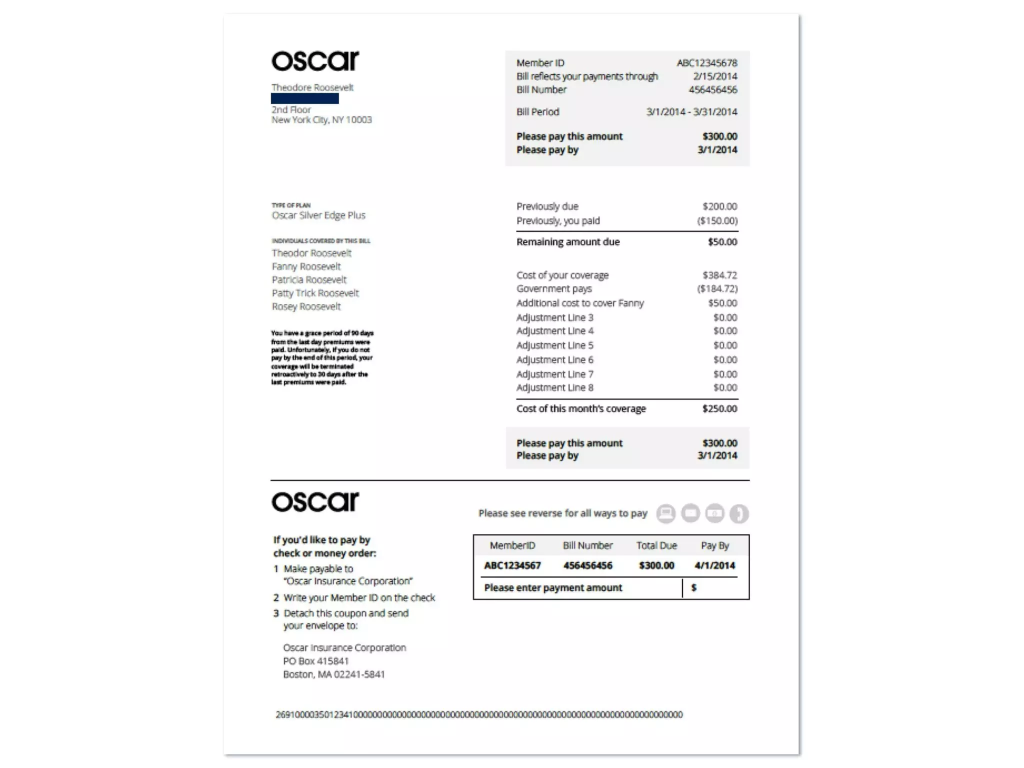
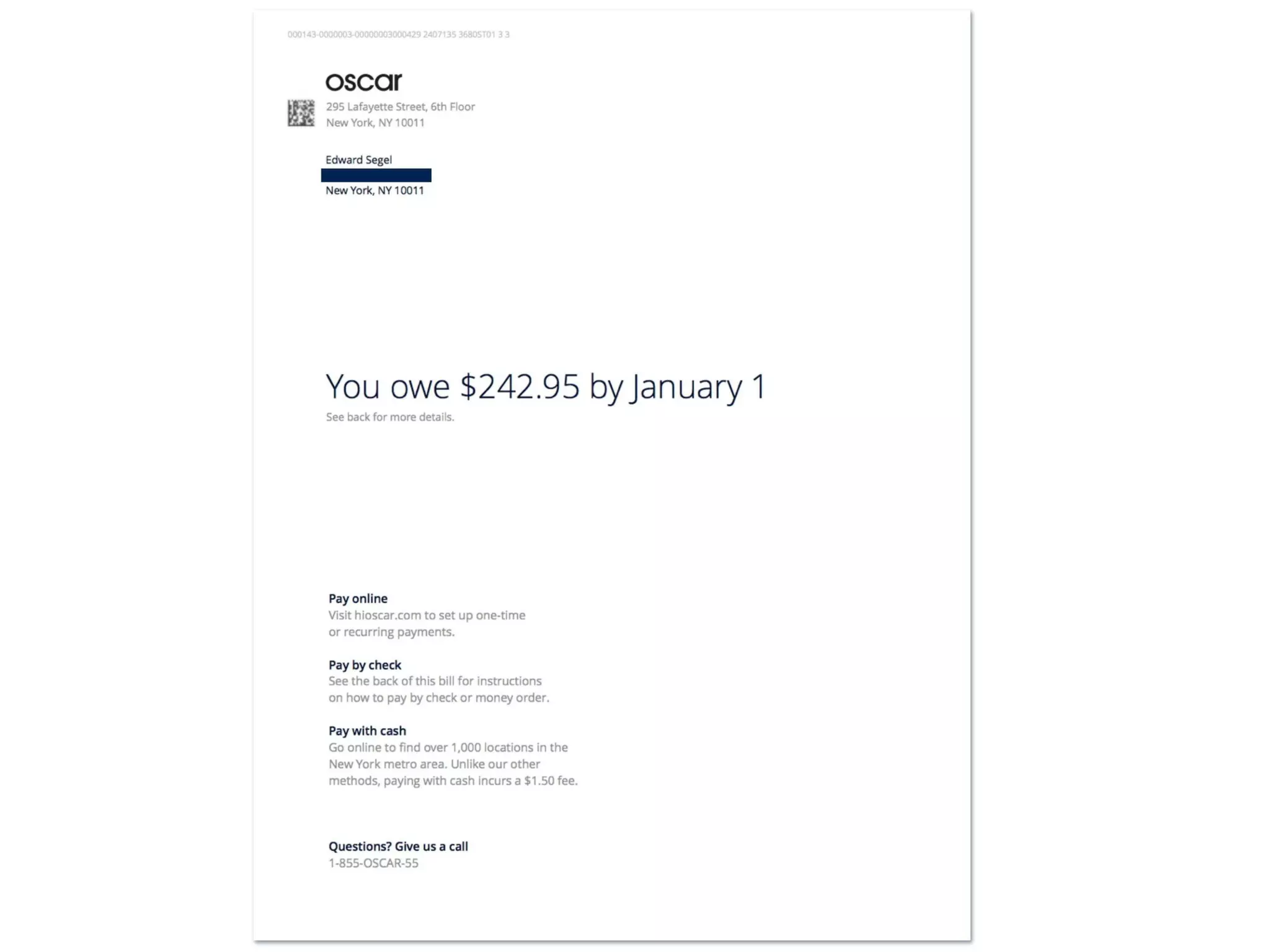
  • Operational simplicity: simplification of billing & member communications (examples of bills and statements, Slides 17–19).

Market Opportunity

TAM / SAM / SOM analysis and numbers shown

  • Explicit market callout: “40 million individuals getting insurance” (Slide 3) — used as the immediate market context (likely referencing newly insured via ACA exchanges).
  • The deck otherwise frames a large consumer market without detailed TAM/SAM/SOM segmentation or dollar TAM math. The focus is on the behavioral shift (people shopping) rather than a numeric TAM breakdown.

Business Model

Revenue model and unit economics (as presented / inferred)

  • Primary revenue: standard health insurance premium model (members pay premiums; insurer pays claims). The deck does not provide detailed premium mixes or loss-ratio assumptions.
  • Product monetization shown through consumer flows: quoting and plan selection (Slide 16), billing examples (Slides 17–19) show how member charges/billing appear but not margins.
  • Ancillary/value services: telemedicine included (likely reduces cost of care / improves member experience), and cost transparency features (price ranges for care shown, Slide 12).
  • Unit economics are not disclosed in the deck (no ARPU, CAC, LTV, loss ratio or medical cost assumptions provided).

Traction & Metrics

Growth metrics and proof points (explicit or shown)

  • The deck is light on classic traction metrics. There are many product screenshots and member-facing examples but few hard adoption numbers.
  • Visible micro-evidence:
    • Billing examples showing sample amounts (e.g., $300 invoice, $242.95 due) — Slides 17–19.
    • Member dashboard examples with small-scope activity: “You spent $123” (Slide 29) and “Your Health Events” timeline showing requests and calls (Slides 11, 27, 29).
    • Teladoc call flows and call details (requested time, wait time, call length) — Slides 11, 25–26.
  • No aggregated customer counts, revenue, growth rates, ARR, CAC or retention numbers are shown in the deck.

Competitive Positioning

How they differentiate

  • Brand + UX: Oscar positions itself as a consumer brand, with approachable visual design and clear, simple language (Slides 1, 6–7, 8).
  • Data & search-first product: natural-language symptom search and data-driven provider matching instead of complex menus (Slides 20–24).
  • Integrated telemedicine and care guidance: inline triage and Doctor-on-call features (Slides 11, 24–26) to reduce friction and increase engagement.
  • Focus on simplification of traditionally complex insurance touchpoints (billing, finding care, plan navigation) rather than competing purely on price.

Team

Team credentials (as presented)

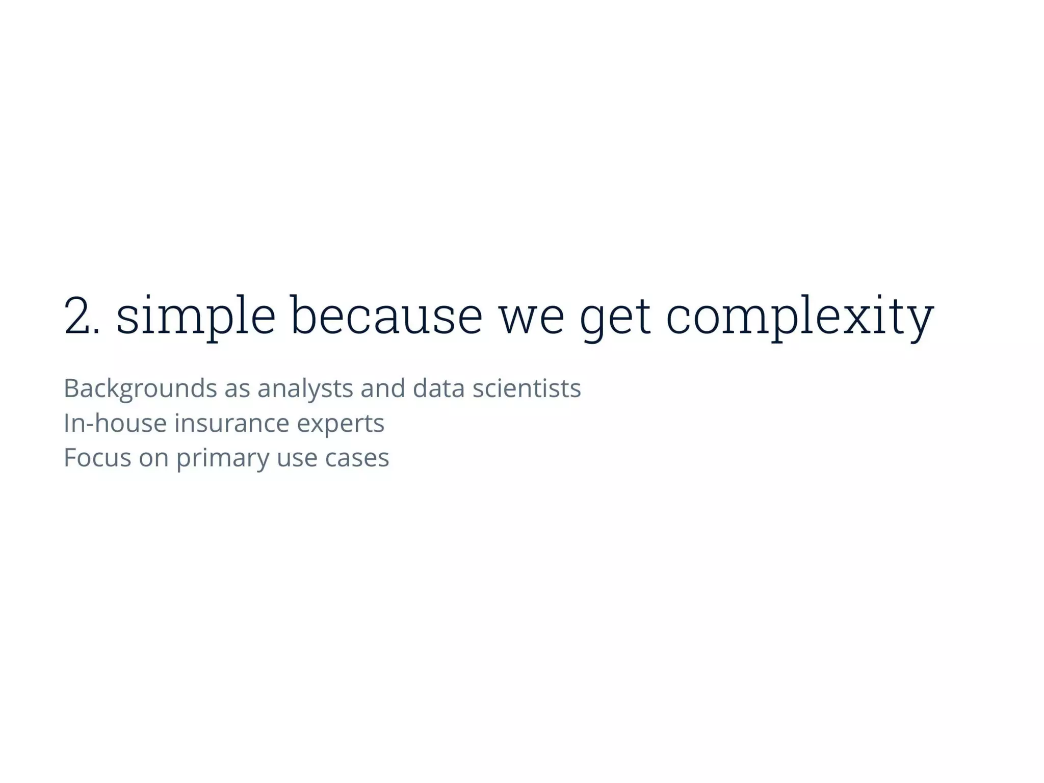
  • The deck states backgrounds: “analysts and data scientists” and “in-house insurance experts” (Slide 16).
  • Final slides list design & product contributors and provide an email contact (Slide 33): names shown include Mario Schlosser among others (Slide 33 shows many names and contact [email protected]). The deck emphasizes a product/design-heavy team rather than detailed executive bios or insurance incumbency credentials.

Go-to-Market Strategy

Distribution approach (as shown)

  • Direct-to-consumer online acquisition: streamlined quoting (Slide 16), large site hero “Hello New York, We’re Oscar” (Slide 8) and on-site marketing creative (Slides 9–10).
  • Digital-first flows: search-driven entry points, easy quoting and onboarding (Slides 12–17).
  • Customer retention/engagement via product features: telemedicine, health events timeline, personalized recommendations and reminders (Slides 11, 24–27).
  • Partnerships implied: provider network mapping and pharmacy/prescription pickup integration (Slides 12–15) — necessary for service delivery.
  • No specific paid acquisition channels, CAC, or channel economics are provided.

The Ask

  • Raising: Series A — $30M (stated by context / known raise).
  • Use of funds: not explicitly broken out in slides; implied priorities are: scale product development, expand into new markets, build operations (provider networks, claims), and accelerate member acquisition through marketing and hiring.

Investor Deep Dive

Executive summary, strengths & red flags

Executive Summary

Oscar's Series A deck is a product- and design-first pitch that frames a large consumer problem (health insurance is confusing and painful) and shows a cohesive digital product, user flows and brand that aim to make insurance "simple, friendly, smart." The deck leans heavily on UX screenshots, search-driven experiences and telemedicine integration as evidence that a modern, data-driven insurer can win consumers where incumbents fail.

Key Strengths

3 identified

1

Strong product & UX storytelling — clear, consistent visual language and many high-fidelity screenshots that show a working, coherent consumer product (Slides 8–15, 21–27).

2

Focused differentiation — a straightforward thesis: make insurance simple via design + data + integrated telemedicine, which is easy to understand and communicates a plausible path to customer adoption (Slides 6–7, 20).

3

Emotional clarity — the deck communicates the consumer pain clearly (Slide 2) and demonstrates how the product reduces friction in concrete ways (search, quotes, Teladoc, billing).

Red Flags & Weaknesses

3 identified

1

Lack of financial/traction metrics — the deck provides almost no user counts, revenue, growth, LTV, CAC, or loss-ratio assumptions. Investors would want early unit economics before underwriting an insurance business (absent from Slides 1–33).

2

Understated regulatory & capital requirements — an insurer needs underwriting, claims reserves and regulatory capital; the deck focuses on UX/product but provides little about how they manage risk, capital or provider contracting.

3

Limited go-to-market detail and scalability proof — product screenshots show a great experience but the deck does not quantify acquisition channels, marketing efficiency, or demonstrated repeatable distribution (Slide 16 shows quoting UX but no channel metrics).

More Pitch Decks To Study

Compare structure, fundraising context, and investor-facing story across similar startup decks.