Compare your deck to Headspace

Compare Your Deck

Headspace Pitch Deck (2015)

Health
Stage: Seed
Raised: $34M
Year: 2015
Slides: 27
Outcome: Merged with Ginger; valued at ~$3B (2021)

Pitch Deck

1 / 27
Headspace pitch deck slide 1
Click to expand

Deck Analysis

This deck is an early-stage investor pitch for Headspace (Seed, 2015) that pairs strong consumer brand design with clear business metrics. It balances friendly, simple visual identity (the recognizable Headspace “smiley sun” motif) with investor-focused tables and charts showing funding history, growth signals, competitive position, and an exit strategy. Notable because Headspace later raised significant capital (~$34M by the seed/early rounds in this timeline) and ultimately merged with Ginger to create a combined behavioral health leader valued near $3B in 2021, the deck demonstrates how consumer health startups can marry emotive branding with rigorous financial and competitive detail to persuade investors.

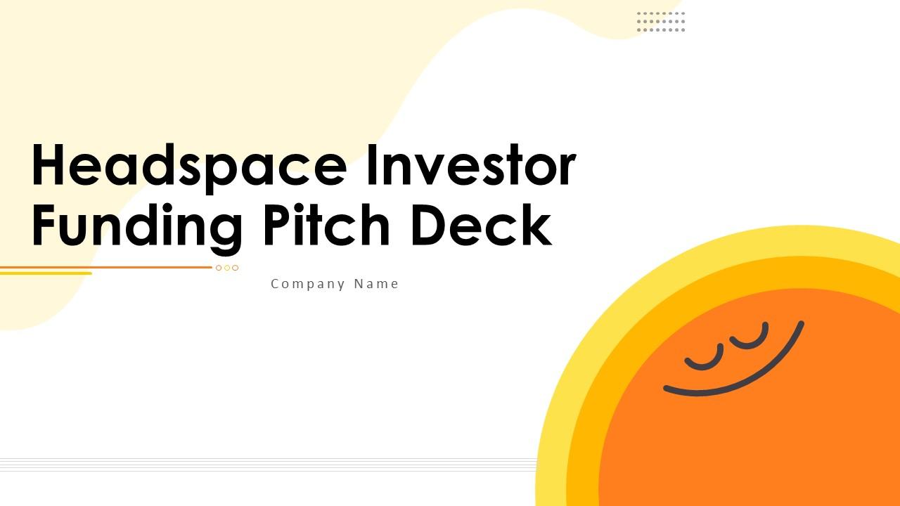
The Opening: Brand-first Title Slide

The Opening: Brand-first Title Slide

The title slide (large bold headline, warm palette, friendly mascot) immediately communicates product tone and category — mental health/wellness — rather than a dry corporate identity. That design choice signals both consumer focus and differentiation: investors know at a glance this is a consumer wellness product with mass-market appeal. The layout also leaves space for company name and sets a calm, trustworthy aesthetic that aligns with Headspace’s product promise.

For founders, this slide is effective because it establishes emotional positioning before metrics: it tells a story about who the user is and what the brand stands for. The lesson: use the opener to encode your customer and brand promise into the first 3 seconds of viewing, while keeping room for investor details (tagline, logo, founder names) that can be introduced on the next slide.

Key Takeaway: Start your deck with an instantly readable brand promise that signals target user and emotional differentiation.
Roadmap for the Investor: Table of Contents

Roadmap for the Investor: Table of Contents

The table of contents slide organizes the deck into clear investor-relevant sections (overview, timeline, valuation, competitors, team, growth signals, investors, acquisitions, exit strategy). This upfront structure helps an investor quickly scan for the sections they care about and sets expectations for a data-driven narrative. Visual anchors like an orange side bar and thumbnail image make the TOC easier to navigate while reinforcing the brand palette.

Founders can learn to use a concise TOC to show discipline and respect investors’ time. If your deck is long, adding a TOC makes it searchable during follow-up conversations and highlights that you’ve prepared the specific proof points investors expect (metrics, comps, team, exit).

Key Takeaway: Include a short, clearly labeled table of contents so investors can find the exact proof points they want to inspect.
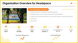
Company Snapshot: Organization Overview

Company Snapshot: Organization Overview

This slide presents a one-page company snapshot with founding date, legal status, employee count, funding stage, ARR/GMV indicators and growth charts — all essential signals for early-stage investors evaluating traction. The combination of a concise bullet summary and small charts (headcount growth / revenue growth) lets viewers absorb both qualitative context and quantitative momentum in one glance. Including an image of real users/customers adds social proof and humanizes metrics.

Best practice here is packing the slide with the most requested due-diligence facts without overwhelming the viewer: founders should prioritize the top 6–8 KPIs (founding year, team size, funding stage, revenue, users, top investors) and support them with mini-charts. This slide shows how to communicate scale and progress efficiently during initial screening.

Key Takeaway: Create a one-page snapshot with the 6–8 KPIs investors check first, using small charts to show trajectory rather than raw numbers alone.
Funding History and Valuation Table

Funding History and Valuation Table

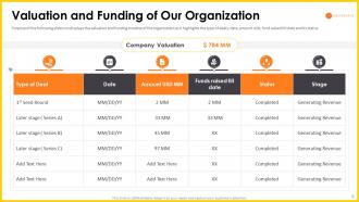
The valuation and funding slide lists previous rounds, dates, amounts and investor roles in a clear tabular format. This transparency demonstrates fundraising competence and situates the current raise in context (how much capital already deployed, who led prior rounds, and valuation progression). For an investor, seeing clean, auditable funding history reduces friction in the term-sheet stage.

Founders should emulate the clarity here: show prior round sizes, dates, participating investors, and use-of-proceeds notes. If there are convertible notes, SAFEs, or outstanding options, flag them plainly — investors value honesty and it prevents surprises in diligence. This slide is particularly effective because it converts potentially messy cap-table history into an easy-to-scan investor timeline.

Key Takeaway: Lay out prior rounds, amounts, dates and lead investors in a clean table so future terms are evaluated against clear historical context.
Competitive Position: Direct Comparison Table

Competitive Position: Direct Comparison Table

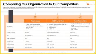
The competitor comparison slide contrasts Headspace against named rivals across attributes (product features, pricing, distribution, and user metrics). Side-by-side comparisons allow investors to judge defensibility and differentiation quickly. The visual use of color highlights Headspace’s strengths and reveals gaps competitors have, which helps justify market positioning and potential valuation premium.

For founders, the lesson is to choose 3–4 most relevant competitors and compare them on the few attributes that matter for defensibility (content depth, user retention, partnerships, distribution channels). Overly long competitor matrices dilute the message; instead highlight where you win and explain how those advantages scale or are hard to replicate.

Key Takeaway: Use a focused, side-by-side competitor table that highlights 3–4 defensibility attributes where you have a clear advantage.
Growth Signals: KPIs, Charts and Traction

Growth Signals: KPIs, Charts and Traction

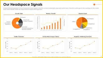
This slide aggregates multiple growth metrics — churn/retention, monthly active users, revenue growth, referral rates — in small charts that tell a consistent growth story. Presenting several correlated KPIs in one view (e.g., users, revenue, referral velocity) allows investors to see momentum rather than isolated numbers. The orange/yellow palette keeps the visuals coherent and readable while the variety of chart forms (pie, line, bar) matches each metric’s nature.

Founders should aim to show trending metrics rather than static snapshots: month-over-month or year-over-year charts that demonstrate trajectory are far more persuasive. Also, include a short annotation for any unusually strong period (product launches, partnerships) so the investor can connect inflection points to business actions.

Key Takeaway: Show correlated KPI trends (user growth, retention, revenue) together with brief annotations to prove consistent momentum and the causes behind inflection points.
Exit Strategy: Clear Paths and Timing

Exit Strategy: Clear Paths and Timing

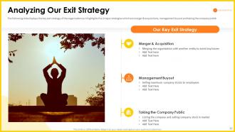
The exit slide lists realistic routes (M&A, management buyout, IPO) with concise rationale and expected timelines/conditions. By articulating exit options, Headspace signals its awareness of investor returns and strategic acquirers, which is especially important in consumer health where strategic partnerships (larger health platforms or digital therapeutics companies) often drive liquidity. The slide’s imagery (meditative silhouette) maintains brand tone while the bulleted options are investor-focused.

Founders should include one slide that honestly outlines exit scenarios and the business milestones required for each. Investors appreciate seeing which acquirers make strategic sense and what metrics would justify an IPO or M&A; this aligns expectations and can spark early acquisition interest from potential partners in diligence conversations.

Key Takeaway: Spell out realistic exit paths and the specific milestones that would trigger each option to align investor expectations from the start.

Conclusion: Key Lessons

Headspace’s deck combines consumer-oriented branding with investor-grade data presentation: a calm, memorable brand identity opens the story and is followed by concise KPIs, funding history, competitor comparisons, and exit scenarios. The biggest strength is the consistent narrative — emotional user value and measurable traction — that links product positioning to business metrics. Actionable advice: lead with a clear brand promise, compress the most-requested KPIs into one snapshot, use focused competitor tables to show defensibility, and present funding history and KPI trends transparently.

For founders preparing investor decks, emulate this balance of emotion and evidence. Keep the visual language aligned with your product, prioritize 6–8 truth-telling metrics, annotate inflection points so growth is explainable, and make prior funding and exit assumptions explicit. That combination reduces investor friction and increases credibility in early diligence conversations.

Full Deck Analysis

11 sections

Overview

Company: Headspace
Round: Seed ($34M)
Year: 2015
Outcome: Merged with Ginger; valued at ~ $3B (2021)


Executive Summary

This deck (27 slides) is a visually polished investor pitch template that Headspace used at seed stage to present company context, product signals, market positioning, team, and growth/financial scenarios. It combines high-level metrics, competitive comparison tables, and roadmap/exit options — but several slides appear to be template/placeholders or use summary-level figures rather than detailed unit economics or TAM breakdowns.


Problem Statement

  • The deck does not lead with a classic, tightly worded problem slide that quantifies the customer pain explicitly (e.g., number of people suffering from stress, lost productivity dollars, or mental health access stats). The Table of Contents (slide 4) implies the deck will cover organizational overview and the product, but there is no single slide labeled “Problem” with hard statistics.
  • Problem framing appears to be implicit across early slides (slides 2–6): the title slide (2–3) sets tone (meditation/wellness) and Organization Overview (slide 5) positions Headspace as an established player in a wellness category — but explicit market pain metrics are not clearly surfaced on the images provided.

Reference: Table-of-contents slide (slide 4) shows structure; Organization Overview (slide 5) contains company background rather than a quantified problem statement.


Solution

  • The deck positions Headspace as a product that addresses mental wellness via an accessible service (visuals and brand cues suggest meditation/mental health app). The solution is presented as a consumer-facing digital product with tracked engagement signals (slide 11: “Our Headspace Signals”) showing usage/revenue growth charts, social/follower metrics, and market share slices.
  • The slides emphasize product-market fit by showing growth and engagement signals, and positioning the product against competitors (slide 8) to show differentiated features/capabilities.

Reference: Solution framing principally appears across slides 8 (comparing to competitors) and 11 (growth & engagement signals).


Market Opportunity

  • The deck does not present an explicit TAM / SAM / SOM breakdown in the images provided. I could not find a slide that lists the common TAM/SAM/SOM numbers.
  • Timeline and market-share visuals (slide 11: market share pie chart) imply a scalable market, but numeric market-size estimates are not visible in the images.

Takeaway: Market sizing is either absent from the visible slides or embedded in slides that use graphics without explicit TAM numbers.


Business Model

  • The deck uses a few slides to suggest financial scenarios and revenue splits:
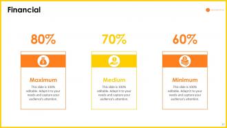
    • Slide 20 shows three financial scenarios: 80% (Maximum), 70% (Medium), and 60% (Minimum) — presented as % metrics of some KPI (likely conversion or margin), but the slide is high-level and reads like scenario sensitivity rather than a detailed revenue model.
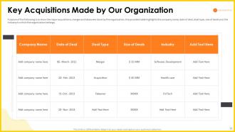
    • Competitive and acquisition tables (slides 8, 12–13) list financing and acquisition activity, implying a mix of direct consumer revenue, possible enterprise/partnership channels, and M&A outcomes.
  • There is no detailed unit-economics slide visible (LTV:CAC, ARPU by cohort, churn rates) in the images provided.

Reference: Financial scenarios (slide 20); competitor/revenue hints in slides 8, 11, 12.


Traction & Metrics

  • Explicit company-level metrics visible on slide 5 (Organization Overview):
    • Founded: 2010
    • Status: Private
    • Employees: 382
    • Latest Valuation: $47.7M (as shown on that slide)
    • Investors: 27
  • Slide 11 “Our Headspace Signals” contains growth charts (growth rate, monthly revenue, social media followers, app installs/referrals) and a market share pie chart, indicating momentum. Exact numeric values in these charts are not legible from the images, but the layout implies steady upward trends.
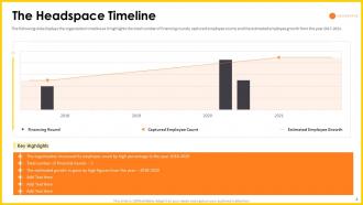
  • Slide 6 (The Headspace Timeline) shows fundraising rounds and employee growth visually for years (bars for 2014–2016+), and the orange highlight box lists key timeline highlights (not legible).
  • Slide 7 (Valuation and Funding) includes a table with past rounds, dates, amounts and a “Company Valuation” badge — but the exact table numbers are not clearly readable from the provided imagery.

Concrete visible datapoints:

  • Employees: 382 (slide 5)
  • Latest Valuation shown on slide 5: $47.7M
  • Investors count: 27 (slide 5)
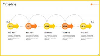
  • Timeline years on slide 21: 2016–2020 shown as roadmap progress

Competitive Positioning

  • The deck includes direct competitor comparison slides:
    • Slide 8: a side-by-side feature/metrics comparison with two named competitors (placeholders “Add Name Here”) to highlight Headspace feature set and metrics advantage.
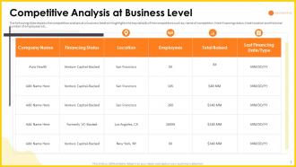
    • Slide 9: “Competitive Analysis at Business Level” shows financing, location, employees and total raised for competitors to contextualize Headspace vs peers.
  • Differentiation is presented via product/feature blocks and growth metrics (slide 11), but the slides look template-based and some competitor names/values appear as placeholders.

Key differentiators implied: brand, engagement signals, product features, and investor/backer profile.


Team

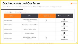
  • Slide 10 (“Our Innovators and Our Team”) lists executive roles and contact info columns. The slide layout highlights leadership titles (CEO, CTO, etc.) and a board seat column.
  • Specific founder names are not legible in the provided images; the slide exists and emphasizes executive bios and board composition but the images appear to be template placeholders for contact items.

Takeaway: Team slide structure is present and follows best practices (title, role, board seat, contact), but the supplied images do not make individual credentials readable.


Go-to-Market Strategy

  • The deck contains GTM elements:
    • Slide 17: 30/60/90 Day Plan — short-term operational milestones for rollout/execution.
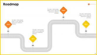
    • Slide 18: Roadmap — a multi-step product/market roadmap with milestones (visualized along a road).
    • Slide 11: metrics like referral and social follower trends imply acquisition channels include content/social, organic installs, and referrals.
  • There is no single slide with a detailed channel strategy (CACs, channel-specific conversion funnels) visible in the images.

Reference: Slide 17 (30/60/90), slide 18 (roadmap), slide 11 (engagement/traffic charts).


The Ask

  • As provided in the Company Context, Headspace raised $34M at Seed (2015). The deck itself does not show a clear “Use of Funds” breakdown in the visible slides, nor a single slide labeled “The Ask” with line-item allocation visible in the images.
  • Slide 7 (Valuation and Funding) includes a funding history table that likely provides past raises and valuations; a direct new-raise line-item is not clearly readable in the images.

Takeaway: The deck does not show an explicit, legible use-of-funds slide in the provided images — an investor would expect a clear breakdown of how the $34M will be allocated.


Investor Deep Dive

Executive summary, strengths & red flags

Executive Summary

This deck (27 slides) is a visually polished investor pitch template that Headspace used at seed stage to present company context, product signals, market positioning, team, and growth/financial scenarios. It combines high-level metrics, competitive comparison tables, and roadmap/exit options — but several slides appear to be template/placeholders or use summary-level figures rather than detailed unit economics or TAM breakdowns.

Key Strengths

3 identified

1

Visual design and brand fit: The deck has a polished, consistent, on-brand visual style (bright, friendly Headspace aesthetic; slides 2–3, 11, 20, 24). This supports product identity and consumer positioning.

2

Traction-focused storytelling: Multiple slides emphasize growth signals (slide 11), timeline and funding history (slides 6–7) and competitor comparisons (slide 8), which help build credibility and momentum.

3

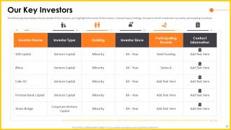
Investor/exit orientation: Slides include investor lists (slide 12), acquisitions (slide 13), and exit strategy options (slide 14) — showing the founders thought about financing history and exit paths, which investors appreciate.

Red Flags & Weaknesses

3 identified

1

Limited explicit problem quantification: The deck does not present a single, data-backed problem slide (customer pain and dollarized impact) up front. Investors want the problem sized clearly in the first 1–3 slides.

2

Missing/unclear unit economics and TAM: There is no clear TAM/SAM/SOM numeric breakdown visible, nor a LTV:CAC or cohort-level unit-economics slide. These are essential for capital-efficiency assessment.

3

Several slides look template/placeholder-heavy: Tables and competitive slides include placeholders like “Add Name Here”, and many numbers are not legible in the provided images. That raises the risk that the deck used for external investors might have relied on visuals more than granular supporting data.

More Pitch Decks To Study

Compare structure, fundraising context, and investor-facing story across similar startup decks.