Compare your deck to Notion

Compare Your Deck

Notion Pitch Deck (2016)

SaaS
Stage: Seed
Raised: $2M Seed
Year: 2016
Slides: 21
Outcome: Valued at $10B

Pitch Deck

1 / 21
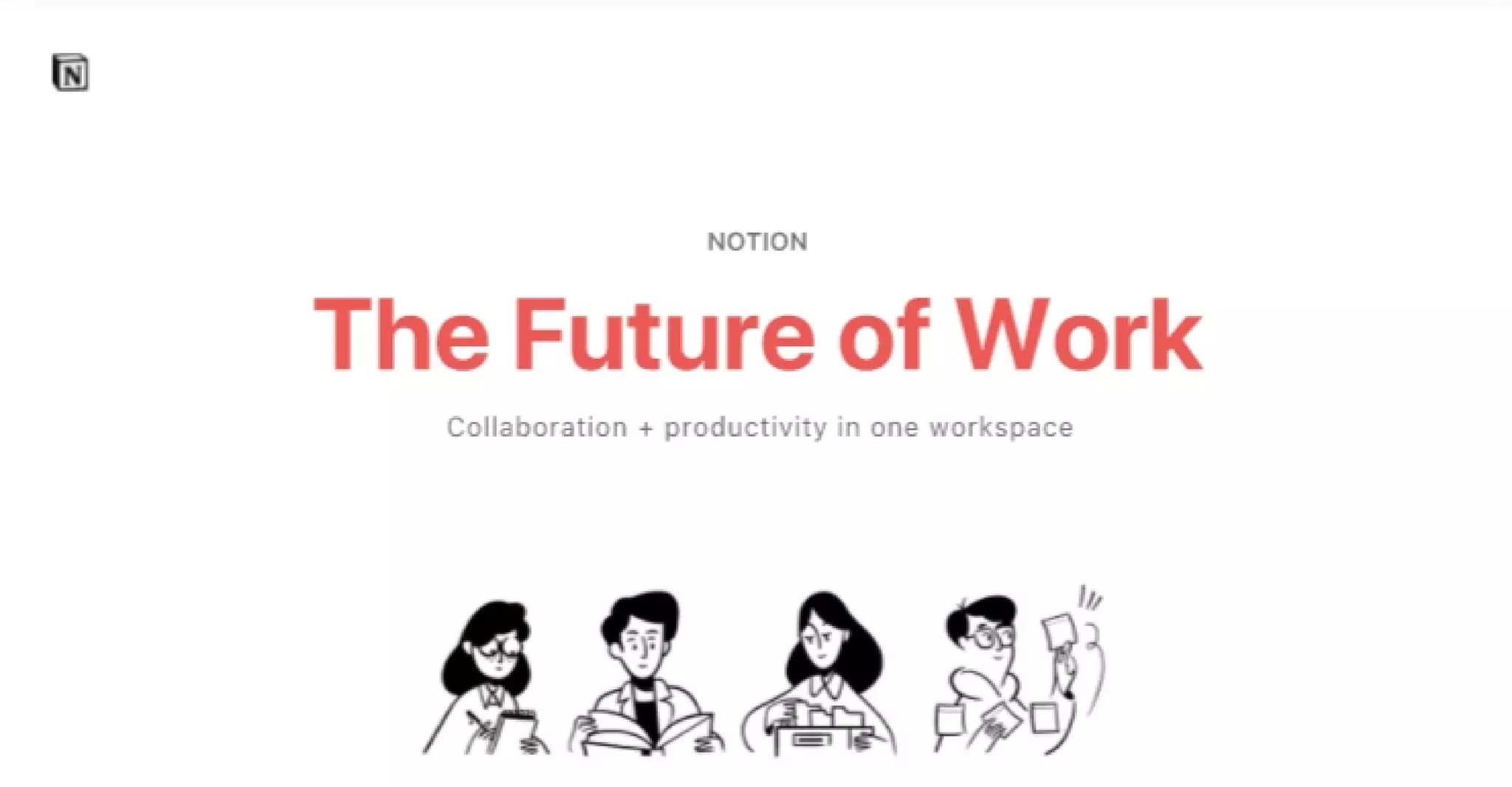
Notion pitch deck - The Opening: Clear brand and single-line positioning
Click to expand

Deck Analysis

This deck from Notion's 2016 seed round is a tight, design-forward presentation that clearly frames a common enterprise productivity problem and positions Notion as a simple, unified solution. It stands out for its minimal slides, large typography, consistent visual language, and a focus on concrete product demonstrations and integrations rather than long-winded metrics or technical detail. What makes it notable is how it balances narrative (problem → consequences → solution) with quick visual proofs (UI mockups, integrations, and a testimonial), enabling early-stage investors to grasp the opportunity and product vision rapidly.

The Opening: Clear brand and single-line positioning

The Opening: Clear brand and single-line positioning

The title slide (big headline, small subhead) establishes Notion's positioning instantly: "The Future of Work" with the subline "Collaboration + productivity in one workspace." The visual treatment — large coral headline, lots of white space, and a small illustrative row of people — communicates confidence and product focus without overwhelming detail. For early-stage decks, this economy of language helps create a framing hypothesis about company mission and target outcome before diving into specifics.

The slide's effectiveness also comes from branding restraint: the logo is present but unobtrusive, and the contrast between headline and subhead makes the core promise memorable. Founders can learn to lead with a single, aspirational-but-actionable positioning line that sets expectations for the rest of the deck while leaving room to tell the story.
Key Takeaway: Start with one bold positioning sentence that frames the value proposition, then use visuals and white space to make it memorable.
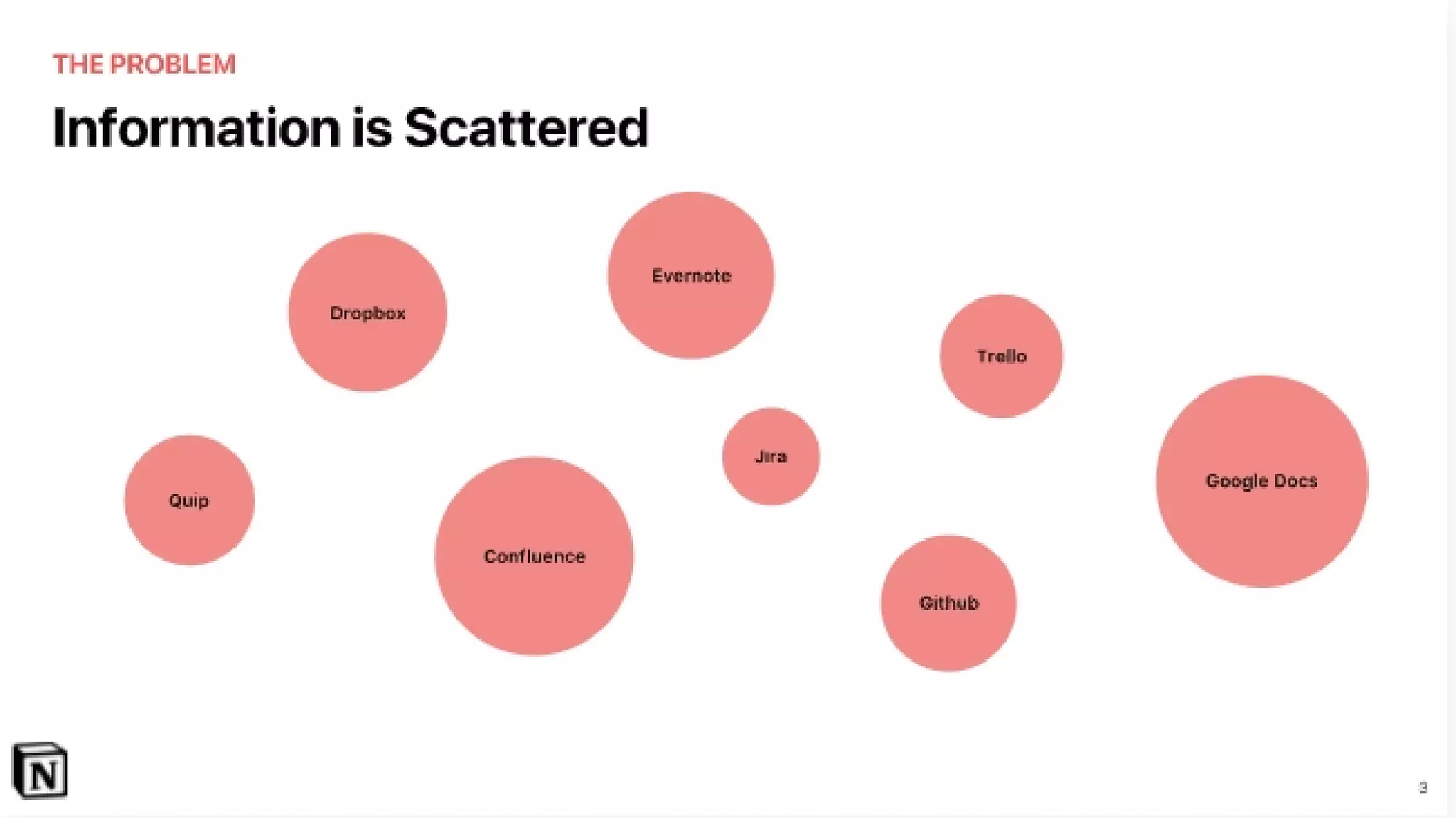
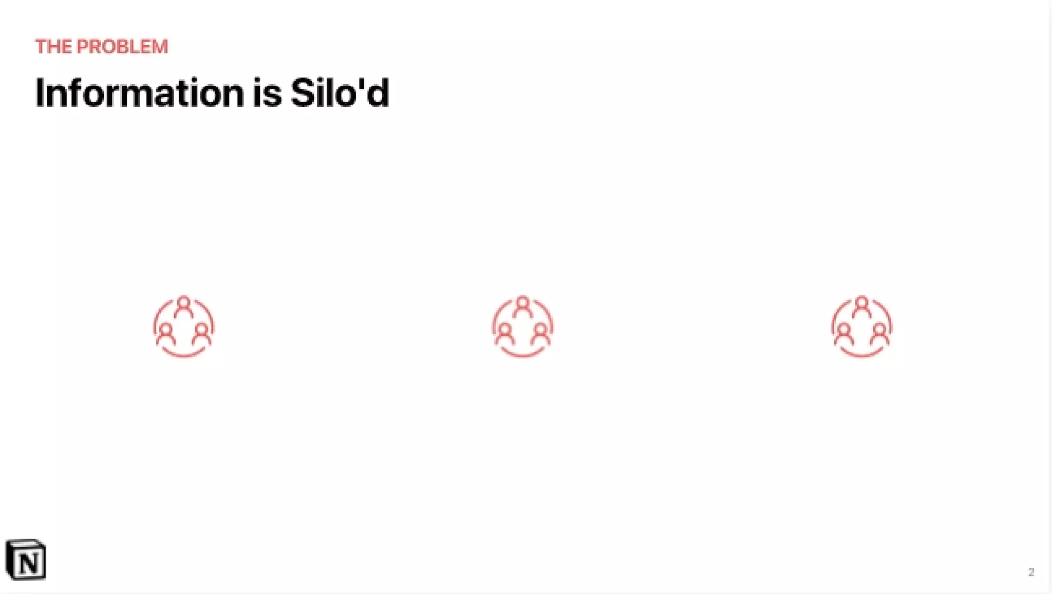
The Problem: Information is siloed

The Problem: Information is siloed

Early in the deck Notion lays out the problem succinctly: information is siloed. A slide with a clear headline and a sparse set of icons communicates that multiple disparate tools and teams lead to fragmentation. The message is supported visually rather than textually — the audience quickly understands the pain without reading long paragraphs. This approach is effective for investor audiences who want the top-line problem quickly.

By focusing on a single, relatable pain (fragmentation of information across tools) the founders avoid the trap of listing dozens of disconnected problems. That makes the case easier to validate in conversation and positions the product as a direct solution to a common operational headache. Founders should emulate this focused framing: choose one primary pain that your product resolves and show it visually.

Key Takeaway: Define one core pain clearly and visually — avoid laundry lists of problems that dilute your narrative.
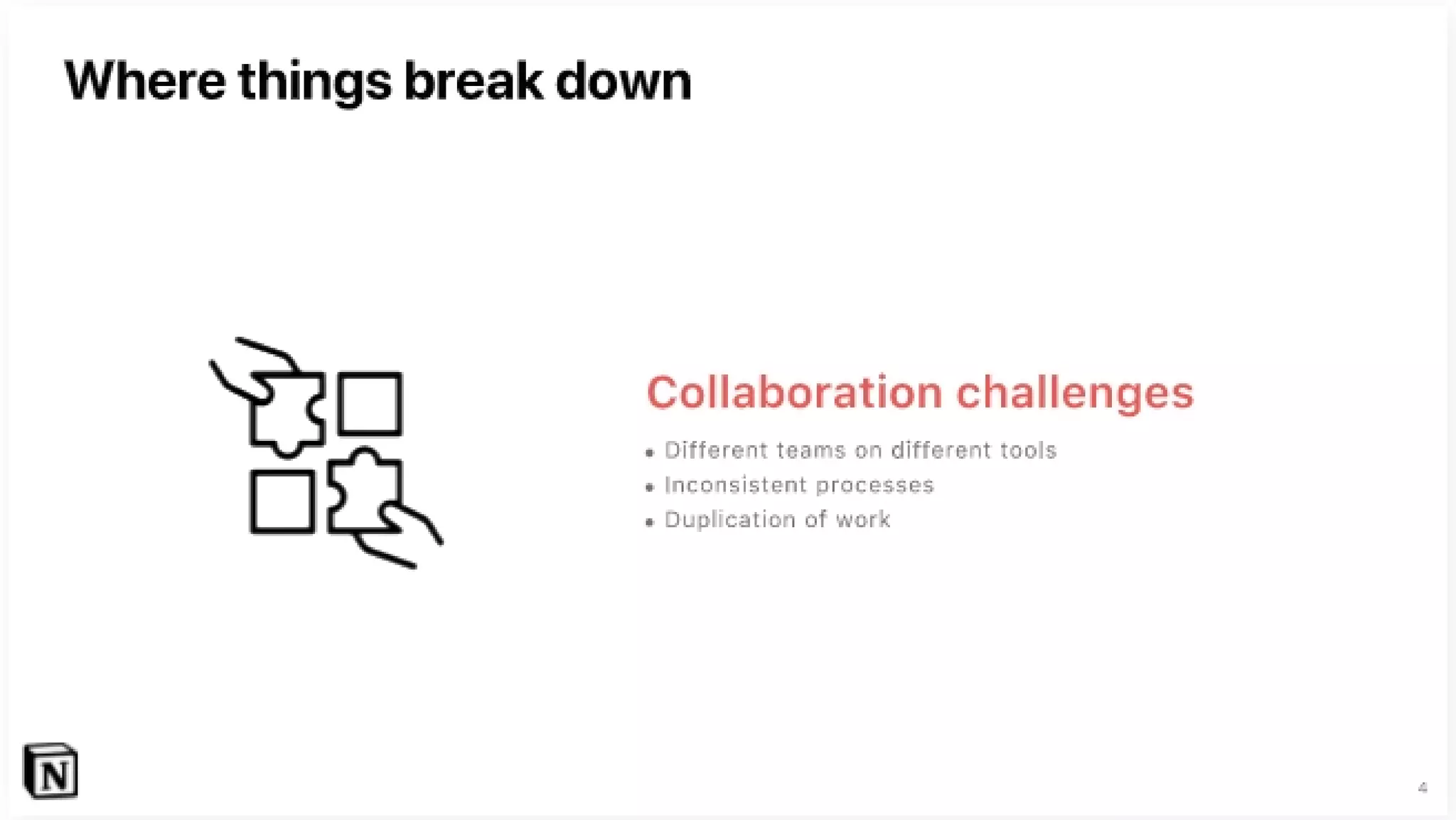
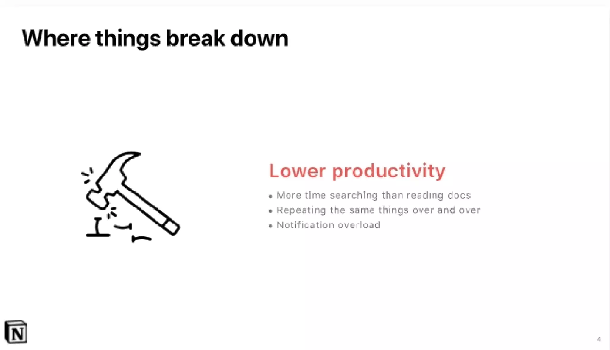
Consequences: Where things break down

Consequences: Where things break down

The deck follows the problem with specific consequences: lower productivity, collaboration challenges, and lack of transparency. Each consequence gets a dedicated slide with a large icon and a short bullet list. This structure translates abstract pain into operational impact (e.g., notification overload, repeated work, inconsistent processes), which helps investors understand the economic and organizational stakes.

The design choice — pairing a single icon with concise bullets and large type — makes the consequences easy to scan and remember. For founders, this is a useful pattern: move from problem to measurable or observable consequences that your product will alleviate. That builds a bridge to a solution that feels necessary rather than optional.

Key Takeaway: After naming the problem, list 2–3 concrete, operational consequences that show why solving it matters.
The Solution: One single workspace

The Solution: One single workspace

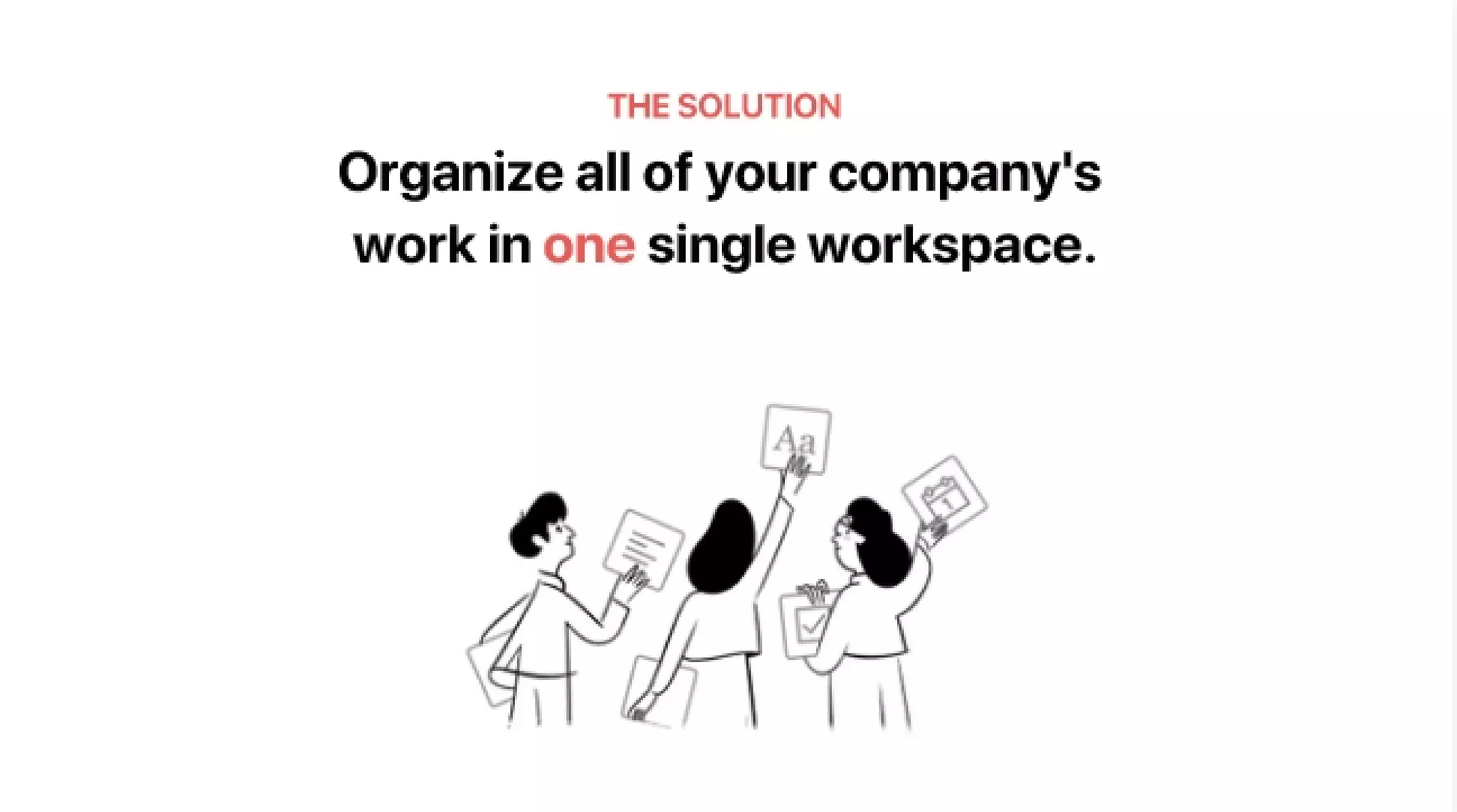
Notion's solution slide is a clear, bold claim: "Organize all of your company's work in one single workspace." The slide uses large typography and a simple illustration to restate the product promise. This is the natural payoff to the problem section — it’s short, confident, and directly addresses the pains previously described.

The slide is effective because it keeps the solution statement high-level and aspirational while preparing the audience for the next slides that show product mechanics. Founders should emulate the pattern of stating a concise, memorable value promise up front and then following it with concrete product examples and proof points.

Key Takeaway: Make a single, memorable solution statement that directly maps to the problem, then prove it with product detail.
Product: What we do (notes, knowledge base, tasks)

Product: What we do (notes, knowledge base, tasks)

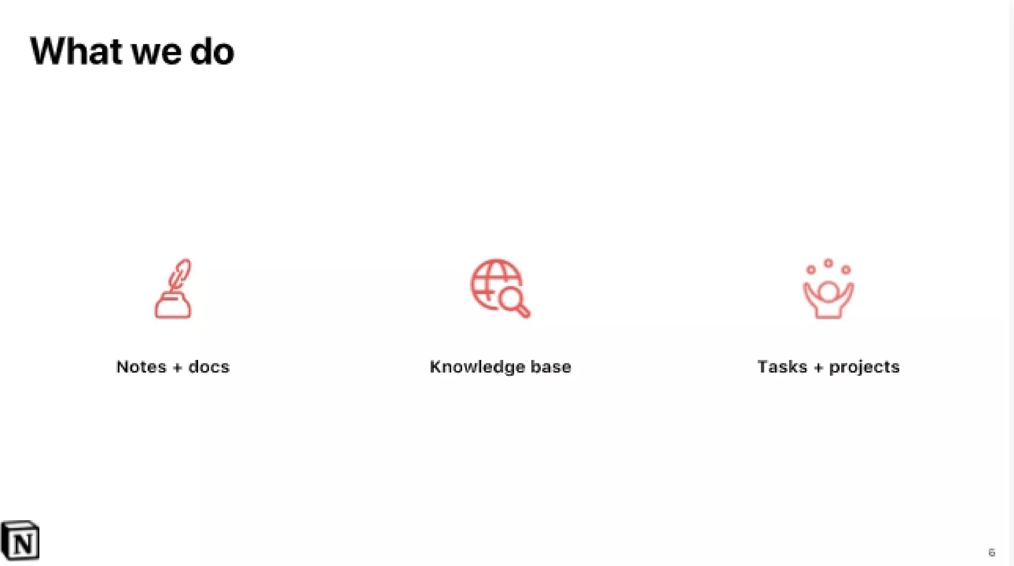
The deck follows the solution claim with a feature map: notes + docs, knowledge base, tasks + projects. The visual layout is clean — three icons and short labels — showing how Notion unifies common workplace primitives. This helps investors quickly understand the product scope without getting lost in feature minutiae.

Presenting product capabilities in discrete, complementary buckets is a useful technique: it clarifies where the product competes (docs, KB, task tools) and where it differentiates (an integrated experience). Founders should structure feature slides as a small set of mutually reinforcing capabilities tied back to the main promise rather than long feature dumps.

Key Takeaway: Group core functionality into 3–4 complementary buckets to show product scope and how pieces fit together.
Integrations & consolidation: Why this matters operationally

Integrations & consolidation: Why this matters operationally

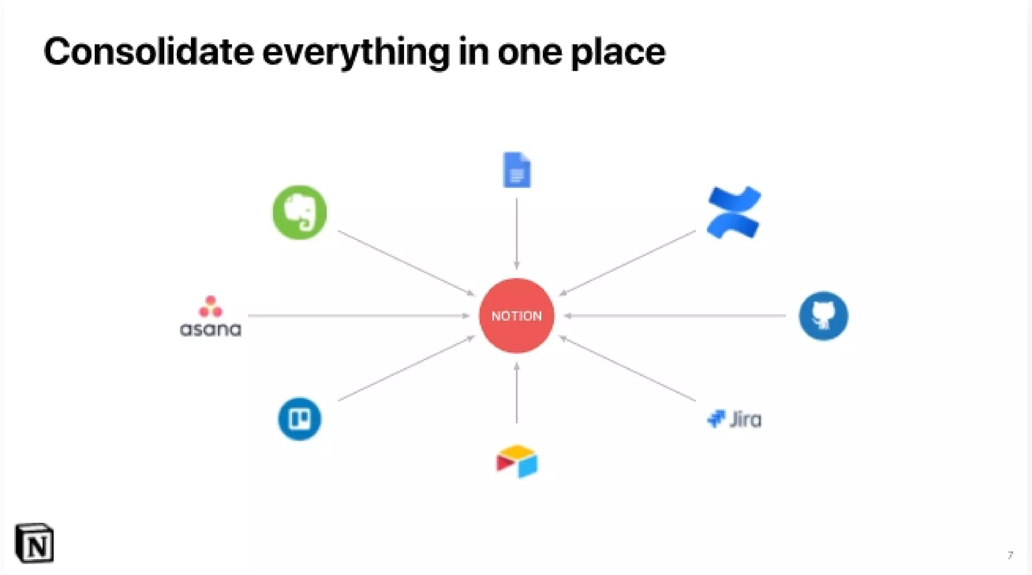
A dedicated slide shows Notion as a hub consolidating other tools (Evernote, Google Docs, GitHub, Trello, etc.) into a central workspace. The hub-and-spoke visual is immediately understandable and directly answers a key buyer question: how does this fit with existing tooling? By showing integrations and the consolidation concept visually, the deck reduces integration risk in an investor's mind and emphasizes practical adoption pathways for companies.

This slide communicates strategy as much as product: consolidation is the path to sticky enterprise adoption. Founders should include a simple integration map or migration story in their decks to show how their product slots into existing workflows and reduces customer friction.

Key Takeaway: Use a simple hub-and-spoke visual to demonstrate how your product integrates with—rather than replaces—existing tools.
Traction & social proof: Early users and testimonials

Traction & social proof: Early users and testimonials

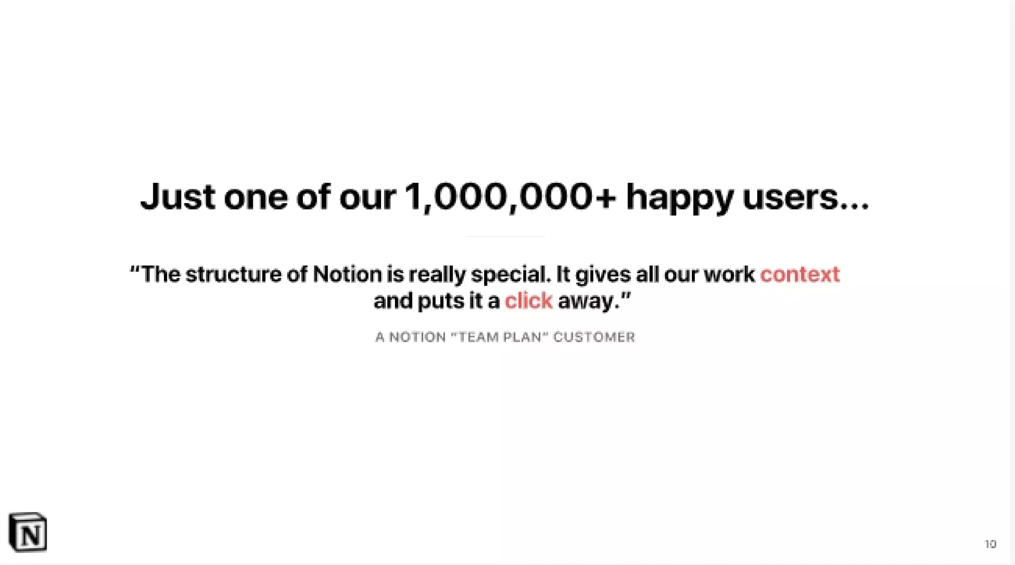
Notion includes social proof late in the deck: "Just one of our 1,000,000+ happy users" accompanied by a customer quote and logos of recognizable customers. The testimonial focuses on structure and context benefits, reinforcing the product promise with a real-world endorsement. Including user numbers and logos is an economical way to communicate early traction and market validation.

The testimonial is brief and product-focused, which keeps the narrative cohesive. Founders should prioritize concise, relevant proof points — user counts, a short quote that ties back to the value prop, and a few recognizable logos — to establish credibility without derailing the story with granular metrics.

Key Takeaway: Use a single, product-focused testimonial plus a user count and a few logos to establish credibility quickly.

Conclusion: Key Lessons

Notion's seed deck demonstrates how clarity, design discipline, and narrative economy can make an early-stage pitch compelling. Strengths include a tight problem→consequence→solution arc, large readable typography, simple visuals that scale the argument (hub-and-spoke integrations, icons for features), and concise proof points. The deck avoids technical overload and instead focuses on the user and organizational pain that the product solves.

Actionable advice for founders: lead with one clear positioning line; define a single core problem and its concrete consequences; present a short, memorable solution statement and then demonstrate how product features map to that promise; show integration paths to reduce adoption risk; and finish with crisp social proof. Keep slides visual, minimize text, and structure the narrative so an investor can tell the story aloud after a quick scan.

Full Deck Analysis

11 sections

Overview

Company: Notion
Round: Seed ($2M Seed)
Year: 2016
Outcome: Valued at $10B

Executive Summary

This 21‑slide seed deck (2016) tightly frames a simple, painful problem — information and tools are scattered across apps — and presents Notion as a single workspace that consolidates notes, docs, knowledge bases, and tasks. The deck stands out for clear visuals, product demos (desktop + mobile) and early social proof (1,000,000+ users and a handful of logos), but it omits detailed market sizing, unit economics, and founder/team credibility details that investors typically expect.


Problem Statement

How the deck articulates the problem:

  • Framed succinctly: “Information is Silo’d” / “Information is Scattered” (Slides 3 & 5). The deck uses simple visual metaphors (separate red bubbles for Google Docs, Confluence, Evernote, Dropbox, Jira, Trello, GitHub, Quip — Slide 5) to show fragmentation.
  • Clearly enumerates breakdowns caused by the problem: lower productivity (searching vs reading, duplicate work, notification overload — Slide 6), collaboration challenges (teams on different tools, inconsistent processes — Slide 7), and lack of transparency (no history, hard to share across teams — Slide 8).
  • Overall: the problem statement is focused, visual, and team/enterprise‑oriented — it targets cross‑functional breakdowns in growing companies rather than a single user pain.

Solution

How the deck positions the solution:

  • Single workspace that consolidates all company work: headline “Organize all of your company’s work in one single workspace.” (Slide 10).
  • Productized as three core capabilities: Notes + docs, Knowledge base, Tasks + projects (Slide 11).
  • Emphasizes integration/aggregation: a diagram of many tools feeding into “NOTION” (Slide 12) to show consolidation of data from tools like Google Docs, Evernote, Confluence, Jira, GitHub, Asana, Trello, Airtable, etc.
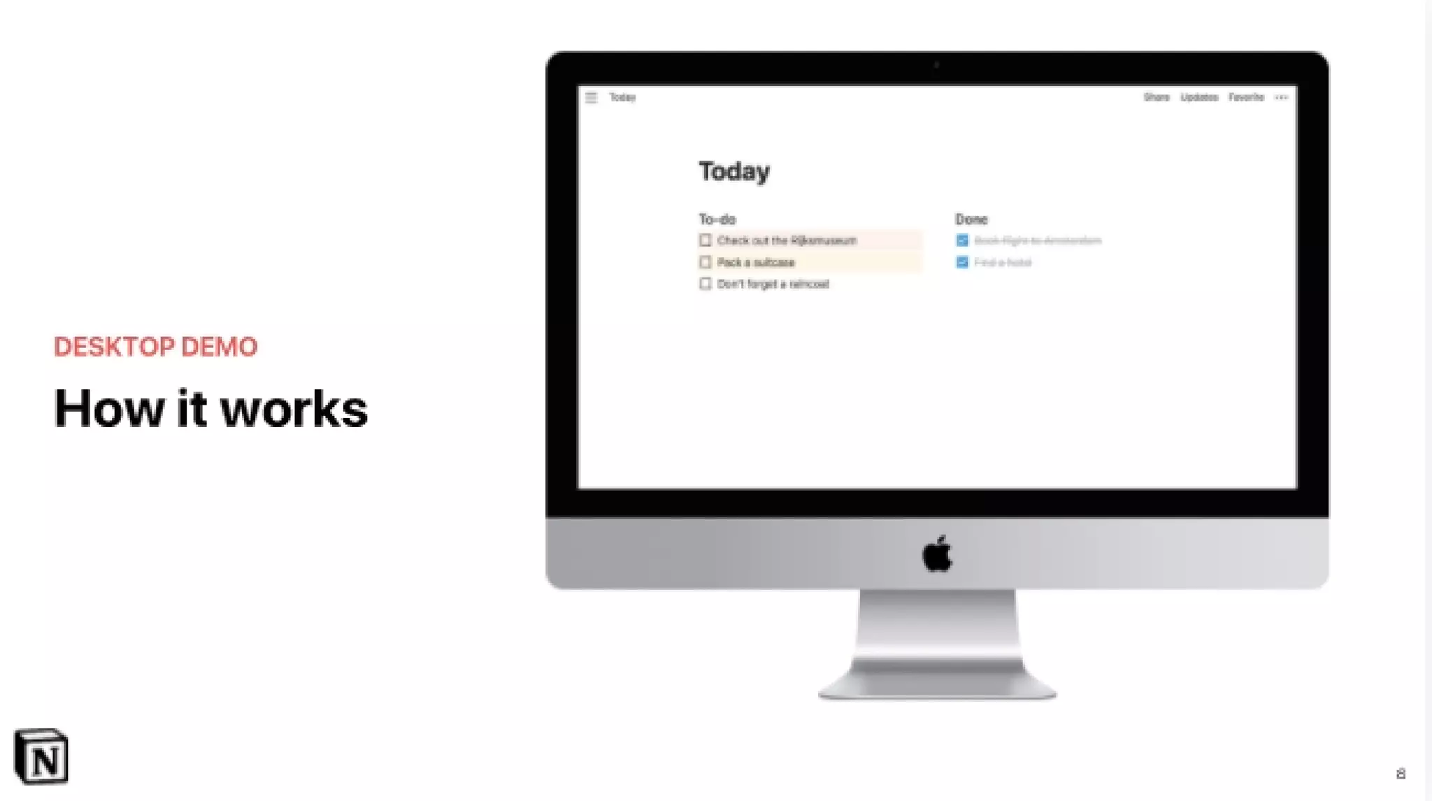
  • Demonstrates usability with “How it works” desktop and mobile demos (Slides 13 and 14).
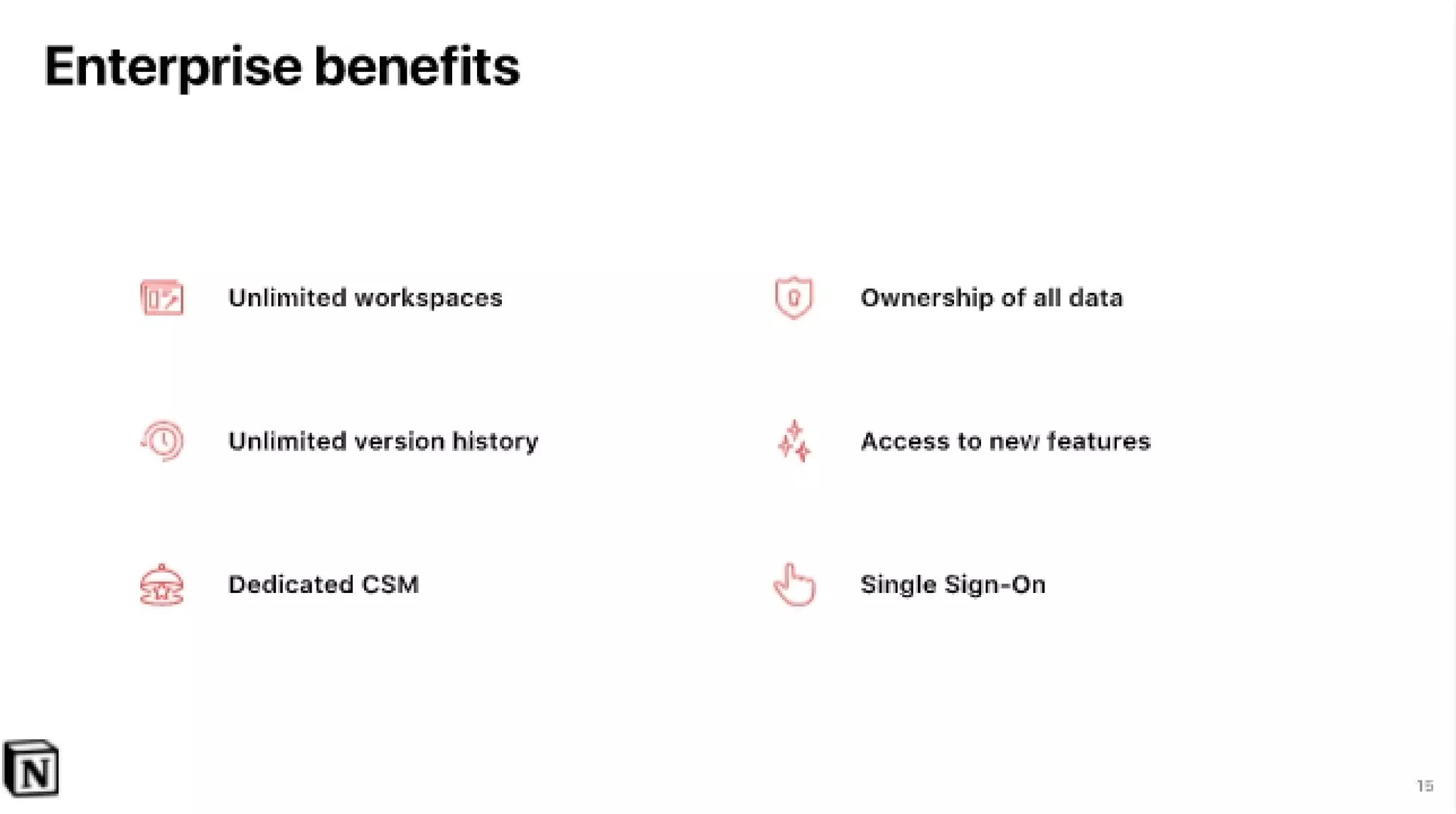
  • Enterprise features listed in Appendix (single sign‑on, unlimited workspaces, unlimited version history, dedicated CSM, data ownership — Slide 20) signaling an eventual enterprise GTM.

Market Opportunity

TAM / SAM / SOM analysis:

  • The deck does not provide explicit TAM/SAM/SOM numbers or dollar estimates in the visible slides. There are no numeric market size slides or pricing TAM charts.
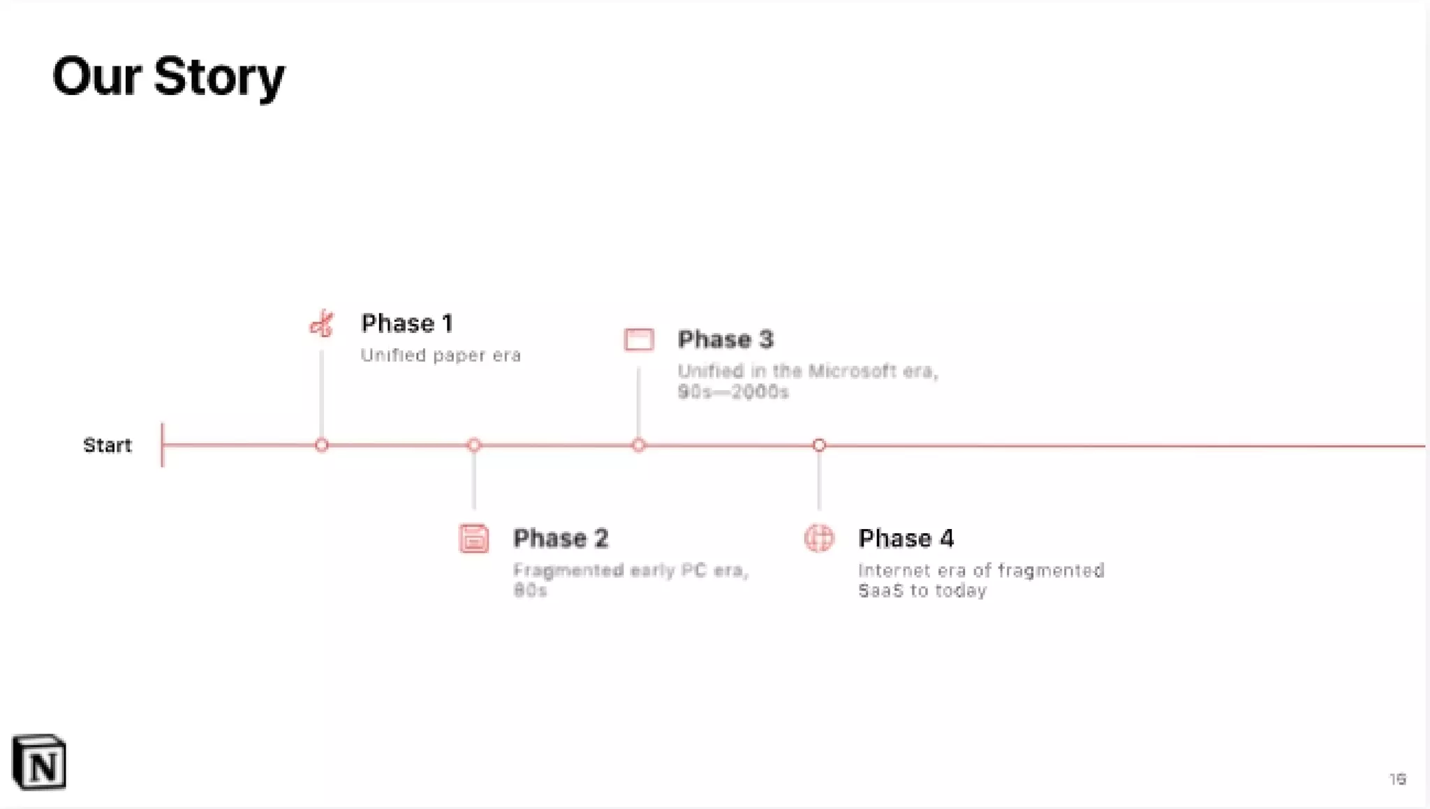
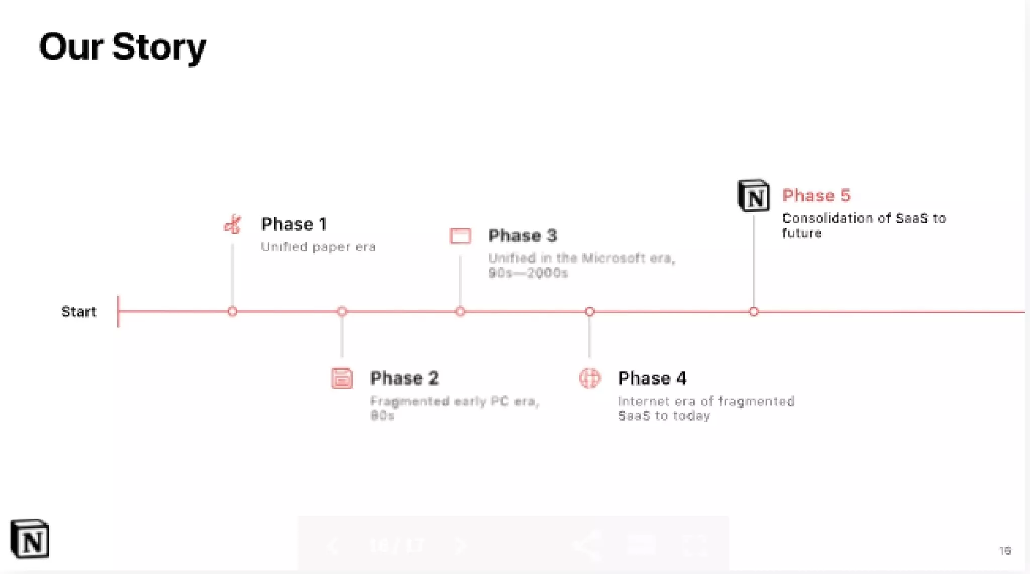
  • Implied opportunity: consolidation of SaaS tools and information management for teams (Slides 5, 10, 12, 21 “Phase 5: Consolidation of SaaS to future”).

Takeaway: market framing is strategic and qualitative (large, growing SaaS/knowledge management market) but lacks quantified TAM/SAM/SOM figures.


Business Model

Revenue model and unit economics (as presented / implied):

  • The deck does not show explicit pricing, ARPU, LTV, CAC, or unit economics.
  • Implied freemium / product-led to enterprise expansion:
    • Core product demos emphasize consumer/team usage (Slides 13–14).
    • Appendix lists enterprise benefits (Slide 20) like SSO and Dedicated CSM, implying a paid enterprise tier / seat licensing model.
  • No clear monetization slide or revenue traction numbers are shown.

Traction & Metrics

Growth metrics and proof points:

  • Stated user/engagement social proof: “Just one of our 1,000,000+ happy users…” (Slide 15). This is the clearest quantitative traction point.
  • Customer logos / brands shown: Duolingo, Lattice, ZEIT (Slide 16).
  • No revenue figures, no paid conversion rates, no growth rates, no retention metrics shown.
  • Product demos (Slides 13–14) show product readiness and cross‑platform availability.

Competitive Positioning

How they differentiate:

  • Product breadth: combining notes/docs, knowledge base and tasks/projects in one workspace (Slide 11) vs. single‑function tools (Slide 5 shows competitors).
  • Consolidation/Integration: selling the benefit of replacing multiple fragmented tools (Slide 12 diagram).
  • User experience and cross‑platform product demos emphasize simplicity and accessibility (Slides 13–14).
  • Enterprise readiness: features targeted at large customers (Slide 20).

Competitive message: Notion is positioned as the single integrated workspace that can replace many single‑purpose apps, with a clean UX and templates/demos to drive adoption.


Team

Team credentials:

  • The deck as shown does not include an explicit team slide with founder bios, prior companies, or roles. (No slides with team headshots or CVs were visible in the 21 images provided.)
  • This is a notable omission for an investor audience at seed stage.

Go-to-Market Strategy

Distribution approach (as shown or implied):

  • Product-led adoption evidenced by prominent demos for desktop and mobile (Slides 13–14), suggesting user acquisition through product virality and self-serve signups.
  • Template / pitch deck imagery (Slide 4) and a focus on replacing many tools implies targeting teams and SMBs first, with enterprise features later for expansion.
  • Enterprise sales implied via enterprise benefits (Slide 20) and customer logos (Slide 16).
  • Integrations (Slide 12) suggest ecosystem play to pull users from other tools.

Explicit GTM elements like CAC, channels, partnerships, or sales motion are not presented.


The Ask

What they were raising and use of funds:

  • Round detail provided externally: $2M Seed (user context). The deck itself (in the visible slides) does not show a “use of proceeds” slide or a specific ask breakdown.
  • Use of funds not detailed in the shown slides.

Investor Deep Dive

Executive summary, strengths & red flags

Executive Summary

This 21‑slide seed deck (2016) tightly frames a simple, painful problem — information and tools are scattered across apps — and presents Notion as a single workspace that consolidates notes, docs, knowledge bases, and tasks. The deck stands out for clear visuals, product demos (desktop + mobile) and early social proof (1,000,000+ users and a handful of logos), but it omits detailed market sizing, unit economics, and founder/team credibility details that investors typically expect.

Key Strengths

3 identified

1

Clear problem framing with strong visuals: The “scattered tools” story is communicated with simple, memorable visuals (Slides 3, 5–8) that quickly show the pain.

2

Product-first demonstration: Desktop and mobile demos (Slides 13–14) and a concise “What we do” slide (Slide 11) show a coherent product that is cross-platform and ready to be used.

3

Early traction & social proof: Callout of “1,000,000+ happy users” (Slide 15) and recognizable customer logos (Slide 16) lend credibility and momentum despite lack of financials.

Red Flags & Weaknesses

3 identified

1

Lack of quantifiable market sizing: No TAM/SAM/SOM numbers presented (missing explicit market sizing slide), which makes it hard to evaluate upside or go‑to‑market targets.

2

Missing monetization & unit economics: No pricing, revenue, ARPU, conversion rates (free→paid), CAC or LTV shown — critical items for investors to model returns.

3

No team slide / credentials: The deck contains no visible founder bios or team background, which is unusual at seed and makes assessment of execution risk difficult.

More Pitch Decks To Study

Compare structure, fundraising context, and investor-facing story across similar startup decks.