Compare your deck to Mural

Compare Your Deck

Mural Pitch Deck (2020)

SaaS
Stage: Series A
Raised: $23M
Year: 2020
Slides: 10
Outcome: Valued at $2B after Series C (2022)

Pitch Deck

1 / 10
Mural pitch deck - The Opening: Brand & Value Proposition
Click to expand

Deck Analysis

This deck for MURAL (Series A, SaaS visual collaboration product) presents a clear, design-forward fundraising narrative that combines product motion, proof of demand, marquee customers, and market context. Notable elements include an immediate visual identity, strong recurring revenue growth called out early, logos and testimonials from enterprise clients, and an emphasis on distributed teams — all reinforced by clean visuals and brief, bold text. The deck is effective because it matches the product’s visual collaboration value proposition with slide-level design that demonstrates product fit and traction rather than long paragraphs of explanation.

The Opening: Brand & Value Proposition

The Opening: Brand & Value Proposition

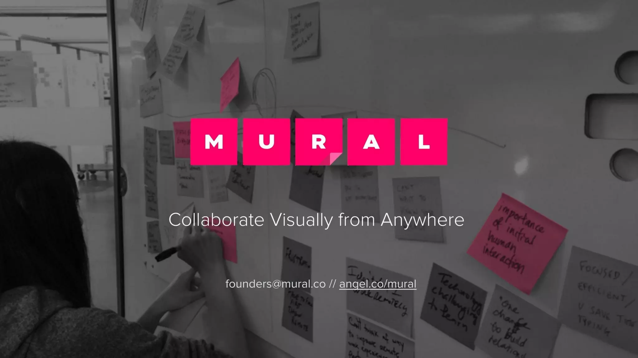
The cover (slide 1) is visually striking and tightly aligned with the product: a large MURAL mark and the tagline "Collaborate Visually from Anywhere." This immediately communicates both what the product does and who it’s for — teams that need visual collaboration across distance. Using a background photo of sticky notes on a whiteboard supports the mental model of translating a physical workshop into a digital space.

The strength here is focus. The slide doesn’t try to pitch features or metrics; it sets tone and positions the company in a single, memorable sentence. Founders can learn the power of a concise value proposition on the first slide: establish identity, promise, and the sensory feeling of the product (visual, tactile) before diving into data.
Key Takeaway: Open with a single clear value proposition and a visual that evokes your product's core experience — set the tone before presenting metrics.
Traction: Clear Revenue Growth & Unit Economics

Traction: Clear Revenue Growth & Unit Economics

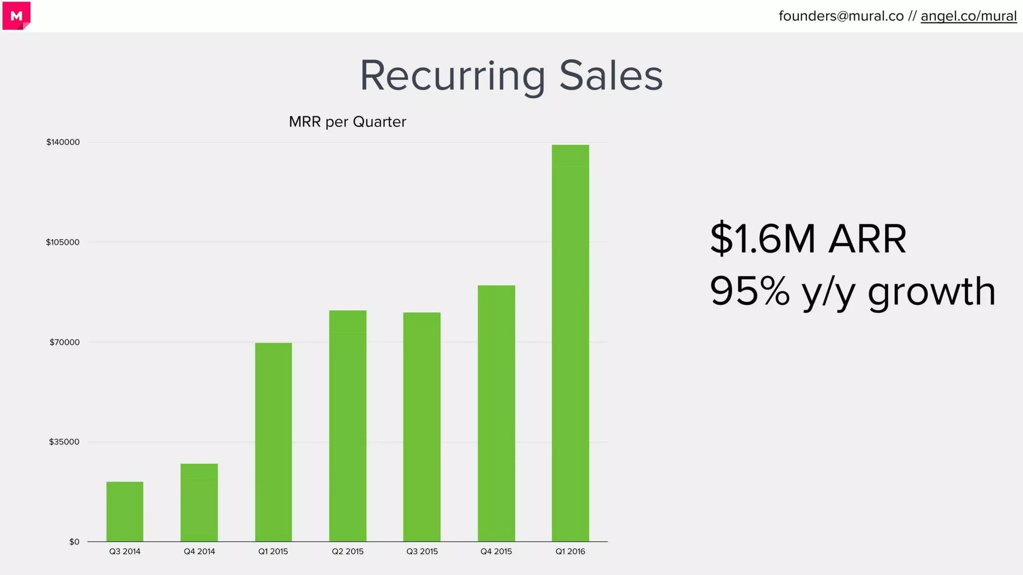
Slide 2 demonstrates recurring revenue growth with a simple bar chart and a bold ARR callout ($1.6M ARR, 95% y/y growth). The page balances a visual trendline on the left with a large, easy-to-read headline metric on the right — this is very effective for investor audiences who often scan for traction signals. The chart's green bars and minimal axis clutter focus attention on the steady increase and the big jump in the latest quarter.

This slide teaches founders to lead with one compelling metric (ARR and growth) and to back it up with an easy-to-digest visual that shows trend momentum. Avoid burying important numbers in dense tables; instead use a single slide to make both quantitative and visual impact.

Key Takeaway: Lead with one powerful traction metric and a simple visual trend to quickly communicate momentum to investors.
Social Proof: High-Quality Clients and Testimonial

Social Proof: High-Quality Clients and Testimonial

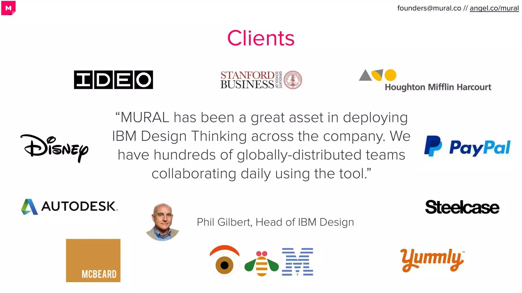
Slide 3 is a logos-and-testimonial layout: reputable brands (Disney, PayPal, Autodesk, IBM/Stanford/IDEO) are shown alongside a quote from a credible internal champion (Phil Gilbert, Head of IBM Design). This approach builds trust quickly — large enterprise logos imply product maturity and purchase viability, while the testimonial explains the usage pattern (deploying IBM Design Thinking across the company) which signals product-market fit in enterprise design workflows.

The lesson is strategic use of social proof: pair recognizable logos with a short, specific testimonial from a respected customer rather than generic praise. That combination conveys both breadth (many clients) and depth (enterprise adoption and daily usage). Founders should secure one or two high-authority quotes and feature them with logos to maximize perceived credibility.

Key Takeaway: Showcase a mix of marquee logos and a short, specific customer quote to demonstrate both adoption and meaningful usage.
Market Reality: Distributed Teams Are Everywhere

Market Reality: Distributed Teams Are Everywhere

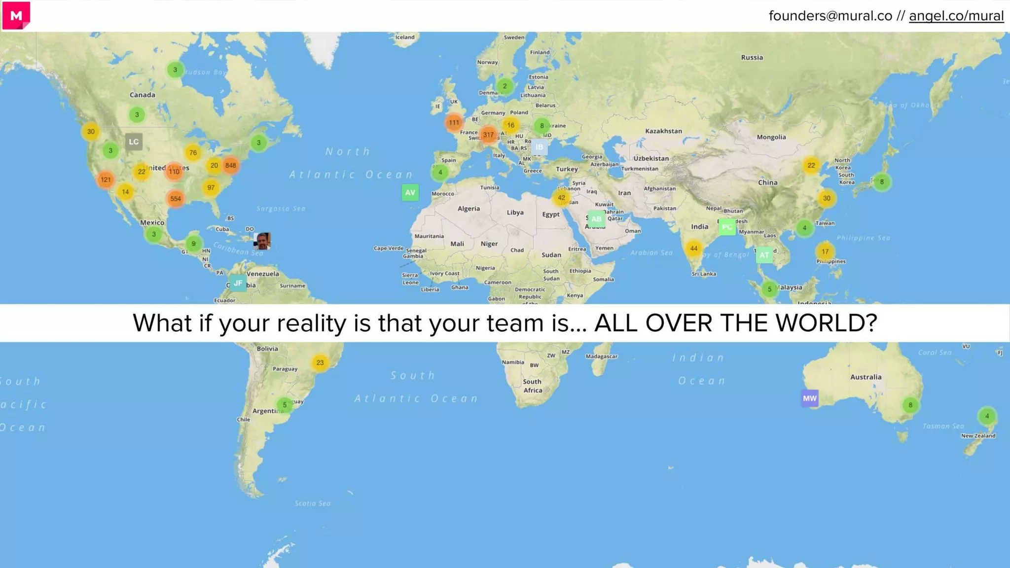
Slide 5 (the global map) frames the core problem: teams are distributed globally. The map with clustered user pins and the banner text "What if your reality is that your team is... ALL OVER THE WORLD?" makes the market context visceral. Rather than stating statistics, the slide visually dramatizes the distributed-team problem that MURAL solves — it creates an emotional 'aha' that justifies the product category.

This slide demonstrates how to use a single, well-composed visual to create empathy for the problem. Founders should think beyond bullet points: show the world through a user's lens and let the visual argue for the product's necessity. If you can make the problem feel immediate, the product solution that follows becomes obvious.

Key Takeaway: Use a single strong visual to make the market problem feel immediate and relatable to the investor's mental model.
Pain Points & Customer Workflows

Pain Points & Customer Workflows

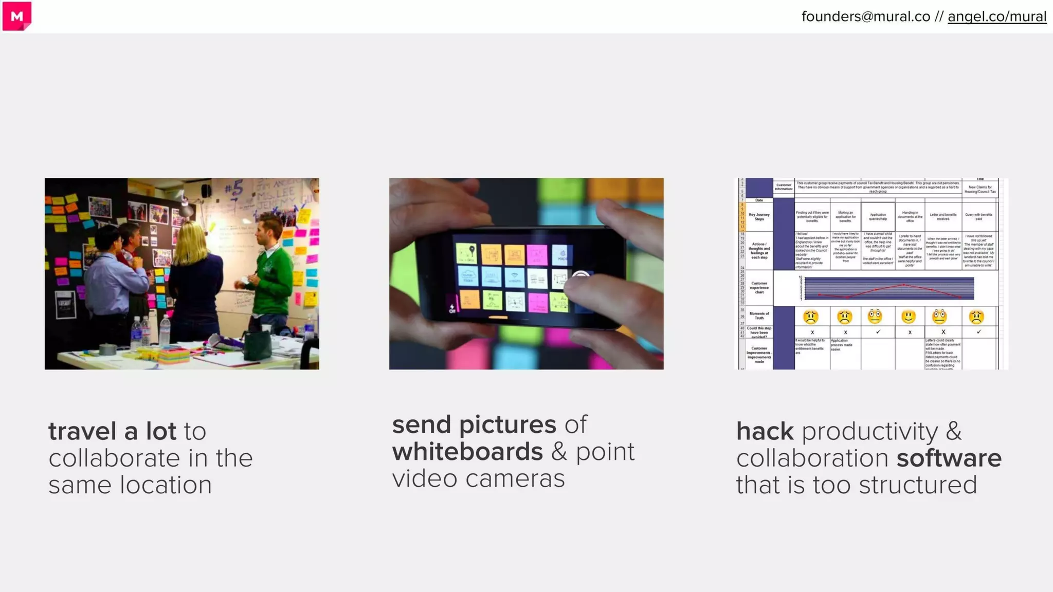
Slide 6 (three-column layout: travel a lot / send pictures / hack productivity tools) succinctly enumerates the current coping strategies teams use and why they’re insufficient. The images paired with short headlines communicate the friction: costly travel, low-fidelity photo solutions, and ill-fitting structured software. This framing leads naturally into the product as the superior alternative.

The two-paragraph structure — problem, then why existing solutions fail — is compact and persuasive. Founders should emulate this: present common workarounds and explain why they break down, creating a clear gap in the market your product fills. Keep copy tight and reinforce each bullet with an evocative image.

Key Takeaway: List the common workarounds customers use and quickly explain their shortcomings to create a clear gap for your solution.
Product Positioning: Demonstrate Experience, Not Specs

Product Positioning: Demonstrate Experience, Not Specs

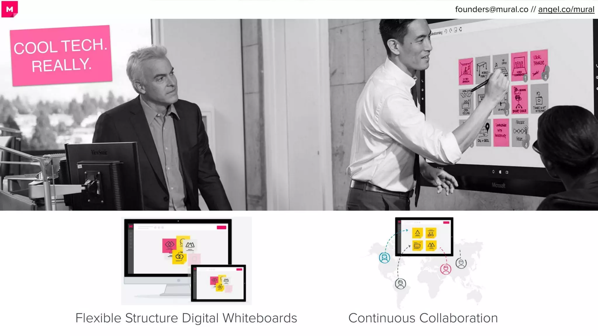
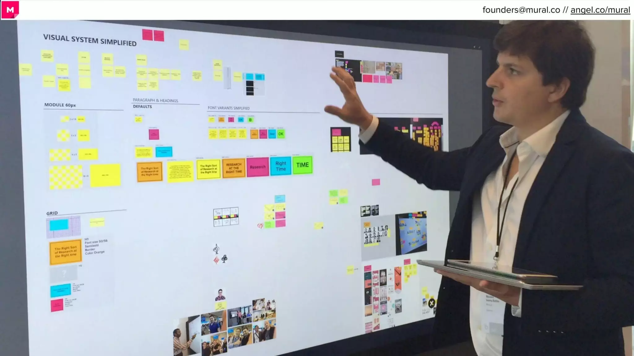
Slide 7 uses photography of real people interacting with touchscreens and two succinct labels: "Flexible Structure Digital Whiteboards" and "Continuous Collaboration." The visual approach shows the product in context rather than enumerating features; it demonstrates how the product behaves in a real meeting or workshop. The 'cool tech' banner adds personality and positions the product as modern and tactile.

This is an effective lesson: when your product's primary value is an experience (interaction, collaboration), show people using it. Feature-driven lists are less persuasive in such cases. Founders should aim to convey the emotional and practical benefits of the experience with photos or short animated demos instead of long technical descriptions.

Key Takeaway: Show real users interacting with the product to communicate experience-based value rather than listing features.
Summary & Investor Signals

Summary & Investor Signals

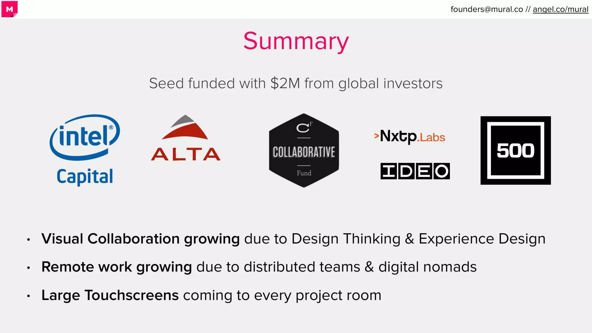
Slide 9 (Summary) consolidates the fundraising and market thesis: seed funded with $2M from notable investors, plus three crisp bullets about trends (visual collaboration, remote work, large touchscreens). Logos of investors (Intel Capital, IDEO, 500) signal credibility and validation. The slide functions as a quick refresh before the ask and shows alignment between product, market, and investor backing.

The practical takeaway is to close the investor narrative by restating funding, macro tailwinds, and why now is the moment for the company. The combination of investor logos and concise trend bullets improves credibility and helps investors quickly recall the deck's high-level arguments.

Key Takeaway: Close with a concise summary that reiterates funding, macro trends, and investor validation to reinforce credibility and urgency.

Conclusion: Key Lessons

MURAL's deck is strong because it matches form to function: visually-driven slides that demonstrate the product's experiential value, early traction presented simply, high-quality social proof, and a clear market problem framed visually. The deck uses whitespace, photography, and single-message slides to make scanning easy for investors while still telling a coherent story from problem to traction to team/funding.

Actionable advice for founders: 1) Open with a clear, evocative value proposition that reflects the product experience. 2) Lead with one or two traction metrics and make them visually prominent. 3) Use logos and a short customer quote to provide social proof. 4) Show the problem and solution through images of people and contexts, not long feature lists. 5) End with a concise summary that restates market tailwinds and investor validation. These elements together create a clean, persuasive deck that sells both product and momentum.

Full Deck Analysis

11 sections

Overview

Company: Mural
Round: Series A ($23M)
Year: 2020
Outcome: Valued at $2B after Series C (2022)

Executive Summary

Mural’s Series A deck tells a focused story: teams rely on physical sticky-note project rooms for creative collaboration but are increasingly distributed — Mural digitizes that whiteboard experience into flexible, continuous visual collaboration across devices and large touchscreens. The deck combines clear customer logos, concrete ARR / MRR growth, and a design-forward pitch (IDEO roots) to demonstrate product-market fit for enterprise and design teams.

Problem Statement

How the deck articulates the problem:

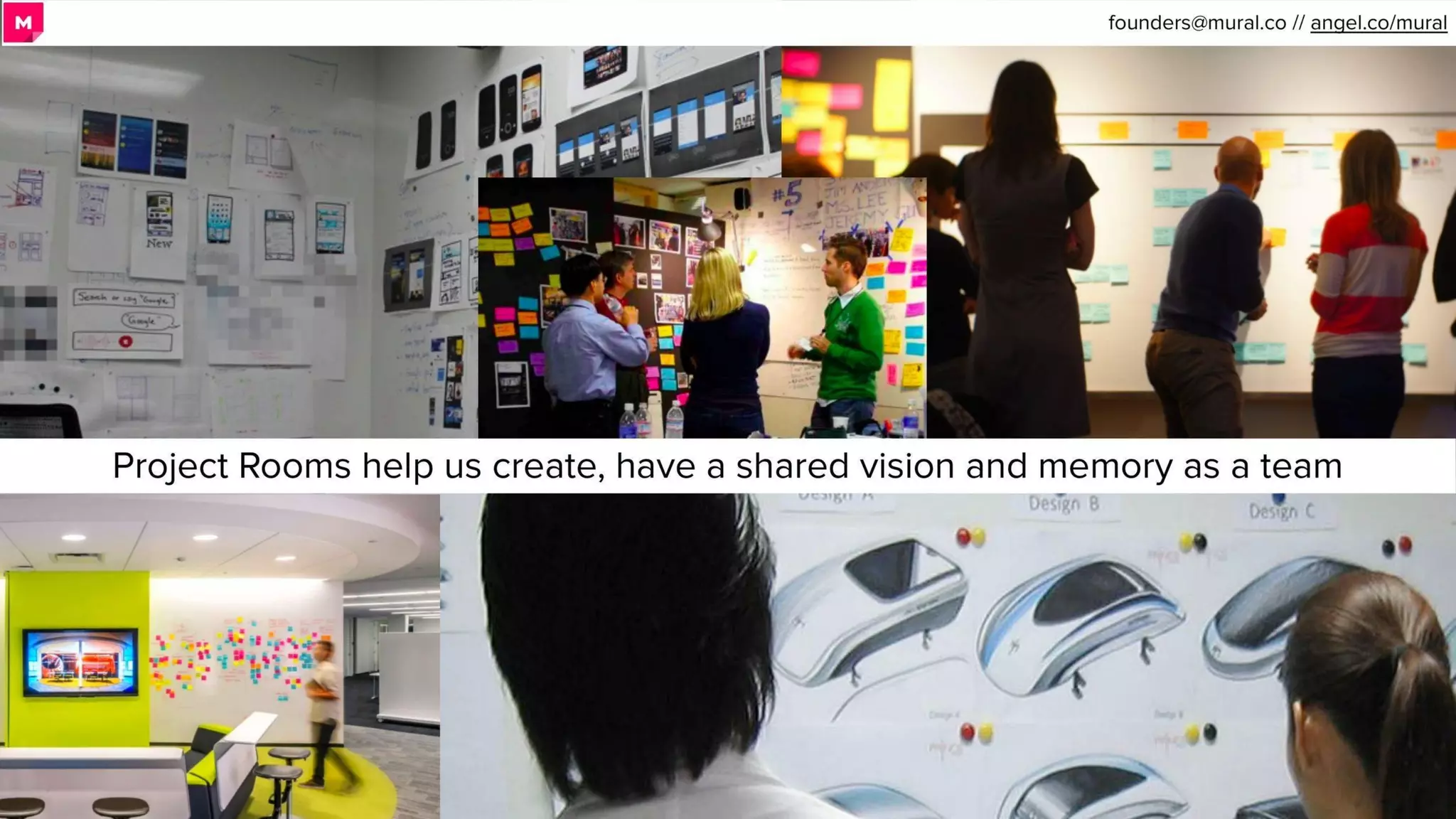
  • Distributed teams lose the shared vision & memory that physical project rooms provide (Slide 4: “Project Rooms help us create, have a shared vision and memory as a team”).
  • Practical workarounds are inefficient: teams travel to collaborate in-person, send photos of whiteboards, or use overly structured productivity tools that don’t map to creative work (Slide 7: “travel a lot… send pictures of whiteboards… hack productivity & collaboration software”).
  • The global distribution of users exacerbates the issue — “What if your reality is that your team is… ALL OVER THE WORLD?” accompanied by a world map of users (Slide 6).

Solution

How the deck positions the solution:

  • A flexible digital whiteboard product that recreates the sticky-note/project-room experience online and supports continuous collaboration across locations and large touchscreens (Slides 1, 8, 10).
  • Product benefits emphasized: “Collaborate Visually from Anywhere” (Slide 1), “Flexible Structure Digital Whiteboards” and “Continuous Collaboration” (Slide 8).
  • Use cases shown: design workshops, product discovery, and project rooms — positioning Mural for design teams, agencies, and enterprise innovation groups.

Market Opportunity

  • The deck argues macro tailwinds rather than presenting hard TAM figures:
    • Visual Collaboration expanding because of Design Thinking & Experience Design (Slide 9 summary).
    • Remote work increasing with distributed teams & digital nomads (Slide 9).
    • Large touchscreens becoming common in project rooms (Slide 9).
  • No explicit TAM / SAM / SOM numeric estimates are provided on the slides. (This is a notable omission.)

Business Model

  • SaaS, recurring revenue model implied by MRR / ARR metrics (Slide 2: “MRR per Quarter” chart).
  • Enterprise / team subscription positioning: evidence comes from customer logos and testimonial (Slide 3).
  • No slide with explicit pricing tiers, average contract value (ACV), gross margins, CAC, or LTV / payback period data.

Traction & Metrics

Concrete traction shown:

  • MRR growth by quarter (Slide 2 MRR per Quarter chart). Visual interpretation of chart:
    • Q3 2014: ~ $25k MRR
    • Q4 2014: ~ $35k MRR
    • Q1 2015: ~ $70k MRR
    • Q2 2015: ~ $90k MRR
    • Q3 2015: ~ $85k MRR
    • Q4 2015: ~ $105k MRR
    • Q1 2016: ~ $140k MRR
  • Callout on Slide 2: $1.6M ARR and 95% year-over-year growth.
  • Customer logos and enterprise proof points (Slide 3): IDEO, Stanford, Houghton Mifflin Harcourt, Disney, PayPal, Autodesk, Steelcase, Yummly, IBM (testimonial from Phil Gilbert, Head of IBM Design).
  • Global adoption map (Slide 5) indicating geographically distributed users and clusters (suggests broad organic adoption).

Competitive Positioning

  • Differentiation centered on recreating the creative project-room experience digitally (sticky notes, freeform canvas) rather than replacing it with structured tools.
  • Design-rooted credibility (IDEO residency, product built by designers) positions them as the best UX for design/innovation workflows (Slide 8, Slide 9 team mention).
  • Not much explicit mention of competitors or direct competitive feature comparisons in the deck — differentiation is product experience + enterprise-ready collaboration.

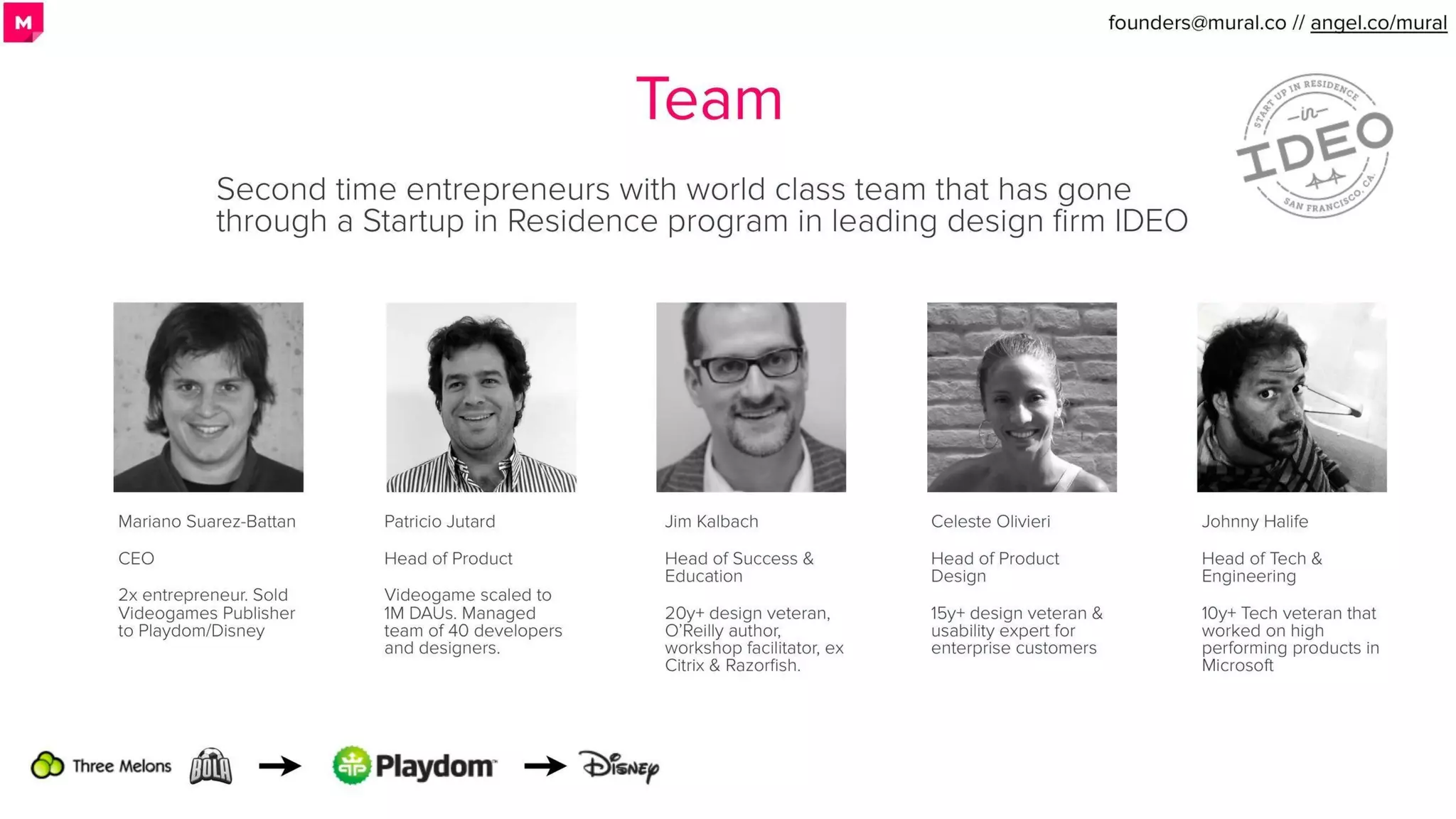
Team

  • Founders and senior team with design + product + engineering backgrounds and prior exits:
    • Mariano Suarez-Battan — CEO. 2x entrepreneur; sold videogames publisher to Playdom/Disney (Slide 8/Team slide).
    • Patricio Jutard — Head of Product. Scaled videogame to 1M DAUs; managed dev & design teams.
    • Jim Kalbach — Head of Success & Education. 20+ year design veteran; O’Reilly author; workshop facilitator.
    • Celeste Olivieri — Head of Product Design. 15+ years in design and enterprise usability.
    • Johnny Halife — Head of Tech & Engineering. 10+ year tech veteran (Microsoft experience).
  • Team credibility amplified by IDEO Startup-in-Residence background (Slide 8/Team slide) and a testimonial from IBM design leadership (Slide 3).

Go-to-Market Strategy

  • Implied GTM levers:
    • Sell into design organizations, innovation teams, agencies and enterprise product teams (Slide 3 clients & Slide 4 project-room imagery).
    • Partnerships / credibility channel via design firms (IDEO) and enterprise relationships (IBM).
    • Organic growth via remote teams adopting the product (global map, Slide 5).
  • The deck does not show explicit sales motion metrics (inside vs enterprise sales split), CAC, channel partners, or a detailed go-to-market plan.

The Ask

  • For this Series A context, the round ultimately raised was $23M (user-provided context). The deck itself shows earlier seed activity (Slide 9 notes “Seed funded with $2M from global investors”).
  • The deck does not explicitly itemize how Series A proceeds will be deployed (no use-of-proceeds slide). Typical use cases likely: scale sales & customer success, product development for large screens & integrations, and international expansion — but these are not documented in the slides.

Investor Deep Dive

Executive summary, strengths & red flags

Executive Summary

Mural’s Series A deck tells a focused story: teams rely on physical sticky-note project rooms for creative collaboration but are increasingly distributed — Mural digitizes that whiteboard experience into flexible, continuous visual collaboration across devices and large touchscreens. The deck combines clear customer logos, concrete ARR / MRR growth, and a design-forward pitch (IDEO roots) to demonstrate product-market fit for enterprise and design teams.

Key Strengths

3 identified

1

Traction with clear MRR / ARR and high y/y growth

2

High-quality customer validation and reference logos

3

Distinct product positioning with design heritage

Red Flags & Weaknesses

3 identified

1

Missing market sizing (TAM/SAM/SOM) and financial projections

2

Lack of unit economics and GTM conversion metrics

3

Limited competitive analysis and pricing clarity

More Pitch Decks To Study

Compare structure, fundraising context, and investor-facing story across similar startup decks.