Compare your deck to Kahoot

Compare Your Deck

Kahoot Pitch Deck (2015)

Edtech
Stage: Seed
Raised: $6.5M
Year: 2015
Slides: 23
Outcome: Acquired by Goldman Sachs AM for $1.7B (2023)

Pitch Deck

1 / 23
Kahoot pitch deck - Cover: Clear brand & mission
Click to expand

Deck Analysis

This deck is a product-focused tutorial-style pitch for Kahoot — an edtech, game-based learning platform — presented during its Seed-era positioning in 2015. Rather than a fundraising narrative full of market charts, this deck walks a teacher through setup, creation, and live gameplay to demonstrate product-market fit with clear, tangible value: high student engagement driven by simple, mobile-first multiplayer quizzes. Its notability comes from packaging the product as the pitch: the deck doubles as an adoption guide that helped drive viral classroom usage, a strategy that contributed to rapid growth and ultimately a high-value exit.

Cover: Clear brand & mission

Cover: Clear brand & mission

The opening slide (cover) uses a bright, friendly visual of the Kahoot brand and an explicit tagline — "For a better education" — that immediately establishes mission and target audience. The imagery (globe, playful type) signals an educational product with global reach and a light, game-like personality; this primes viewers for a product that is both playful and pedagogical. The slide functions as more than decoration: it orients readers to the context and tone of the entire deck, which is teacher-focused, practical, and action-oriented.

Founders can learn the power of a simple, well-branded cover: set expectations for the rest of the presentation and make it obvious who benefits. The combination of mission statement and strong visual identity reduces cognitive load and invites the audience to continue — crucial when the deck is also intended as a how-to resource for non-technical users (teachers and educators).

Key Takeaway: Lead with a concise mission and consistent visual identity so the audience immediately understands who the product helps and why it matters.
Value proposition & context (teacher-facing)

Value proposition & context (teacher-facing)

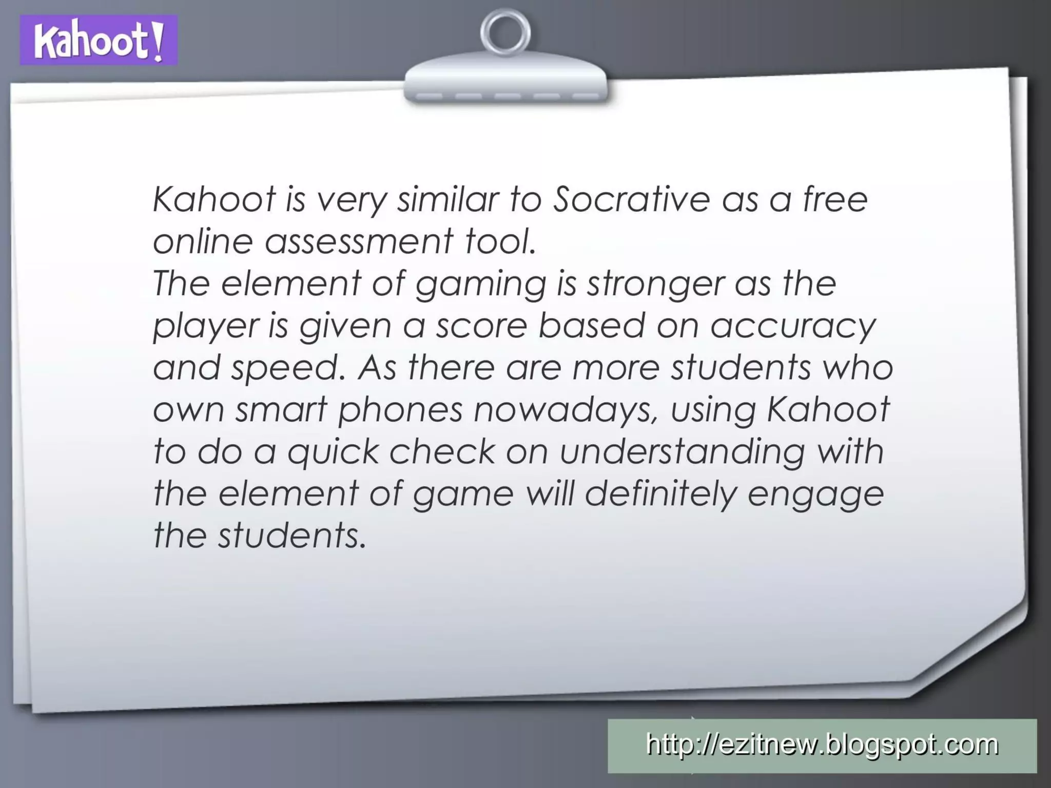
The second slide positions Kahoot relative to other classroom tools (mentions Socrative) and emphasizes the differentiator: gamification that rewards both accuracy and speed, combined with widespread smartphone ownership. This slide smartly frames the use-case and the viral distribution channel (students' own devices), which together explain how the product solves a practical problem (quick check-ins) while increasing engagement.

For founders, this is a reminder to explicitly state why customers will switch or adopt your product: point-of-use advantages (speed, engagement) and enabling conditions (device penetration) are persuasive when they are concrete and grounded in current behavior. The slide is effective because it connects product mechanics to teacher goals (engagement + assessment speed), rather than dwelling on tech specs.

Key Takeaway: Articulate not just what your product does but the real-world conditions and user behaviors that make adoption easy and compelling.
Immediate call-to-action: 'Try it now' onboarding

Immediate call-to-action: 'Try it now' onboarding

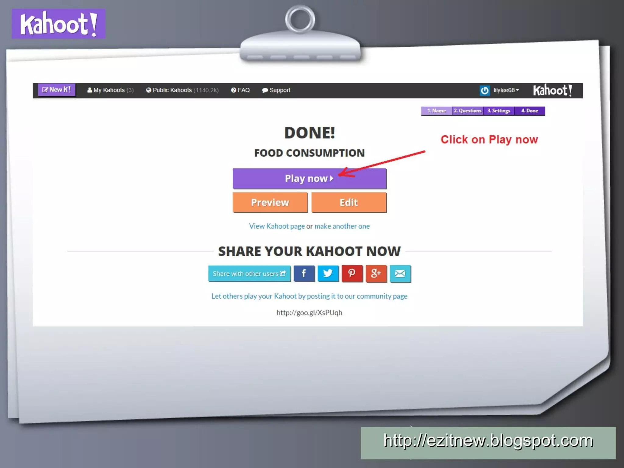
Slide 3 functions as a direct CTA: "Let's start by trying out Kahoot!" with the short URL kahoot.it. This is a powerful move in early-stage decks for product-led companies — instead of asking the viewer to imagine, you immediately invite them to experience the product. Delivering an ultra-short entry URL reduces friction and highlights a mobile-first onboarding flow that is tuned for quick adoption in classrooms.

Founders should note the effectiveness of immediate, low-friction CTAs in decks: when your product is experiential (games, collaboration, communication), giving the audience an instant way to try it creates a better impression than words alone. The slide also reinforces that the primary UX is web/mobile entry, an important distribution and retention lever.

Key Takeaway: If your product is experiential, include an immediate, low-friction CTA that lets the audience try it while their attention is highest.
Product onboarding & creation flow (teacher experience)

Product onboarding & creation flow (teacher experience)

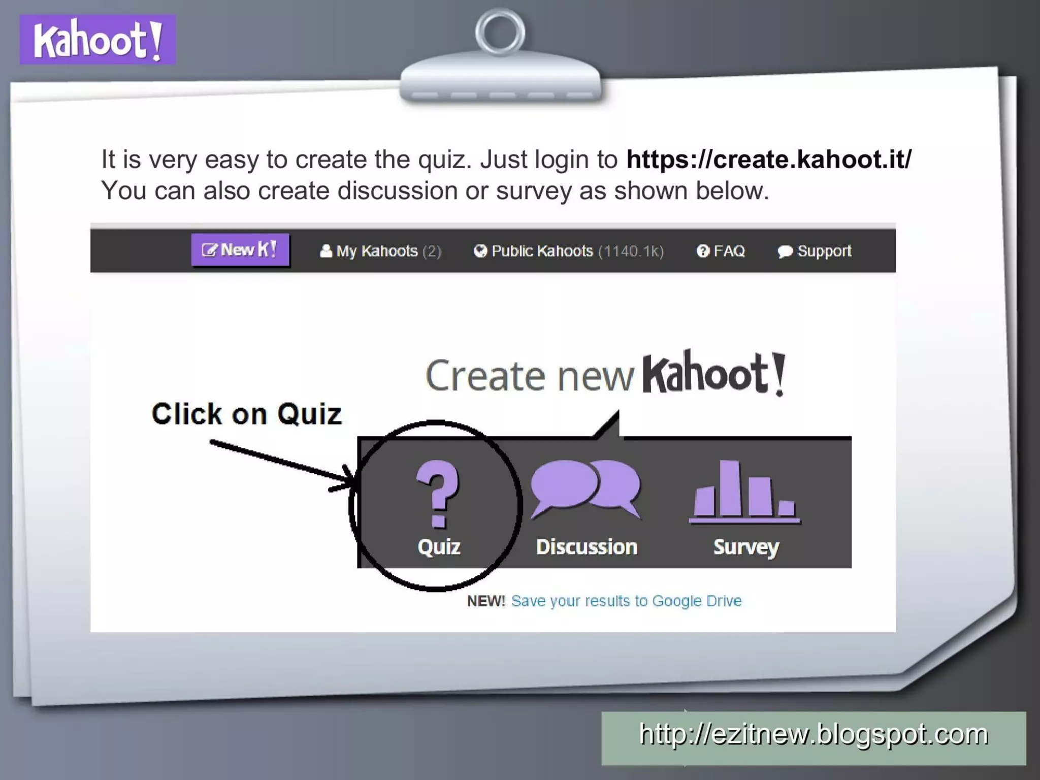
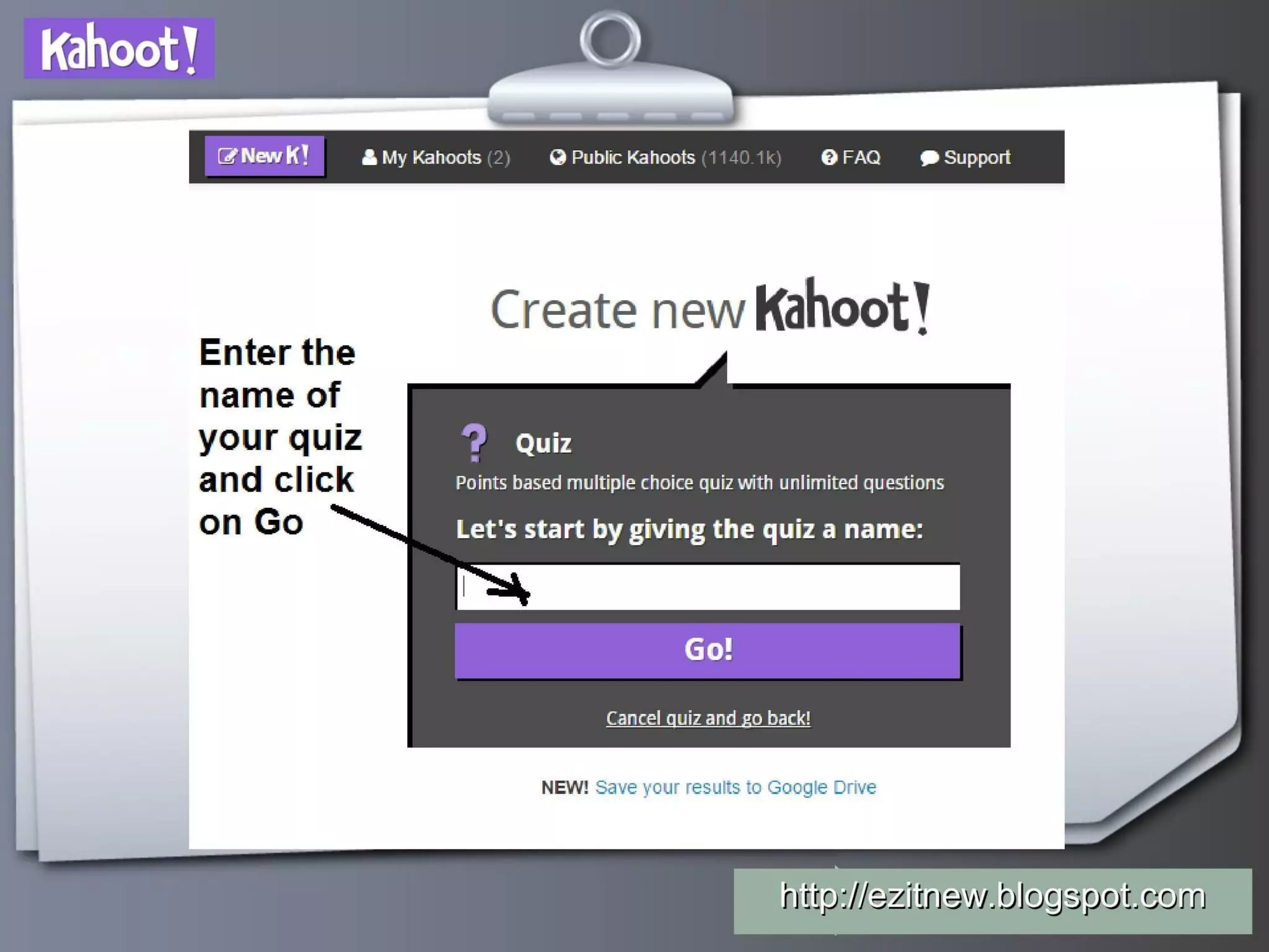
Slide 4 demonstrates how teachers begin creating a quiz on the platform (create.kahoot.it and the choice between quiz/discussion/survey). The visual guide with arrows and a simple sequence reduces fear-of-use and shows that creating content is straightforward. Highlighting multiple content modes (quiz, discussion, survey) reveals a broader product scope while the click-to-start interface emphasizes low setup time, important for adoption in busy classrooms.

This is instructive for founders: use step-by-step visuals to dismantle perceived complexity. If your onboarding matters for adoption, show the exact first steps and make it obvious how little effort is required to reach core value. For customer-facing decks, clarity around the first activation path often beats lengthy feature lists.

Key Takeaway: Show the first three steps of your onboarding — if users can reach value quickly, visualize that path to remove friction.
Question authoring UX: simplicity and media support

Question authoring UX: simplicity and media support

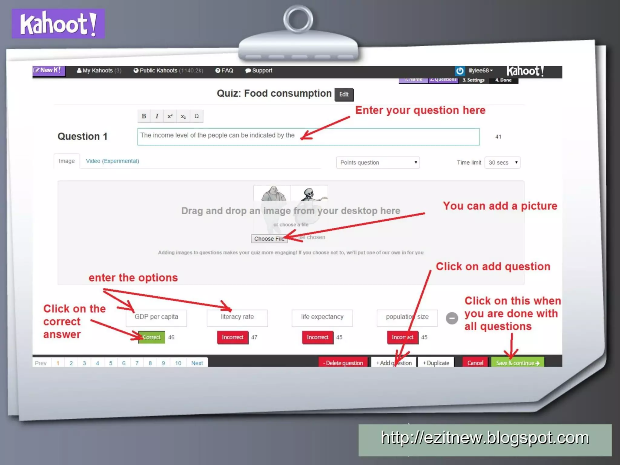
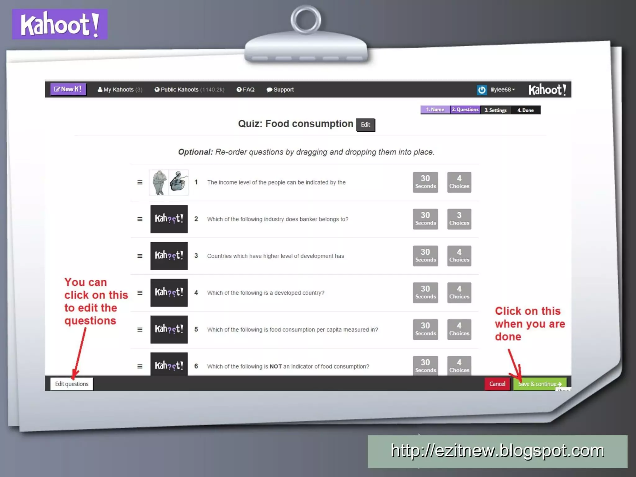
Slide 6 zooms into the question editor: text entry, image upload, marking correct answers, time limits, and adding questions. The annotated screenshot communicates that authors can customize questions with images and configure scoring/time settings while keeping the interface simple. This transparency reassures teachers that quizzes can be meaningful (not dumbed-down) while remaining quick to assemble.

Founders should emulate this clarity when showing product features: screenshots annotated with simple instructions help non-technical users picture themselves using the tool. Demonstrating support for media and configurable rules also signals that the product balances depth (rich questions) and ease (intuitive controls), which is essential for sustained usage in professional settings.

Key Takeaway: Use annotated product screenshots to lower technical anxiety and show that depth (customization) and simplicity can coexist.
Live hosting & multiplayer lobby (viral classroom mechanics)

Live hosting & multiplayer lobby (viral classroom mechanics)

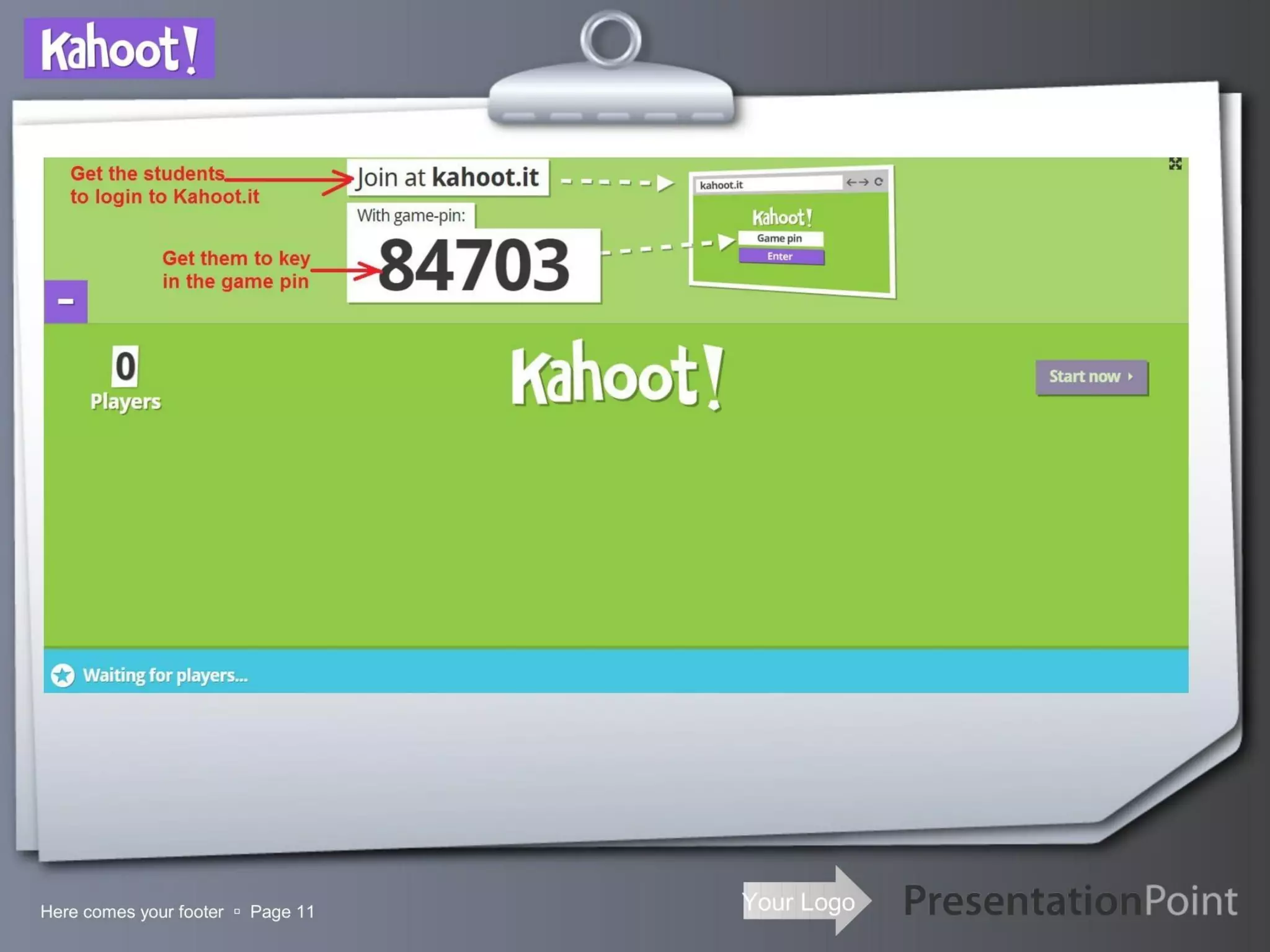
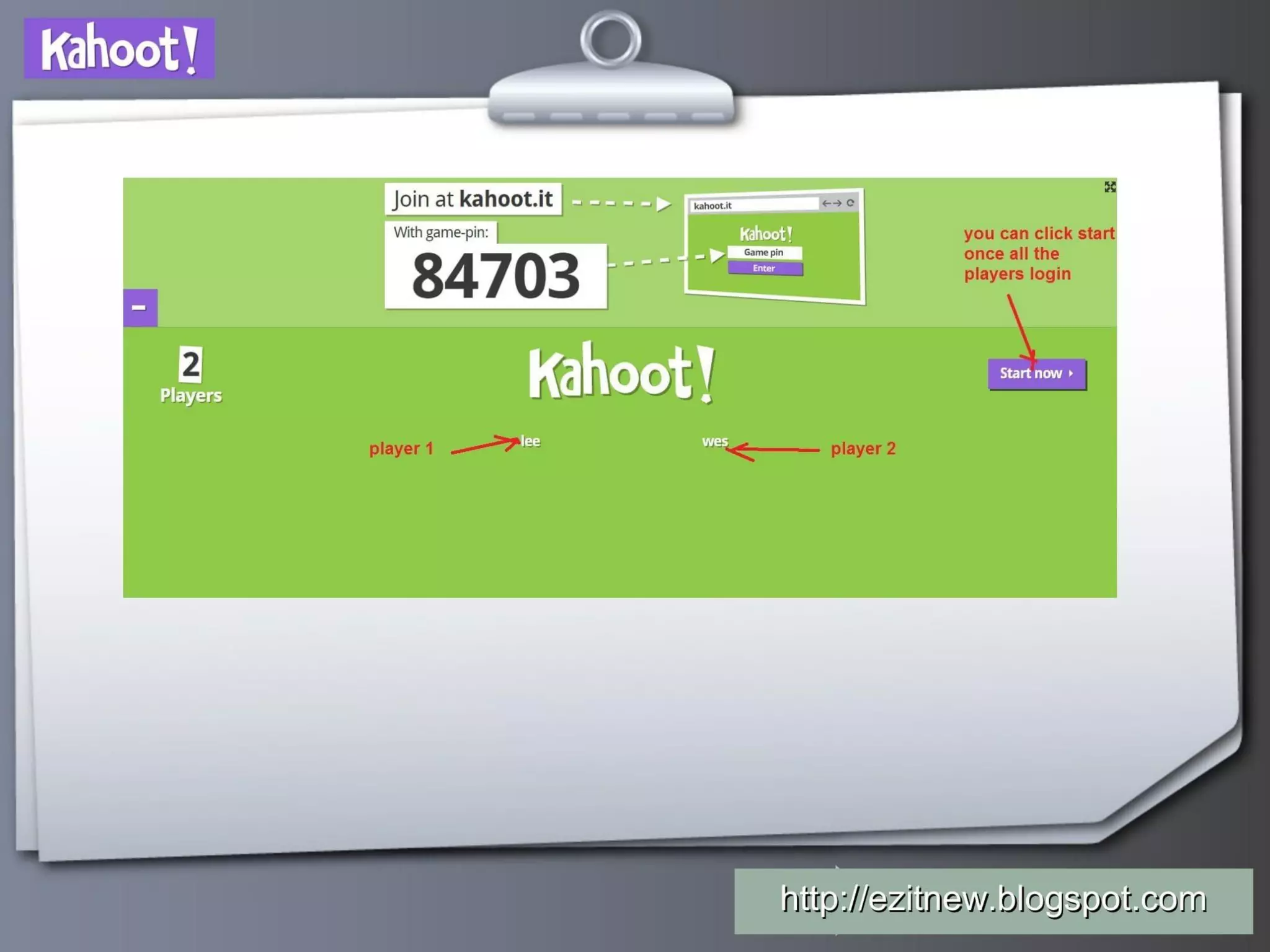
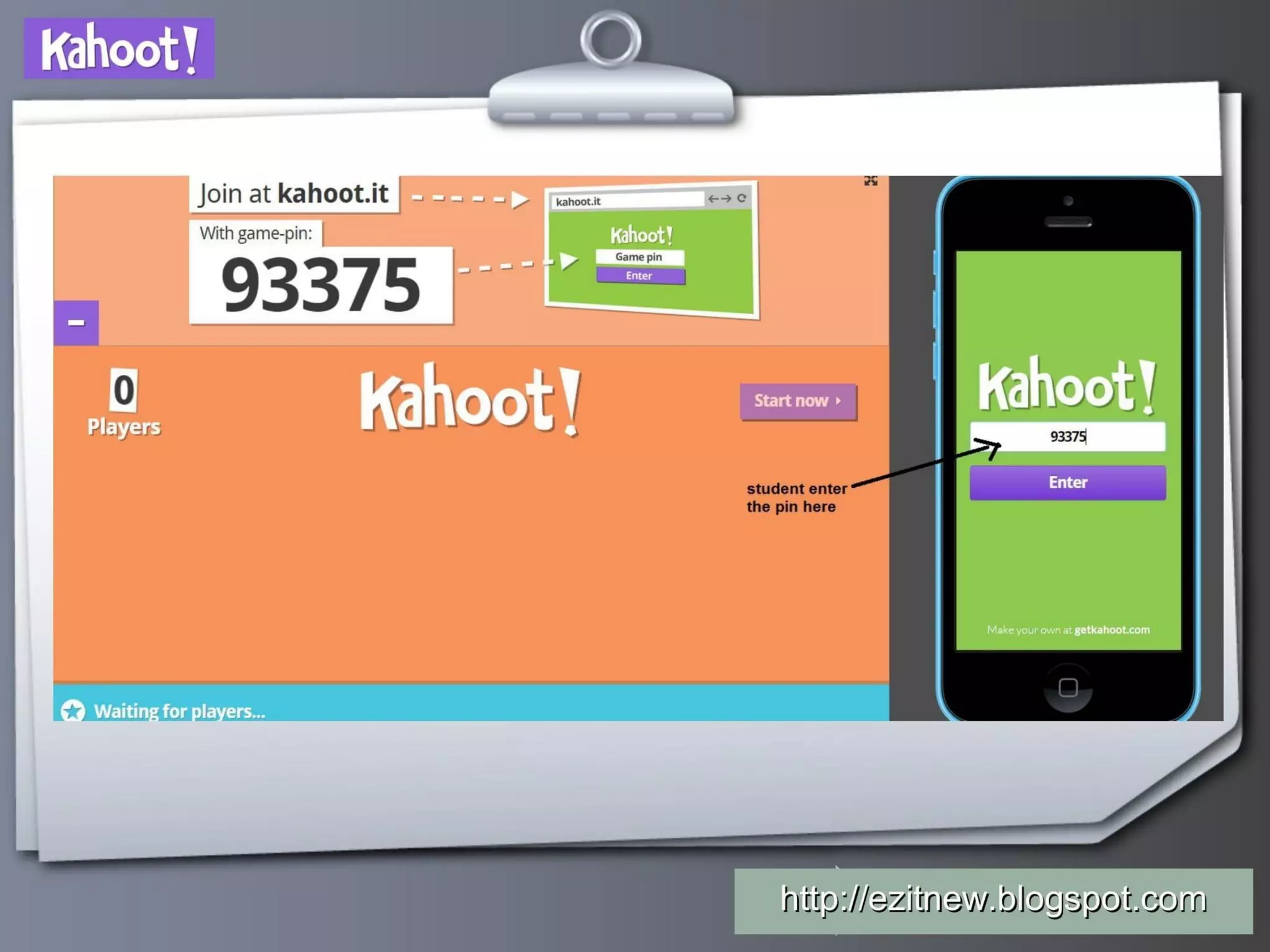
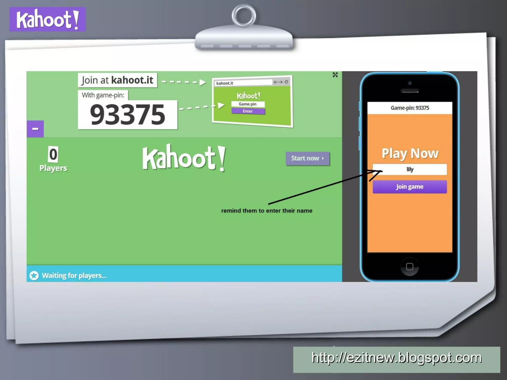
Slide 11 illustrates the live host screen and the game-pin system (showing a 5-digit code and player lobby). This is the heart of Kahoot’s viral mechanics: one teacher launches, many students join via a shared PIN on their devices. The slide demonstrates social proof (player names appearing) and the low-barrier entry that supports mass participation in minutes. It also implicitly conveys safety and teacher control: the teacher controls the pace and can wait until all players have joined.

For founders building multi-user experiences, this slide is a lesson in demonstrating orchestration mechanics — show how one user can invite many and how you handle identity and session joining. Clearly visualizing synchronous flow and the visible presence of players helps investors and adopters quickly grasp scale and classroom dynamics.

Key Takeaway: When your value depends on multi-user involvement, visually show the live orchestration (how users join and how sessions are controlled) to prove viral and synchronous utility.
Gameplay and scoring: the product’s delightful moment

Gameplay and scoring: the product’s delightful moment

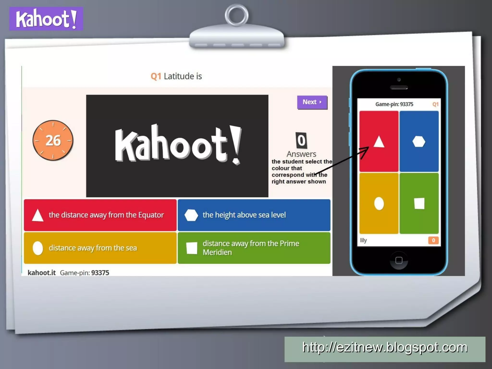
Slide 21 shows the teacher-facing question screen side-by-side with the student mobile UI — large colored answer tiles mapped to phone shapes and a visible countdown. This dual-view is effective because it conveys the synchronous, gamified interaction that creates engagement: students tap a color/shape, the teacher sees answers aggregated, and the scoreboard updates. The scoreboard screens seen elsewhere emphasize instant feedback and competition, core motivators that drive repeat use.

Startups should present the product’s "moment of delight" visually and succinctly. Showing both ends of the interaction (host and participant) clarifies the full product loop: activation → participation → feedback → retention. If your product creates a repeatable emotional experience, make that experience front-and-center.

Key Takeaway: Highlight the 'moment of delight' by showing both sides of a synchronous interaction to prove how the product creates repeatable engagement.
Pros/cons, feedback loop and CTA

Pros/cons, feedback loop and CTA

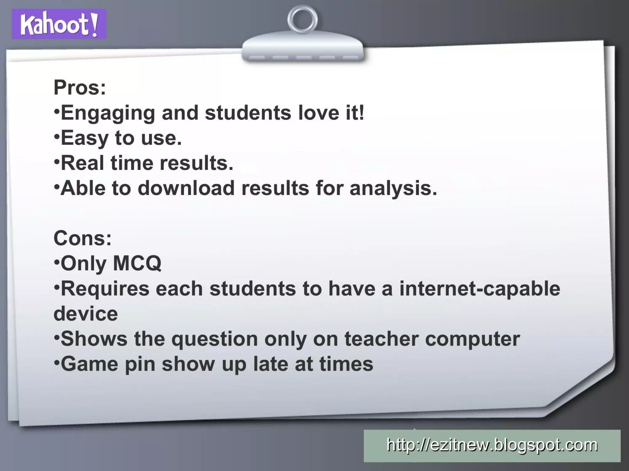
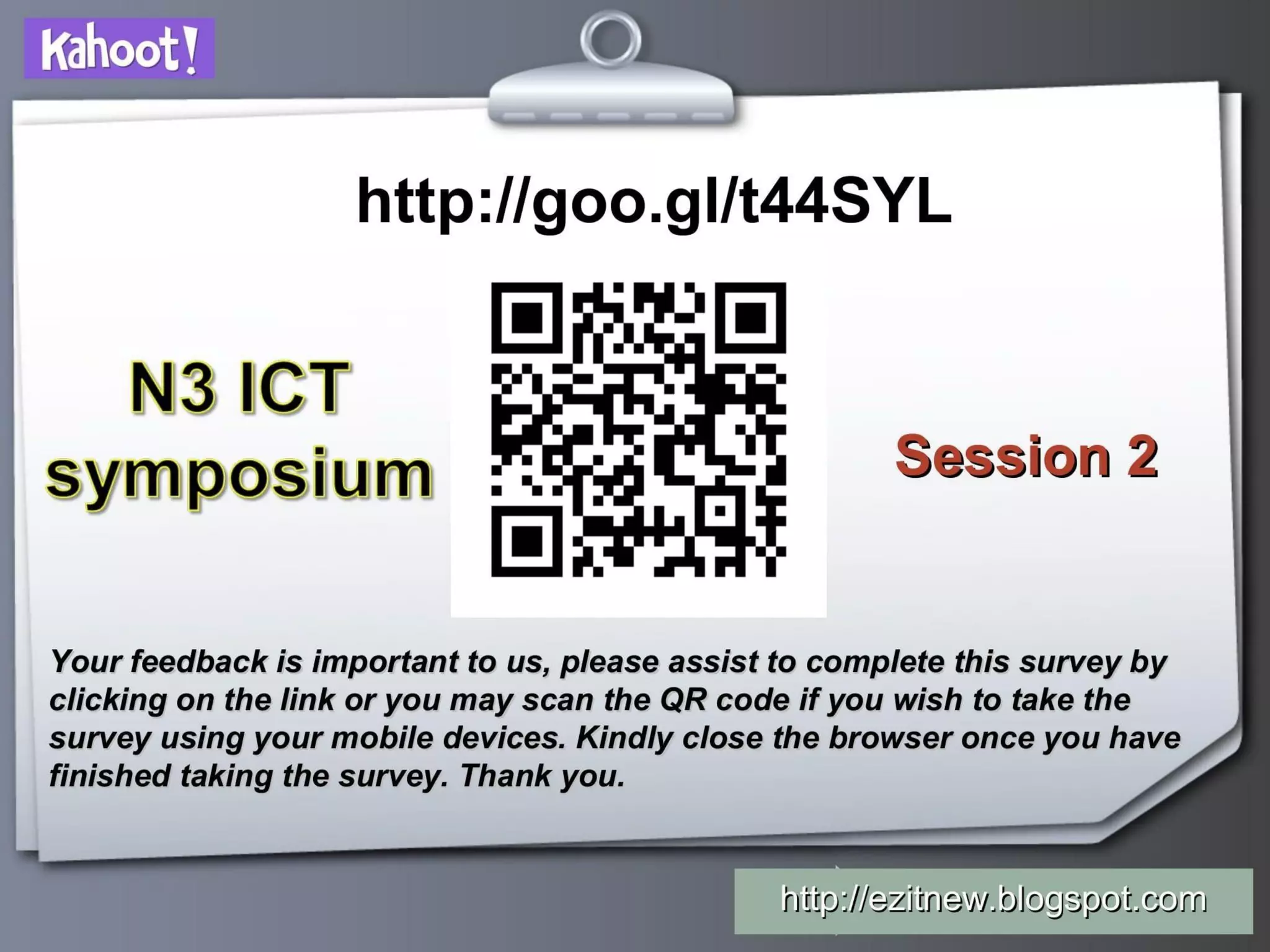
The deck concludes with an honest pros/cons list and a QR/short-link CTA for feedback (slides showing pros/cons and a QR link). Listing pros like engagement, real-time results, and exportability alongside cons (only MCQ, device requirement, occasional late game-pin) demonstrates credibility and teacher empathy — it admits limits while emphasizing practical strengths. The QR-code and feedback request turns the deck into a product adoption instrument and a data collection tool for improvement.

Founders should consider closing a deck with candid tradeoffs and a clear next action. Transparency about limitations builds trust; coupling that with a low-friction CTA (QR link, short URL) encourages immediate engagement and provides a channel to capture interested users and iterate using feedback.

Key Takeaway: End with candid tradeoffs and a low-friction CTA (short link/QR) so viewers can act immediately and you can collect real-world feedback.

Conclusion: Key Lessons

This Kahoot deck is notable for treating the pitch as product onboarding: it uses simple, annotated screenshots and immediate CTAs to turn curious viewers into active users. Strengths include a clear user-centered narrative (teacher first), demonstration of the viral multiplayer loop (game-pin), focus on the moment of delight (live gameplay and scoreboard), and transparency about limitations. Together these elements show how a product-led growth strategy can be communicated effectively in a Seed-era presentation.

Actionable advice: show the first activation path, make the experience tryable immediately, visualize multi-user orchestration, highlight the emotional value moment, and be candid about limits. For founders, a deck that teaches and converts simultaneously can accelerate adoption and make your product’s value obvious without heavy financial or market slides.

Full Deck Analysis

11 sections

Overview

Company: Kahoot
Round: Seed ($6.5M)
Year: 2015
Outcome: Acquired by Goldman Sachs Asset Management for $1.7B (2023)

Executive Summary

This deck is not a classic investor-focused pitch — it reads like a product training/tutorial for teachers showing how to create, launch and run Kahoot quizzes in class. It is notable because it demonstrates an early, very strong product-led growth motion (teacher adoption, BYOD mobile play, public content library) even though it lacks traditional fundraising elements (TAM, unit economics, team bios).

Problem Statement

  • The deck implicitly frames the problem as low engagement and lack of quick formative assessment tools in classrooms (slides 2–3: describe Kahoot as an engaging online assessment tool and compare to Socrative).
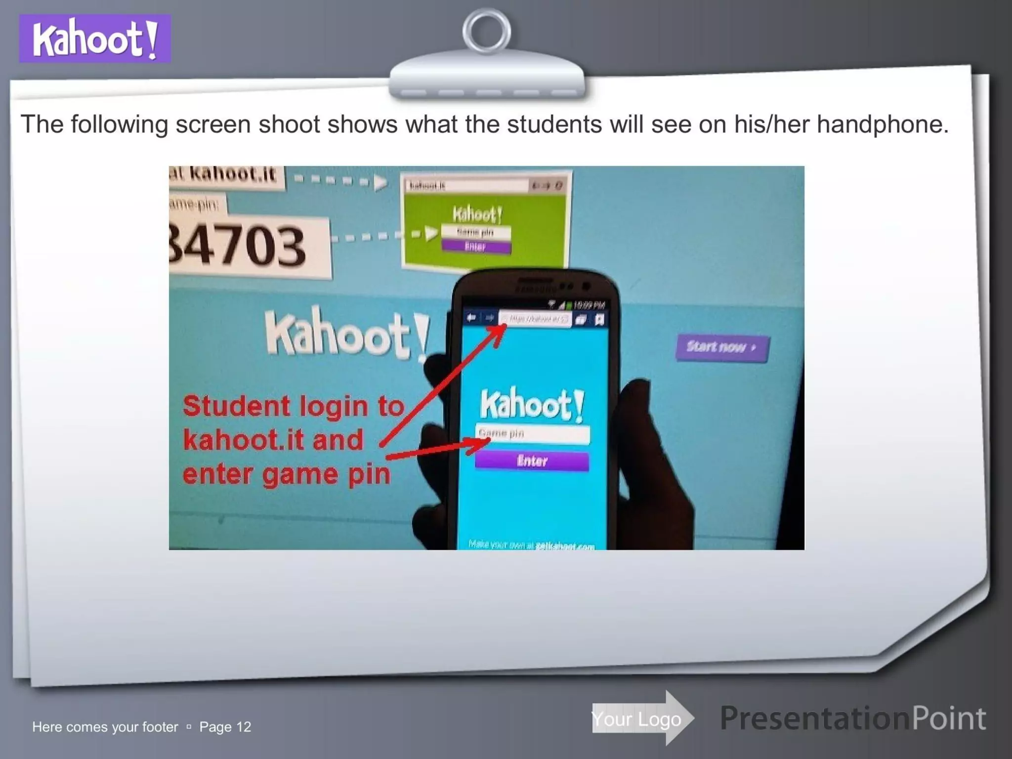
  • The slides focus on the teacher pain: needing a fast, fun way to check understanding using students’ smartphones (slides 2, 11–14 show student mobile workflow and game-pin flow).

Solution

  • Kahoot is positioned as a simple, gamified quiz platform that runs on teacher computers and students’ mobile devices (slides 1, 3, 11–14, 20–21).
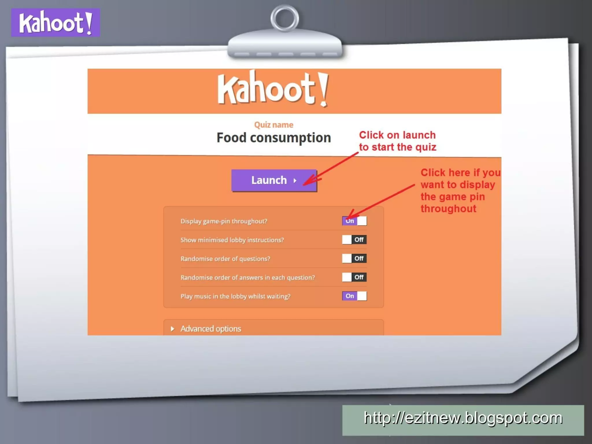
  • The deck walks through product features: create quizzes, add images/videos, set time limits, run live sessions, show live scoreboard and winners, and share/preview content (slides 4–10, 15–19, 22).
  • Emphasis is on engagement and real-time results (slide 22 pros list: “Engaging and students love it!”, “Real time results”).

Market Opportunity

  • The deck does not provide a TAM/SAM/SOM analysis or explicit market-sizing numbers.
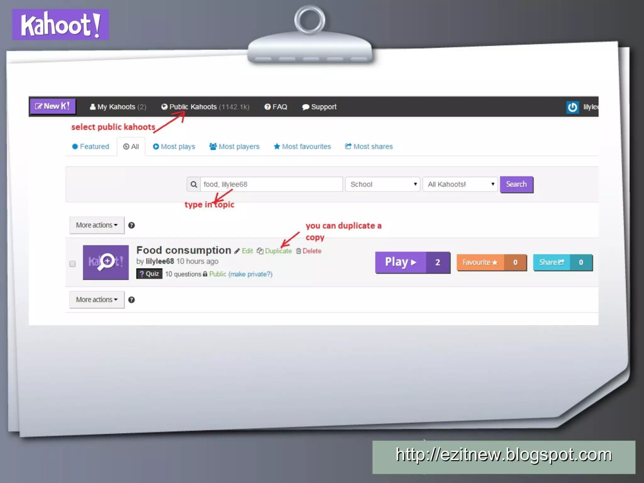
  • The UI screenshot headers hint at scale of user-generated content — “Public Kahoots (~1.14M)” is visible in the header on multiple slides (e.g., slides 6, 17) — implying a large public library and usage footprint, but this is not framed as a market-sizing slide.
  • No formal education market metrics, school adoption rates, or global penetration figures are provided.

Business Model

  • The deck contains no explicit revenue model, pricing, or unit-economics slide.
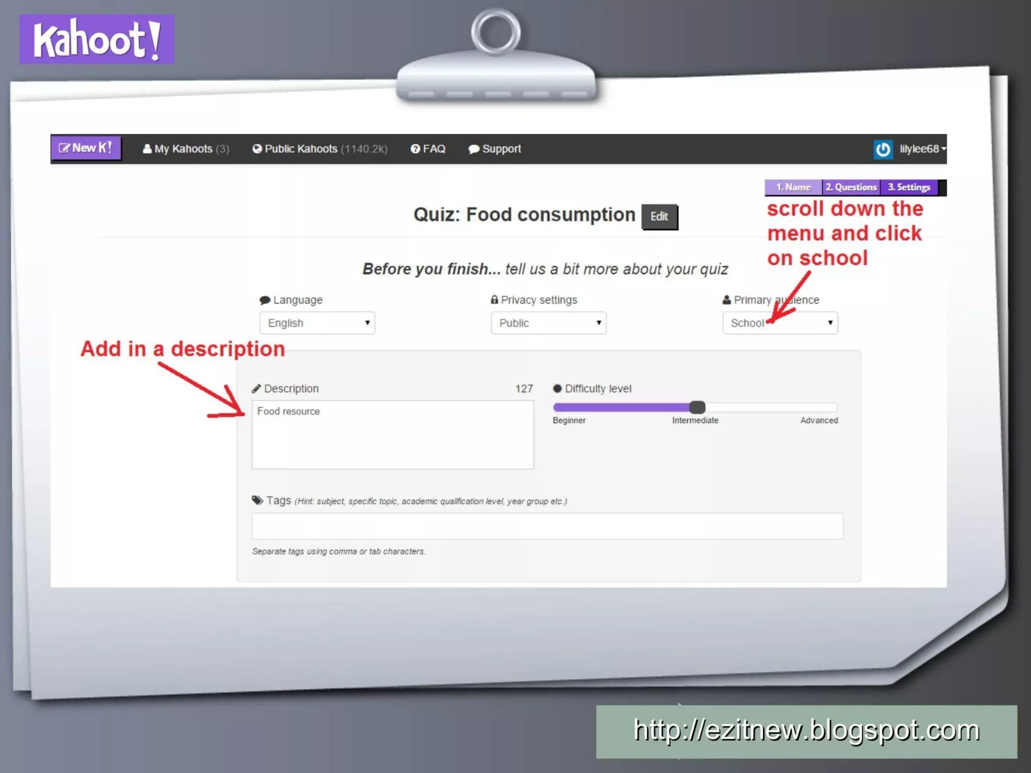
  • From content and interface cues (public library, sharing, “School” audience selection on settings slide), the investor would infer a freemium / teacher-first model with potential premium features for schools/districts (not stated).
  • No ARPU, LTV, CAC, conversion or monetization metrics are shown.

Traction & Metrics

  • The deck is product/demo-heavy and provides only incidental usage data embedded in screenshots rather than a traction slide:
    • UI header shows “Public Kahoots ~1.14M” (slides 6, 17).
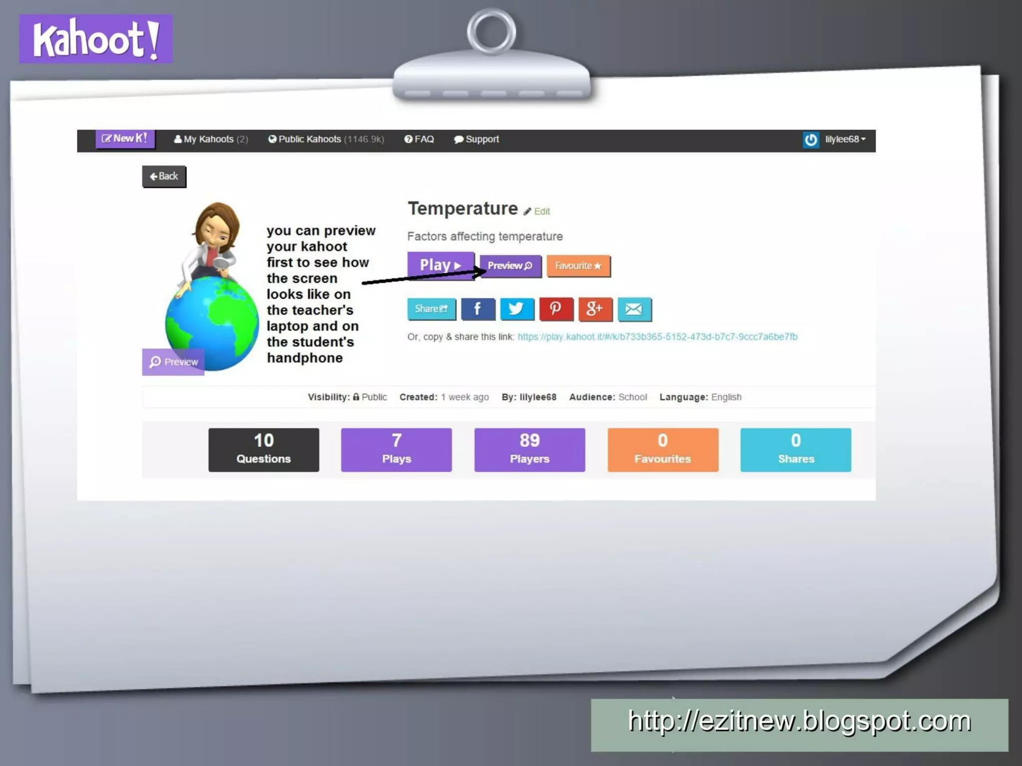
    • Example “Plays” and “Players” counters are visible on one screen (slide 18 shows “7 Plays” and “89 Players” as UI stats).
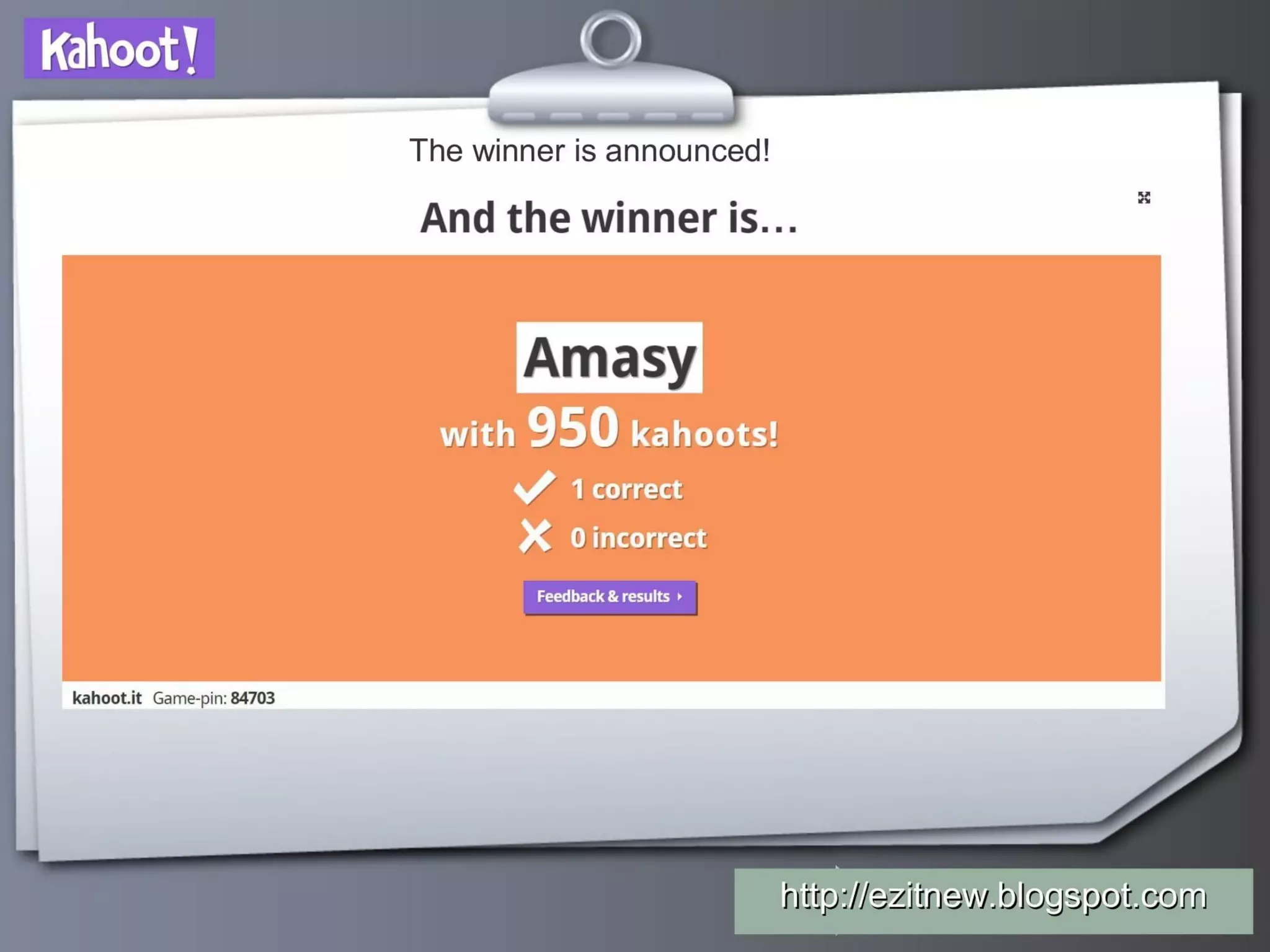
    • Live game examples show ephemeral metrics (game-pin sessions, scoreboard with top score 950 on slide 15), but these are not presented as proof of growth or retention.
  • There is no clear chart of DAU/MAU, growth rates, revenue growth, or cohort metrics.

Competitive Positioning

  • The deck briefly compares Kahoot to Socrative (slide 2), arguing Kahoot has a stronger gaming element — scoring based on accuracy and speed — making it more engaging.
  • Differentiation emphasized: mobile-first live gameplay, gamified scoring/leaderboard, ease of quiz creation and public repository of kahoots for reuse and sharing (slides 4–10, 16–18).
  • No slide explicitly mapping competitors, feature-by-feature differentiation, or defensibility (e.g., network effects from public kahoots) beyond product UX.

Team

  • The deck does not include founder or team bios, backgrounds or relevant experience. No hiring or organizational slides are present.

Go-to-Market Strategy

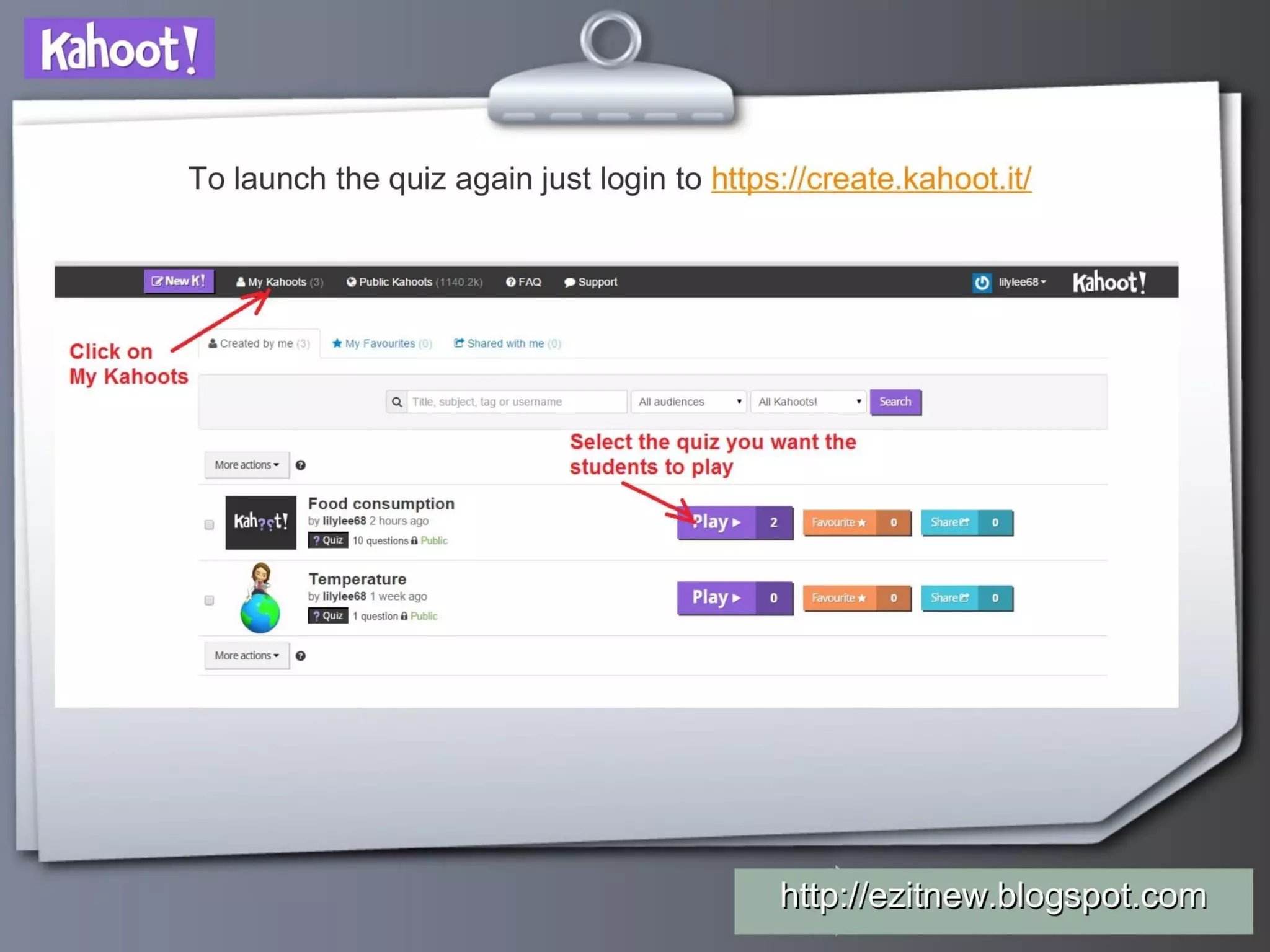
  • The deck implicitly describes a teacher-led, organic/viral GTM: teachers create and share kahoots, public kahoots repository, in-class demonstration encourages adoption (slides 16–19 show “Share”, “Preview”, “Public Kahoots” features).
  • The product is designed for BYOD (bring-your-own-device) classrooms; distribution relies on educators posting and sharing content, and on students using mobile devices (slides 11–14, 20–21).
  • There is no explicit paid sales motion, channel partnerships, or school/district sales plan outlined.

The Ask

  • The deck is a product tutorial for educators — it does not contain an investor “ask” or a use-of-funds slide. (Cover slide attributes the presentation to a teacher: “Presented to you by Mrs Lily Lee” — slide 1.)

Investor Deep Dive

Executive summary, strengths & red flags

Executive Summary

This deck is not a classic investor-focused pitch — it reads like a product training/tutorial for teachers showing how to create, launch and run Kahoot quizzes in class. It is notable because it demonstrates an early, very strong product-led growth motion (teacher adoption, BYOD mobile play, public content library) even though it lacks traditional fundraising elements (TAM, unit economics, team bios).

Key Strengths

3 identified

1

Product-first clarity and usability: The deck is an excellent step-by-step product demo that shows teachers exactly how to create and run a Kahoot — lowering adoption friction (slides 4–14).

2

Clear evidence of a product-led viral loop: public repository and “share/play” flows are shown throughout the UI (slides 16–18), signaling organic distribution via teacher communities.

3

Immediate engagement value proposition: the gamified scoring, leaderboards and real-time results are consistently highlighted (slides 11–15, 22), making the core user benefit obvious.

Red Flags & Weaknesses

3 identified

1

Missing investor-grade metrics: No TAM/SAM/SOM, ARR, CAC, retention, or growth-rate slides; only incidental UI counters exist (slides 6, 18). This would make it hard for investors to assess scale and unit economics.

2

No team or go-to-market execution details: The deck omits founder bios, hires, sales strategy, or channel partnerships — critical for early-stage diligence.

3

No monetization or roadmap: There’s no pricing strategy, premium feature description, or roadmapped product/market expansion plan — investors would flag how and when conversion from free usage to revenue will occur.

More Pitch Decks To Study

Compare structure, fundraising context, and investor-facing story across similar startup decks.