The Opening: Clear positioning and brand signal
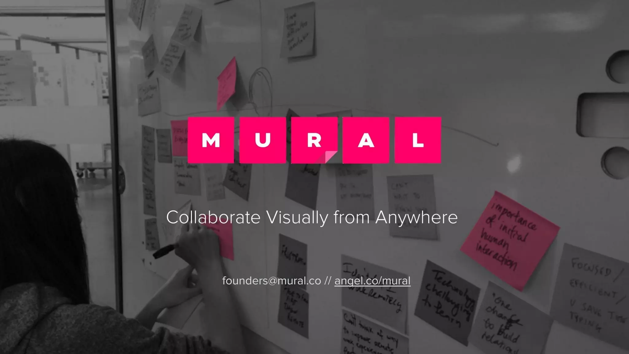
The cover (slide 1) is visually bold and minimal: a strong brand mark, a short, audience-focused tagline and a clean design. That opening immediately signals who the company is for and what it does without burying viewers in jargon. It sets tone and credibility in seconds, an important advantage when investors scan many decks.
Founders can learn from the restraint here. Lead with a one-line positioning that names the customer and the core benefit, and back it up with professional, consistent visuals. The cover should invite the viewer into a clear narrative rather than trying to explain everything at once.
Key Takeaway: Start with a single, audience-focused positioning statement and confident design to establish context in the first five seconds.