Compare your deck to Honey

Compare Your Deck

Honey Pitch Deck (2015)

Consumer
Stage: Seed
Raised: $1.8M
Year: 2015
Slides: 8
Outcome: Acquired by PayPal for $4B (2020)

Pitch Deck

1 / 8
Honey pitch deck - The Opening: Clear brand + contact
Click to expand

Deck Analysis

This deck presents Honey (Seed, 2015), a consumer-focused browser extension that automatically finds and applies coupon codes at checkout. It pairs a clear consumer pain point (coupon hunting and cart abandonment) with a friction-reducing, delight-focused solution and backs the claim up with early traction, a monetization comparison to incumbents, and a data-driven defensibility narrative. Notable: the deck balances product simplicity, real metrics, and a believable revenue path — the combination that helped Honey grow and eventually be acquired for $4B.

The Opening: Clear brand + contact

The Opening: Clear brand + contact

The cover (slide_01) is minimalist and brand-forward: large Honey wordmark centered on a pale background with small contact / angel page text in the corner. It sets tone and makes the product identity memorable without overwhelming the audience with details. For a seed deck the visual emphasis on the brand communicates confidence and consumer focus — important when selling a product that runs in browsers and relies on recognition.

Key Takeaway: A clean, branded cover builds immediate recognition and positions your product in investors' minds — keep contact details available but visually secondary.
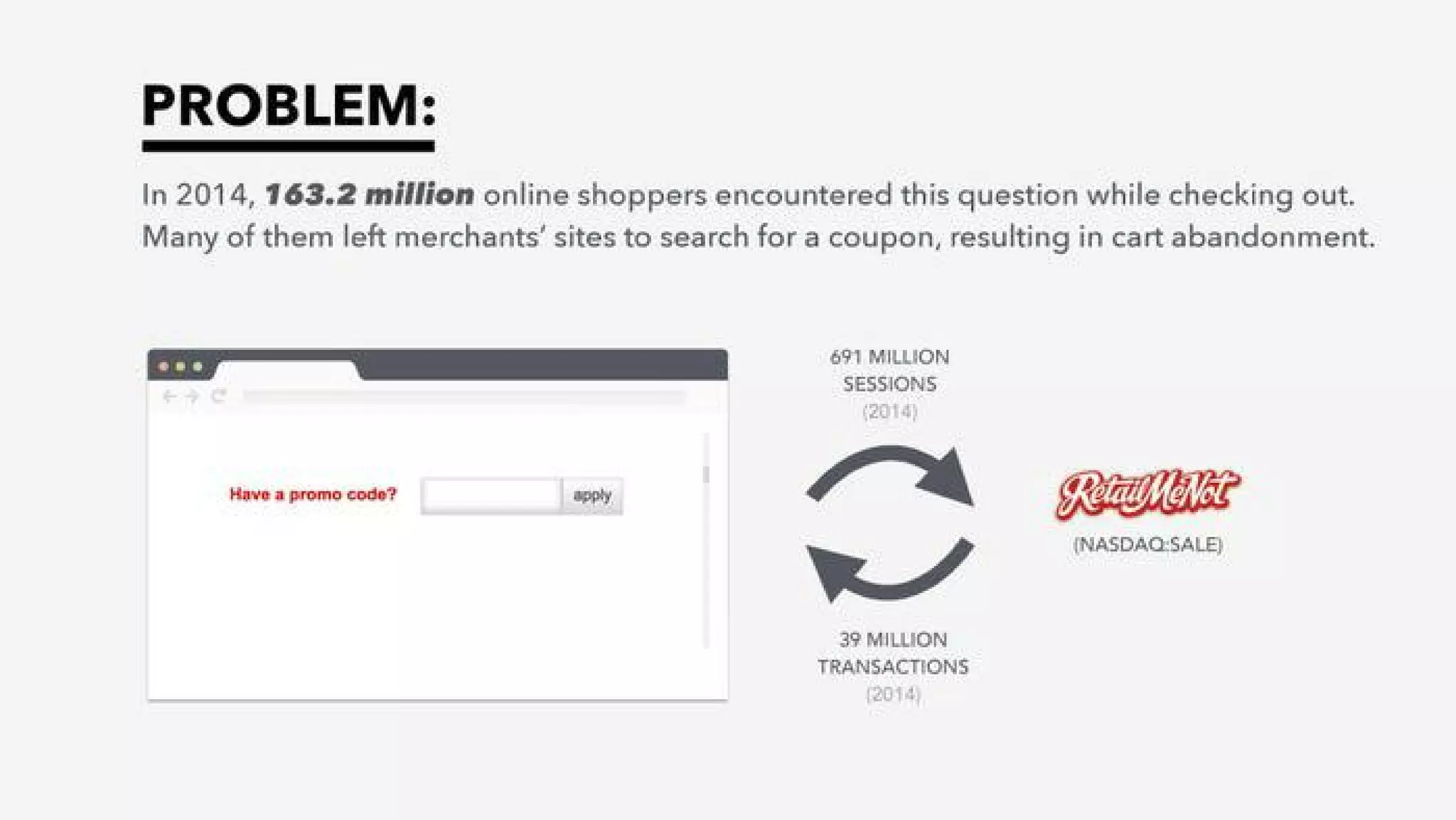
The Problem: Quantify the pain

The Problem: Quantify the pain

Slide_02 opens with a bold problem statement and a concrete, large-scale statistic (163.2 million online shoppers encountering coupon prompts) that quantifies the opportunity and pain point. The combination of an evocative headline, short explanatory copy (“left merchants' sites to search for a coupon”), and a simple visual of a promo-code field makes it obvious why a product that automates coupon-finding would create value for both consumers and merchants.

This slide is effective because it pairs a visceral human behavior (searching for coupons at checkout) with market-scale numbers and a recognizable competitor/partner logo (RetailMeNot). Founders should emulate this approach: state the pain, show the scale, and use a simple visual that your audience instinctively understands to make the problem believable and urgent.

Key Takeaway: Lead with a single clear problem + one or two large statistics to convey urgency and market scale quickly.
The Solution: Simple, delightful product

The Solution: Simple, delightful product

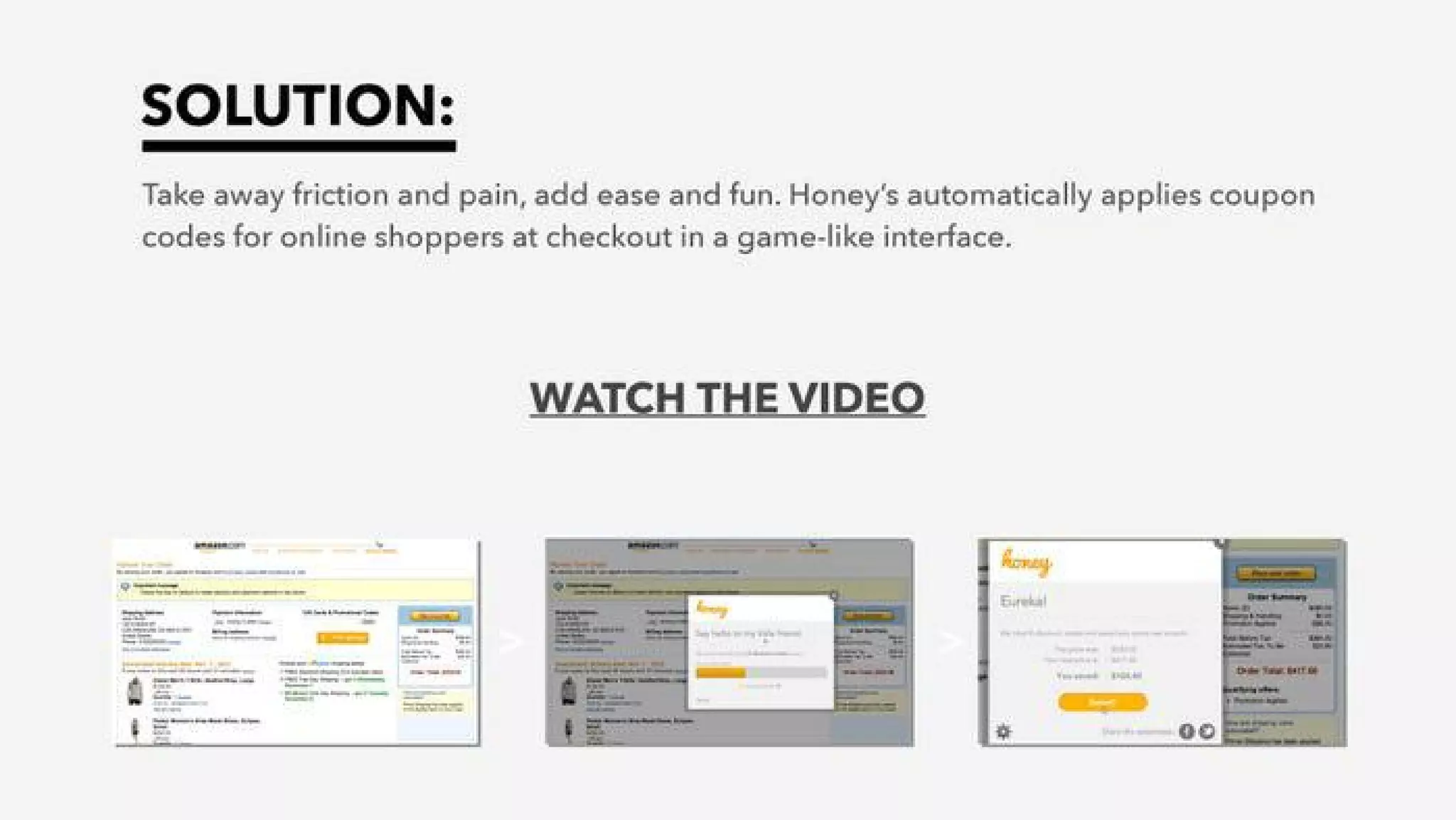
Slide_03 explains the product succinctly: remove friction, add ease and fun, and automatically apply coupon codes via a game-like interface. The messaging is concise and consumer-centric, emphasizing immediate benefit at checkout. Visuals of the UI and a CTA to watch a video provide social proof that the product is executable and consumer-facing rather than hypothetical.

The slide works because it focuses on outcomes (less pain, more fun) rather than technical detail. For seed-stage consumer startups, showcasing how the product works in the user's flow and including a short demo or screenshots is more persuasive than describing backend mechanisms. Founders should prioritize clear, benefit-driven language and a short visual demo to communicate product experience.

Key Takeaway: Show the product in-context with simple benefit language + a short demo to make the value tangible.
Traction: Early metrics and growth visualization

Traction: Early metrics and growth visualization

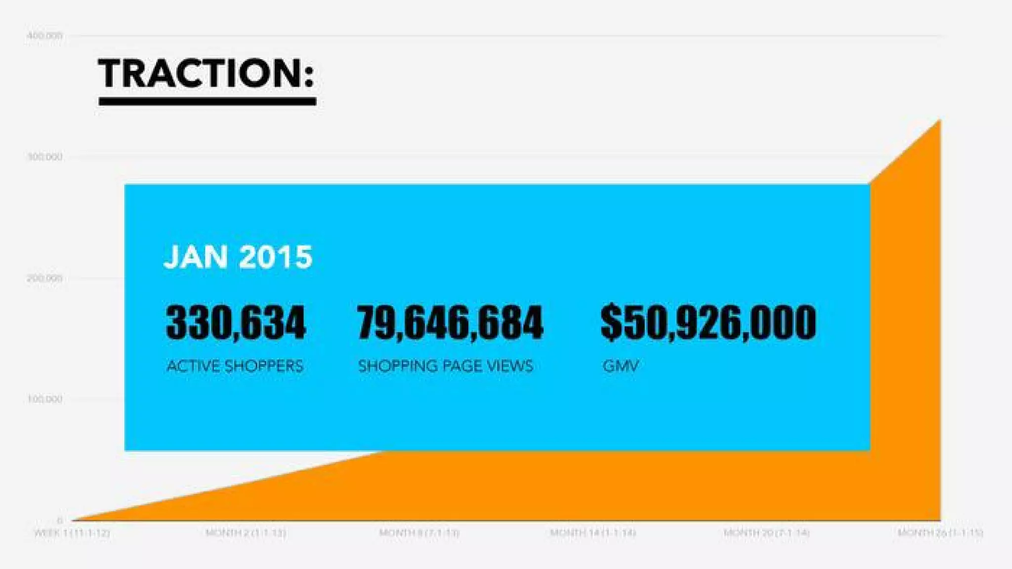
Slide_04 surfaces concrete metrics (Jan 2015: 330,634 active shoppers, ~79.6M shopping page views, $50.9M GMV) and pairs them with a growth chart. Presenting specific numbers at seed is powerful — it tells investors you’ve moved past concept to measurable adoption. The bold, large typography for key stats makes them readable and memorable during a pitch.

The graph behind the card shows rising engagement, which supports the numeric claims without drowning the viewer in data. Founders should emulate this by selecting 2–3 KPIs that best capture product-market fit and showing both absolute numbers and growth trendlines so investors can assess momentum and the plausibility of scale.

Key Takeaway: Pick 2–3 clear KPIs and show both absolute scale and trend to communicate momentum and credibility.
Monetization & Market Sizing: Comparable model and upside

Monetization & Market Sizing: Comparable model and upside

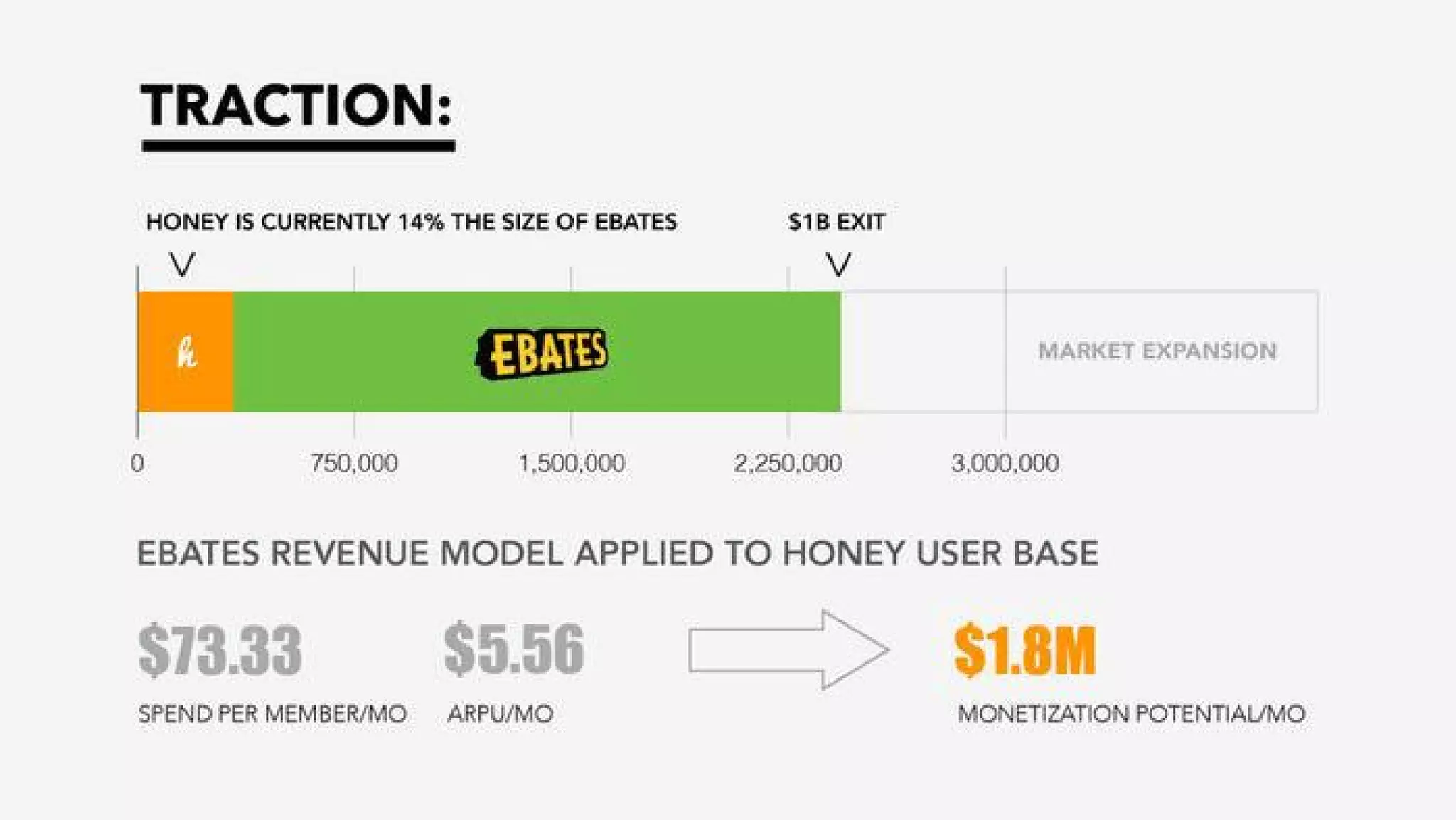
Slide_05 compares Honey to a proven incumbent (Ebates) and applies Ebates’ revenue model to Honey’s user base to produce a monetization potential ($1.8M/mo). The slide breaks down key assumptions (spend per member, ARPU) which helps investors trace the logic and test sensitivity. Using an existing, successful business as a benchmark is helpful because it reduces perceived risk in the revenue model.

That said, the slide assumes conversion of behavioral parity and makes an exit projection ($1B exit) visible on the scale chart. Founders should copy the approach of benchmarking to incumbents but also be explicit about assumptions and potential variance (conversion rates, take rates). Adding a short sensitivity range would make this even stronger, but the deck already succeeds at giving a concise, monetizable narrative.

Key Takeaway: Benchmark your monetization to a known equivalent and show the arithmetic — investors want to see simple, traceable revenue math.
Business Model & Product Integration: How value is captured

Business Model & Product Integration: How value is captured

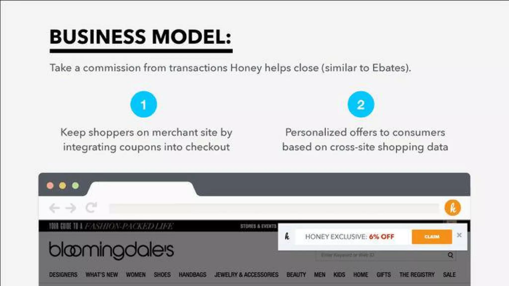
Slide_06 lays out the business model (commissions on transactions Honey helps close) and two concrete value plays: keeping shoppers on-site by integrating coupons and serving personalized offers. The inclusion of a live-site screenshot demonstrating an on-site Honey banner ties the business model to user flow and merchant experience, making it clear how Honey preserves conversion while enabling tracking and monetization.

This combination of product placement and business mechanics is instructive: it shows not just that you can get users, but exactly how you monetize them during the moment of purchase. For founders, the lesson is to align product UX with revenue capture points and visually show that alignment — screenshots of the product in the merchant flow are extremely persuasive.

Key Takeaway: Demonstrate exactly where in the user flow you capture value and how that maps to revenue — visuals + model win trust.
Unfair Advantage: Data-driven personalization

Unfair Advantage: Data-driven personalization

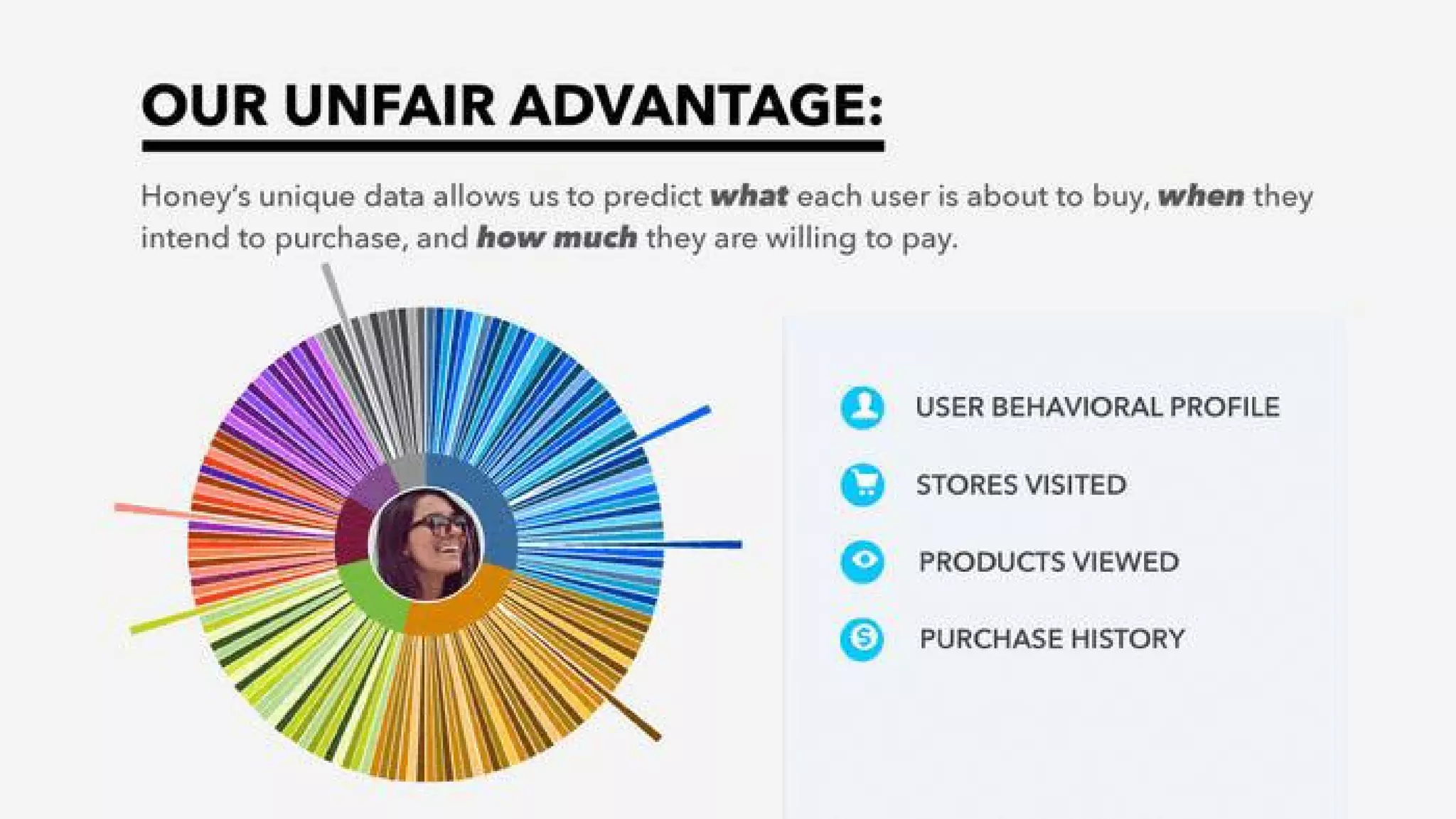
Slide_07 articulates Honey’s defensibility: proprietary behavioral data that predicts what users will buy, when, and price sensitivity. The colorful radial visualization and list of signals (behavioral profile, stores visited, products viewed, purchase history) communicates richness of data without heavy technical detail. Positioning data as the core moat helps justify long-term competitive position beyond simple UI features.

The slide is effective because it connects the data advantage back to personalization and merchant value. Founders with data-moats should mimic this: translate technical assets into business outcomes (better predictions → higher conversion → more commission) and use a simple visual to show data breadth rather than deep technical diagrams that can confuse a general investor audience.

Key Takeaway: Frame data assets as direct levers for better outcomes (conversion, ARPU) and visualize breadth of signals instead of deep technical detail.
Team: Founders + complementary hires

Team: Founders + complementary hires

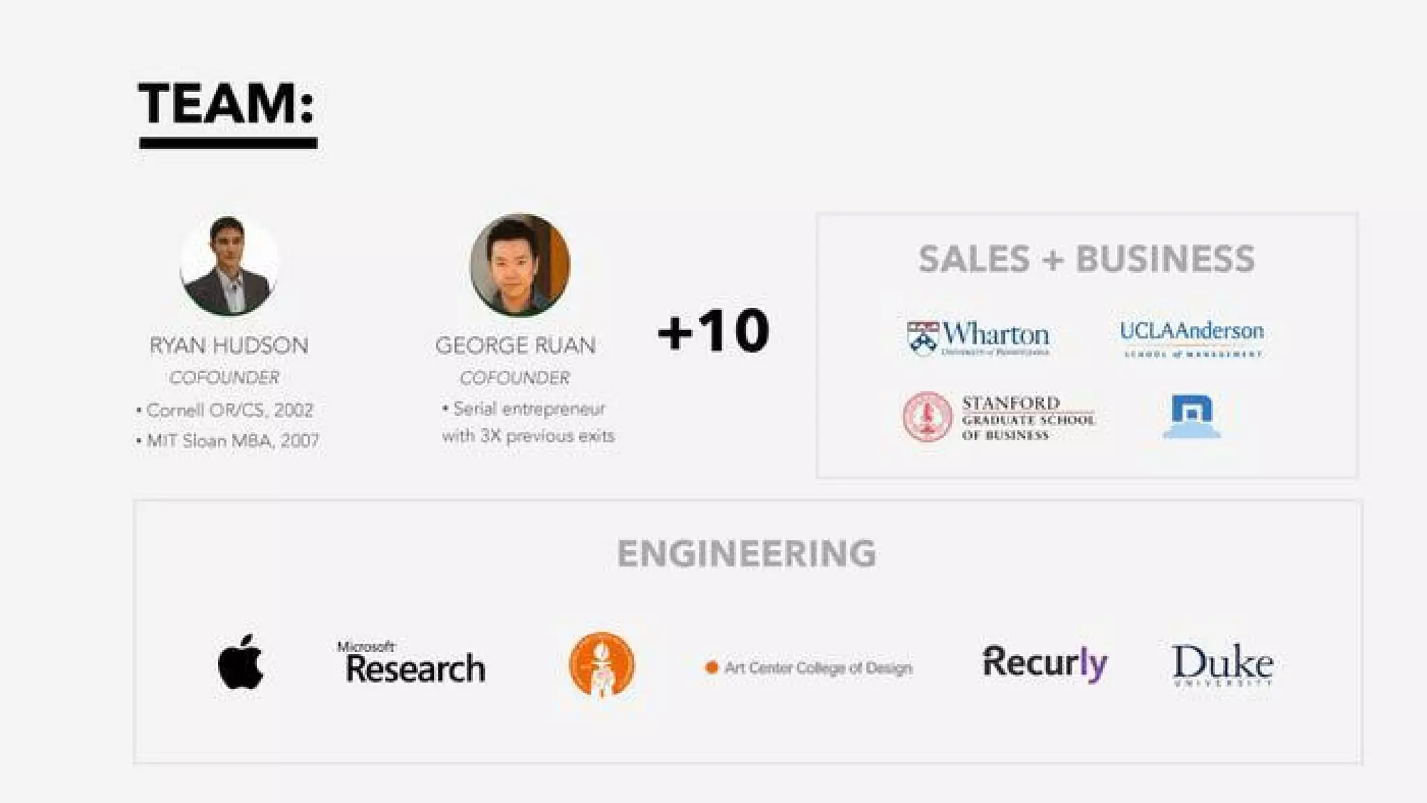
Slide_08 positions the founding team (backgrounds, schools) and highlights additional hires across sales and engineering with recognizable logos (Apple, Microsoft Research, Recurly, Duke). This communicates both leadership credibility and the ability to attract experienced talent. For seed-stage investors, founder background and early hires are a major factor — the slide balances pedigree with signals of domain and execution capability.

The slide could be strengthened by adding a one-line summary of each founder’s direct, relevant accomplishments (e.g., prior exits or product achievements), but it succeeds at showing a team that covers both product/engineering and business development. Founders should ensure team slides demonstrate complementary skills and early recruiting momentum.

Key Takeaway: Show complementary founder skills and early hires/affiliations to signal execution capability and hiring momentum.

Conclusion: Key Lessons

Honey’s seed deck is a strong example of how to combine a crisp problem statement, a clear consumer product demo, early traction metrics, a simple monetization model benchmarked to incumbents, and a defensible data moat — all while keeping visuals clean and narrative tight. Strengths include compelling, memorizable numbers; product-in-context screenshots; and straightforward revenue math that investors can follow.

Actionable advice for founders: lead with a single, believable problem and size it; show the product in the user's flow (screenshots or a short demo); present 2–3 concrete KPIs with growth; benchmark monetization to a known model while calling out assumptions; and turn technical assets (data, algorithms) into business outcomes. Keep the deck visually simple and let clear numbers and product demos do the persuading.

Full Deck Analysis

11 sections

Overview

Company: Honey
Round: Seed ($1.8M)
Year: 2015
Outcome: Acquired by PayPal for $4B (2020)

Executive Summary

Honey’s seed deck is a tightly focused product-led story: identify a clear checkout friction (promo codes), present an automatic, game-like coupon application UX, show strong early user traction and unit-economics modeled off an incumbent (Ebates), and highlight a data-driven “unfair advantage” from cross-site behavioral data. It stands out for clean visuals, concrete early metrics, and a believable monetization path that later proved correct given the $4B exit.

Problem Statement

  • Slide(s): 2
  • How it’s framed: The deck opens with a clear pain: many online shoppers encounter the “Have a promo code?” question at checkout and leave merchant sites to search for coupons, driving cart abandonment.
  • Key numbers called out: 163.2 million online shoppers in 2014 encountered this (slide 2), 691 million sessions and 39 million transactions (2014) referenced as the pool of coupon-searching behavior. The deck connects that behavior directly to merchant revenue loss.

Solution

  • Slide(s): 3 (and imagery on 6)
  • Positioning: Honey is positioned as a friction-removing product that “automatically applies coupon codes for online shoppers at checkout in a game-like interface.” The UX is integrated at checkout (e.g., Chrome extension/browser integration implied), it runs coupon tests automatically, and it can present “Honey Exclusive” offers. The tone emphasizes ease + fun + automation.

Market Opportunity

  • Slide(s): 2, 5
  • Explicit numbers shown:
    • 163.2M shoppers (2014) who saw a promo-code field (slide 2).
    • 691M sessions and 39M transactions (2014) cited (slide 2).
    • Competitive benchmark: Honey stated to be currently 14% the size of Ebates (slide 5).
    • Ebates-derived monetization projection: applying Ebates’ revenue model produced the claim of $1.8M monetization potential per month for Honey’s user base (slide 5).
  • TAM/SAM/SOM notes: The deck does not present a layered TAM/SAM/SOM with explicit dollar TAM, but uses industry behavior metrics (sessions/transactions) and a competitor (Ebates) as a proxy to show large market opportunity and how Honey can scale within it.

Business Model

  • Slide(s): 6 (and slide 5 modeling)
  • Primary model: Affiliate/commission-based—take a commission on transactions Honey helps close (explicitly compared to Ebates).
  • Unit economics / assumptions shown (slide 5):
    • Spend per member / mo: $73.33
    • ARPU / mo: $5.56
    • Monetization potential: $1.8M / mo (model applying Ebates revenue assumptions to Honey’s user base)
  • Go-to-revenue mechanism: keep shoppers on merchant sites by integrating coupons at checkout and offer personalized deals based on cross-site data.

Traction & Metrics

  • Slide(s): 4, 5
  • Concrete traction numbers (Jan 2015, slide 4):
    • Active shoppers: 330,634
    • Shopping page views: 79,646,684
    • GMV (Gross Merchandise Value): $50,926,000
  • Growth visualization: slide 4 shows a rising orange area culminating in the Jan 2015 data (implies fast growth across months).
  • Additional traction framing (slide 5): Honey compared to Ebates (14% the size) and the monthly monetization figure ($1.8M) shows progress toward a scaled revenue stream.

Competitive Positioning

  • Slide(s): 2, 6, 7
  • Competitors referenced: RetailMeNot (slide 2), Ebates (slide 5) used as a revenue benchmark.
  • Differentiation:
    • UX-first: automated coupon application at checkout (removes consumer friction vs. manual coupon search).
    • Gamified, frictionless experience that runs in the background.
    • Data advantage: cross-site behavioral data to predict what, when, and how much a user will buy (slide 7) enabling personalization and higher convertibility.
    • Merchant-retention angle: the extension / in-page coupon presentation aims to keep shoppers on merchant sites (instead of sending them away to coupon sites).

Team

  • Slide(s): 8
  • Founders:
    • Ryan Hudson — Co-founder. Background: Cornell OR/CS 2002; MIT Sloan MBA 2007.
    • George Ruan — Co-founder. Serial entrepreneur with three prior exits.
  • Team breadth: “+10” (small core + growth team). Sales & business advisors/hires from Wharton, UCLA Anderson, Stanford GSB; engineering hires/experience include Apple, Microsoft Research, Recurly, Art Center College of Design, Duke. Visual/headshot + logos give credibility.

Go-to-Market Strategy

  • Slide(s): 3, 6
  • Channels / approach implied:
    • Browser extension / plugin distribution (visuals and in-checkout modal suggest extension-based distribution).
    • Product virality: the extension activates at checkout across many merchants, promoting repeated use.
    • Merchant partnerships: revenue sharing / affiliate relationships similar to Ebates.
    • Personalization: using cross-site behavioral data to surface tailored offers, increasing conversion and merchant value.

The Ask

  • Slide(s): (not explicit in deck visuals provided)
  • Deck context and company metadata: Seed round, $1.8M raised. The slides supplied do not show a dedicated use-of-funds or detailed funding ask slide. (This is a notable omission — see weaknesses.)

Investor Deep Dive

Executive summary, strengths & red flags

Executive Summary

Honey's seed deck is a tightly focused product-led story: identify a clear checkout friction (promo codes), present an automatic, game-like coupon application UX, show strong early user traction and unit-economics modeled off an incumbent (Ebates), and highlight a data-driven "unfair advantage" from cross-site behavioral data. It stands out for clean visuals, concrete early metrics, and a believable monetization path that later proved correct given the $4B exit.

Key Strengths

3 identified

1

Clear problem → product fit: The deck articulates a universally felt checkout friction (promo-code lookup) and directly ties it to cart abandonment with user/session numbers (slide 2).

2

Strong early traction and unit metrics: Active users (330,634), ~80M shopping page views, $50.9M GMV (Jan 2015) and an ARPU model ($5.56/mo) provide tangible proof of demand and monetization potential (slides 4–5).

3

Compelling “unfair advantage”: Cross-site behavioral data and personalization claims are concrete differentiators that explain defensibility beyond a simple coupon database (slide 7). Visuals help communicate the data depth.

Red Flags & Weaknesses

3 identified

1

Lack of explicit CAC/LTV and growth economics: The deck shows ARPU and a monetization projection, but omits customer acquisition cost, churn, LTV, or channel-by-channel payback — essential to validate the $1.8M/month projection.

2

Missing ask / use of funds detail: The slides shown do not include a clear funding ask, allocation of proceeds, or milestones tied to the round (the deck as presented doesn’t show how the $1.8M would be deployed).

3

Privacy/regulatory and merchant risk not addressed: The strategy relies on cross-site behavioral data and running coupons on merchant pages; the deck does not discuss privacy safeguards, merchant acceptance, or how merchants/affiliate programs might react (e.g., changes in affiliate terms or coupon blocking). This could be a material business risk.

More Pitch Decks To Study

Compare structure, fundraising context, and investor-facing story across similar startup decks.