Compare your deck to Gusto

Compare Your Deck

Gusto Pitch Deck (2012)

SaaS
Stage: Seed
Raised: $6.1M
Year: 2012
Slides: 16
Outcome: Valued at $9.5B+ (2025)

Pitch Deck

1 / 16
Gusto pitch deck slide 1
Click to expand

Deck Analysis

This deck is a seed-era pitch template used by Gusto (then ZenPayroll) in 2012. It is notable for its clean, founder-friendly structure: bold branding and a short title slide, an ambitious vision, a clear articulation of customer pain, concise product explanation with room for screenshots, a quantified market section, traction and roadmap notes, team bios, and a short summary/ask. The presentation prioritizes clarity and storytelling over dense data, making it easy for investors to quickly understand the opportunity, why now matters, and why the founding team is equipped to execute.

Title / Opening: Clear brand and immediate context

Title / Opening: Clear brand and immediate context

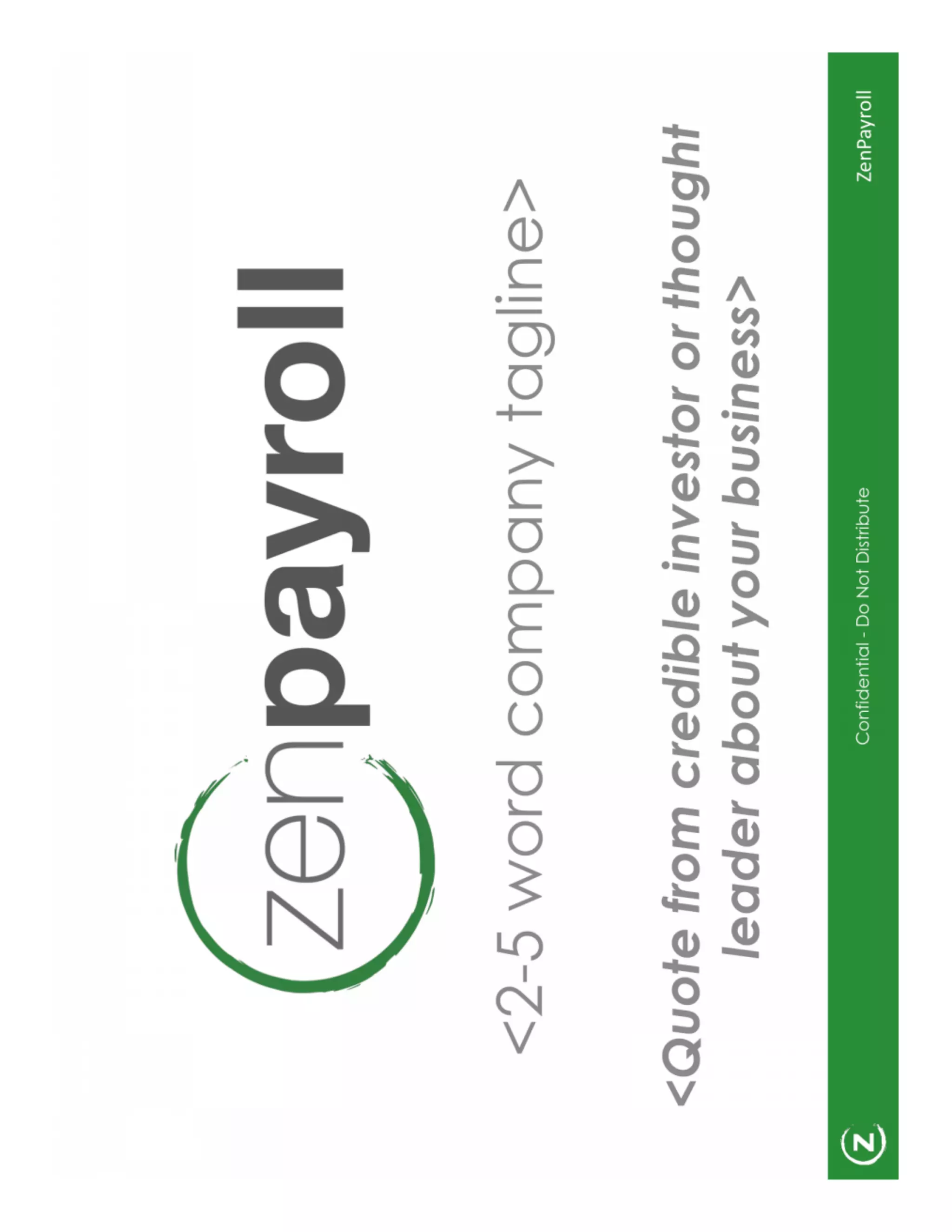
The opening slide (big logo, tagline, contact) uses a minimalist layout to create immediate brand recognition and sets the tone for the deck. It places the company identity front-and-center and leaves room for a one-line tagline and contact details — a simple way to ensure investors always know who they're hearing from and how to follow up.

This slide is effective because it avoids clutter and communicates confidence. Founders can learn to treat the title slide not as filler but as the first signal of professionalism: strong visual identity, a short memorable tagline, and clear contact information make it easy for busy investors to remember and act after the meeting.

Key Takeaway: Start strong with an uncluttered branded title slide that includes a concise tagline and contact info so your company is instantly memorable.
Vision: Big, declarative, guiding statement

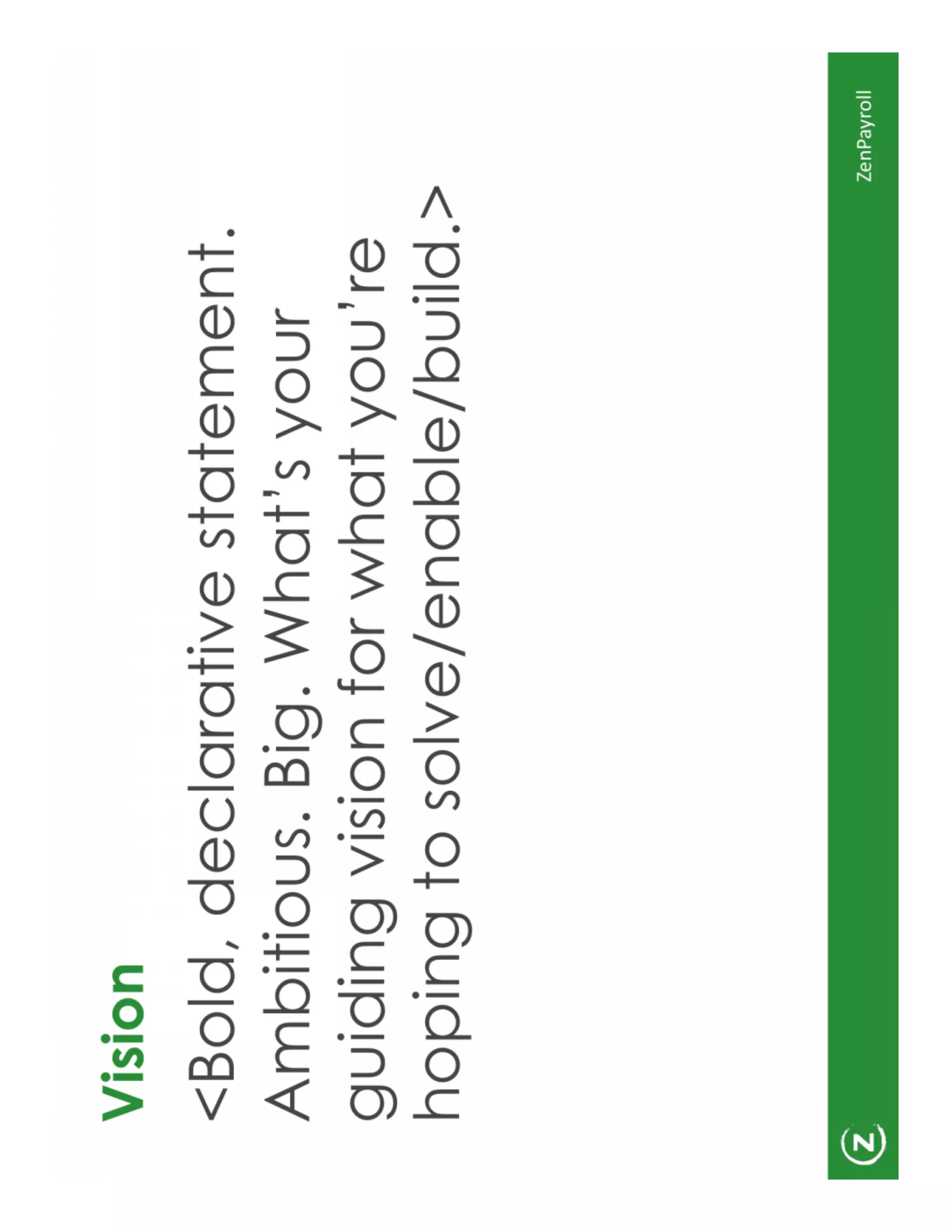
Vision: Big, declarative, guiding statement

The Vision slide asks for a bold, declarative statement — a short, ambitious description of the future the company is building toward. The deck explicitly suggests 'big' and 'ambitious' vision language that can guide product decisions and rally both investors and internal teams.

This is effective because a concise vision helps investors quickly place the company in a broader context and evaluate its long-term upside. Founders should craft a single, bold sentence that explains why the company exists and what significant change it is pursuing, using it to frame later slides about product and market.

Key Takeaway: Use one short, ambitious sentence as your north star that makes it obvious why your company matters at scale.
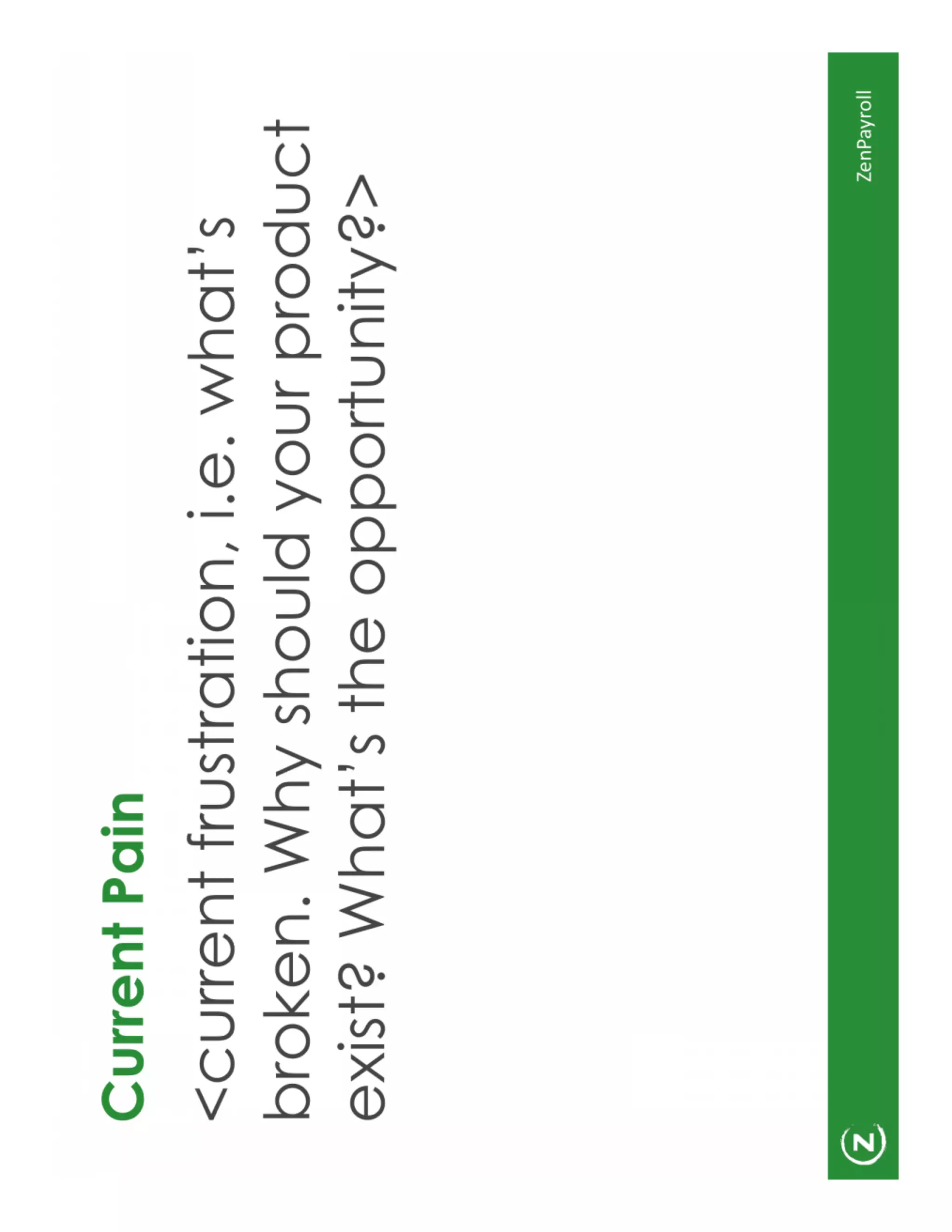
Current Pain: Start with the customer's broken experience

Current Pain: Start with the customer's broken experience

The Current Pain slide asks founders to list the frustrating status quo and explain why existing solutions fail — the classical problem-first approach. The slide nudges presenters to show what is broken, why the problem is painful, and why that pain creates an opportunity for your product to win.

By leading with pain, the deck forces a logical narrative: pain → solution → market. Founders should quantify the pain where possible (time wasted, dollars lost, error rates) and pair emotional language with concrete examples to make the problem tangible for investors who haven’t lived it.

Key Takeaway: Open with a crisp, quantified articulation of the customer pain to make the need for your solution obvious and urgent.
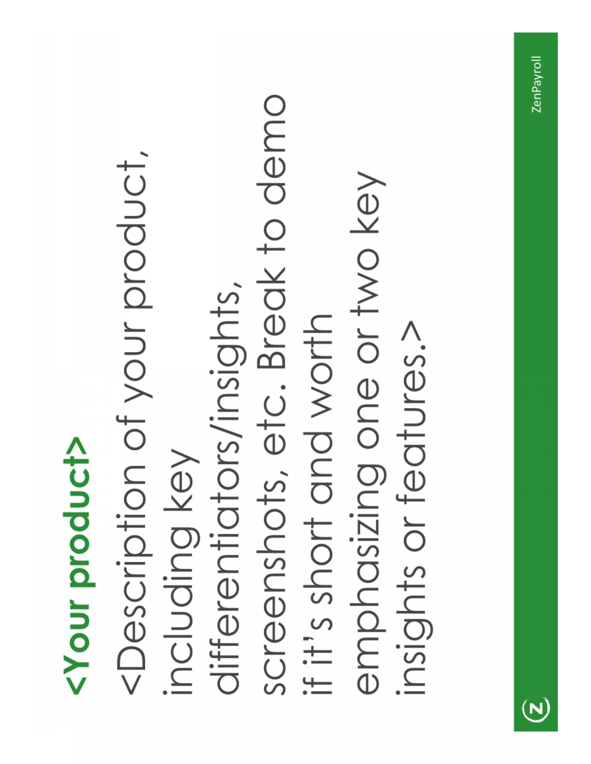
Product: Show one core user experience and differentiators

Product: Show one core user experience and differentiators

The product slide layout emphasizes a short description, screenshots, and a few differentiating insights. It recommends demonstrating the product (or demo screenshots), highlighting one or two key features, and explaining short- and long-term roadmaps. The guidance balances detail (screenshots, worth-to-demo items) with restraint so slides don’t become feature dumps.

This is effective because investors want to understand the core experience quickly. Founders should focus on the single workflow that solves the customer pain, use clear visuals to show that workflow, and call out defensible differentiators or planned capabilities that move beyond an MVP.

Key Takeaway: Focus your product slide on one core user flow with screenshots and 1–2 differentiators rather than listing every feature.
Market / Landscape: Quantify the opportunity and map competition

Market / Landscape: Quantify the opportunity and map competition

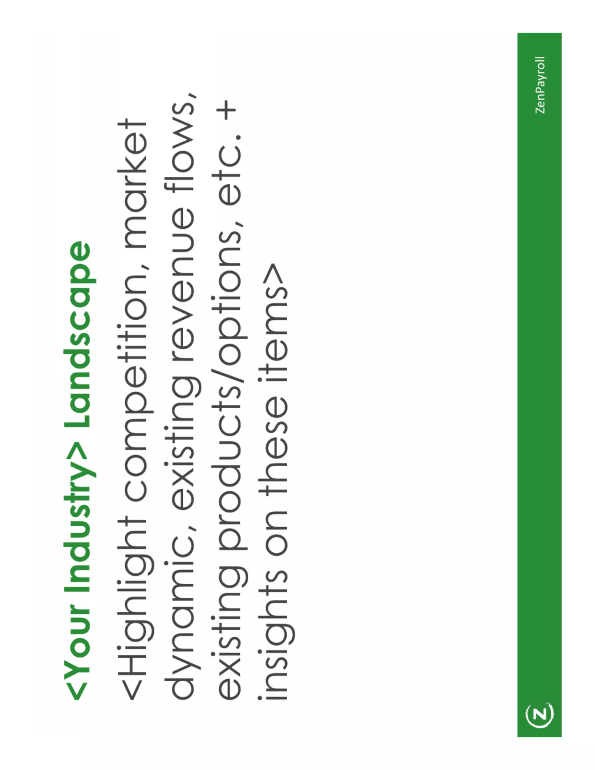
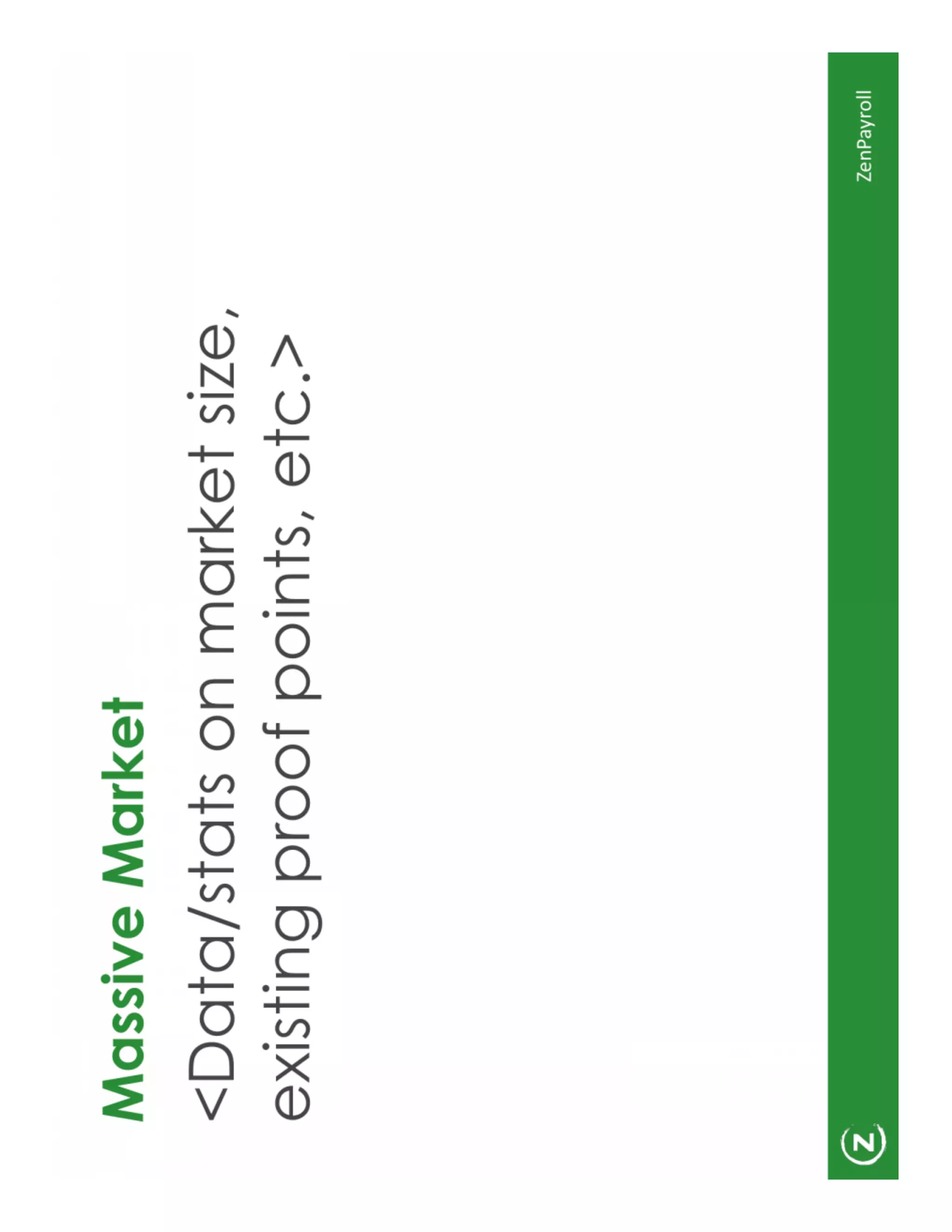
The deck calls out a 'Massive Market' slide and an 'Industry > Landscape' slide to highlight market size, dynamics, existing competitors, and proof points. It encourages founders to include data/stats on market size and existing adoption signals so investors can assess scale and defensibility.

What works here is the combination of TAM/SAM/SOM thinking with competitive context: show how the market is big, growing, and why current products leave room for your solution. Founders should bring credible sources for market numbers and use the landscape to signal positioning (e.g., simpler, cheaper, specialized).

Key Takeaway: Quantify market size and explain where you fit in the competitive landscape with data-backed evidence of demand.
Traction & Roadmap: Metrics plus concrete next steps

Traction & Roadmap: Metrics plus concrete next steps

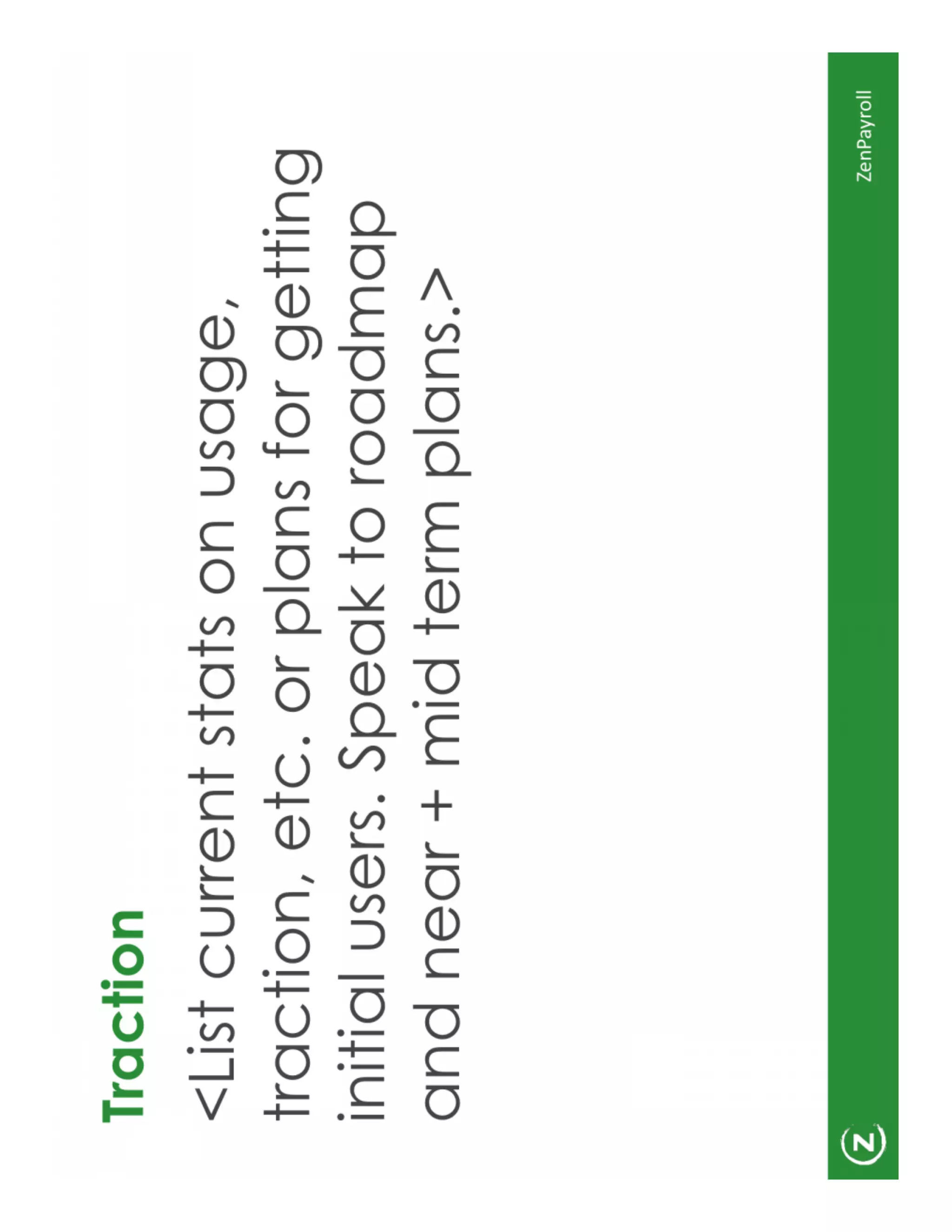
The Traction slide recommends listing current stats (usage, growth, revenue), initial user sets, and a roadmap for near- and mid-term plans. It frames traction as both evidence of product-market fit and the springboard for future growth, suggesting founders mix quantitative metrics with a short plan to expand.

This approach is effective because investors weigh both present momentum and the team's realism about growth. Founders should present a few leading metrics (growth rate, retention, revenue), explain how those translate to scale, and pair them with a clear roadmap of what they will build or measure next.

Key Takeaway: Show a few strong, high-signal metrics and pair them with a realistic roadmap that explains how you'll convert traction into large-scale adoption.
Team: Short bios that prove execution capability

Team: Short bios that prove execution capability

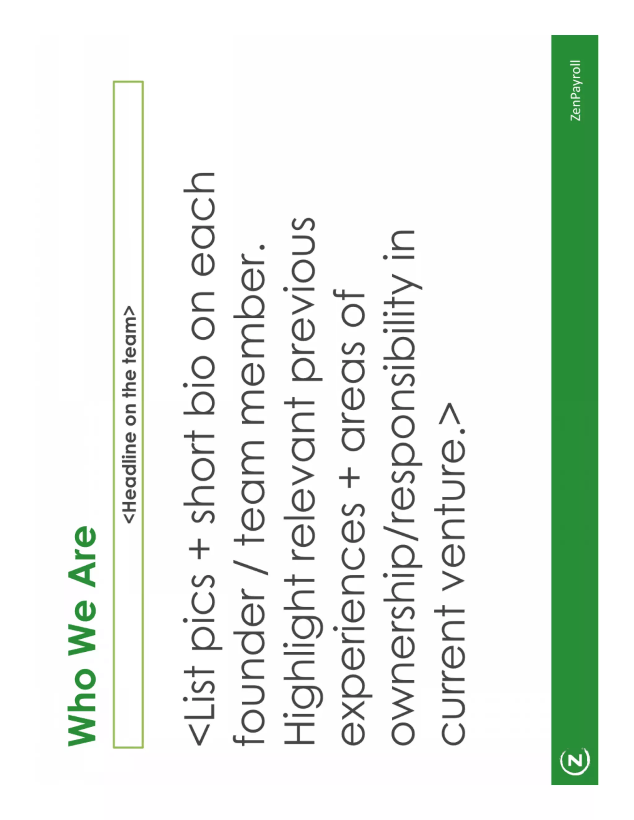
The 'Who We Are' slide suggests short pictures and bios, highlighting founders’ relevant previous experience and ownership of responsibilities. The slide prompts teams to emphasize prior successes, domain expertise, and complementary skills rather than long CVs.

This is effective because investors want to quickly assess whether the team can execute. Founders should keep bios concise (one line each), call out relevant exits/roles/technical strengths, and map responsibilities to show coverage across product, go-to-market and operations.

Key Takeaway: Use crisp one-line bios that highlight prior relevant experience and clearly show who owns what in the company.
Summary / Ask: Close with 3–5 key takeaways and the explicit ask

Summary / Ask: Close with 3–5 key takeaways and the explicit ask

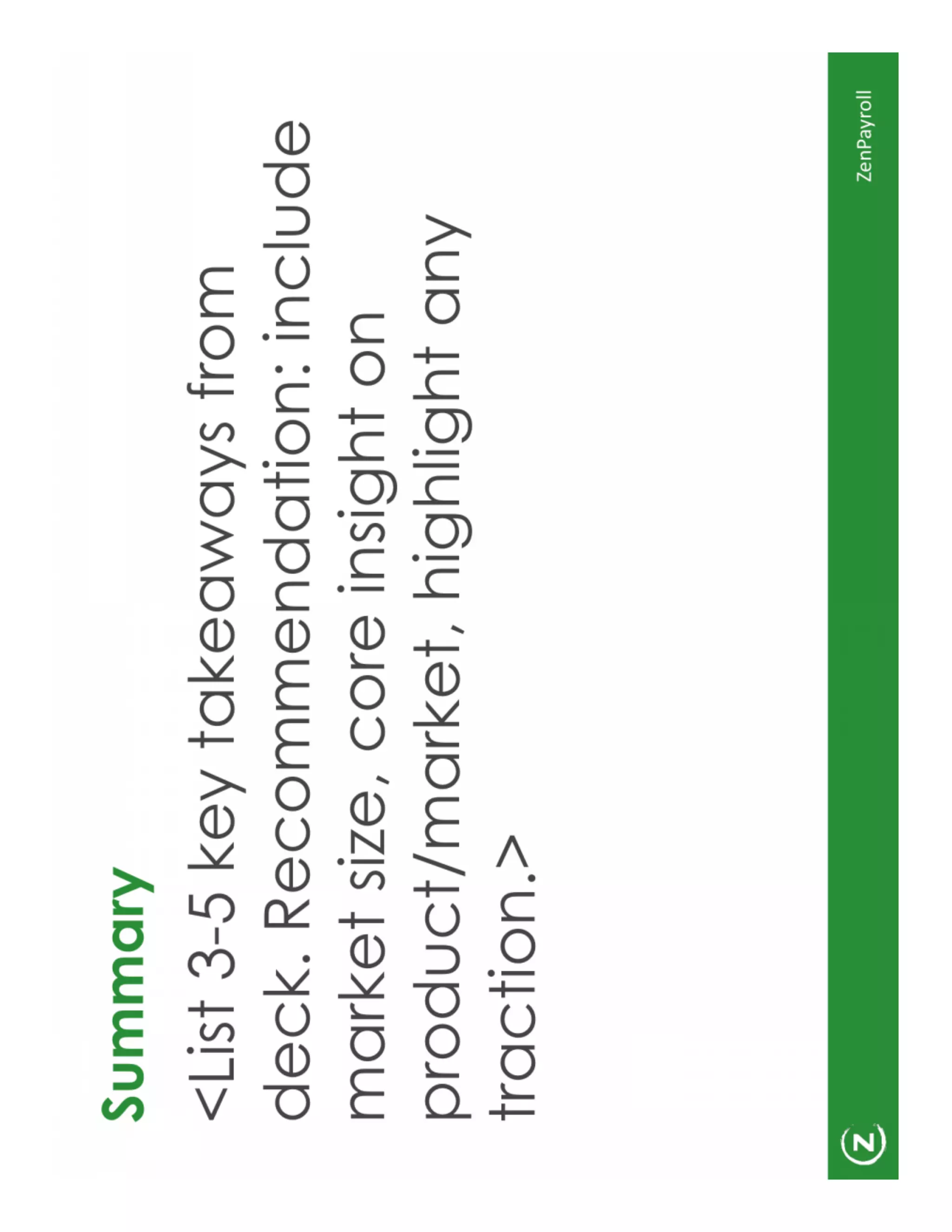
The Summary slide asks for 3–5 key takeaways: recommendation, core insight on market/product, and traction highlights. The deck implies an explicit ask (funding amount or next steps) should be paired with these takeaways so investors leave with a clear mental checklist.

This structure is effective because it reinforces the narrative and makes the next action clear. Founders should end with a short list of core points that support their ask and then present a specific fundraising request (amount, use of funds, and milestones), ensuring the conversation can move to a concrete close.

Key Takeaway: Finish with 3–5 crisp takeaways that support a clear, specific ask (amount, use, milestone) so investors know exactly what you want.

Conclusion: Key Lessons

Gusto’s seed-era deck is a model of minimalist, narrative-driven fundraising: big brand slide, one-sentence vision, crisp problem statement, focused product explanation, quantified market, concrete traction, and succinct team bios. Its strength is in disciplined brevity — every slide has a clear role in the story rather than trying to do everything at once. Founders should emulate the deck’s emphasis on clarity, measurable signals, and a single core product narrative.

Actionable advice: craft a one-line vision that frames the entire presentation; open with the customer pain and show one product workflow that solves it; present 2–3 high-signal traction metrics backed by a realistic roadmap; and end with 3–5 takeaways and a specific ask. Keeping slides visually simple and text-light helps investors focus on the story, not on parsing dense pages of information.

Full Deck Analysis

11 sections

Overview

Company: Gusto (formerly ZenPayroll)
Round: Seed ($6.1M)
Year: 2012
Outcome: Valued at $9.5B+ (2025)


Executive Summary

This slide set is a clean, investor‑oriented template-style pitch that covers the canonical early-stage story arc: vision → problem → product → market → traction → team → fundraising ask. The deck as shown is largely composed of placeholders and structural prompts rather than completed, data-rich slides — it reads like the outline a founding team used to build their seed narrative rather than a final, metric-heavy investor presentation. That said, the structure and “why now” framing are strong foundations that likely helped Gusto (ZenPayroll) tell a concise story to early investors.


Problem Statement

  • Location: Slide titled “Current Pain” (Slide 6 in the provided sequence).
  • How it’s articulated: The deck includes a direct prompt to state the current frustration customers face — “what’s broken” and why the product should exist. The slide is structured to emphasize customer pain points and the opportunity created by those failures.
  • Observation: The slide is a template prompt; no specific customer quotes, quantified pain (time/cost lost), or real-world anecdotes are present in the images provided. An investor would expect concrete examples and numbers (e.g., X hours spent on payroll per pay-cycle, % error rates, compliance fines).

Solution

  • Location: Slide titled “Your product” (Slide 7).
  • How it’s positioned: The slide instructs the founders to describe the product, show screenshots, and highlight differentiators and one or two key features. The recommended emphasis is on short, compelling visuals and the main value props.
  • Observation: The actual images contain placeholders rather than screenshots or product flows, so the deck as provided does not communicate the product’s UX, onboarding flow, or core feature set in concrete terms.

Market Opportunity

  • Location: Slide titled “Massive Market” (Slide 4) and “Your Industry Landscape” (Slide 5).
  • What’s shown: These slides are placeholders instructing the team to include market data, stats, existing proof points, competition, revenue flows and product options.
  • Extracted numbers: None — no TAM/SAM/SOM figures or quantified market sizes are present in the provided slides.
  • Recommendation (what should be included): A credible seed deck should include a defensible TAM (e.g., >$1B for a company targeting payroll/HCM across SMBs), SAM (the subset you can reach in the short term), and SOM (realistic share in early years). Because the slides are blank, an investor cannot evaluate the scale of the opportunity from this deck alone.

Business Model

  • Location: Slide titled “Business Model” (Slide 10).
  • How it’s presented: The slide asks founders to “List the different ways you’ll make money” with short/long-term options and alternate revenue streams.
  • What’s visible: Template guidance only (no concrete pricing, ARPU, unit economics).
  • Typical expectations (missing): seed investors typically want to see primary pricing (e.g., per‑employer or per‑employee pricing), average revenue per customer (ARPU), gross margin profile, CAC payback and basic LTV/CAC logic. None of these numbers are shown.

Traction & Metrics

  • Location: Slide titled “Traction” (Slide 9).
  • How the deck prompts traction to be shown: “List current stats on usage, traction, initial users, roadmap, speak to roadmap and near + mid term plans.”
  • Observed evidence: No actual metrics (no users, revenue, growth rates, retention stats) are present in the slides provided.
  • Investor expectation (missing): seed decks usually include metrics such as MRR/ARR, monthly growth rate, number of customers or payrolls run, churn rates, and representative customer examples or logos. The absence of these means the slide cannot be used to judge early product-market fit.

Competitive Positioning

  • Location: Slide titled “Your Industry Landscape” (Slide 5).
  • How they suggest positioning: Highlight competitors, market dynamics, existing products and revenue flows; call out proof points on these items.
  • Observation: Slide contains a prompt but no completed competitive matrix or specific competitors called out. Differentiation is therefore unspecified in the provided deck.

Team

  • Location: Slide titled “Who We Are” (Slide 12).
  • How the slide is structured: Space for photos and short bios, highlights of relevant experience, ownership/responsibility in the current venture.
  • Observed content: Placeholder instructions only — no names, roles, prior exits, or relevant credentials are visible in the supplied images.
  • Note: The quality of the template indicates the founders were guided to present crisp bios, which in reality (for Gusto) proved important to investor confidence.

Go-to-Market Strategy

  • Location: Slide titled “Customer Acquisition” (Slide 11).
  • How the deck frames GTM: Prompt to list acquisition approaches/tactics, channels to get customers, and initial funnel and conversion assumptions.
  • Observed details: Slide contains guidance only. No channels (e.g., direct sales, inbound content, partnerships, CPAs) or projected CAC figures are shown.

The Ask

  • Location: Slide titled “Fundraising” (Slide 14).
  • What’s on the slide: Template prompt — “List amount raising as well as investors that are currently in the round.”
  • Observed data in deck images: No ask amount is stated on the slide itself.
  • Known context: You provided that the seed round raised $6.1M in 2012. That figure is not present in the slides shown but is the real-world raise.

Investor Deep Dive

Executive summary, strengths & red flags

Executive Summary

This slide set is a clean, investor‑oriented template-style pitch that covers the canonical early-stage story arc: vision → problem → product → market → traction → team → fundraising ask. The deck as shown is largely composed of placeholders and structural prompts rather than completed, data-rich slides — it reads like the outline a founding team used to build their seed narrative rather than a final, metric-heavy investor presentation. That said, the structure and “why now” framing are strong foundations that likely helped Gusto (ZenPayroll) tell a concise story to early investors.

Key Strengths

3 identified

1

Clear, investor-focused structure and narrative flow

2

Emphasis on “why now” and market context

3

Minimalist, consistent visual branding

Red Flags & Weaknesses

3 identified

1

Lack of concrete metrics and evidence

2

No market numbers or competitive specifics

3

Generic placeholders instead of real content

More Pitch Decks To Study

Compare structure, fundraising context, and investor-facing story across similar startup decks.