Compare your deck to Figma

Compare Your Deck

Figma Pitch Deck (2012)

SaaS
Stage: Pre-seed
Raised: $3.8M
Year: 2012
Slides: 29
Outcome: Acquired by Adobe for $20B (cancelled)

Pitch Deck

1 / 29
Figma pitch deck - Team & Founders — establishing credibility up front
Click to expand

Deck Analysis

This deck is an early pre-seed presentation for Figma (2012), showing a founder-led, demo-heavy narrative focused on technical capability, target users, and a clear product roadmap. Notable for blending deep technical demos (image matting, blending, color manipulation) with simple, customer-focused value props (accessible, connected, education), the deck signals that the team’s strength is in shipping visual tools that make complex graphics work approachable in the browser. For founders, this is a useful example of pairing credibility-building technical demonstrations with straightforward go-to-market positioning and a lean milestone plan.

Team & Founders — establishing credibility up front

Team & Founders — establishing credibility up front

Slide 1 opens with a photographic, human introduction of the founders and short badges of pedigree (schools, companies). The visual is informal but communicates who the founders are and where they came from — a concise trust signal without a verbose bio. For pre-seed decks this approach works well: it gives investors quick context on technical and network credibility while keeping attention on the product story that follows.

The slide balances personalities and succinct credentials rather than long resumes. Founders should learn to surface a few high-impact signals (relevant past employers, technical fellowships, or startup exits) that align with the product’s risk (technical risk, distribution risk, etc.) and to do so in a single glanceable frame that sets the stage.

Key Takeaway: Lead with a short, visual founder slide that signals credibility relevant to the product (technical chops, domain experience) without overwhelming the deck with CV detail.
Process & Early Design Work — showing craft and iteration

Process & Early Design Work — showing craft and iteration

Slide 3 shows stacks of paper prototypes, wireframes and printed screens — a tactile view into iterative design practice. This communicates that the team is doing real design work, iterating on flows and UX before coding, which is especially important for a product in the creative tooling space. It reassures investors that the approach is user-centered and not merely an engineering demo.

The lesson for founders is to surface signals of process maturity early: prototypes, user testing artifacts, or screenshots of early flows. These assets demonstrate product thoughtfulness and reduce perceived execution risk by showing that features are designed and validated rather than ad-hoc.

Key Takeaway: Include concrete artifacts that show iterative design and user-centered development — prototypes speak to process and reduce execution risk.
Product Value Props — accessible, connected, educational

Product Value Props — accessible, connected, educational

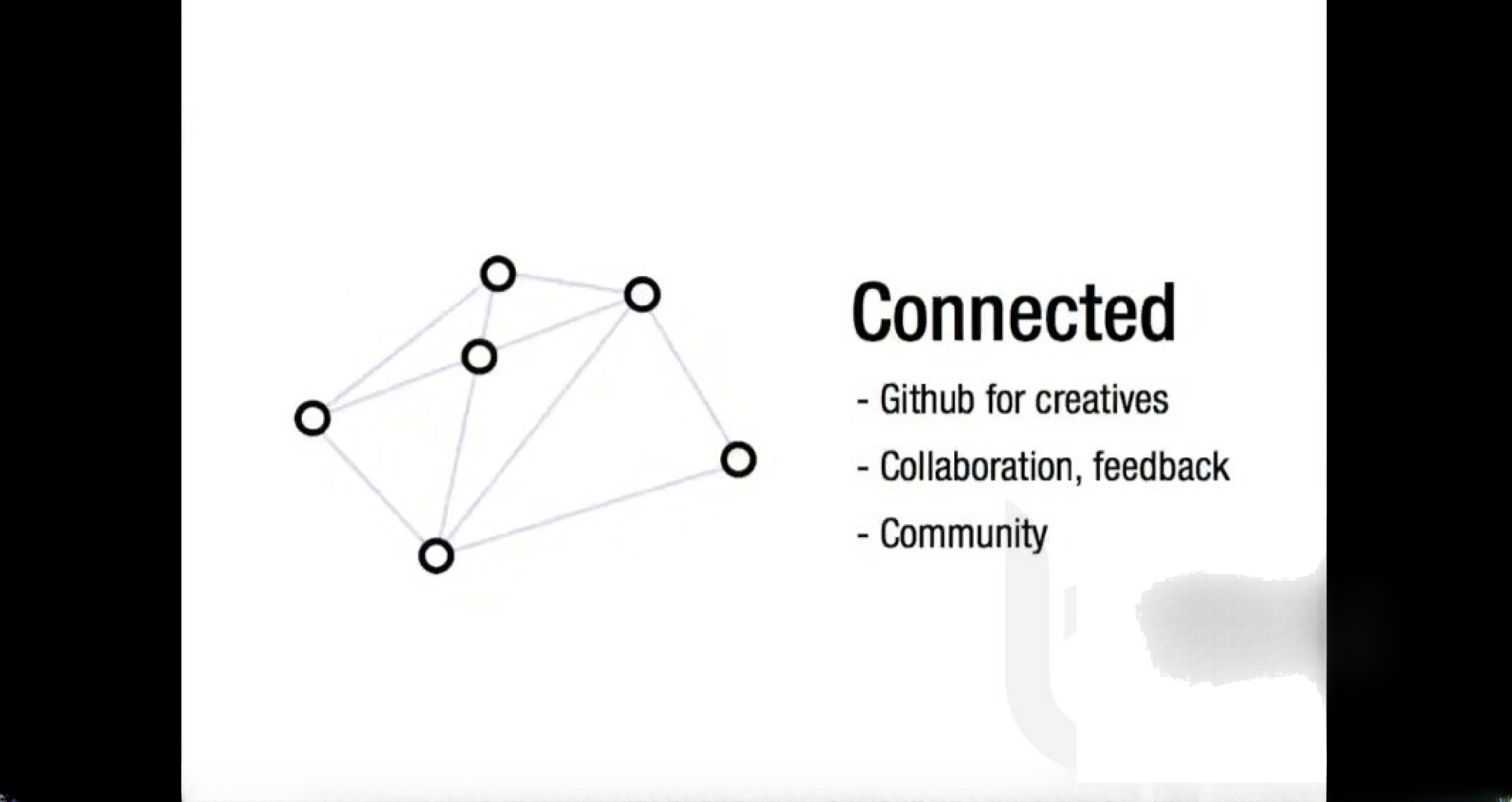
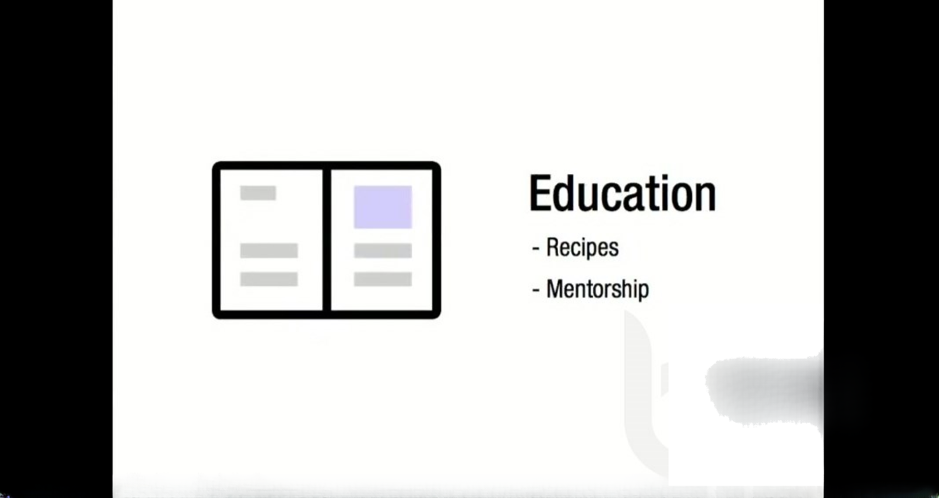
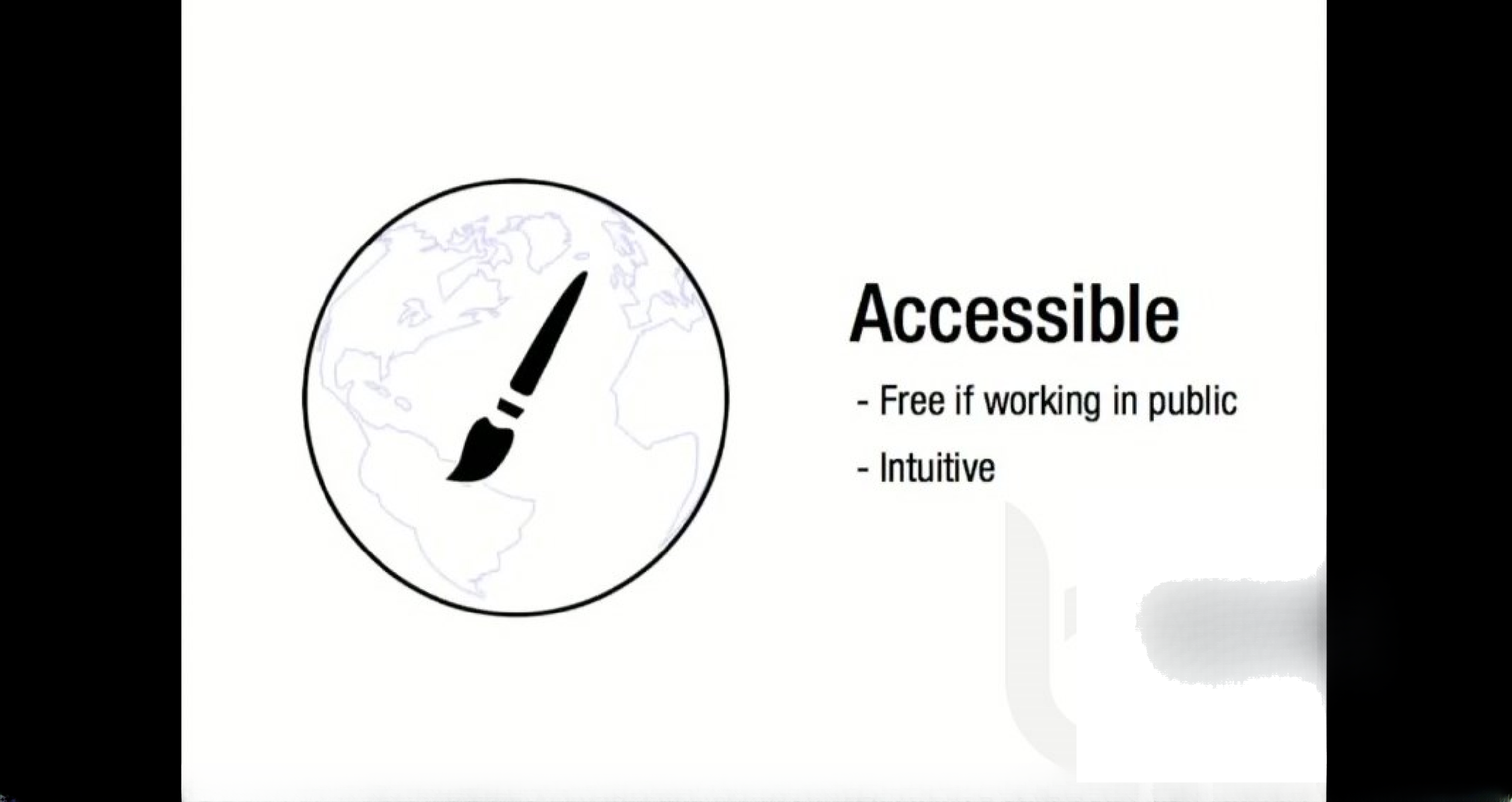
Slides 6–8 present three clean value propositions: Accessible (free if public, intuitive), Connected (collaboration, Github-like features, community), and Education (recipes, mentorship). These are shown with minimalist icons and short bullets, which makes the claims easy to scan and repeat. Rather than dense paragraphs, this section maps product capabilities to user benefits: lowering the barrier to entry, enabling collaboration, and providing learning resources for growth.

The clarity here is instructive: boil product advantages down to 2–3 crisp, distinct pillars that speak to different buyer/user motivations. For founders, the takeaway is to craft a short list of differentiated benefits (what users gain) and avoid feature lists that don’t translate into user value. Also, pairing each claim with a simple icon increases recall during an investor Q&A.

Key Takeaway: Frame your product as 2–3 differentiated pillars that map directly to user outcomes, and present them with minimal text and strong visual anchors.
Technical Demos — using live examples to prove feasibility

Technical Demos — using live examples to prove feasibility

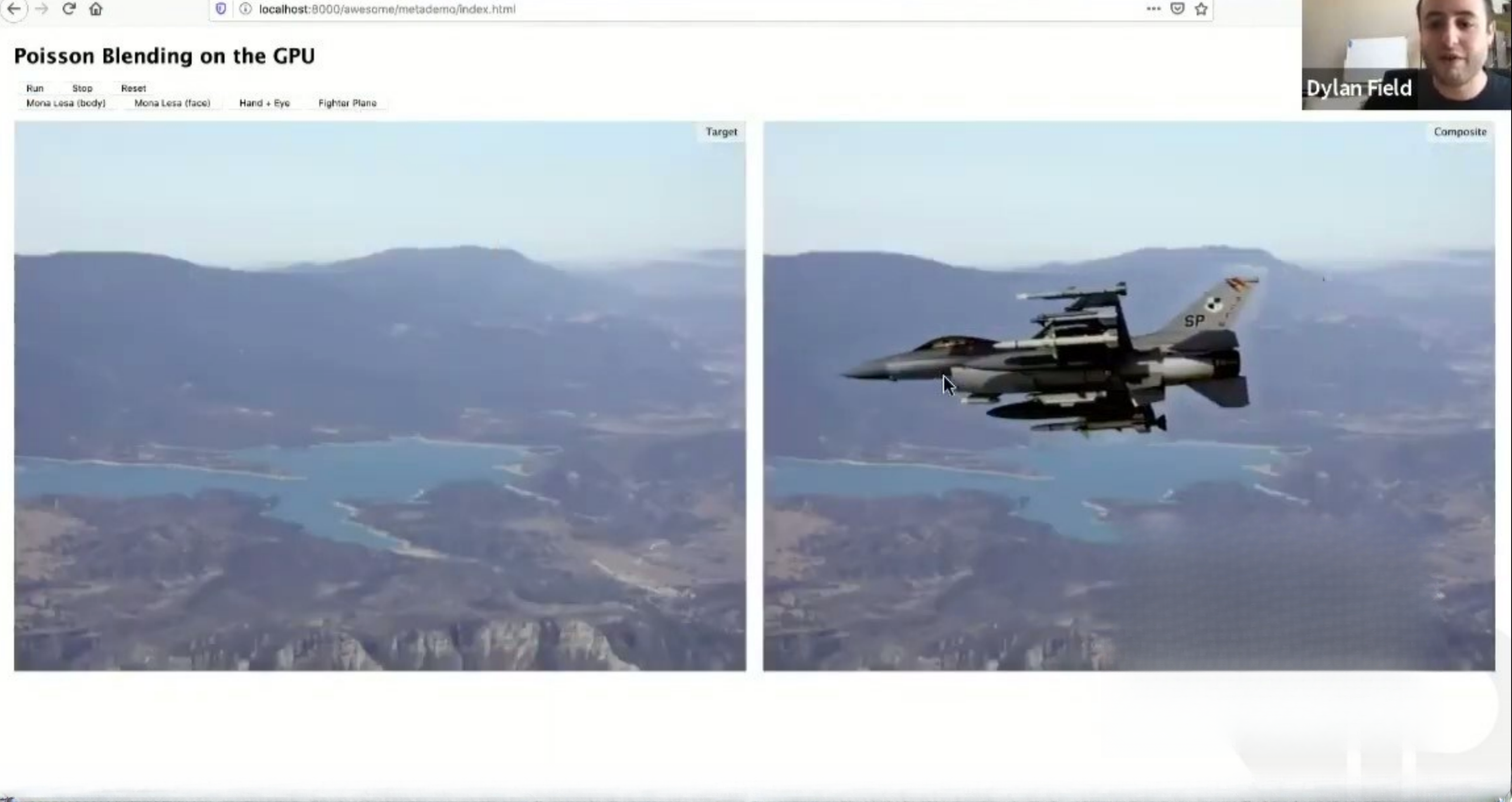
Slide 9 (Poisson blending demo) and the sequence of demo slides show algorithmic blending and compositing running in a browser context. Rather than describing technical achievements abstractly, the deck uses before/after visuals (Mona Lisa face swap, fighter jet composite) to make technical claims tangible. For a product where perceived quality and responsiveness matter (graphics tools), seeing working demos dramatically reduces technical skepticism.

This tactic is powerful but high-risk: demos must be reliable and represent real product capability. Founders should use short, repeatable demos that highlight core differentiation (speed, quality, browser-native behavior) and avoid one-off tricks that can’t be reproduced. When possible, capture short videos or screenshots of the demos inside a controlled environment to ensure reproducibility during investor meetings.

Key Takeaway: Use concise, high-impact demos to prove core technical claims — show what users will experience rather than only describing it.
Solving Hard UX Problems — image matting and edge cases

Solving Hard UX Problems — image matting and edge cases

Slide 16 shows advanced image matting (a dog image and matte) and subsequent slides demonstrate handling of hair, transparent edges and fine-grain alpha which are notoriously hard problems in graphics. By surfacing examples with tricky boundaries (fur, hair, motion blur), the team signals that their core algorithms handle real-world edge cases rather than only idealized inputs. This builds confidence that the product can be relied upon in professional workflows.

Founders building tools should similarly surface success on hard, representative examples that customers care about. Highlighting difficult edge cases and showing solid results differentiates basic implementations from production-grade systems. If you claim to solve a technical pain point, show it working on the hardest, most common real inputs customers will bring.

Key Takeaway: Demonstrate robustness on real-world edge cases — investors and users care that solutions work on messy, production inputs.
User Interface & Workflow — the edit environment and tooling

User Interface & Workflow — the edit environment and tooling

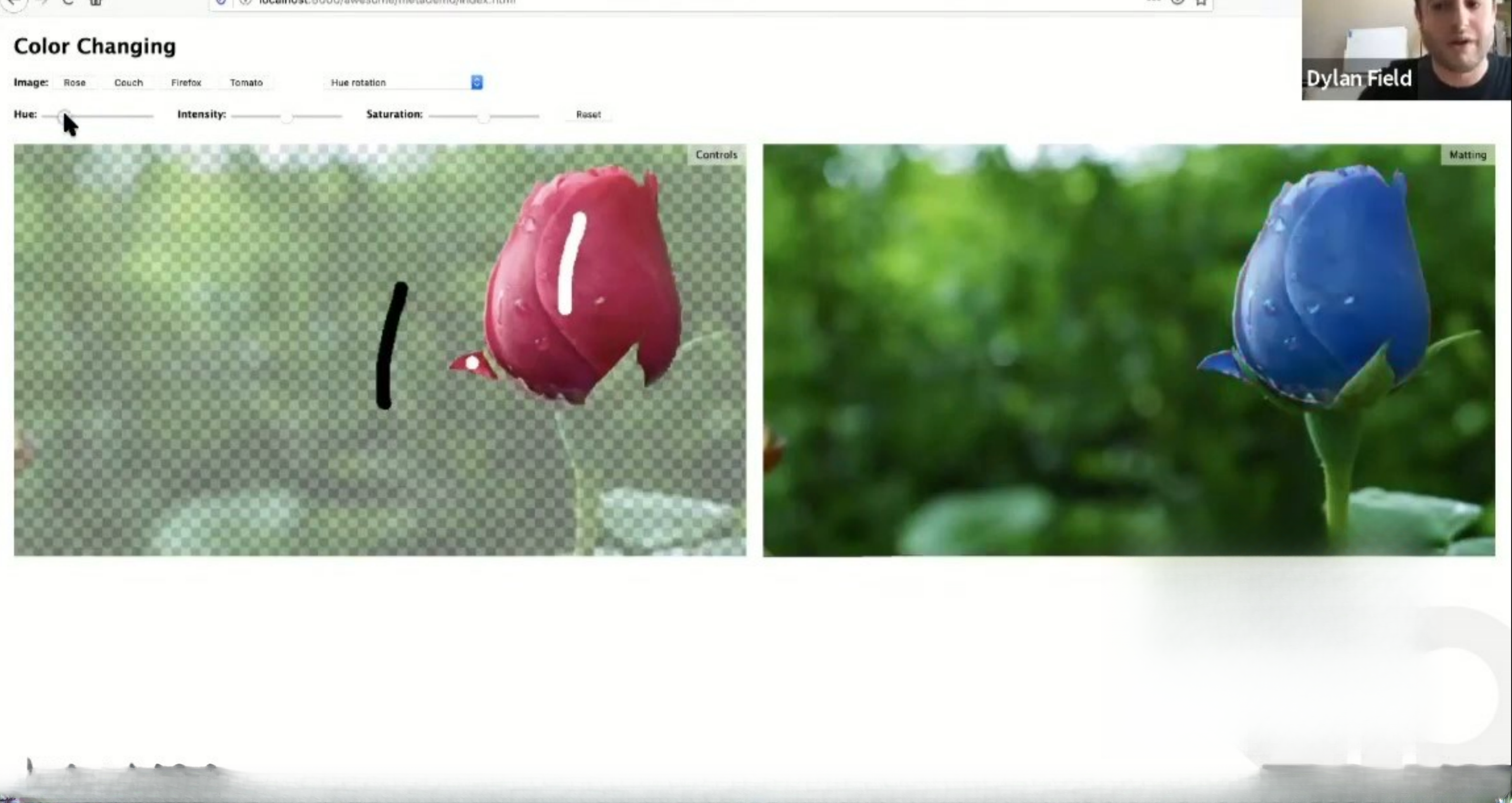
Slide 21 (the editing UI with sliders and tools) showcases a clean, Photoshop-like UI but simplified for the web, which speaks directly to accessibility and adoption. The screenshots of brush tools, color controls and clone/heal workflows give a sense of the product’s ergonomics: familiar metaphors with web-native constraints. That helps investors understand how users transition from desktop apps to the product and how friction will be reduced.

For founders, prioritizing a few high-value workflows and polishing them for UX clarity is more persuasive than a laundry list of features. Show how the UI reduces cognitive load and accelerates common tasks — investors can infer retention and adoption signals from how intuitive and familiar the interface appears.

Key Takeaway: Show concrete, familiar workflows in your UI—investors infer adoption potential from polished, intuitive interactions.
Roadmap & GTM — timing, milestones and scaling hires

Roadmap & GTM — timing, milestones and scaling hires

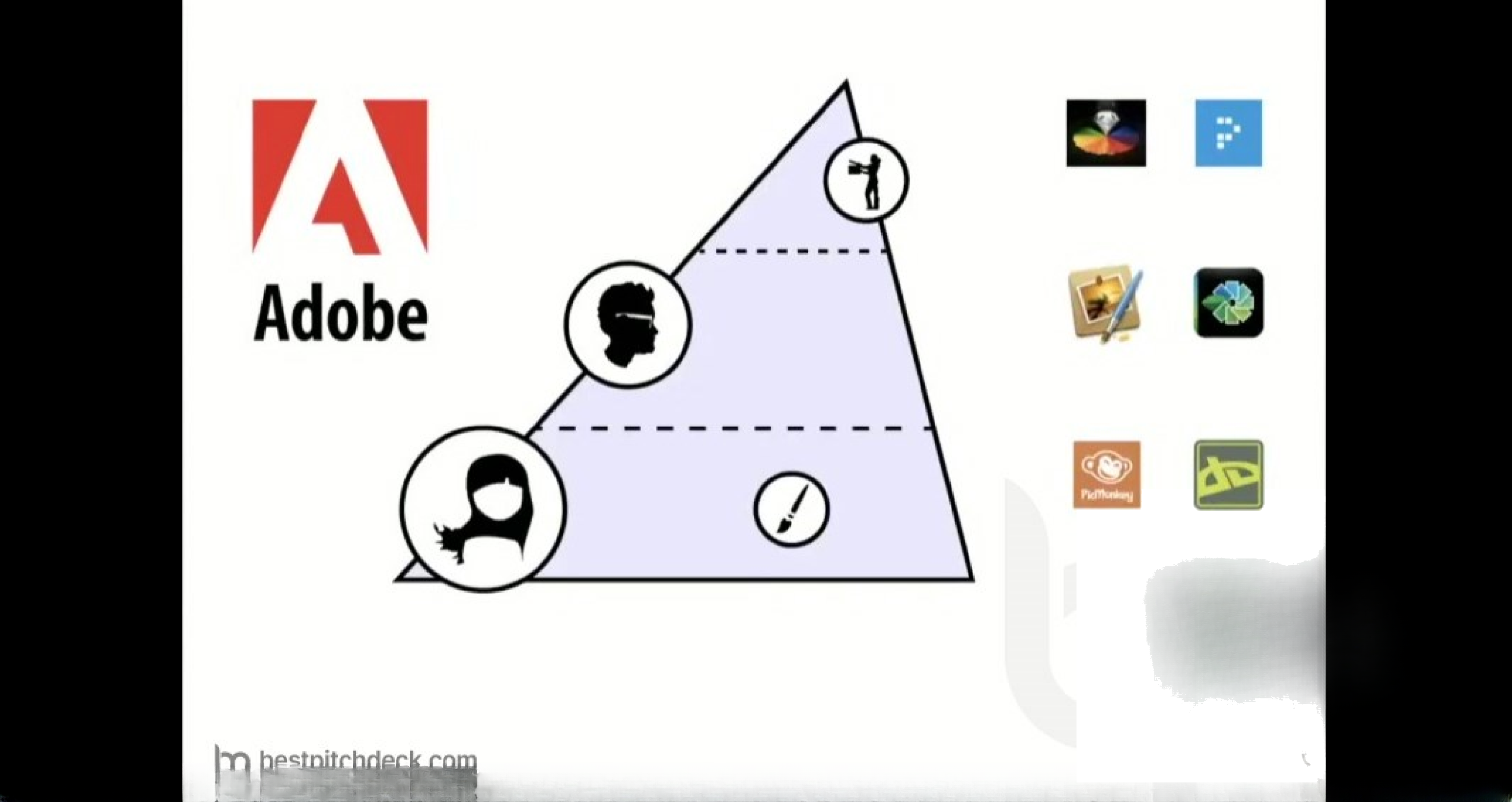
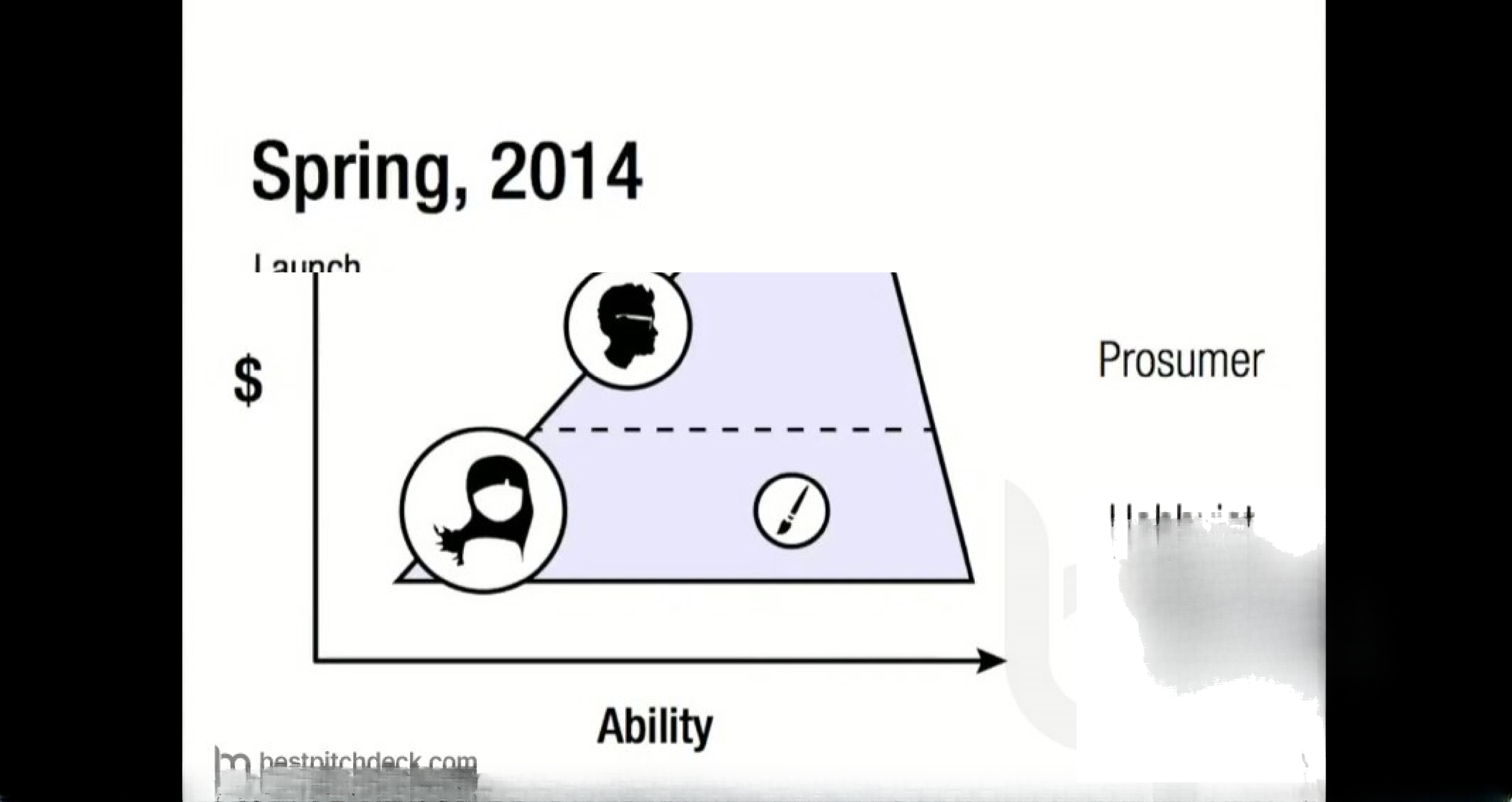
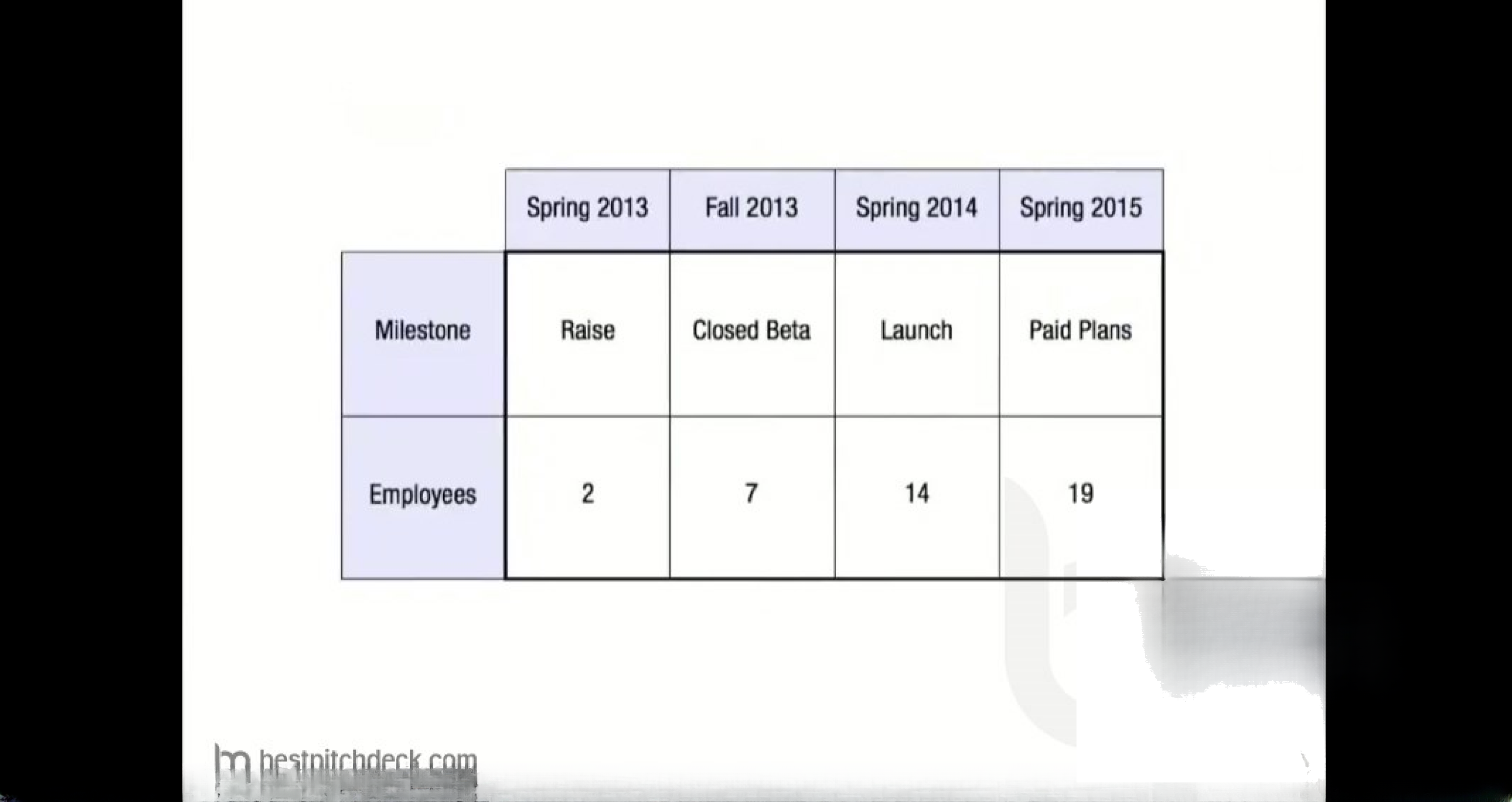
Slide 26 lays out a simple roadmap (raise, closed beta, launch, paid plans) and an ability/revenue diagram that clarifies the intended customer segments (prosumer vs professional). The accompanying milestone slide (slide 28) shows employee growth targets through launch and monetization. This combination gives investors a clear timeline and a hiring plan tied to specific product milestones and monetization moments.

Actionable planning like this helps reduce investor uncertainty: it shows that the team has thought about scaling engineering and support around product launches and pricing. Founders should be explicit about what materially changes at each milestone (e.g., closed beta => usage metrics to validate retention, launch => conversion to paid plans) and tie hiring to measurable outcomes rather than abstract headcounts.

Key Takeaway: Present a short, milestone-driven roadmap with measurable gating criteria and tie hiring to specific go/no-go outcomes.

Conclusion: Key Lessons

This deck’s strengths are clarity, demonstration, and alignment between technical capability and user value. It opens with quick credibility signals, then rapidly moves to hands-on demos and representative product workflows that validate feasibility and desirability. The team pairs those demonstrations with a succinct set of product pillars (accessibility, collaboration, education) and a milestone-driven plan that ties hiring and monetization to product validation.

Actionable advice: lead with credibility but focus the majority of your deck on demonstrable user outcomes (demos, before/after visuals, real edge-case handling). Keep value propositions to 2–3 memorable pillars, show the UI flows that drive adoption, and present a concrete, milestone-driven roadmap with measurable gating criteria. This combination reduces technical skepticism, signals product-market fit intent, and makes it easier for investors to see how funds will accelerate concrete progress.

Full Deck Analysis

11 sections

Overview

Company: Figma
Round: Pre-seed ($3.8M)
Year: 2012
Outcome: Acquired by Adobe for $20B (cancelled)
Status: Raised capital successfully despite significant pitch deck issues


Executive Summary

The Figma pre-seed pitch deck is a cautionary tale of technical prowess overshadowing product clarity. While the deck demonstrates exceptional engineering capability through 15 consecutive image processing demonstrations, it fundamentally fails to articulate what Figma actually is or why it matters. The founders—Dylan Field (Thiel Fellow, ex-Flipboard/LinkedIn) and Evan Wallace (ex-Pixar/Microsoft Office)—have impeccable credentials, but the pitch creates massive confusion about whether Figma is a photo editor, image processing tool, or design collaboration platform. Despite these critical flaws, the deck succeeded in raising $3.8M, suggesting that founder pedigree and technical credibility can overcome poor pitch structure. The eventual $20B Adobe acquisition validates the underlying vision, but the pitch deck itself represents a masterclass in how NOT to communicate a product’s value proposition.


Problem Statement

Articulation Quality: Poor to Non-existent

The deck attempts to establish the problem through visual storytelling rather than explicit articulation:

  • Slide 3 shows scattered design sketches and wireframes on a table, implying the pain of manual, paper-based design workflows
  • Implicit problem: Designers work in fragmented, non-digital environments with poor collaboration
  • Missing explicit statement: The deck never clearly states “Designers spend X hours on Y task” or “Current tools cost Z and lack A, B, C features”

What’s Missing:

  • No quantification of the problem (market size, frequency, cost impact)
  • No user research or designer interviews cited
  • No competitive pain points articulated
  • No urgency established for solving this problem

Verdict: The problem statement relies entirely on visual inference rather than explicit communication. While the sailboat photo and scattered sketches create emotional resonance, they don’t establish a compelling business case for investment.


Solution

Positioning: Confused and Contradictory

The deck attempts to position Figma through three pillars (Slides 5-8):

Three Core Features (Slides 5-8)

1. Accessible (Slide 6)

  • Free if working in public
  • Intuitive interface
  • Implication: Democratized design tools for non-professionals

2. Connected (Slide 7)

  • “Github for creatives”
  • Collaboration and feedback
  • Community-driven
  • Implication: Social, network-effects-driven platform

3. Education (Slide 8)

  • Recipes (tutorials/templates)
  • Mentorship
  • Implication: Learning platform for designers

The Critical Problem: 15 Consecutive Image Processing Demos (Slides 9-23)

After establishing these three pillars, the deck pivots to 15 consecutive technical demonstrations of image processing capabilities:

Slide Demo Relevance to Design Collaboration
9-10 Poisson Blending (image compositing) None
11 Advanced image compositing (eye in palm) None
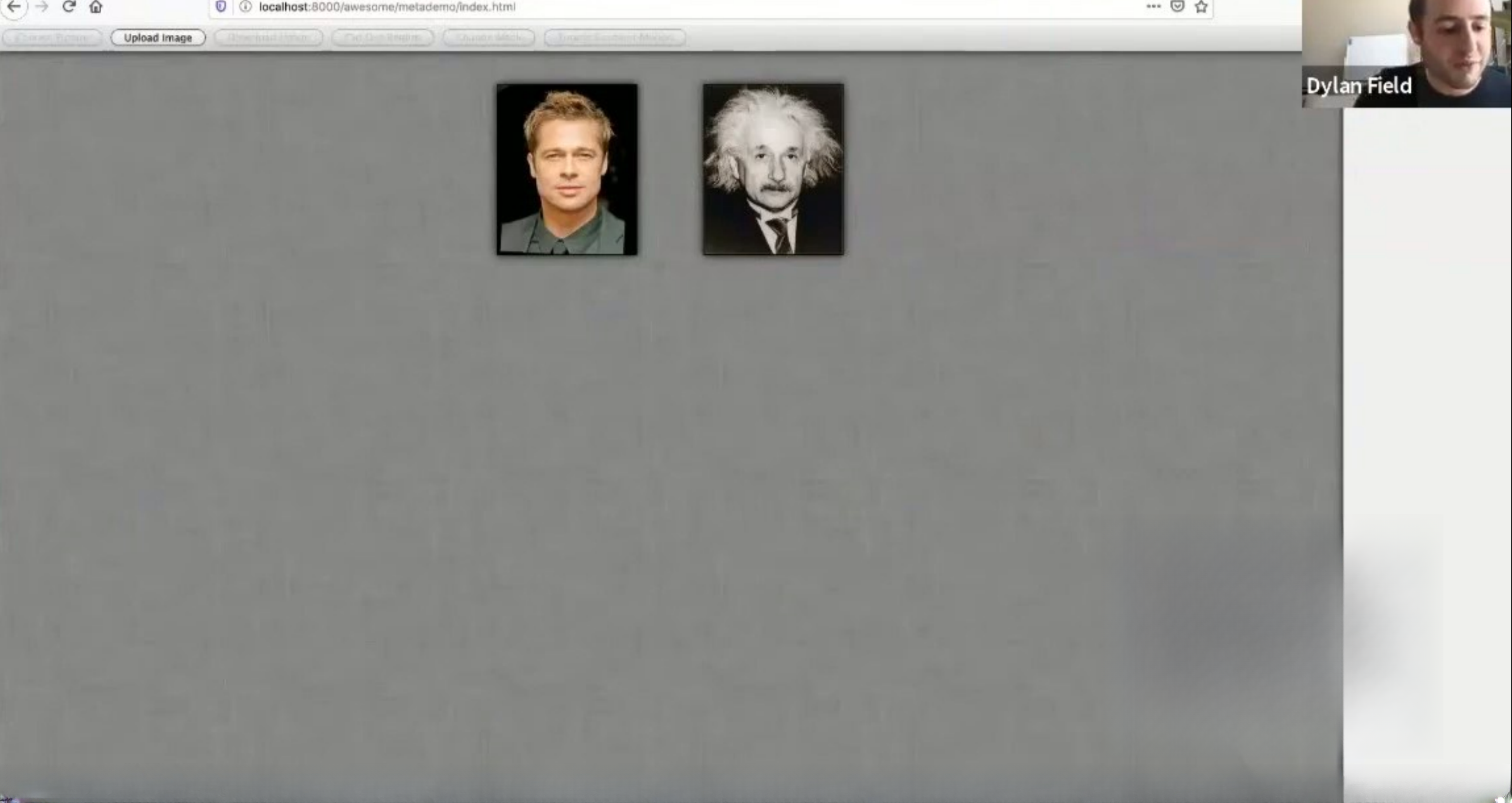
12 Image gallery/upload Minimal
13 Image selection/cropping Minimal
14 Background removal Minimal
15 GraphCut segmentation None
16 Image matting (dog example) None
17 Image matting (girl example) None
18 Color line detection Minimal
19 Color changing (rose) Minimal
20 Color changing (Firefox logo) Minimal
21 Photo editing interface Minimal
22 Interactive image annotation Minimal
23 Digital painting tools Minimal

The Fundamental Disconnect:
The solution positioning (design collaboration tool) has virtually no connection to the demonstrated capabilities (image processing). This creates massive investor confusion about what Figma actually does.

What investors likely thought:

  • Slides 1-8: “Figma is a collaborative design tool like Github for designers”
  • Slides 9-23: “Wait, Figma is a photo editor with advanced image processing”
  • Slides 24-29: “Actually, Figma is… a design tool? But we just saw 15 image processing demos”

Market Opportunity

TAM/SAM/SOM Analysis: Essentially Non-existent

The deck provides zero quantification of market opportunity:

  • No Total Addressable Market (TAM) stated
  • No Serviceable Addressable Market (SAM) stated
  • No Serviceable Obtainable Market (SOM) stated
  • No market size research cited
  • No designer population statistics provided
  • No design tool market analysis included

Implied Market Segments (Slides 25-26):

From the positioning matrix (Slides 25-26), two target segments are implied:

  1. Prosumer (Professional Consumer)
    • Higher ability, higher cost tier
    • Likely: Freelance designers, small design studios
    • No market size provided
  2. Hobbyist
    • Lower ability, lower cost tier
    • Likely: Students, casual designers
    • No market size provided

Competitive Context (Slide 26):

  • Adobe identified as primary competitor
  • 6+ alternative tools shown (icons, not labeled)
  • No market share analysis provided
  • No pricing comparison provided

Verdict: The deck completely fails to establish market opportunity. For a pre-seed pitch, this is a critical omission. Investors have no basis for evaluating whether this is a $100M, $1B, or $10B opportunity.


Business Model

Revenue Model: Freemium (Implied, Not Explicit)

Slide 6 - “Accessible”:

  • “Free if working in public”
  • Implicit: Paid for private work

Slide 25 - Spring 2014 Launch:

  • Positioning matrix shows cost/ability segmentation
  • Implies tiered pricing

Slide 27 - Spring 2015 Milestone:

  • “Paid Plans” listed as milestone
  • Suggests monetization begins ~2 years after launch

What’s Missing:

  • No explicit pricing tiers stated
  • No revenue per user (ARPU) projections
  • No unit economics provided
  • No customer acquisition cost (CAC) assumptions
  • No lifetime value (LTV) calculations
  • No gross margin assumptions
  • No path to profitability articulated

Verdict: The business model is inferred rather than explicitly stated. For a pre-seed pitch, this is acceptable (many early-stage companies haven’t finalized pricing), but it leaves investors guessing about monetization strategy.


Traction & Metrics

Traction Evidence: Minimal to Non-existent

The deck provides virtually no traction metrics:

  • No user numbers
  • No signups
  • No beta participants
  • No revenue
  • No growth rates
  • No retention metrics
  • No engagement metrics

What’s Provided:

Slide 1 - Team Credentials:

  • Dylan Field: Thiel Fellow, ex-Flipboard, ex-LinkedIn, ex-MSR
  • Evan Wallace: ex-Pixar, ex-Microsoft Office
  • Implication: Team has shipped products at scale

Slides 9-23 - Technical Demonstrations:

  • Working prototypes of image processing algorithms
  • Implication: Team can execute complex technical projects
  • Problem: Doesn’t demonstrate design collaboration features

Slide 27 - Execution Roadmap:

  • Spring 2013: 2 employees (current state)
  • Fall 2013: 7 employees (target)
  • Spring 2014: 14 employees (target)
  • Spring 2015: 19 employees (target)
  • Implication: Planned 3.5x hiring growth per year

Verdict: The deck relies entirely on founder credibility and technical demonstrations rather than product traction. For a pre-seed round, this is somewhat acceptable (product may not exist yet), but it’s a significant weakness compared to decks with user traction.


Competitive Positioning

Competitive Analysis: Superficial and Incomplete

Slide 26 - Competitive Landscape:

Primary Competitor Identified:

  • Adobe (explicitly called out with logo)
  • Implied positioning: Figma is the “accessible” alternative to Adobe’s expensive, complex tools

Alternative Tools Shown (6 icons, not labeled):

  • Likely includes: Sketch, Photoshop, Illustrator, Pixlr, Canva, Pixelmator
  • Problem: Icons are not labeled, making competitive set unclear

Positioning Matrix (Slides 25-26):

  • X-axis: Ability (capability/complexity)
  • Y-axis: Cost ($)
  • Figma’s position: Lower cost, lower ability (implied)
  • Adobe’s position: Higher cost, higher ability (implied)

Differentiation Strategy (Implied):

  1. Accessibility: Free for public work (vs. Adobe’s expensive subscriptions)
  2. Collaboration: “Github for creatives” (vs. Adobe’s solo-focused tools)
  3. Community: Built-in mentorship and recipes (vs. Adobe’s isolated experience)

What’s Missing:

  • No explicit feature comparison (Figma vs. Adobe vs. Sketch)
  • No pricing comparison
  • No market share analysis
  • No customer switching costs analysis
  • No defensibility strategy articulated
  • No network effects explanation

Verdict: The competitive positioning is vague and relies on price/accessibility differentiation rather than feature or capability differentiation. This is a weak competitive moat.


Team

Team Composition: 2 Co-founders (Visible), 1 Co-founder (Missing)

Visible Founders

Dylan Field (Co-founder/CEO)

  • Title: Thiel Fellow, Brown University
  • Experience:
    • Flipboard (social news aggregation platform)
    • LinkedIn (professional social network)
    • MSR (Microsoft Research)
  • Credentials: Thiel Fellowship is prestigious; experience at scale (LinkedIn, Microsoft)
  • Implication: Has shipped products, understands growth, knows how to work at large companies

Evan Wallace (Co-founder)

  • Title: CS195 (course?), Brown University
  • Experience:
    • Pixar (animation/graphics company)
    • Microsoft Office (productivity suite)
  • Credentials: Graphics expertise (Pixar); experience with consumer software (Microsoft Office)
  • Implication: Deep technical expertise in graphics and UI; understands consumer product design

Missing Co-founder

Immanuel Mortenson (Co-founder - Not Visible in Deck)

  • Not mentioned or shown in the pitch deck
  • Problem: Incomplete team presentation; investors don’t know about third founder

Team Credibility Assessment

Strengths:

  • Both founders have experience at prestigious companies
  • Complementary skills: Dylan (product/growth), Evan (graphics/engineering)
  • Both from Brown University (shared context)
  • Dylan’s Thiel Fellowship is prestigious signal

Weaknesses:

  • No design expertise visible (both are engineers/product people)
  • No business/finance expertise visible
  • No marketing/sales expertise visible
  • Third co-founder not mentioned (incomplete team presentation)
  • No advisors listed (Bret Victor mentioned on Slide 2, but relationship unclear)

Verdict: Strong founder credentials, but incomplete team presentation and missing design expertise are concerns for a design tool startup.


Go-to-Market Strategy

GTM Strategy: Essentially Non-existent

The deck provides no explicit go-to-market strategy:

  • No customer acquisition channels identified
  • No sales strategy articulated
  • No marketing plan provided
  • No partnership strategy mentioned
  • No distribution channels discussed

Implied GTM (From Roadmap):

Slide 24 - Fall 2013 Closed Beta:

  • Suggests invite-only beta launch
  • Implies word-of-mouth/community-driven acquisition

Slide 25 - Spring 2014 Launch:

  • “Launch” milestone suggests public availability
  • Implies open access (vs. closed beta)

Slide 7 - “Connected” Feature:

  • “Github for creatives” positioning
  • Implies network effects and community-driven growth
  • Suggests user-generated content as acquisition driver

Slide 8 - “Education” Feature:

  • “Recipes” and “Mentorship”
  • Implies content marketing and community engagement

Inferred GTM Strategy:

  1. Phase 1 (Fall 2013): Closed beta with designer community
  2. Phase 2 (Spring 2014): Public launch with free tier
  3. Phase 3 (Ongoing): Community-driven growth through network effects and user-generated content

Verdict: The GTM strategy is inferred rather than explicit. For a pre-seed pitch, this is a significant weakness. Investors want to understand how you’ll acquire customers, not guess based on feature positioning.


The Ask

Funding Request: $3.8M (Pre-seed Round)

What’s Stated:

  • Slide 27 shows hiring plan: 2 → 7 → 14 → 19 employees over 2 years
  • Implies capital needed to fund team growth

What’s Missing:

  • No explicit ask amount stated in deck
  • No use of funds breakdown provided
  • No runway calculation provided
  • No burn rate assumptions provided
  • No capital allocation (engineering vs. marketing vs. operations)

Implied Use of Funds (From Roadmap):

  • Hiring: Primary use (team grows from 2 to 19 over 2 years)
  • Infrastructure: Server costs for web-based platform
  • Product development: Engineering resources
  • Marketing: Likely minimal (community-driven growth assumed)

Verdict: The ask is not explicitly stated in the deck, which is a significant omission. However, the $3.8M figure is known from external sources. The deck should have included a clear “We’re raising $3.8M to…” statement with use of funds breakdown.


Investor Deep Dive

Executive summary, strengths & red flags

Executive Summary

The Figma pre-seed pitch deck is a cautionary tale of technical prowess overshadowing product clarity. While the deck demonstrates exceptional engineering capability through 15 consecutive image processing demonstrations, it fundamentally fails to articulate what Figma actually is or why it matters. The founders—Dylan Field (Thiel Fellow, ex-Flipboard/LinkedIn) and Evan Wallace (ex-Pixar/Microsoft Office)—have impeccable credentials, but the pitch creates massive confusion about whether Figma is a photo editor, image processing tool, or design collaboration platform. Despite these critical flaws, the deck succeeded in raising $3.8M, suggesting that founder pedigree and technical credibility can overcome poor pitch structure. The eventual $20B Adobe acquisition validates the underlying vision, but the pitch deck itself represents a masterclass in how NOT to communicate a product's value proposition.

Key Strengths

5 identified

1

Exceptional Founder Credentials

- Dylan Field: Thiel Fellow with experience at Flipboard, LinkedIn, Microsoft Research

2

Technical Credibility Through Live Demonstrations

- 15 consecutive working prototypes of complex image processing algorithms

3

Clear Product Vision (Despite Confusion)

- Three pillars clearly articulated: Accessible, Connected, Education

4

Concrete Execution Roadmap

- Specific milestones with dates: Closed Beta (Fall 2013), Launch (Spring 2014), Paid Plans (Spring 2015)

5

Freemium Business Model

- Free tier for public work (accessibility)

Red Flags & Weaknesses

8 identified

1

Catastrophic Disconnect Between Positioning and Demonstrations

- Slides 1-8 position Figma as a design collaboration tool; Slides 9-23 demonstrate image processing capabilities

2

No Product-Market Fit Evidence

- Zero traction metrics (no users, signups, beta participants, or revenue)

3

No Market Opportunity Quantification

- Zero TAM/SAM/SOM analysis; no market size provided

4

Incomplete Team Presentation

- Third co-founder (Immanuel Mortenson) not mentioned; no design expertise visible

5

No Go-to-Market Strategy

- No customer acquisition channels, sales strategy, or marketing plan articulated

6

Vague Competitive Positioning

- Competitive set shown but not labeled; differentiation relies on price/accessibility rather than features

7

No Explicit Ask or Use of Funds

- Deck doesn't state funding amount or use of funds breakdown

8

Missing Business Model Details

- Freemium model implied but not explicit; no pricing, ARPU, CAC, or LTV provided

More Pitch Decks To Study

Compare structure, fundraising context, and investor-facing story across similar startup decks.