Compare your deck to DocSend

Compare Your Deck

DocSend Pitch Deck (2013)

SaaS
Stage: Seed
Raised: $1.7M
Year: 2013
Slides: 19
Outcome: Acquired by Dropbox for $165M (2021)

Pitch Deck

1 / 19
DocSend pitch deck - Cover & Research Framing: Establishing Credibility
Click to expand

Deck Analysis

This deck from DocSend (Seed, 2013) is a data-driven, design-forward playbook aimed at founders raising seed rounds. It combines anonymized analytics from 200 startups with practical recommendations about pitch deck structure, investor outreach, and fundraising timelines. Notable for its clean visual language and evidence-based guidance (page-by-page viewing times, average meetings/contact counts, and fundraising outcomes), the deck serves both as marketing for DocSend’s product and as a concise operational guide for entrepreneurs.

Cover & Research Framing: Establishing Credibility

Cover & Research Framing: Establishing Credibility

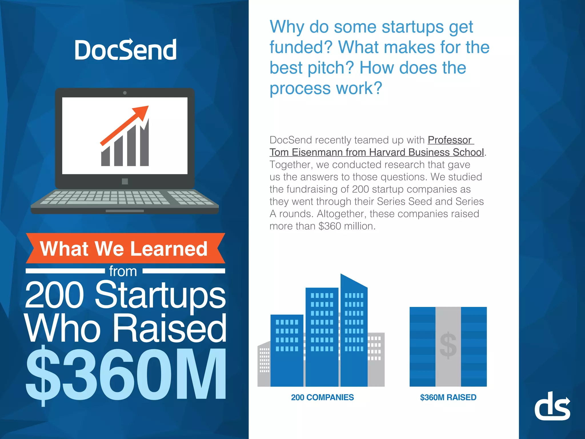
The opening slide immediately sets the narrative: DocSend partnered with academic expertise to study 200 startups that raised a combined $360M. As a cover it does three things well — it brands the study, communicates scope (200 companies, $360M), and positions DocSend as an authority by referencing a Harvard Business School collaborator. The large visual hierarchy (big dollar figure, bold branding) makes the proposition obvious within seconds.

From a founder’s perspective, this is a model for an opening slide: lead with credibility and a clear data point. If you’re presenting a study or your company story, surface the sample size and headline metric early. That establishes authority, reduces skepticism, and primes the audience to treat subsequent claims as evidence-backed rather than anecdotal.
Key Takeaway: Open by establishing credibility with a clear headline metric and the scale of your data or traction to earn attention and trust.
Fundraising Process Snapshot: Concrete Benchmarks

Fundraising Process Snapshot: Concrete Benchmarks

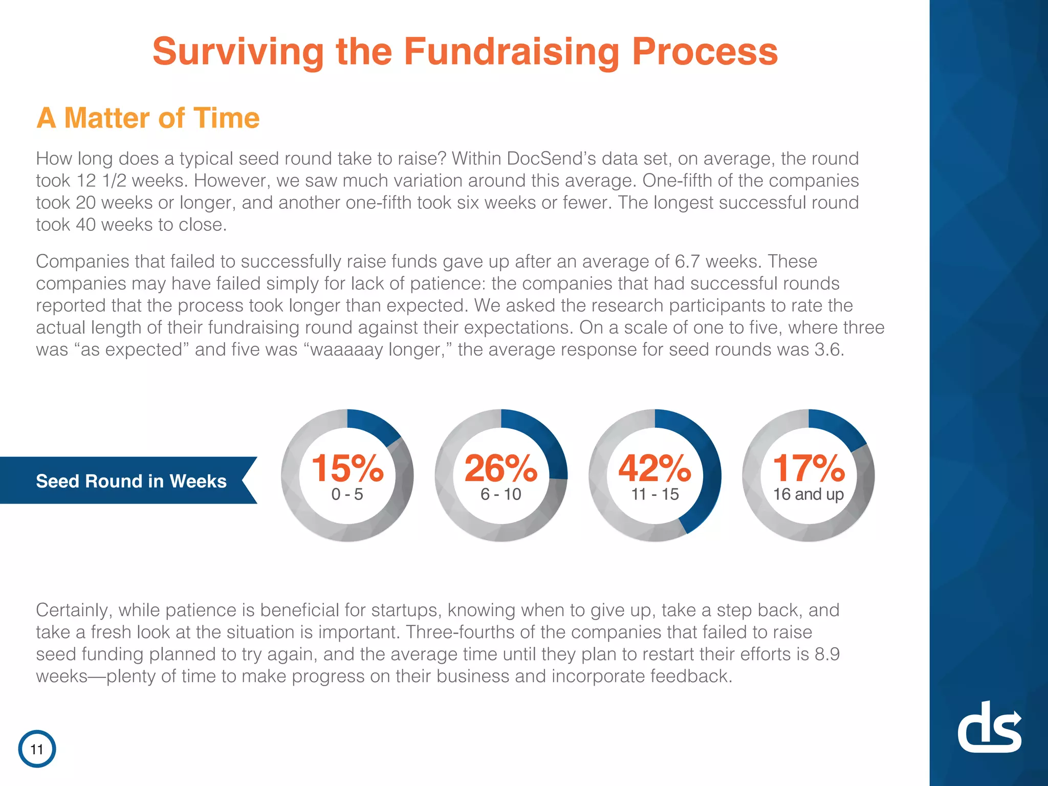
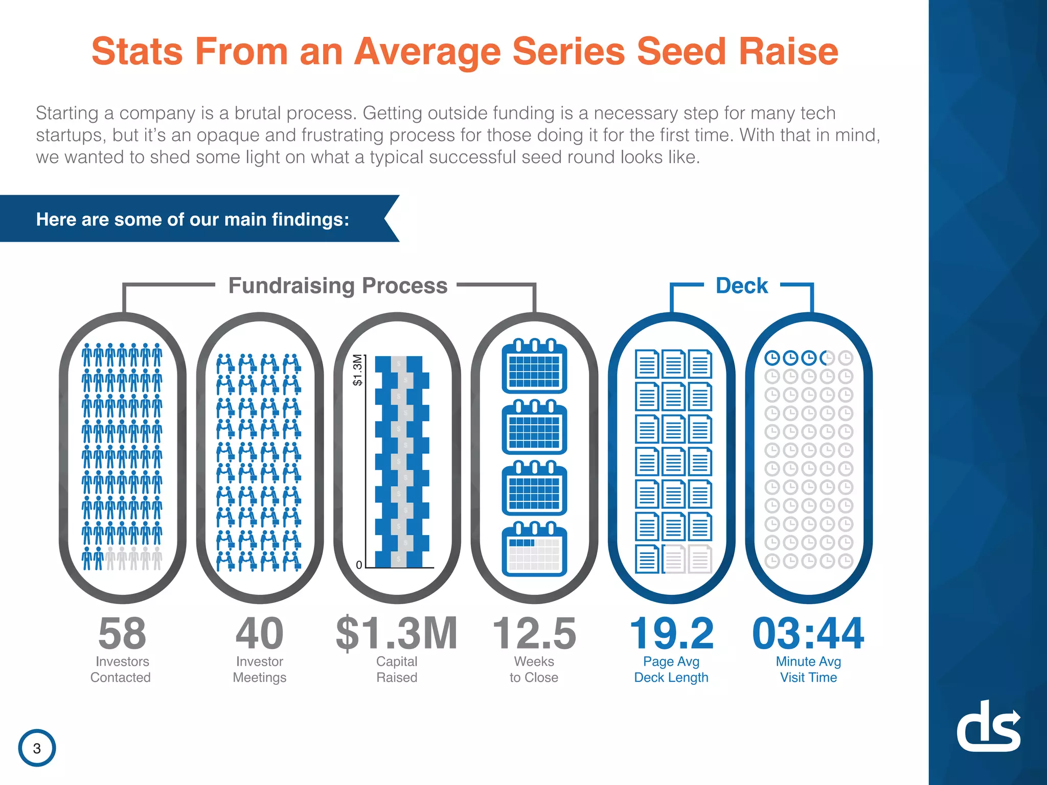
Slide 3 lays out concrete, memorable benchmarks: 58 investors contacted, 40 investor meetings, $1.3M raised, 12.5 weeks to close, 19.2 pages deck avg, 3:44 average visit time. Presenting the whole funnel side-by-side gives founders realistic expectations and a sense of pacing — how many outreach touches convert into meetings and capital. The infographic format lets readers absorb the end-to-end process quickly and compare their own metrics against the sample.

This approach is effective because it reduces ambiguity. Many founders enter fundraising with vague timelines; giving specific medians/modes helps with planning resource allocation (how many intros to chase, how long to expect the process to take). For founders creating investor-facing materials, replicating a similarly simple funnel visualization can communicate credibility and help investors quickly understand traction and process rhythms.

Key Takeaway: Give investors and stakeholders a compact funnel with 3–6 benchmark metrics so expectations and pacing are clear from the start.
Designing the Deck: What Pages to Include and Frequency

Designing the Deck: What Pages to Include and Frequency

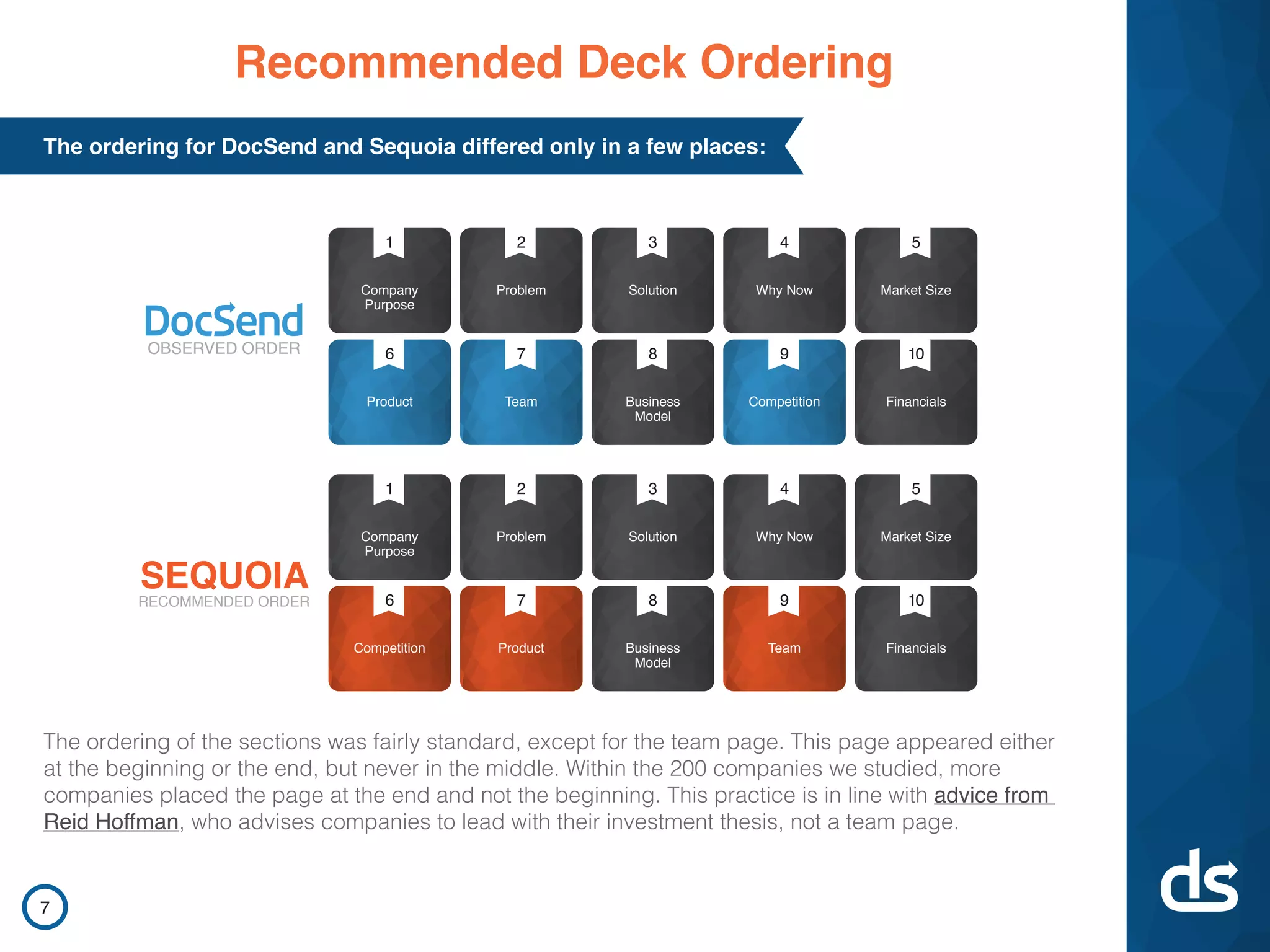
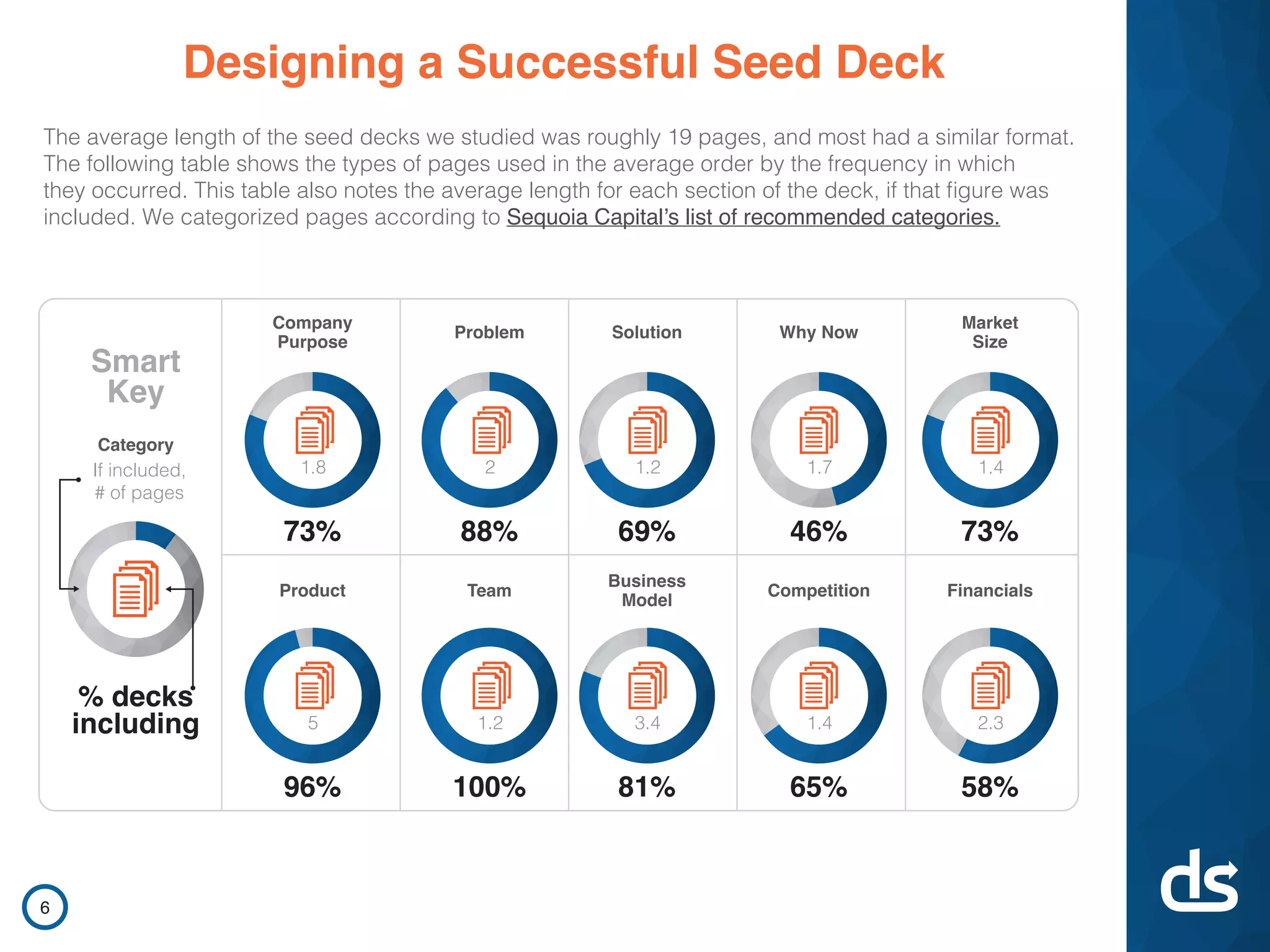
Slide 6 maps the common deck sections (Company Purpose, Problem, Solution, Product, Team, Business Model, Financials, etc.) and shows the percentage of decks that include each plus average pages per section. Two insights stand out: most successful decks included Product and Team (96–100%), while Financials were present in only ~58% but commanded more attention when present. The visual ring and page-count callouts make it clear which sections founders prioritize and how deep they typically go.

For founders this is practical: follow conventions but be deliberate about inclusion and depth. If financials are included, make them crisp because investors will spend more time there; if you lack robust financials, focus on product, team, and market to compensate. The slide’s structure — frequency plus depth — is a template founders can use to audit their own decks against market norms.

Key Takeaway: Follow expected deck categories but prioritize clarity: include team and product always, and only include financials if they’re concise and well-supported.
How Viewers Read Decks: Time and Mobile Attention

How Viewers Read Decks: Time and Mobile Attention

Slide 8 highlights that the average successful deck was viewed for 3 minutes 44 seconds and that 12% of investors viewed decks on mobile. The stopwatch and phone imagery emphasize the limited attention window and the reality of mobile consumption. This is a subtle but strong reminder: pages need to communicate quickly and legibly on small screens.

The implication for founders is tactical: design slides for skimmability (bold headers, clear visuals, minimal dense text) and test how the deck looks on mobile. Don’t assume investors will read an attached 40-page appendix; instead, craft a focused narrative that can be scanned in under four minutes and still leave a memorable impression.

Key Takeaway: Design decks for quick scanning and ensure key slides are readable on mobile — you have roughly 3–4 minutes to make your case.
Which Pages Matter Most: Where Investors Spend Time

Which Pages Matter Most: Where Investors Spend Time

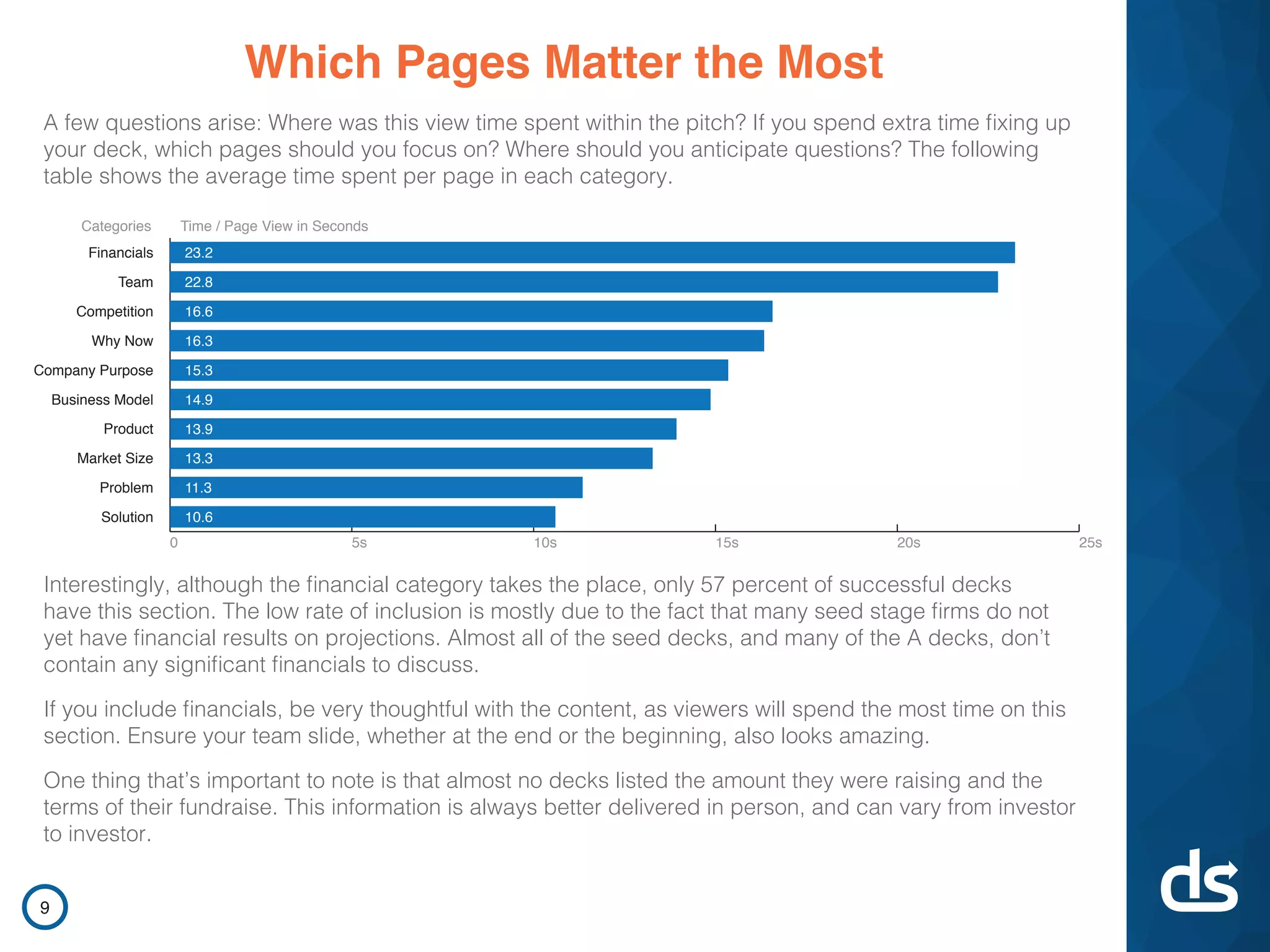
Slide 9 ranks average time per page category — Financials (~23s) and Team (~23s) top the list, while Solution and Problem receive less dwell time. The bar chart makes the point visually: certain pages earn disproportionately more attention. The slide then discusses the trade-off that not all decks included financials but those that did saw them scrutinized more closely.

This is actionable: if a section draws more time, it likely spurs more questions and requires cleaner presentation. Spend disproportionate design and review effort on the team and financial slides (or on whatever your data indicates investors care about). Anticipate follow-up questions in the areas where viewers linger and use those slides to pre-emptively answer them.

Key Takeaway: Invest time where investors spend time — make financials and team slides airtight because they attract the most scrutiny.
Outreach Strategy: Quality Over Quantity

Outreach Strategy: Quality Over Quantity

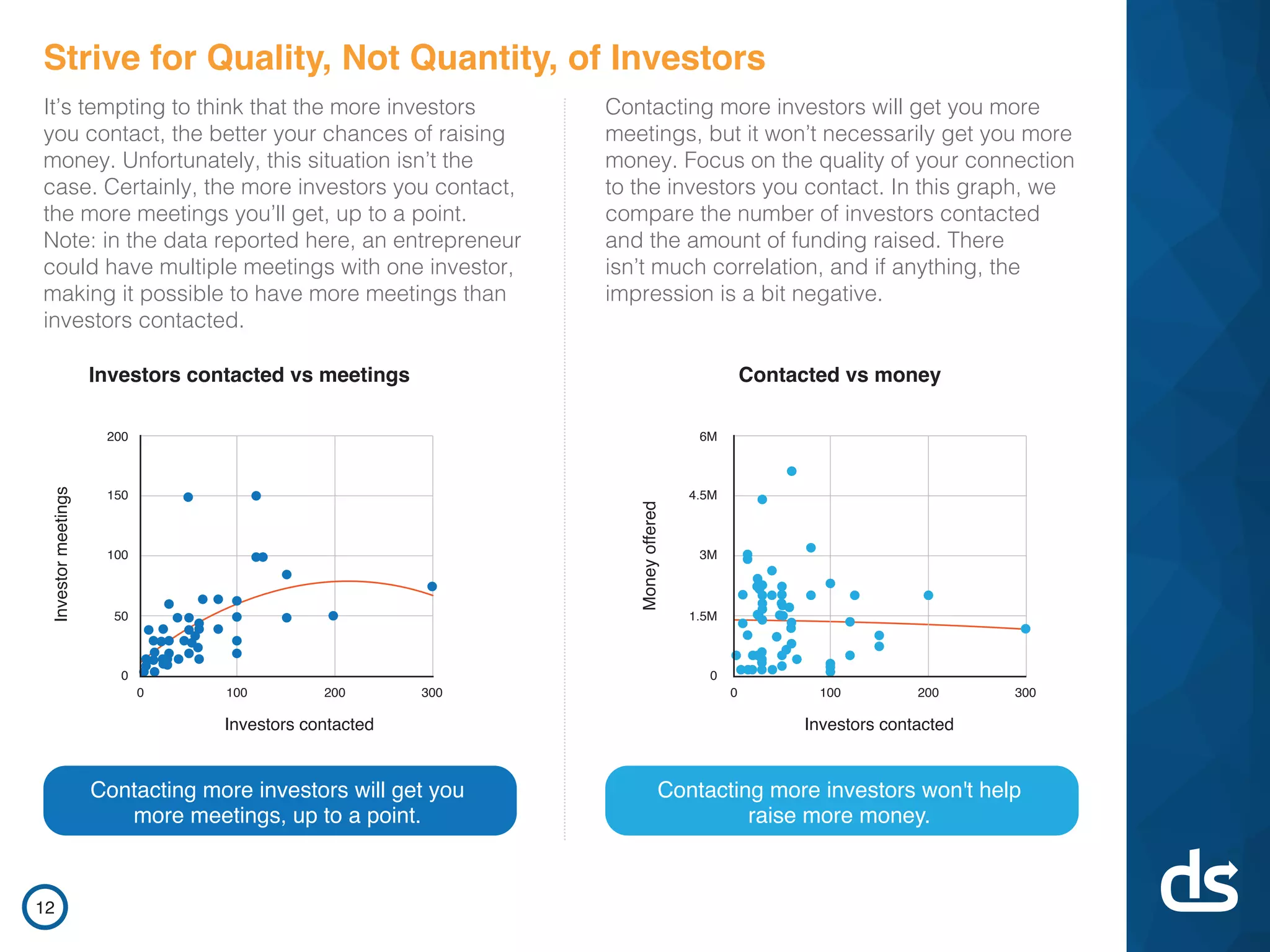
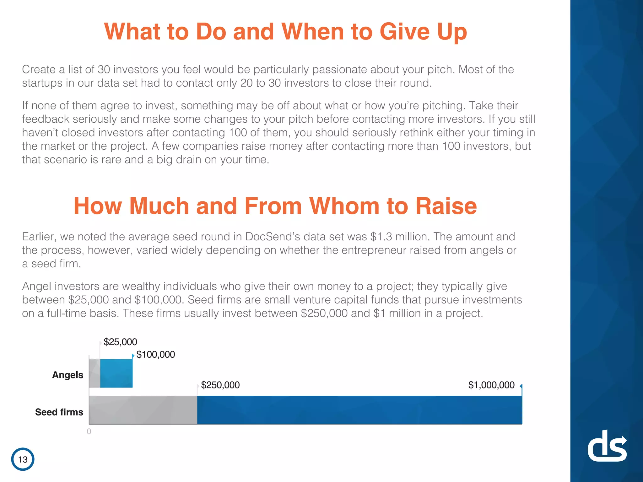
Slide 12 addresses outreach dynamics with scatter plots showing investors contacted vs. meetings and contacted vs. money raised. The narrative and charts argue that contacting more investors increases meetings up to a point but does not reliably increase the amount raised. This counters a common founder instinct to 'spray and pray' and reframes the activity as targeted relationship-building.

Founders should take a strategic approach: build a prioritized list of 20–30 high-fit investors and iterate on pitch quality based on feedback instead of contacting hundreds. The slide’s visual data plus explicit recommendation (quality > quantity) provides an evidence-based rule of thumb founders can operationalize during a fundraising sprint.

Key Takeaway: Prioritize a curated list of high-fit investors and iterate on your pitch from feedback — more outreach doesn’t guarantee more capital.
Firm-Led vs Angel Rounds: Trade-offs and Unit Economics

Firm-Led vs Angel Rounds: Trade-offs and Unit Economics

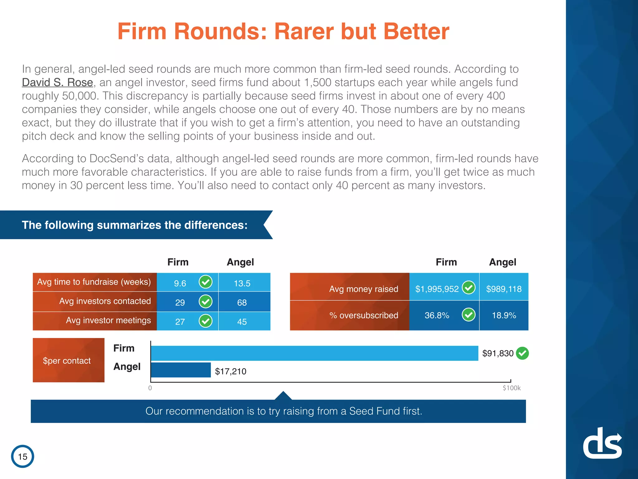
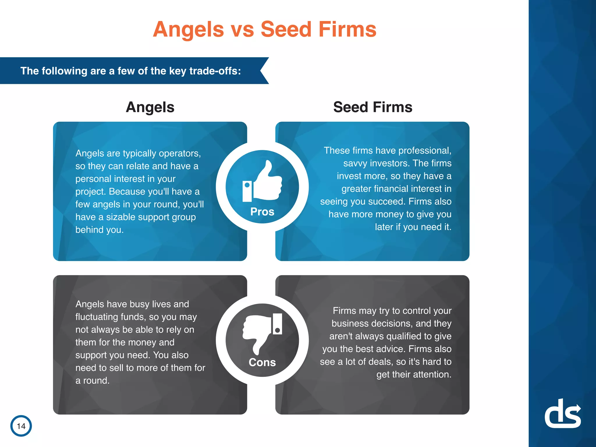
Slide 15 compares firm-led and angel-led seed rounds, showing differences in time to close, investors contacted, money raised, oversubscription rates, and dollars-per-contact. The takeaway is stark: firm-led rounds tend to be faster, involve fewer contacts and meetings, and yield more capital per contact. The deck quantifies the advantage (e.g., roughly twice the money raised and higher efficiency per contact for firms).

For founders deciding whom to target, this is actionable guidance: if you can access seed funds, prioritize them because they may be more efficient and bring follow-on capital. However, the slide also implicitly acknowledges access constraints — many founders rely on angels — so it frames a strategic hierarchy rather than a one-size-fits-all prescription.

Key Takeaway: If possible, target seed funds before angels — firms are more efficient (less time, fewer contacts) and often raise larger rounds than angel groups.
Recap & Practical Checklist: Actionable Takeaways

Recap & Practical Checklist: Actionable Takeaways

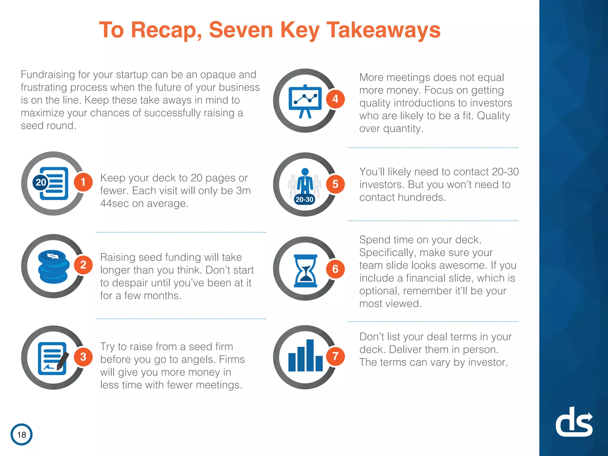
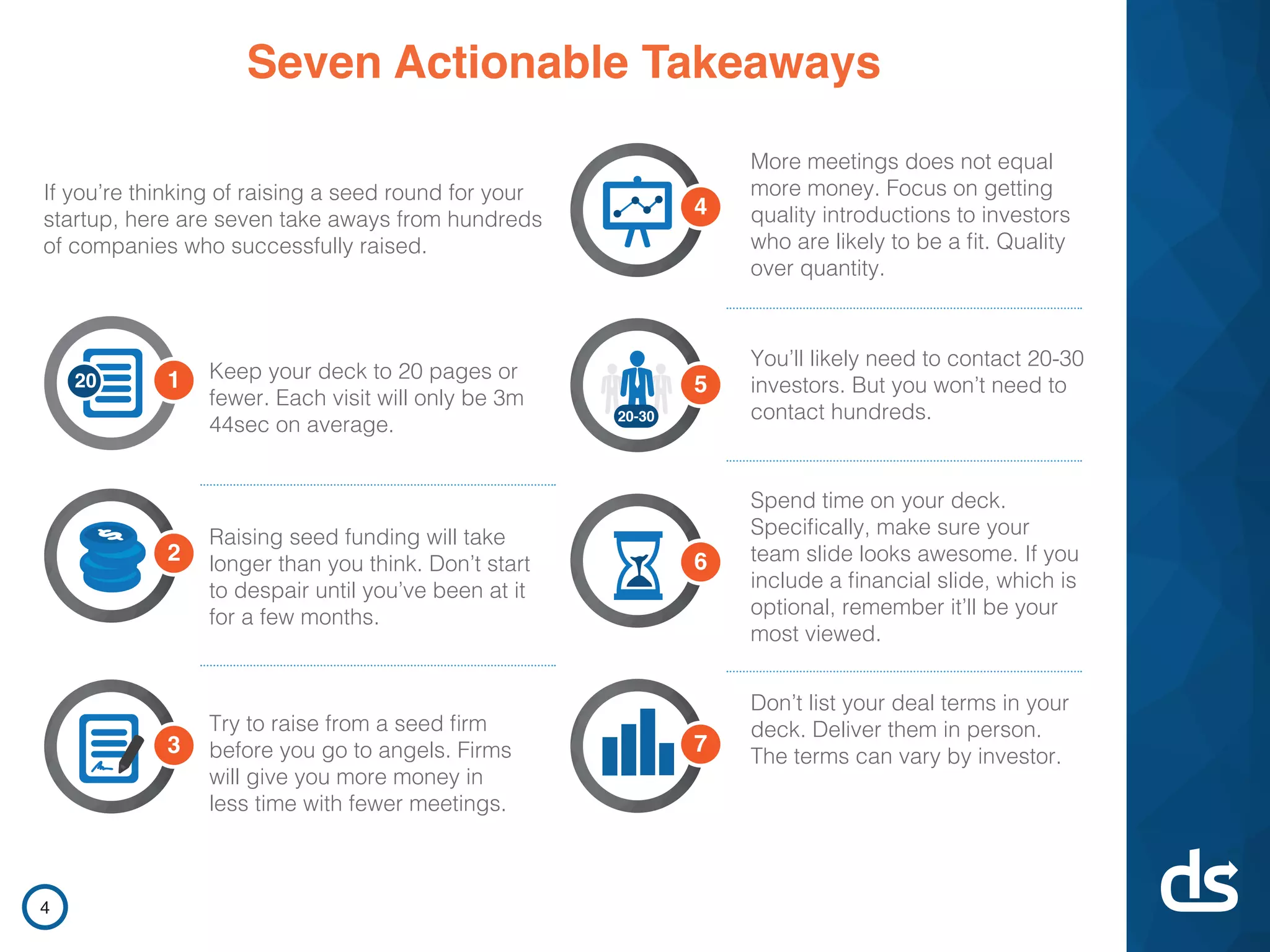
Slide 18 (the deck recap) summarizes seven tactical takeaways: keep deck to ~20 pages, expect raising to take longer than anticipated, prefer seed funds to angels, pursue quality introductions, target ~20–30 investors, polish your team slide, and present deal terms in person. The layout functions like a one-page checklist founders can use to self-audit before fundraising.

This type of close — a simple, numbered checklist reinforced by the study’s data — is effective because it converts research into concrete behaviors. Founders should emulate this structure: research-backed claims followed by a short, prioritized checklist that teams can convert into tasks during a fundraise.

Key Takeaway: End with a concise, prioritized checklist that converts insight into tasks founders can act on during fundraising.

Conclusion: Key Lessons

DocSend’s deck succeeds by blending empirical analysis with clean visual design and practical recommendations — a model any founder can borrow. Strengths include early credibility, funnel-level benchmarks, prioritized guidance on deck content and outreach strategy, and concrete metrics on investor behavior (view times, contact-to-meeting ratios, firm vs. angel outcomes). The deck transforms data into operational advice and ends with a usable checklist.

Actionable advice for founders: lead with a clear credibility statement and headline metric; design decks for rapid scanning and mobile; prioritize team and financial slides (they get the most attention); target high-fit investors (20–30) and iterate on pitch quality rather than quantity of outreach; and, if possible, aim for seed funds before angels because of the efficiency advantages. Use the DocSend approach of pairing data with simple visual rules to make your fundraising playbook both credible and actionable.

Full Deck Analysis

11 sections

Overview

Company: DocSend
Round: Seed ($1.7M)
Year: 2013
Outcome: Acquired by Dropbox for $165M (2021)

Executive Summary

This deck is a research-driven, content-marketing style seed presentation that doubles as a product pitch: it demonstrates DocSend’s domain expertise by publishing a study of 200 startup fundraising journeys and uses that authority to introduce DocSend (a document / pitch-deck analytics product). The approach signals product-market fit via thought leadership and strong design, but the deck deliberately emphasizes market/industry data rather than hard company traction, unit economics, or a full investor ask breakdown.


Problem Statement

How the deck articulates the problem:

  • Slide 2 directly states the core problem context: founders need a reliable way to send pitch decks to investors and to understand how investors interact with those documents. DocSend is framed as a “sales enablement tool that tracks per-page analytics on document usage” and as a “popular way for founders to send pitch decks to investors.”
  • Implicitly the deck also frames the fundraising process as opaque, time-consuming and frustrating for first-time founders (Slide 3 intro / Slide 11 “A Matter of Time”).

Reference slides: 2 (product positioning/context), 3 (framing fundraising opacity), 11 (time/friction in fundraising).


Solution

How the deck positions the solution:

  • DocSend is positioned as the analytics & control layer for documents: track per-page attention, know who reads your deck and for how long, and manage distribution (Slide 2, Slide 19 CTA).
  • The study itself acts as product-led marketing: by publishing actionable fundraising insights (Slides 3, 4, 6–10, 12–18), DocSend demonstrates the value of per-page analytics and positions its product as the tool that enables those insights.
  • CTA asks viewers to sign up for a free DocSend account (Slide 19).

Reference slides: 2 (product description), 19 (call to action / sign-up).


Market Opportunity

TAM / SAM / SOM analysis (what the deck shows and what it omits):

  • What the deck provides:
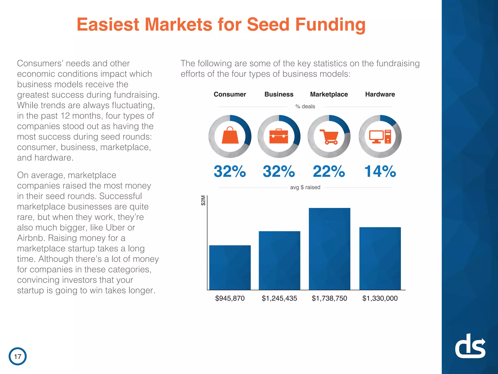
    • A descriptive market/segment readout: slide 17 shows fundraising success by business model (consumer, business, marketplace, hardware) and average dollars raised by category (e.g., marketplace average ~$1,738,750; consumer ~$945,870; business ~$1,245,435; hardware ~$1,330,000).
    • It demonstrates a broad opportunity in the startup fundraising ecosystem (200 startups studied, $360M raised collectively — Slide 1).
  • What the deck does NOT provide:
    • No explicit TAM / SAM / SOM figures or investor-addressable market sizing (no dollar estimate for the total market opportunity for a document analytics product).
  • Takeaway: the deck documents the customer processes and dollar flows in startup fundraising but stops short of quantifying the addressable market for DocSend itself.

Reference slides: 1 (200 startups, $360M study result), 17 (avg $ raised by business type). No dedicated TAM/SAM/SOM slide present.


Business Model

Revenue model and unit economics (explicit vs inferred):

  • Explicitly shown: none — the deck does not present pricing, ARPU, MRR, LTV/CAC, or unit economics.
  • Implicit/inferred model:
    • Slide 2 and Slide 19 imply a SaaS / freemium approach: product is a web-based “sales enablement” tool with free signup CTA (Slide 19). Typical DocSend market knowledge: per-document analytics delivered as a paid SaaS tiering model (not shown in this deck).
  • Investor-facing shortcoming: there are no numbers on conversion, pricing tiers, or revenue growth in the deck.

Reference slides: 2 (product type), 19 (free sign-up CTA). No revenue slides.


Traction & Metrics

Growth metrics and proof points (what the deck provides and lacks):

  • Provided (mostly from the research study, not product traction):
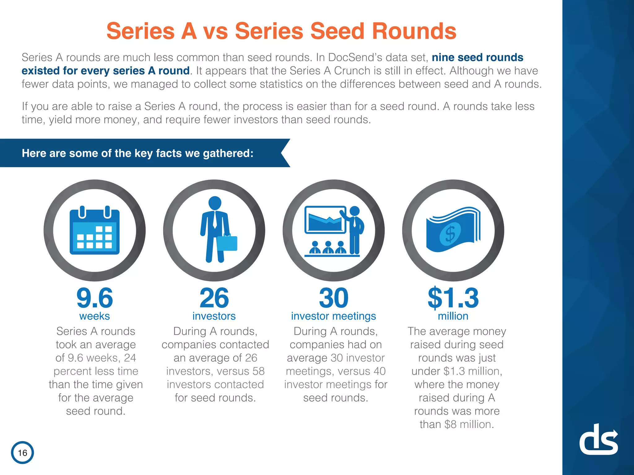
    • Aggregate study metrics (from 200 startups): 58 investors contacted, 40 investor meetings, $1.3M capital raised (average in the study), 12.5 weeks to close, average deck length 19.2 pages, average visit time 03:44 (Slide 3).
    • The 200 companies in the study collectively raised $360M (Slide 1).
    • Series A vs seed comparisons: Series A rounds averaged 9.6 weeks, 26 investors contacted, 30 investor meetings (Slide 16).
    • Firm vs angel comparative metrics: firms yielded ~ $1.996M avg vs angels ~$989k avg; firms took ~9.6 weeks vs angels 13.5 weeks; $/contact for firms was shown as much higher ($91,830 vs $17,210 for angels) (Slide 15).
    • Engagement metrics by slide type: Financials 23.2s/page, Team 22.8s/page, etc. (Slide 9).
  • Lacking (critical for seed investors evaluating the company):
    • No DocSend-specific usage metrics: number of users, paying customers, MRR, churn, growth rate, notable customers, or case studies are not provided.
    • No KPIs that show product adoption or monetization momentum.
  • Net: strong third-party / market data, weak company traction disclosure.

Reference slides: 1, 3, 9, 15, 16. Missing product KPIs.


Competitive Positioning

How they differentiate:

  • Differentiators emphasized in the deck:
    • Domain expertise and unique data: DocSend demonstrates capability through analysis — “we can measure how decks are read” (Slides 3, 6–10, 12).
    • Product-focused differentiator: per-page analytics and control (Slide 2).
    • Thought leadership / academic collaboration: research done with Professor Tom Eisenmann of HBS (Slide 1) confers credibility and differentiates DocSend as the category authority.
  • The deck does not explicitly call out named competitors or show a competitive matrix; differentiation is primarily through content authority and implied product capability rather than feature-by-feature comparison.

Reference slides: 1 (research partner), 2 (product description), whole study content for differentiation.


Team

Team credentials (what the deck shows):

  • The deck references collaboration with Professor Tom Eisenmann (Slide 1) — this signals academic validation of the analysis.
  • The deck itself does not contain a dedicated team slide with founder bios, prior exits, or investor list. The “team” category is discussed in the research results (Slides 6 & 9 show “Team” as a highly viewed page in decks), but not as DocSend’s team credentials.
  • Investor implication: the deck is missing explicit founder/resume information that investors typically expect.

Reference slides: 1 (Professor Eisenmann mentioned). No founder bios present.


Go-to-Market Strategy

Distribution approach (what the deck shows or implies):

  • Primary GTM shown: product-led, content marketing & inbound — the report itself acts as a lead generator and education tool (Slides 1–4, 10, 19 CTA).
  • Target customers signaled: founders, startups, and investors (Slide 2 explicitly mentions founders use DocSend to send pitch decks).
  • Secondary GTM inferences: viral distribution via shared decks (example pitch decks, Slide 10) and direct signups from the report (Slide 19).
  • No explicit paid sales motion, channel partners, enterprise sales funnel, or conversion metrics are provided.

Reference slides: 2 (user), 10 (example decks), 19 (CTA).


The Ask

What they were raising and use of funds:

  • What they were raising: Seed round — $1.7M (context provided externally / known outcome).
  • What the deck shows: The deck does not include a detailed “ask” slide with use-of-funds, milestones, cap table, or valuation. The call-to-action (Slide 19) is product sign-up oriented, not an investor ask.
  • Investor implication: the fundraising specifics/plan are not publicly spelled out in this deck.

Reference slides: none with explicit ask; Slide 19 only contains a CTA to sign up.


Investor Deep Dive

Executive summary, strengths & red flags

Executive Summary

This deck is a research-driven, content-marketing style seed presentation that doubles as a product pitch: it demonstrates DocSend’s domain expertise by publishing a study of 200 startup fundraising journeys and uses that authority to introduce DocSend (a document / pitch-deck analytics product). The approach signals product-market fit via thought leadership and strong design, but the deck deliberately emphasizes market/industry data rather than hard company traction, unit economics, or a full investor ask breakdown.

Key Strengths

3 identified

1

Data-led credibility: The deck is built around a 200-company study and features concrete metrics (e.g., avg deck length 19.2 pages; avg visit 03:44; financials receive 23.2s/page). Using proprietary data to demonstrate domain expertise is very powerful (Slides 1, 3, 9).

2

Excellent visual design and structure: the report is well-designed, easy to scan, and uses visuals effectively (infographics, icons, banners), which reinforces professionalism and product competence (throughout; especially Slides 3, 6–9, 16).

3

Product-led content marketing GTM: the deck functions as both a product pitch and lead-gen asset — the study itself attracts founders/investors to try the product (Slides 10, 19). This is an effective low-cost way to acquire early users.

Red Flags & Weaknesses

3 identified

1

No company traction / financial metrics: The deck contains rich market research but almost no DocSend-specific KPIs (MRR, users, paying customers, growth). For a seed investor, absence of early traction numbers is a major gap.

2

No team slide / founder credentials: investor-standard information (founders’ backgrounds, prior exits, domain expertise) is missing, which reduces confidence in execution capability.

3

No explicit ask, use of funds, or financial plan: fundraising details and projected milestones tied to the raise are absent, making it hard for an investor to evaluate need, valuation, or dilution.

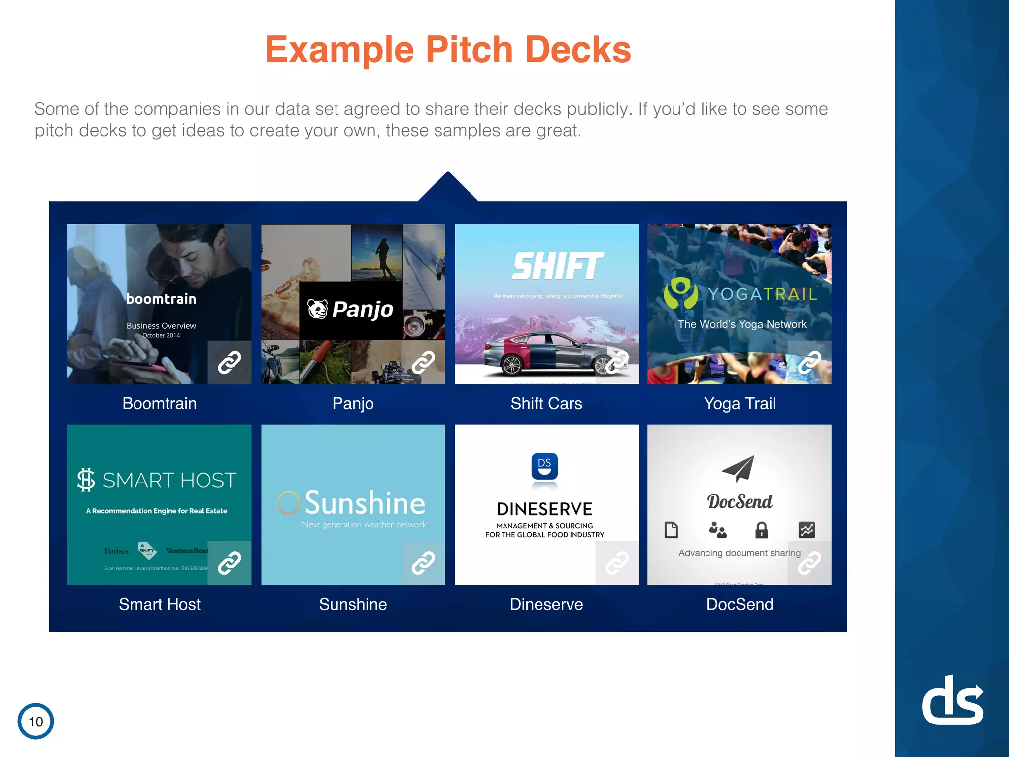
More Pitch Decks To Study

Compare structure, fundraising context, and investor-facing story across similar startup decks.