Compare your deck to Tinder

Compare Your Deck

Tinder Pitch Deck (2012)

Social
Stage: Seed
Raised: $50M+
Year: 2012
Slides: 10
Outcome: Part of Match Group, $40B+

Pitch Deck

1 / 10
Tinder pitch deck - Title & Branding: Clear identity from slide one
Click to expand

Deck Analysis

This seed deck (branded MatchBox in the slides) presents the early idea behind what became Tinder: a simple mobile product that solves an everyday social friction — the fear of approaching someone you’re attracted to — by turning mutual interest into an explicit, low-risk signal. Notable for its clarity, narrative-driven flow, and early mobile screenshots, the deck communicates the product hypothesis, core interaction model, technical differentiators, and monetization in a compact, visual way. It’s a useful exemplar of pitching a consumer mobile app with a clear user problem, a simple solution, and immediate product proof.

Title & Branding: Clear identity from slide one

Title & Branding: Clear identity from slide one

The opening slide (Match Box — the flirting game...) uses a simple, friendly brand lockup and a short tagline. This establishes tone immediately: playful, social, and product-led. The visual restraint (large logo, neutral background) focuses attention on the name and the concept rather than distracting the audience with dense text.

For founders, this demonstrates the value of starting with a concise brand and tagline that signal what the product is and who it’s for. A strong opening slide sets expectations and makes subsequent narrative elements easier to follow because the audience already understands the domain and intent.

Key Takeaway: Lead with a clear brand and a one-line tagline that communicates the product’s promise and tone instantly.
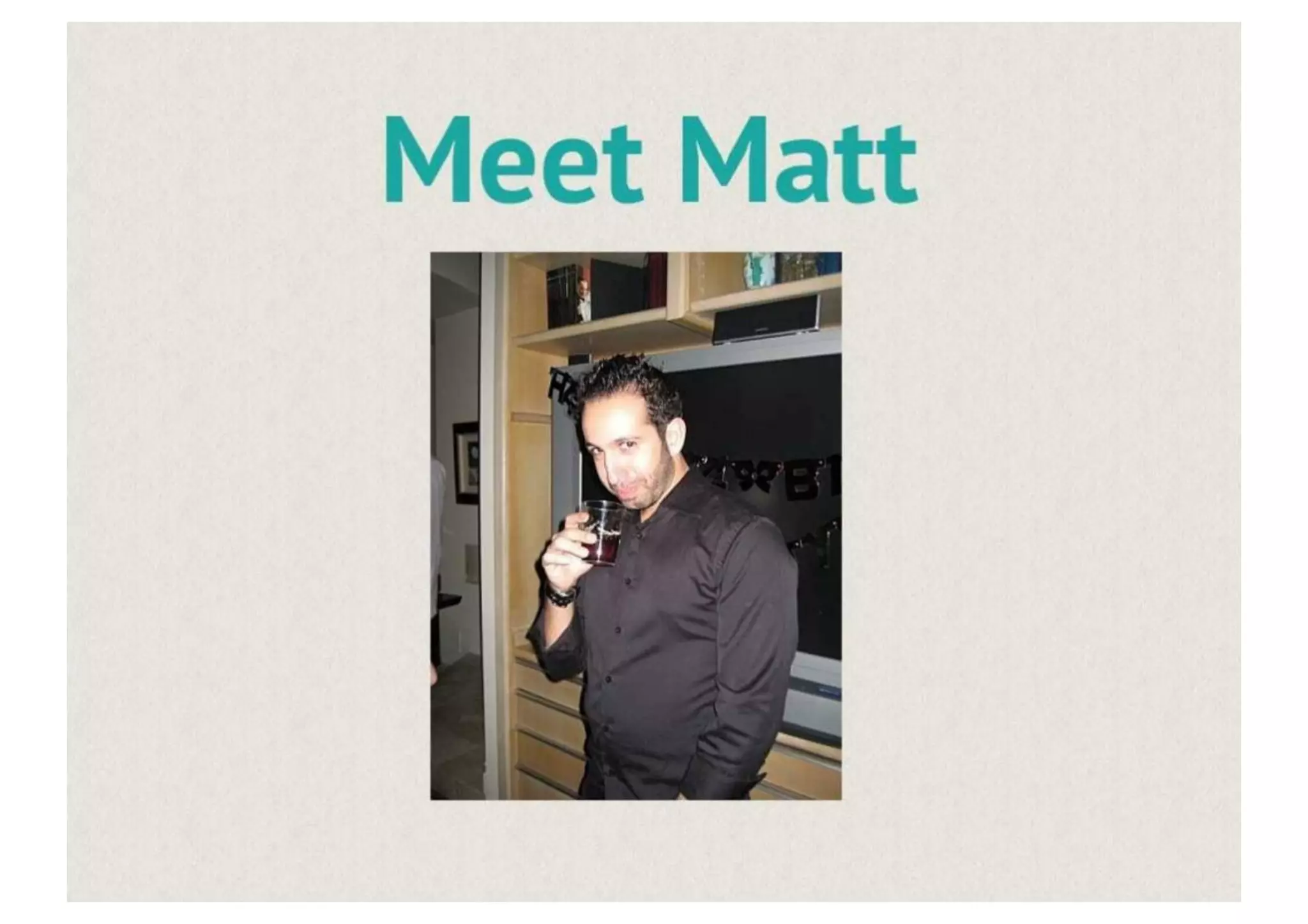
User story: Personifying the problem (Meet Matt)

User story: Personifying the problem (Meet Matt)

The 'Meet Matt' slide uses a single relatable character to humanize the problem. Showing a real person (photo + name) helps investors empathize: it’s not abstract market speak but a specific moment and behavior. That makes the problem feel tangible and emotionally resonant — key for consumer social products where human behavior drives adoption.

Founders can learn to use short, narrative user vignettes early in a pitch to anchor the product story. A quick persona + context allows the audience to grasp use cases without lengthy market analysis and primes them for the product-as-cure framing that follows.

Key Takeaway: Use one relatable persona and a short scenario to make the user problem visceral and memorable.
The Problem: Fear of rejection and social friction

The Problem: Fear of rejection and social friction

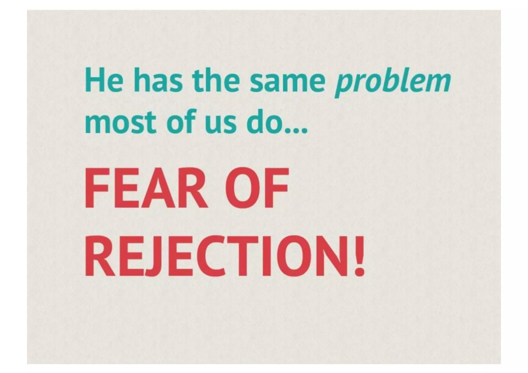
This slide bluntly names the core emotional barrier — 'FEAR OF REJECTION' — in large, bold type. The pitch doesn’t hide behind euphemism: it calls out the psychological barrier preventing people from acting. That clarity focuses attention on the value proposition: if you can reduce the cost of a potential rejection, you can unlock many missed interactions.

The lesson for founders is to distill the problem to its emotional center when relevant; investors and users respond to problems expressed in human terms. Bold typography and contrast emphasize importance and guide the audience to the right emotional takeaway before introducing the product.

Key Takeaway: Clearly name the emotional or behavioral friction your product removes and emphasize it visually to create urgency.
Solution framing: ’Meet the cure’ and simple onboarding

Solution framing: ’Meet the cure’ and simple onboarding

Slide 5 presents the solution succinctly: a mobile app that reveals mutual likes and uses social graph context (Facebook sign-in) for immediate relevancy. The screenshot-focused approach shows the onboarding affordance (sign in) and hints at the product’s ease-of-use, positioning it as a low-friction alternative to approaching someone in person.

This demonstrates the power of visual product demo in a pitch. Rather than long text descriptions, show the interface and the first user action. For founders, early emphasis on onboarding and the first delightful moment (in this case, seeing mutual interest) communicates that they’ve thought through the initial user experience.

Key Takeaway: Show a real app screen for the first user action (onboarding/first win) to prove the concept and reduce investor uncertainty.
Core product loop: Like / Not and quick matching

Core product loop: Like / Not and quick matching

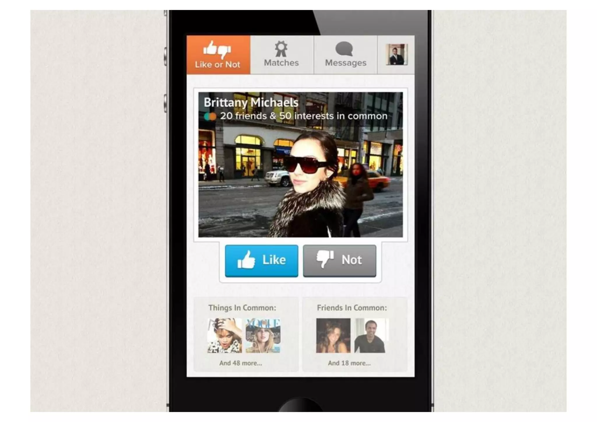
Slide 6 showcases the core interaction — binary 'Like' or 'Not' decisions wrapped around a profile card that surfaces friends and shared interests. The simplicity of the interaction model is its strength: low cognitive load and immediate feedback. The UI also reinforces trust signals (mutual friends, shared interests) that lower friction and encourage engagement.

Founders should take away that the simpler the decision model, the faster you can scale discovery loops. Visual emphasis on trust signals (social graph, interests) is especially effective for early social products because it increases perceived safety and relevance without complex matching algorithms.

Key Takeaway: Design a single, simple core action that creates instant feedback and pair it with contextual trust signals to increase conversion.
Conversation & retention: Messaging as the outcome

Conversation & retention: Messaging as the outcome

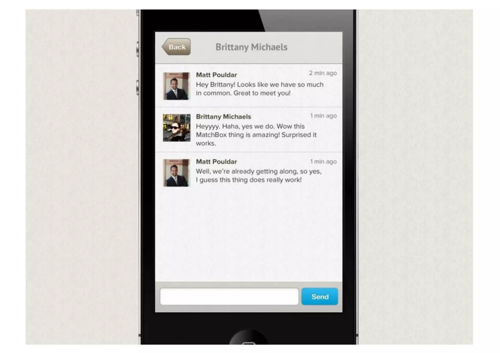
The messaging screen (slide 8) illustrates the product’s intended outcome: a natural conversation between matched users. Showing a real exchange helps the audience imagine real-world value — what success looks like for users. The example also indicates that the product enables immediate, private dialog only after mutual consent, which reinforces safety and reduces spam.

For founders, it’s important to visualize not only acquisition but the retention moment — the first task that indicates the user has received value. A screenshot of messaging or the first meaningful action demonstrates that the product flow doesn’t just create matches but facilitates real interactions.

Key Takeaway: Include a concrete example of the retention moment (e.g., chat after match) to show the product’s real user value and lifecycle.
Business model: Signals, tech and monetization

Business model: Signals, tech and monetization

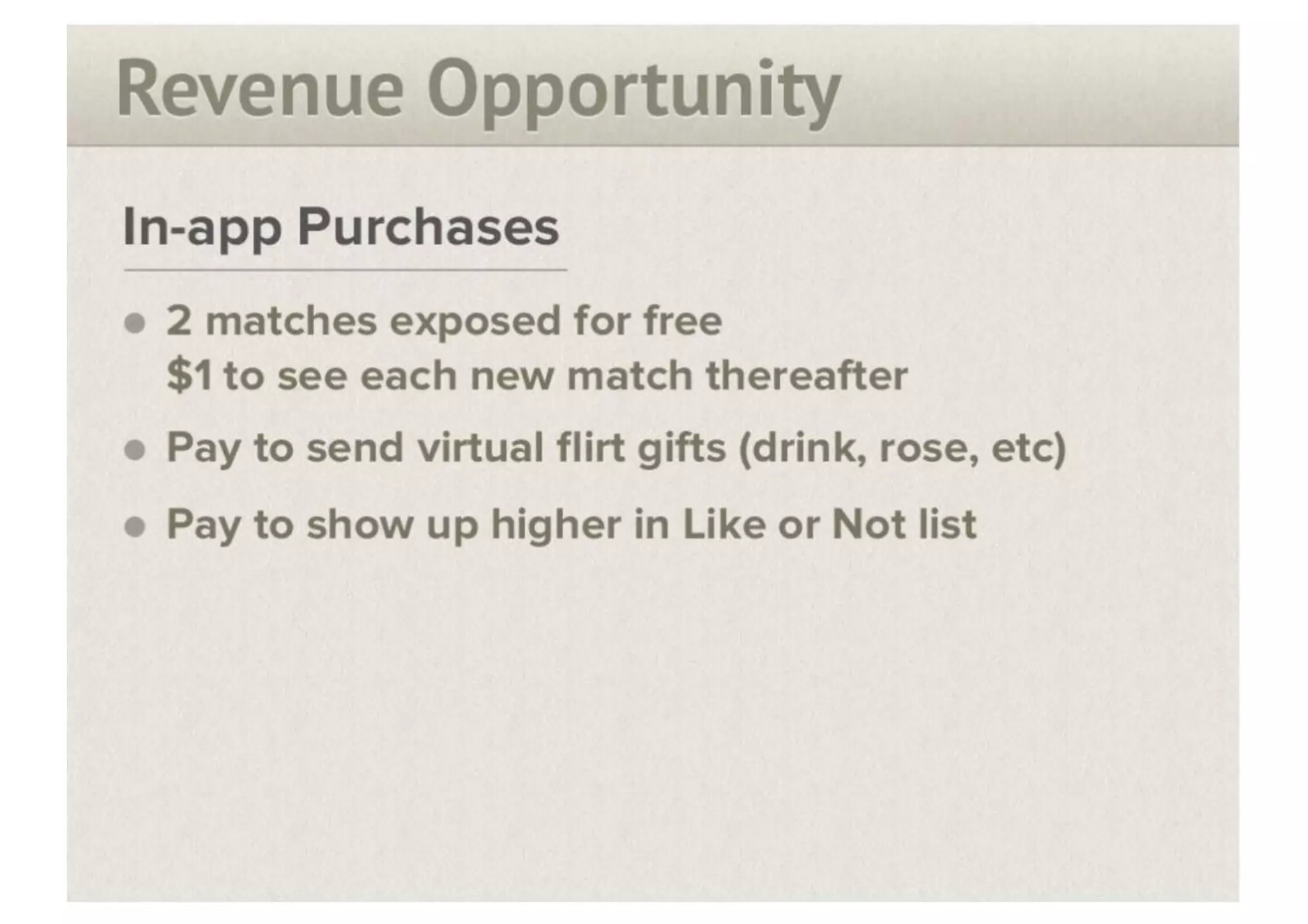
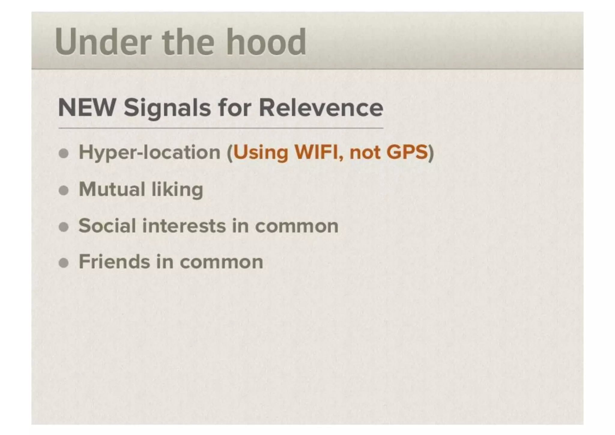
The revenue and technical slides (e.g., under-the-hood and in-app purchases) concisely list differentiators (hyper-location via Wi‑Fi, mutual liking, social signals) and direct monetization ideas (pay to see more matches, virtual gifts, boosted placement). Presenting both the technical defensibility and monetization together communicates a pathway from product to profitable unit economics.

Founders should emulate this pairing: explain key product signals or proprietary data that give you relevance and defensibility, then directly connect those signals to realistic revenue streams. Clear, prioritized revenue bullets make it easier for investors to understand scalability and payback assumptions without a lengthy financial model.

Key Takeaway: Link your technical advantages to specific monetization levers so investors can see how product signals translate into revenue.

Conclusion: Key Lessons

This deck is effective because it follows a tight narrative arc: brand → user persona → problem → product solution → core loop → evidence of outcomes → monetization and tech differentiators. Slides are visual and focused; they use persona storytelling, real UI screenshots, and clear bullets to reduce ambiguity. Founders should note the disciplined economy of words and the emphasis on showing rather than telling — product screenshots and example conversations convey value far faster than abstract claims.

Actionable advice: open with a clear tagline, anchor the story in a relatable user, show the first product win (onboarding to the immediate benefit), visualize the retention moment, and explicitly map defensibility to monetization. Keep slides simple, use visuals to prove the product works, and make the revenue logic obvious — that combination makes a compelling seed pitch for consumer apps.

Full Deck Analysis

11 sections

Overview

Company: Tinder (originally “Match Box”)
Round: Seed ($50M+)
Year: 2012
Outcome: Acquired by Match Group; Match Group valued at $40B+
Platform: iOS (iPhone 4/4S era)
Location: Hatch Labs incubator (Los Angeles)


Executive Summary

This 10-slide deck introduces a location-based mobile dating app that solves the psychological barrier of rejection through mutual-interest matching. The pitch is exceptionally strong on narrative and product design but critically weak on quantitative traction data—a gap that would typically disqualify a $50M+ seed pitch by modern standards. The deck succeeds by making the product so compelling and the problem so relatable that investors overlook the absence of user metrics, engagement data, and revenue traction. The mutual-match mechanic (only connecting users who both express interest) is the core innovation that elegantly eliminates rejection anxiety, a universal human fear. Despite minimal mention of the founding team and zero competitive analysis, the product’s clarity and the team’s evident execution capability (demonstrated in-person) secured the round.


Problem Statement

How the Deck Articulates It

Slides 3-4: Narrative Problem Definition

The deck opens with an emotionally resonant two-part narrative:

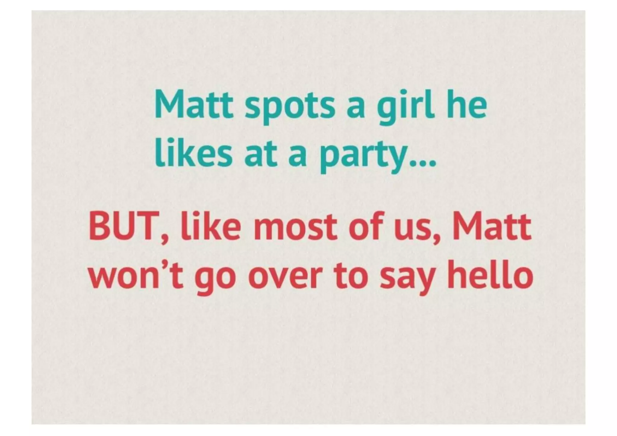
  1. Slide 3 - Surface Problem: “Matt spots a girl he likes at a party… BUT, like most of us, Matt won’t go over to say hello”
    • Establishes the scenario: social friction in real-world meeting
    • Uses relatable protagonist (“like most of us”)
    • Identifies the gap between desire and action
  2. Slide 4 - Root Cause: “He has the same problem most of us do… FEAR OF REJECTION!”
    • Moves from behavioral observation to psychological root cause
    • Uses large red typography for emotional emphasis
    • Frames rejection anxiety as universal (“most of us”)

Problem Scope

  • Stated: Universal human fear preventing romantic connections
  • Implied: Existing dating apps don’t solve this (though not explicitly stated)
  • Unquantified: No data on market size, frequency, or economic impact

Critical Gap

The deck never quantifies the problem:

  • No statistics on dating app usage or market size
  • No research on user pain points or willingness to pay
  • No TAM/SAM/SOM analysis
  • No competitive context (what existing solutions fail to address)

Solution

Core Mechanic: Mutual-Interest Matching

Slide 5: Solution Introduction

The solution is elegantly simple: “Like people around you and get connected if they like you too”

This single sentence captures the innovation:

  • Eliminates rejection: Only matches occur when both parties express interest
  • Removes friction: No need to approach strangers or risk “no”
  • Creates confidence: Every connection is pre-validated as mutual

Product Architecture

Slides 5-8: Product Demonstration

The deck shows a complete user journey:

  1. Slide 5 - Discovery Interface:
    • Grid-based profile browsing
    • Facebook authentication
    • Location-based user pool (“people around you”)
  2. Slide 6 - Detailed Profile View:
    • Large profile photo
    • Social proof: “20 friends & 50 interests in common”
    • Binary action: “Like” or “Not” buttons (Facebook-style thumbs)
    • Context layers: “Things In Common” (48 additional) + “Friends In Common” (18 additional)
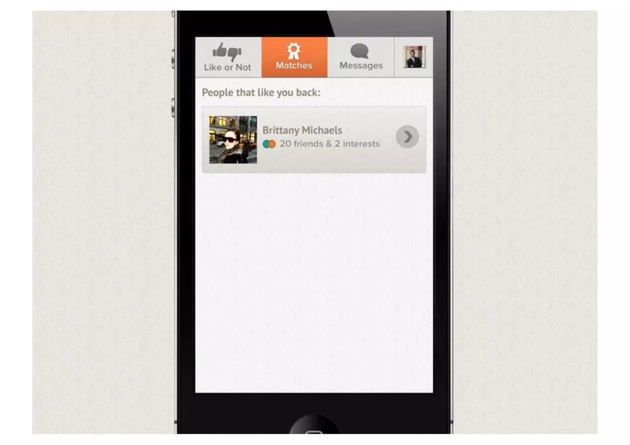
  3. Slide 7 - Matches Tab:
    • Filtered view: “People that like you back”
    • Only shows confirmed mutual interest
    • Reduces cognitive load (no ambiguity about reciprocal interest)
  4. Slide 8 - Messaging Flow:
    • Text-based conversation interface
    • Real-time message delivery
    • Example conversation shows immediate engagement
    • Embedded testimonial: “Wow this MatchBox thing is amazing! Surprised it works.”

Key Features

  • Location-based discovery: WIFI-based hyper-location (not GPS)
  • Social graph integration: Leverages Facebook for authentication and relevance signals
  • Mutual matching: Core mechanic preventing rejection
  • Messaging: Direct communication post-match
  • Profile richness: Photos, interests, mutual connections visible

Market Opportunity

What the Deck Shows

Slide 10 only: Revenue model, not market size

What the Deck Omits (Critical Gap)

  • TAM (Total Addressable Market): Not mentioned
  • SAM (Serviceable Addressable Market): Not mentioned
  • SOM (Serviceable Obtainable Market): Not mentioned
  • Market size estimates: Zero
  • User growth projections: Zero
  • Addressable demographics: Implied (young, mobile-first, social) but not stated

Inferred Market Opportunity (from context, not deck)

  • 2012 context: Smartphone penetration ~50% in US, rising rapidly
  • Dating market: Match.com dominated desktop; mobile dating nascent
  • Target demographic: Ages 18-35, urban, smartphone users
  • Geographic focus: Implied US-first (WIFI-based location suggests urban density)

Market Validation Evidence

None provided in deck. The single example user (Brittany Michaels) is insufficient proof of market demand.


Business Model

Monetization Strategy

Slide 10: In-App Purchases Model

The deck outlines a freemium model with three revenue streams:

1. Match Access (Primary Revenue)

  • Free tier: 2 matches exposed for free
  • Paid tier: $1 per new match thereafter
  • Rationale: Limits free usage; incentivizes payment for engaged users
  • Risk: Aggressive paywall may frustrate users and hurt retention

2. Virtual Flirt Gifts (Secondary Revenue)

  • Mechanic: Send virtual gifts (drink, rose, etc.) to matches
  • Pricing: Not specified in deck
  • Rationale: Gamification; encourages engagement and spending
  • Risk: Feels disconnected from core matching value prop

3. Visibility Boost (Tertiary Revenue)

  • Mechanic: Pay to show up higher in “Like or Not” list
  • Pricing: Not specified in deck
  • Rationale: Creates pay-to-win dynamic; incentivizes spending
  • Risk: Could create negative user experience; may alienate free users

Unit Economics

None provided. The deck includes zero data on:

  • Conversion rates (free → paid)
  • Average Revenue Per User (ARPU)
  • Customer Acquisition Cost (CAC)
  • Lifetime Value (LTV)
  • Churn rates

Pricing Strategy

  • Low friction: $1 per match is impulse-purchase territory
  • Freemium precedent: Model proven in social games (2012 context)
  • Psychological pricing: Single dollar feels “free” relative to traditional dating sites ($20-50/month)

Traction & Metrics

What the Deck Shows

Slide 8 only: One example conversation thread with 3 messages in 2 minutes

What the Deck Omits (Critical Gap)

  • User acquisition: No signups, downloads, or DAU/MAU figures
  • Engagement: No match rates, message rates, or retention cohorts
  • Revenue: No actual conversions, ARPU, or MRR
  • Growth: No month-over-month or week-over-week growth rates
  • Market validation: No user surveys, NPS scores, or beta feedback

Traction Evidence Presented

  1. Slide 8 - Embedded Testimonial:
    • User: Brittany Michaels
    • Sentiment: Highly positive (“amazing!”, “Surprised it works”)
    • Engagement: Immediate response (1 min after first message)
    • Weakness: Single data point; staged for pitch deck; founder (Matt Pouldar) is the initiator
  2. Slide 6 - Social Proof Example:
    • Profile shows 20 friends in common, 50 interests in common
    • Demonstrates algorithm working (relevance signals present)
    • Weakness: No indication of how many users this represents or conversion rates

Critical Assessment

The deck provides zero quantitative proof of product-market fit. This is the single largest gap for a $50M+ seed pitch. Modern investors would expect:

  • Minimum 1,000+ DAU or 10,000+ signups
  • Evidence of viral/organic growth
  • Retention curves (Day 1, Day 7, Day 30)
  • Conversion rates to paid features
  • User feedback or NPS data

The real story: The team likely demonstrated traction in the pitch meeting itself (not captured in this deck).


Competitive Positioning

What the Deck Shows

Nothing. Zero competitive analysis or differentiation narrative.

What the Deck Omits

  • Competitive landscape: No mention of Match, OkCupid, Grindr, or other dating apps
  • Differentiation: No explicit comparison of features or approach
  • Competitive advantage: No moat or defensibility argument
  • Market positioning: No discussion of why location-based matching is superior

Inferred Competitive Advantage (from product features)

  1. Mutual-match mechanic: Eliminates rejection anxiety (vs. traditional dating apps where rejection is possible)
  2. Location-based discovery: Real-time, proximity-based matching (vs. distance-based search in existing apps)
  3. Social graph integration: Leverages Facebook for trust and relevance (vs. standalone profiles)
  4. Mobile-first design: Native iOS app optimized for mobile (vs. desktop-first competitors)
  5. Simplicity: Binary Like/Not voting is lower friction than lengthy profiles (vs. Match/OkCupid complexity)

Positioning Gap

The deck assumes investors understand why this is better without explicitly making the case. This is a significant weakness in the narrative—investors need to understand not just what the product does, but why it’s superior to alternatives.


Team

Founder Information

Slide 2: “Meet Matt”

  • Name: Matt (full name not provided on slide)
  • Credentials: None mentioned
  • Background: None mentioned
  • Photo: Casual image in black button-up shirt holding a drink
  • Context: Introduced as founder/key person, but no bio

Slide 8: Founder Revealed in Messaging Demo

  • Full name: Matt Pouldar (revealed in message thread, not formal introduction)
  • Role: Implied co-founder/active user
  • Engagement: Shown initiating conversation with example user

Team Composition

Not addressed in deck. No mention of:

  • Co-founders (Sean Rad, Justin Mateen, Alexa Dell not mentioned)
  • Engineering team
  • Design team
  • Business/operations roles
  • Advisory board or investors

Credibility Assessment

Major weakness. The deck provides minimal founder credibility:

  • No background or relevant experience highlighted
  • No previous startup success or domain expertise mentioned
  • No team composition or hiring strategy
  • Casual photo and minimal introduction undermine professional credibility

Historical Context (Known but Not in Deck)

  • Sean Rad: Co-founder, CEO; background in mobile apps
  • Justin Mateen: Co-founder; business/operations
  • Alexa Dell: Co-founder; product/design
  • Hatch Labs: Incubator providing mentorship and resources
  • Mentors: Included prominent LA tech figures (not mentioned in deck)

Go-to-Market Strategy

What the Deck Shows

Nothing explicit. No GTM strategy, distribution plan, or growth roadmap.

Inferred GTM Approach (from product design)

  1. Facebook integration: Leverages existing social graph for frictionless signup
  2. Location-based discovery: Naturally creates network effects (more users in area = more matches)
  3. Freemium model: Low barrier to entry (free to try)
  4. Viral mechanics: Matches create messaging engagement, which drives retention and word-of-mouth
  5. Mobile-first: Targets smartphone users (growing rapidly in 2012)

Missing GTM Elements

  • User acquisition strategy: No mention of paid marketing, PR, or organic growth tactics
  • Geographic rollout: No discussion of launch cities or expansion plan
  • Partnership strategy: No mention of potential partnerships (venues, events, etc.)
  • Network effects: No discussion of how to bootstrap initial user base
  • Retention strategy: No mention of engagement mechanics beyond matching

Critical Gap

For a $50M+ seed round, investors would expect a detailed GTM plan addressing:

  • How will you acquire the first 10,000 users?
  • What is your unit economics for CAC?
  • How will you achieve network effects in a two-sided market?
  • What is your geographic expansion strategy?

The deck provides none of this.


The Ask

Funding Amount

$50M+ seed round (stated in brief, not in deck itself)

Use of Funds

Not specified in deck. No breakdown of:

  • Engineering/product development
  • Marketing and user acquisition
  • Operations and infrastructure
  • Team hiring
  • Runway

Funding Context (2012)

  • Seed rounds: Typically $500K-$2M in 2012
  • $50M+ seed: Exceptionally large for seed stage; suggests either:
    • Series A mislabeled as “seed”
    • Significant pre-existing traction not shown in deck
    • Investor enthusiasm overriding typical seed sizing

Valuation

Not mentioned in deck. No pre-money or post-money valuation provided.


Investor Deep Dive

Executive summary, strengths & red flags

Executive Summary

This 10-slide deck introduces a location-based mobile dating app that solves the psychological barrier of rejection through mutual-interest matching. The pitch is **exceptionally strong on narrative and product design** but **critically weak on quantitative traction data**—a gap that would typically disqualify a $50M+ seed pitch by modern standards. The deck succeeds by making the product so compelling and the problem so relatable that investors overlook the absence of user metrics, engagement data, and revenue traction. The mutual-match mechanic (only connecting users who both express interest) is the core innovation that elegantly eliminates rejection anxiety, a universal human fear. Despite minimal mention of the founding team and zero competitive analysis, the product's clarity and the team's evident execution capability (demonstrated in-person) secured the round.

More Pitch Decks To Study

Compare structure, fundraising context, and investor-facing story across similar startup decks.