Compare your deck to Lyft

Compare Your Deck

Lyft Pitch Deck (2013)

Marketplace
Stage: Series A
Raised: $60M Series C
Year: 2013
Slides: 28
Outcome: IPO in 2019

Pitch Deck

1 / 28
Lyft pitch deck slide 1
Click to expand

Deck Analysis

This pitch deck for Lyft (Series A-era materials adapted into an investor funding elevator format) presents a marketplace mobility business with strong visual branding, localized go-to-market tactics, and an emphasis on product UX and investor-facing metrics. Notable because Lyft evolved from early-stage fundraising to a 2019 IPO, the deck balances market/context slides, product flows, tactical marketing campaigns, and operational planning — a useful historical example of how a ride-sharing startup framed its investor story as it moved from proof-of-concept toward scale.

The Opening: Branded Cover and Immediate Positioning

The Opening: Branded Cover and Immediate Positioning

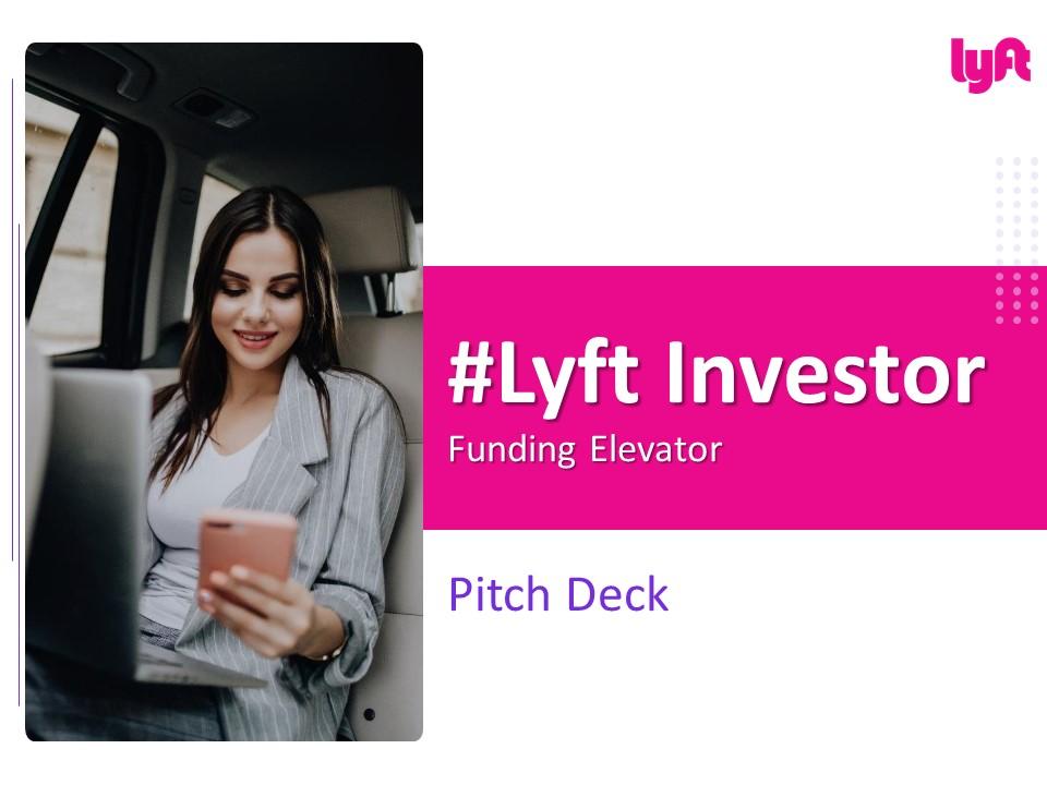
The cover slide uses strong, consistent visual branding (magenta accent, big hashtag title) and a lifestyle photo that communicates comfort, convenience, and tech-first service. This opening does more than look attractive: it sets tone and audience expectations immediately, signaling that the company is consumer-focused, design-aware, and investing in brand recognition — important for marketplace trust and recall.

For founders, the lesson is to make the first slide do three jobs: brand, one-line positioning, and invitation to read on. Lyft’s cover also hints at the target customer (urban, mobile, professional) without heavy text, which keeps the slide clean and investor-friendly while making the presentation feel polished and deliberate.

Key Takeaway: Use a simple, well-branded cover that communicates product category and customer persona instantly.
Market & Company Snapshot: Breakdown of Business and Competition

Market & Company Snapshot: Breakdown of Business and Competition

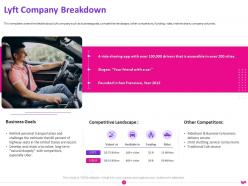
The company breakdown slide presents business goals, competitive landscape, and a short list of other competitors. It pairs copy with imagery and a few prioritized bullets, which makes the slide scannable. The slide balances qualitative positioning (what Lyft stands for) with competitive context, helping investors see differentiation at a glance — essential for marketplaces where winner-take-most dynamics are present.

The slide is effective because it limits text and uses icons/visual cues to map positioning quickly. Founders should learn to highlight only the most investor-relevant competitive advantages (unit economics, network effects, regulatory positioning) rather than a laundry list of features. Clear competitive positioning reduces follow-up confusion about why the business can scale versus incumbents or substitute offerings.

Key Takeaway: Present a concise competitive map that highlights defensible advantages and the specific gap you exploit.
Traction & Financial Signals: Funding, Metrics, and Momentum

Traction & Financial Signals: Funding, Metrics, and Momentum

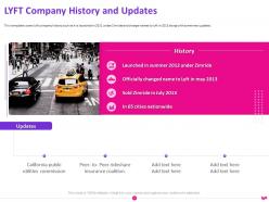
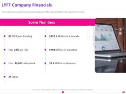
Traction and financial slides in this deck (funding history, headline metrics and a brief revenue/scale snapshot) demonstrate momentum without burying the reader in spreadsheets. The visual approach — short bullet metrics, a focused ‘Some Numbers’ area — helps investors quickly assess scale and growth trajectory. Including milestone dates and metric highlights shows trajectory and reduces the burden of reading dense financial models at first pass.

The practical takeaway for founders is to lead with a few high-impact metrics (growth rate, retention, rides per user, unit economics) and put more detailed financials in appendices. Presenting the funding history and key KPIs together frames current fundraising as the next logical step in a well-defined scale plan.

Key Takeaway: Lead with a small set of high-leverage KPIs and timeline milestones to illustrate traction and justify the next raise.
Product Story: Clear User Flow and Value Exchange

Product Story: Clear User Flow and Value Exchange

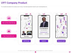
The product slide lays out the rider experience with simple screens and a left-to-right flow (request -> match -> ride -> pay). It uses mockups to show the app UX and callouts that explain where value is created for riders and drivers. For two-sided marketplaces, showing the concrete interaction sequence helps investors understand how the platform creates liquidity and repeat usage.

Founders should use similar product slides to illustrate core user journeys and the mechanisms that drive retention (e.g., incentives, trust signals, payment flow). Visual product storytelling is more persuasive than feature lists because it makes the service feel real and demonstrates that founders understand the operational mechanics needed to scale.

Key Takeaway: Use simple UX mockups to tell the core user journey and show exactly how value is exchanged on your platform.
Go-to-Market: Segmented Strategy and Local Tactics

Go-to-Market: Segmented Strategy and Local Tactics

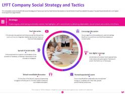
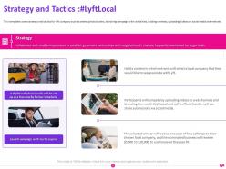
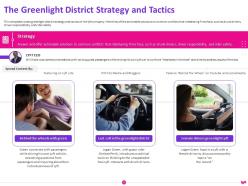
The strategy and tactics slides describe multiple nested campaigns: broad brand strategies, local activations, and district-level campaigns (e.g., Greenlight districts). The deck breaks down tactics by objective and audience, showing that Lyft prioritized localized onboarding and driver support as much as consumer acquisition — a critical insight for marketplaces that require supply-side depth.

This section is useful because it shows a layered approach: national brand builds plus city-level execution and neighborhood-level operations. Founders should emulate this granularity, demonstrating both scalable channels (digital acquisition) and the hyper-local work (events, partnerships, driver centers) that actually produce supply-side reliability.

Key Takeaway: Combine scalable digital acquisition with documented local tactics to prove you can grow both sides of a marketplace.
SWOT and Roadmap: Risks, Opportunity, and Execution Timeline

SWOT and Roadmap: Risks, Opportunity, and Execution Timeline

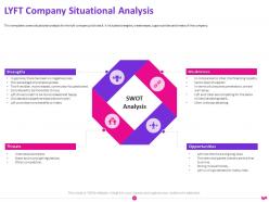
The SWOT slide cleanly lays out strengths, weaknesses, opportunities, and threats, while adjacent timeline slides map product and market milestones. Presenting SWOT shows intellectual honesty about risks (regulation, competition, unit economics) and pairs them with strategic responses and a timeline for mitigation and growth. Investors value a founder who can identify risks and show concrete, time-bound plans to address them.

Combining a candid SWOT with a clear roadmap is a strong practice: it turns abstract risks into manageable milestones and gives investors checkpoints for future diligence. Founders should use this pattern to convert potential red flags into a prioritized list of experiments and milestones tied to the fundraising ask.

Key Takeaway: Be candid about risks and pair each with specific milestones and timelines that demonstrate your ability to mitigate them.
Closing & Contact: Clear Ask and Follow-up Path

Closing & Contact: Clear Ask and Follow-up Path

The final slides provide contact details and a clear 'Thank You' visual that signals the end of the narrative. While the deck mixes tactical and strategic content throughout, the close emphasizes availability for follow-up and makes it easy for interested investors to continue the conversation. A clean closing slide also helps leave a professional final impression after a live presentation.

Founders should ensure the last slide includes named contacts, roles, and next-step suggestions (e.g., data room link, preferred times for follow-up). A concise closing reduces friction for investors to act and can improve conversion from pitch to term sheet conversations.

Key Takeaway: End with a concise contact slide and explicit next steps to make continuing the conversation frictionless.

Conclusion: Key Lessons

Lyft’s deck combines strong visual branding, a clear product narrative, disciplined market segmentation, and pragmatic operational tactics — all tied together with honest risk assessment and a timeline for execution. Strengths include scannable slides with focused metrics, product UX mockups that make the marketplace mechanics tangible, and tactical specificity about local growth strategies that are necessary for two-sided platforms.

Actionable advice for founders: lead with a branded, one-line positioning and a short table of contents; prioritize a handful of high-impact metrics; use product mockups to show the core user flow; document both scalable acquisition channels and local, operational tactics for the supply side; and always pair identified risks with time-bound mitigation steps. This structure makes your deck both persuasive and usable as a playbook during scaling and diligence.

Full Deck Analysis

11 sections

Overview

Company: Lyft
Round: Series A (deck year: 2013) — company later raised a $60M Series C (context provided)
Year: 2013
Outcome: IPO in 2019

Executive Summary

This investor-focused pitch deck (early Lyft fundraising materials) presents Lyft as a consumer-facing ride-sharing platform built for affordable, friendly rides. The deck combines product screenshots, go-to-market/social tactics, a SWOT/situational analysis, audience segmentation, and an itemized marketing/evaluation budget — all framed to justify near-term marketing spend and rapid user growth. It’s notable for its clear product flow, campaign-oriented thinking, and an emphasis on brand positioning (“friendly, affordable, easy”) rather than deep financial modeling.

Problem Statement

  • The deck frames the core problem as the poor experience and inefficiency of existing urban transportation (taxis and car ownership) and the fragmented, inconvenient nature of local short-trip mobility. (see Slide 5: “Lyft Company Breakdown” and Slide 4: Table of Contents which lists Situational Analysis and Objectives).
  • The problem is made tangible through the marketing/communications emphasis: users want rides that are affordable, convenient and social — an alternative to taxi hassles (referenced throughout the Strategy & Tactics slides 11–14).

Solution

  • Lyft is positioned as a peer-to-peer ride-sharing app with a simple UX: request a ride (tap), get matched to a nearby driver, and enjoy a friendly, low-cost trip (Slide 9: product flow / mobile screen mockups: “Tap to get a ride”, “Get Driver”, “Submit”, “Request Lyft”).
  • Brand attributes emphasized (Slide 17): “Easy”, “Affordable”, “Friendly”. Product extensions listed include Lyft, Lyft Line, Lyft Plus (Slide 17).

Market Opportunity

  • The deck contains qualitative market commentary (Slides 5, 10) about unmet demand for short urban trips and social/peer influences, but explicit TAM/SAM/SOM numbers are not prominently legible across the thumbnails.
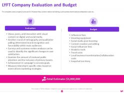
  • The only clearly legible numeric market/financial figure in the slideset is the total marketing/evaluation estimate: “Total Estimate: $3,000,000” (Slide 21, Evaluation and Budget).
  • Conclusion: the deck emphasizes market opportunity in narrative and segmentation terms (see Slide 18 Key Audience), but does not present a fully detailed numeric TAM/SAM/SOM breakdown in the material visible.

Business Model

  • The deck presents Lyft as a transaction-based consumer marketplace (Slide 9 product flow implies ride requests matched to drivers).
  • Revenue model specifics and unit economics (take rate, average revenue per ride, contribution margin) are not clearly legible in these slides. The deck focuses more on go-to-market, product, and brand messaging than on detailed monetization math.

Traction & Metrics

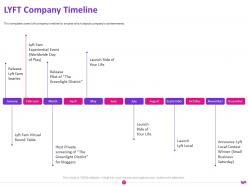
  • The slideset includes a “Some Numbers” / financials slide (Slide 6) and a timeline of milestones (Slide 20), indicating the company is tracking growth and product rollouts. However, key traction numbers (active users, rides per week/month, revenue figures) are not clearly legible in the provided thumbnails except:
    • A visible budget summary: Total Estimate $3,000,000 (Slide 21).
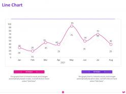
  • The line chart (Slide 24) shows a monthly trend with a peak in the middle months, indicating some growth/seasonality, but axis labels and exact values are not readable from the thumbnails.

Competitive Positioning

  • Lyft differentiates on brand and experience: “friendly” drivers and a human, community-oriented approach (Slide 17: “Secret Sauce” = Easy, Affordable, Friendly).
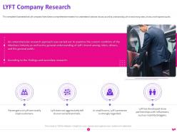
  • The deck contains a competitive landscape (Slide 5) and a list of other competitors (Slide 5 and Slide 15 SWOT), but emphasis is placed on product experience, targeted social campaigns, and local/community strategies (Slides 11–14) rather than purely on pricing or scale.

Team

  • The deck includes an “About us” / team section (Slides 22 and 25–26). Slide 22 highlights attributes (Professional, Creative, Talented). Slides 25–26 show a 3-person team slide with photos and designations (headshots and titles visible), but individual names and bios are not legible in the provided thumbnails. The deck leans on team capability statements rather than long CVs.

Go-to-Market Strategy

  • Multi-channel, community-driven approach:
    • Heavy focus on social campaigns and viral mechanics (Slides 11, 12): “Spread on social media”, “Viral social media” and driver/community amplification.
    • Local event and district strategies (Slide 14 “Greenlight District Strategy and Tactics”) to drive local adoption and offline activation.
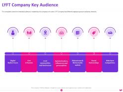
    • Persona-targeted campaigns (Slide 12 & 18) — e.g., campaigns tailored to young urban riders, commuters, and social users.
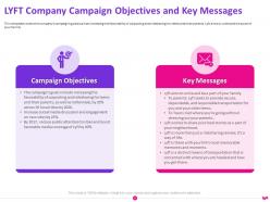
    • The deck includes tactical assets: campaign messaging, Earned/paid media mix, influencer/local partnerships, and experiential events (Slides 11–14, 21).

The Ask

  • The slides do not show a single explicit funding ask line (e.g., “we are raising $X”) in a legible way in the thumbnails provided. Context indicates this is a Series A-stage deck. The slide set clearly requests or justifies a marketing budget (~$3M) for the near term (Slide 21). If fundraising ask was present, it is not clearly visible in the thumbnails.

Investor Deep Dive

Executive summary, strengths & red flags

Executive Summary

This investor-focused pitch deck (early Lyft fundraising materials) presents Lyft as a consumer-facing ride-sharing platform built for affordable, friendly rides. The deck combines product screenshots, go-to-market/social tactics, a SWOT/situational analysis, audience segmentation, and an itemized marketing/evaluation budget — all framed to justify near-term marketing spend and rapid user growth. It's notable for its clear product flow, campaign-oriented thinking, and an emphasis on brand positioning ("friendly, affordable, easy") rather than deep financial modeling.

Key Strengths

3 identified

1

Clear product demonstration and UX flow (Slide 9): The deck uses mobile mockups to show exactly how a user requests a ride and interacts with drivers — very tangible for an investor evaluating consumer product fit.

2

Practical go-to-market playbook (Slides 11–14): The deck moves beyond “ideas” to concrete campaign themes, local activation plans, and social tactics — useful evidence the team understands customer acquisition.

3

Strong brand positioning and simple value props (Slide 17): “Easy, Affordable, Friendly” + product variants (Lyft Line, Lyft Plus) make differentiation memorable and investor-friendly.

Red Flags & Weaknesses

3 identified

1

Sparse/unclear financial and traction detail: The deck lacks clearly presented revenue figures, unit economics, and growth metrics that investors typically expect (Slide 6 and Slide 24 hint at numbers, but they are not clear). This makes it hard to assess scalability or capital efficiency.

2

No explicit TAM/SAM/SOM quantitative breakdown: Market sizing is described qualitatively, but the absence of a numeric opportunity model weakens the investment case for large-scale expansion.

3

Funding ask and use of proceeds not explicit: While the marketing budget is shown (~$3M), there is no clearly legible slide that states the total capital sought in this round and exactly how funds beyond marketing would be deployed.

More Pitch Decks To Study

Compare structure, fundraising context, and investor-facing story across similar startup decks.